The first unofficial Riga Type Week kicked off on Monday evening with a lecture by designers Miķelis Baštiks and Aigars Mamis from the design studio «Asketic». The audience turned out to be bigger than our premises, so we have put together a short summary for those who were not able to attend. The talk was based on eight discoveries and conclusions that Miķelis and Aigars have come across in both commisioned and self–initiated work.
Follow your passions
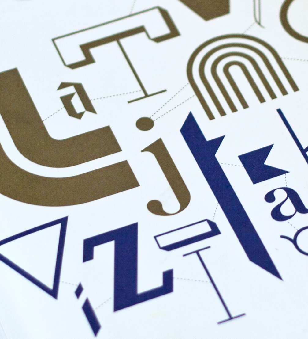
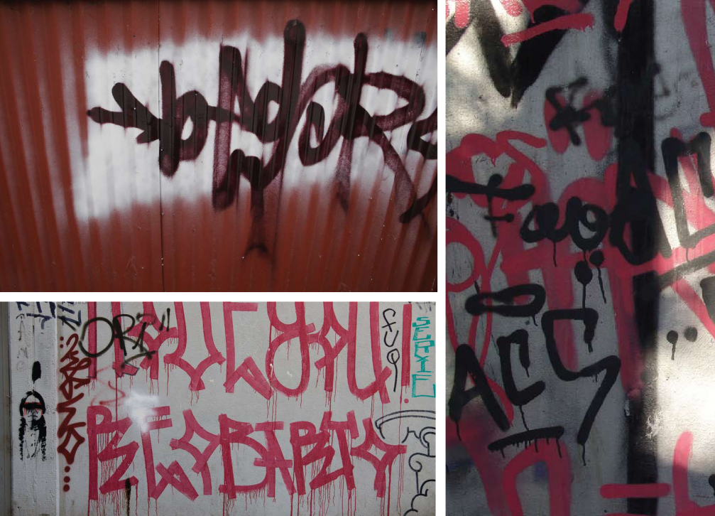
For most designers at «Asketic» studio, the first encounters with typography come through street art. Graffiti is the same drawings of letters, just painted on the walls of houses. Looking at the urban streetscape, we can’t help but notice that graphic design is a form of graffiti, gone through the filters of bureaucracy. Following our passion has led us from one form of typography — street art — into another — graphic design, and the two have many principles and methods in common.
Simple ideas work
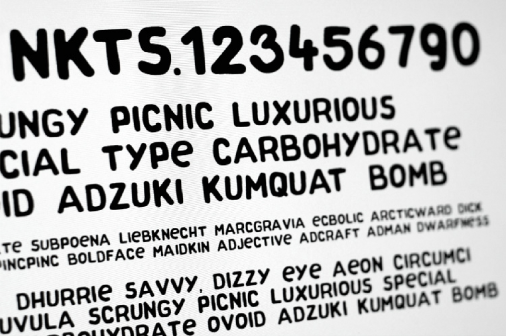
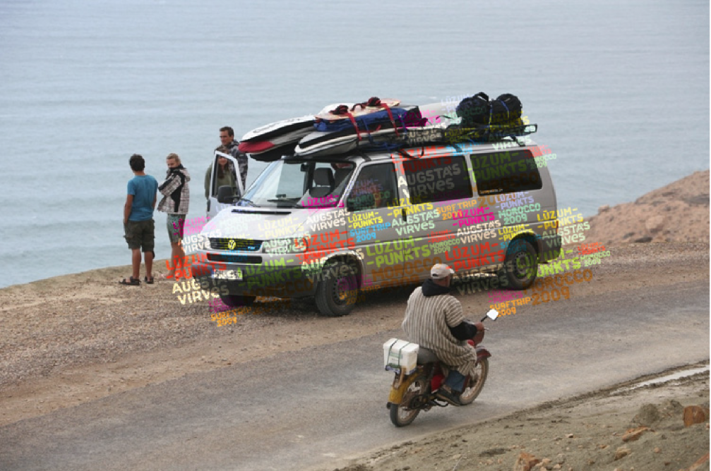
One of our first experiments in type design was work on the visual identity of the adventure organisation «Lūzumpunkts». Knowing that the company has diverse needs, but a tight budget, we decided to create a convenient graphic tool — a font that the employees can adjust themselves on a daily basis without involving a designer every time. A simple idea, well executed — a hand–drawn and afterwards digitalised font — sometimes works better than a sophisticated design approach.
Learn by doing
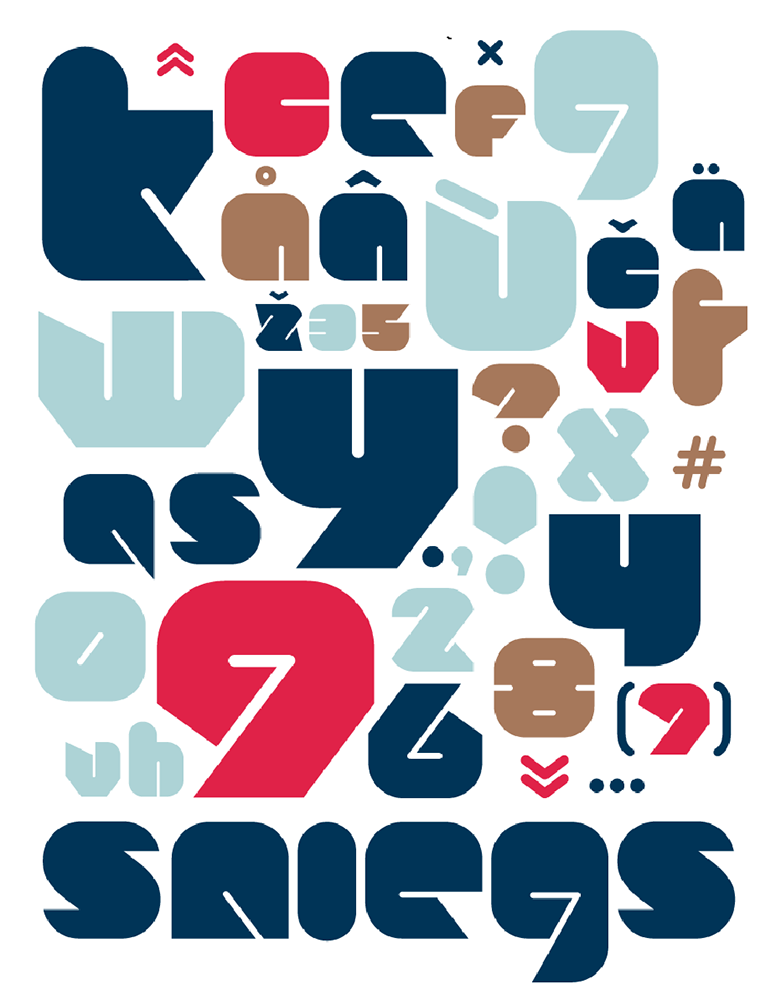
While taking the first steps in typography, we decided to create a separate font for the logo of the snowboarders’ community «Sniegaklubs». It was not a necessity of the client, but our own initiative. We spent our free time, evenings, weekends to test ideas and to learn.
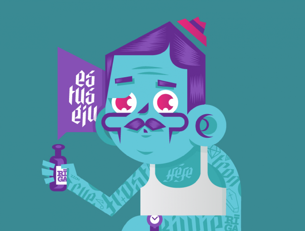
Experiments are fun
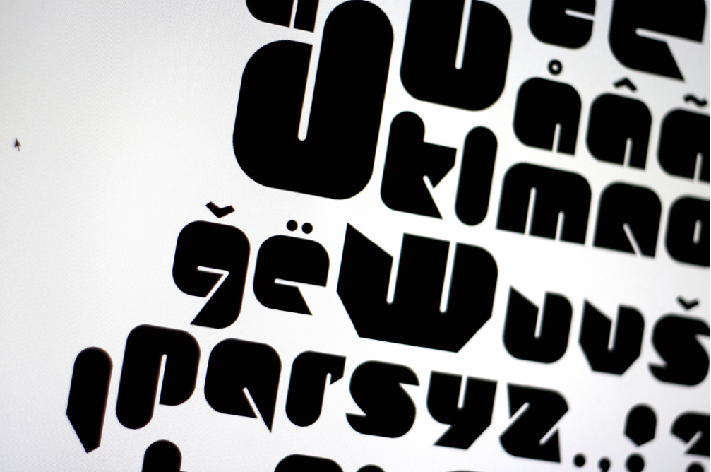
Our experimental font «Heefe» was created in our free time between commissions of clients. It is an interesting example of type forms having impact on illustration and the style of other graphic elements.
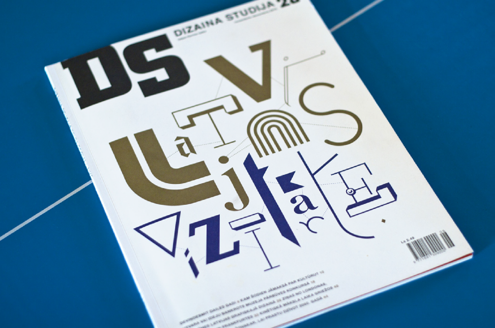
Latvia is more interesting than it seems at first
For one of the last issues of the magazine «Dizaina studija» we developed its main theme «Latvia’s business card» by using fonts created in Latvia for both the cover illustration, as well as for headlines in the spreads.
Don’t be afraid to look from a different perspective
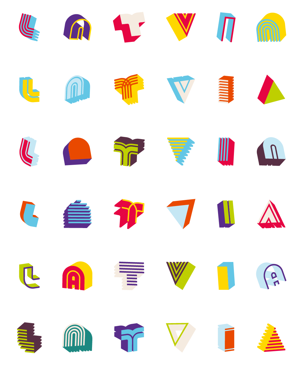
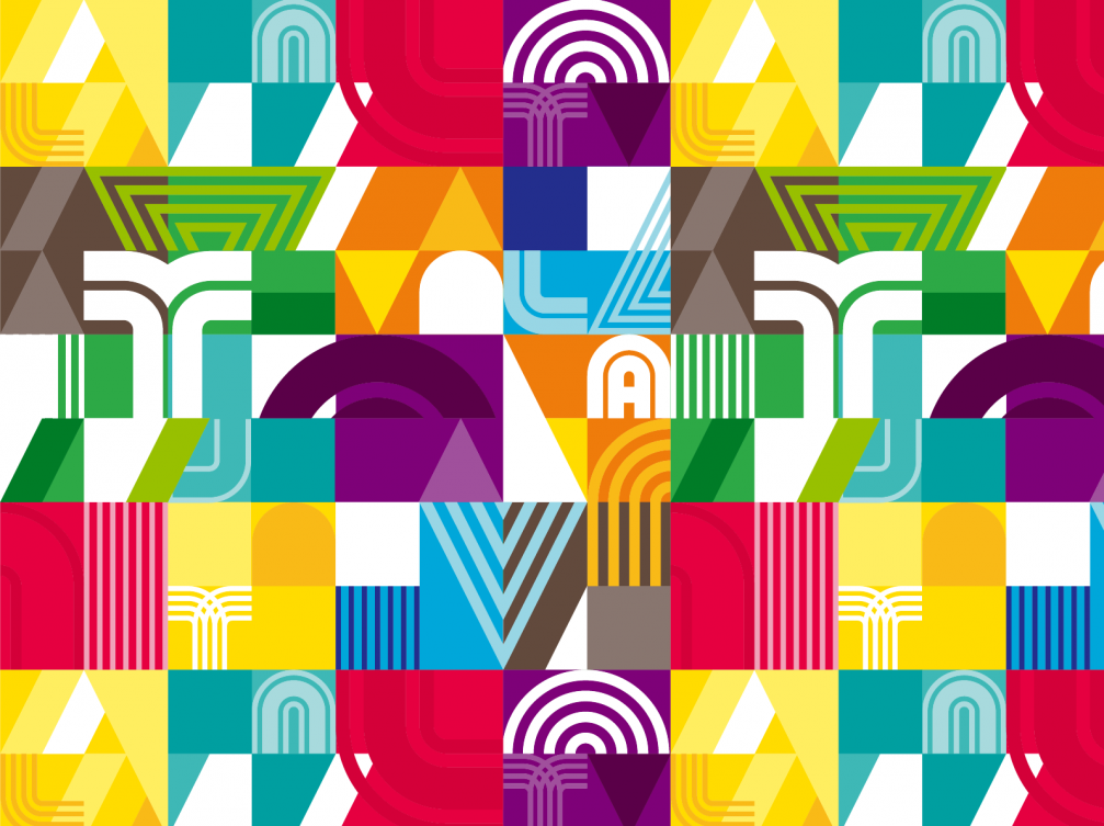
Our biggest project up to date is the visual identity of Latvia for the EXPO pavilion in Shanghai. We started with four different fonts of one type family and later based the whole identity on them. All elements in graphic patterns, clothing, souvenirs and interior were developed from different forms and colours of the fonts. It allowed us to view the sometimes so standardised image of Latvia from a more contemporary viewpoint.
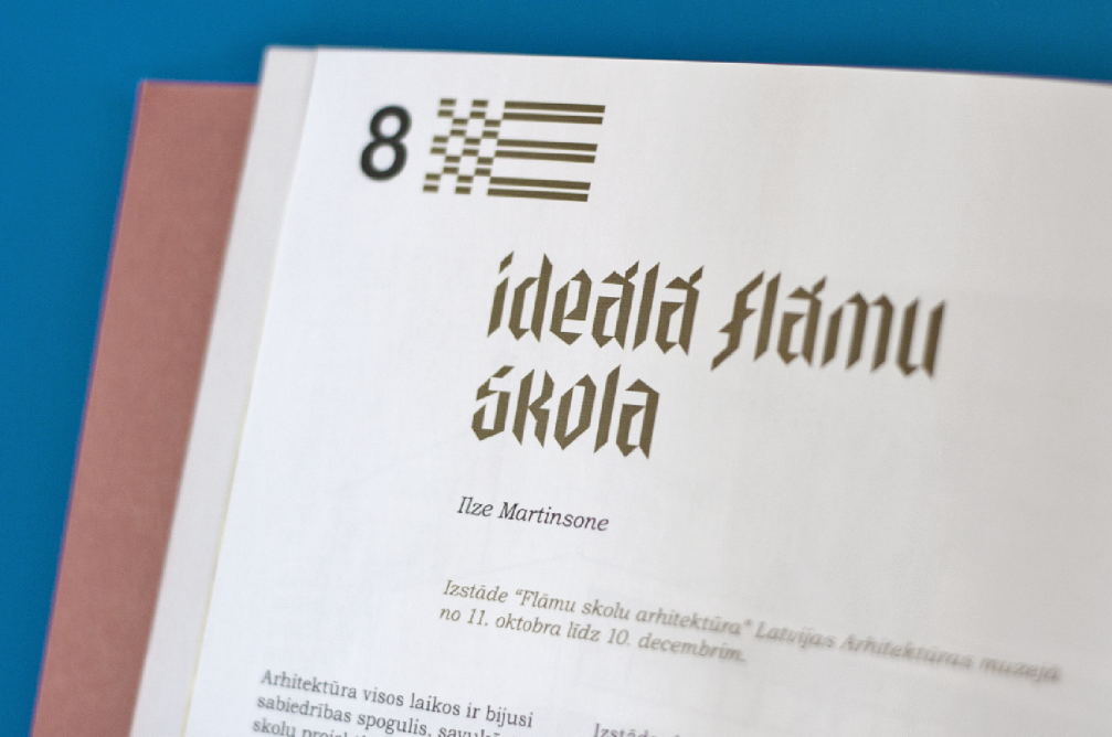
Use the everyday to discover new worlds
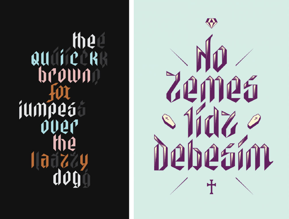
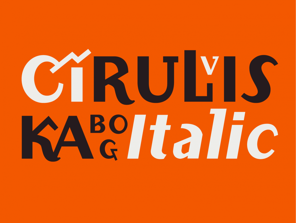
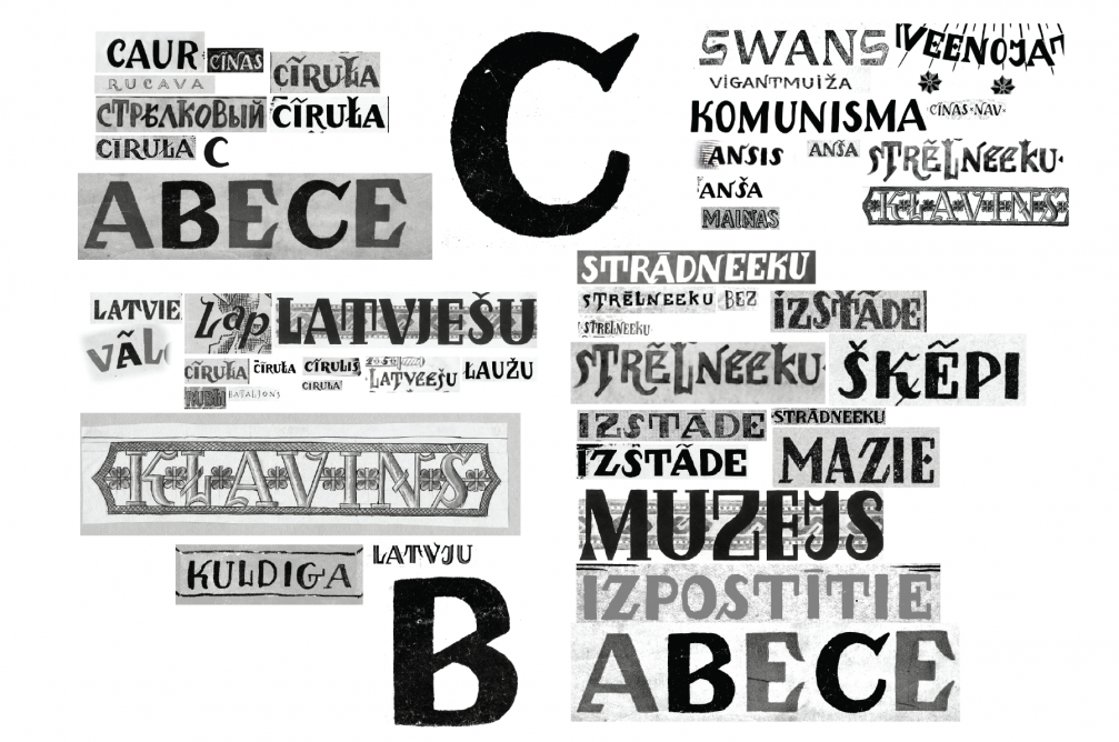
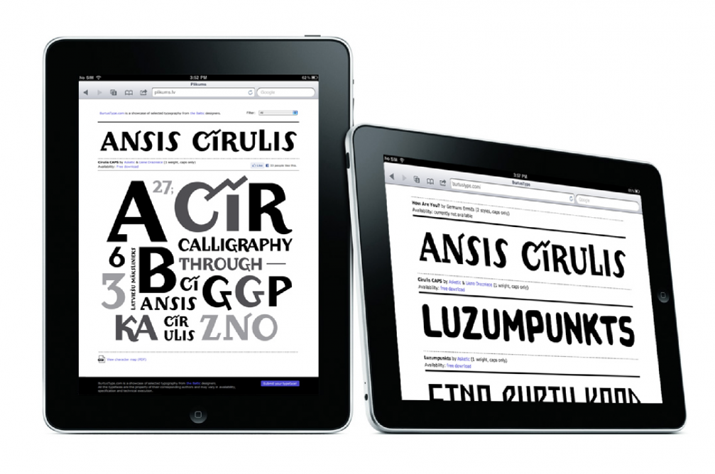
We started making the «Cīrulis» font while collaborating with the graphic designer Liene Drāzniece on a book about the artist Ansis Cīrulis. The first sketches of the font were made when looking for headlines that would add fit together with the artwork in the book. By carefully studying forms and origins of the letters, we got carried away, and we still continue developing the font today. Currently we are designing a type family, so that the font could be used not only in headlines, but in other written matter as well. Those interested can sign up for a free font on the website «getCirulis».
There are more good things around than one might notice
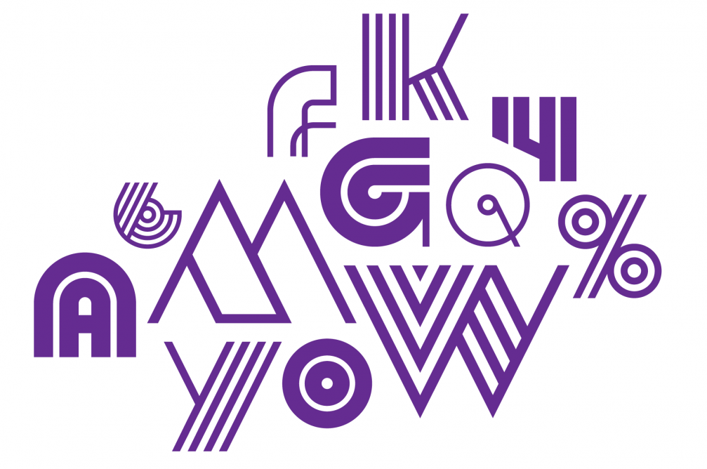
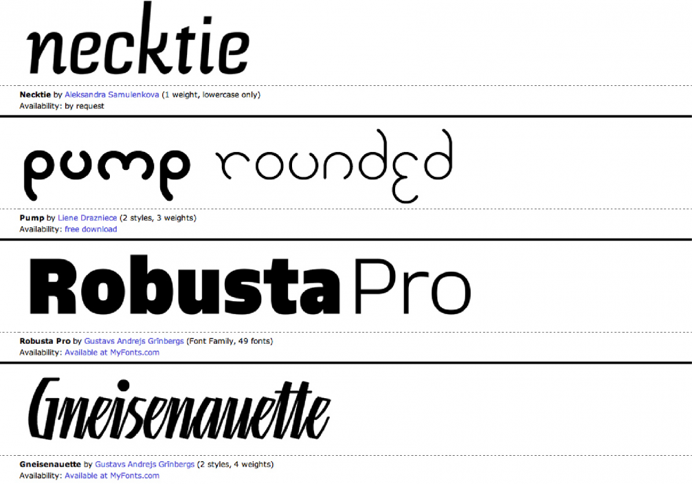
When we became interested in type design in Latvia and the Baltics, it seemed that there are just a few enthusiasts hiding in dark corners. We created a selection of the best creations in the field in order to bring forward the work of Latvian type designers. The current catalog contains over 30 different fonts and can be accessed online at «BurtusType».
Viedokļi