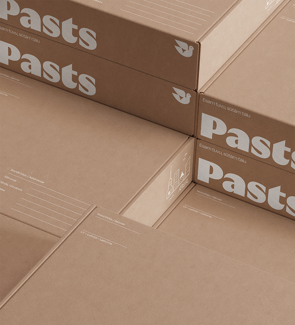
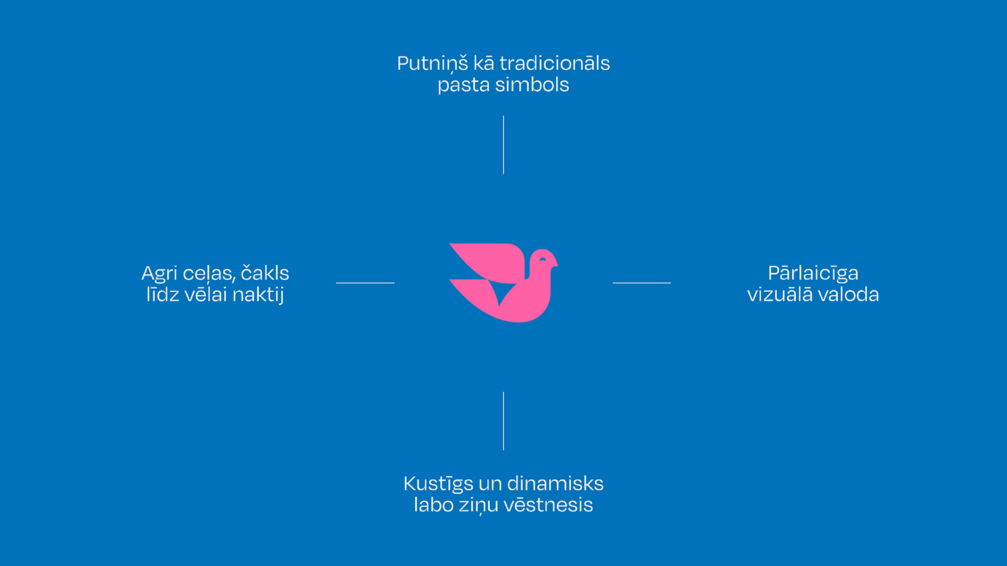
To become closer to local residents and increase its competitiveness, Latvijas Pasts (Latvian Post) has now become simply Pasts. The new brand and its strategy were developed by the Magic agency, while the Kid Design studio created a modern visual identity, focusing on expressive typography. The new company logo is complemented by a new symbol — a bird — which stands for diligence and movement, referring to both the values of the company and the history and traditions of the post.
Latvijas Pasts operates in a highly competitive environment, and to gain a bigger market share, especially in the field of e-commerce, the company is implementing a new strategy that includes both a new customer service model and the introduction of new digital solutions. Latvijas Pasts’ previous brand was created in 2004, so it was only natural that changes in the company’s strategy also required a brand change.
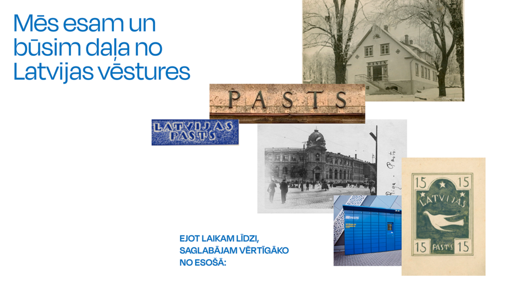
The brand development process, carried out by Magic and Kid Design, consisted of several stages — an audit of the existing brand, several brand perception studies, case studies of postal brands in other countries, developing a new brand strategy, and creating visual identity and communication materials. Co-creation workshops involving postal workers played an important role in the process. During the research, the Magic strategy team came to the conclusion that the company is characterised by humanity and the ability to connect Latvia and the world, while the audience’s needs are united by the desire to achieve more in a convenient way.
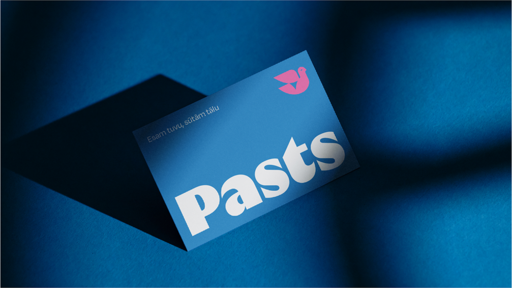
The company’s legal name will remain Latvijas Pasts, but to be more concise and better reflect how customers perceive and refer to the brand on a daily basis, the brand name was changed to Pasts. Magic emphasises that the word «pasts» has both local and international meaning, and logistics companies in the global market often include the word «post» in various languages in their names.
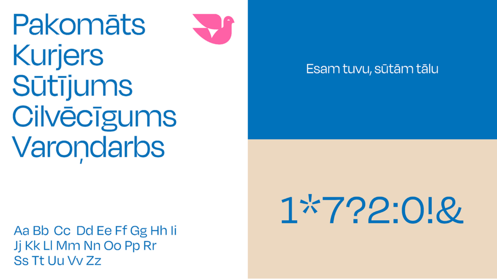
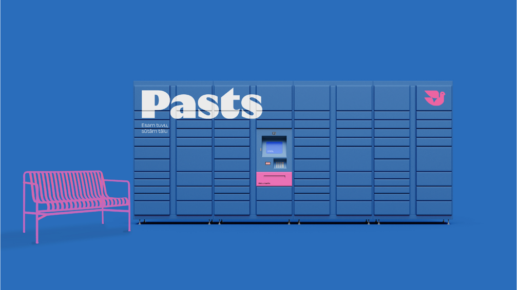
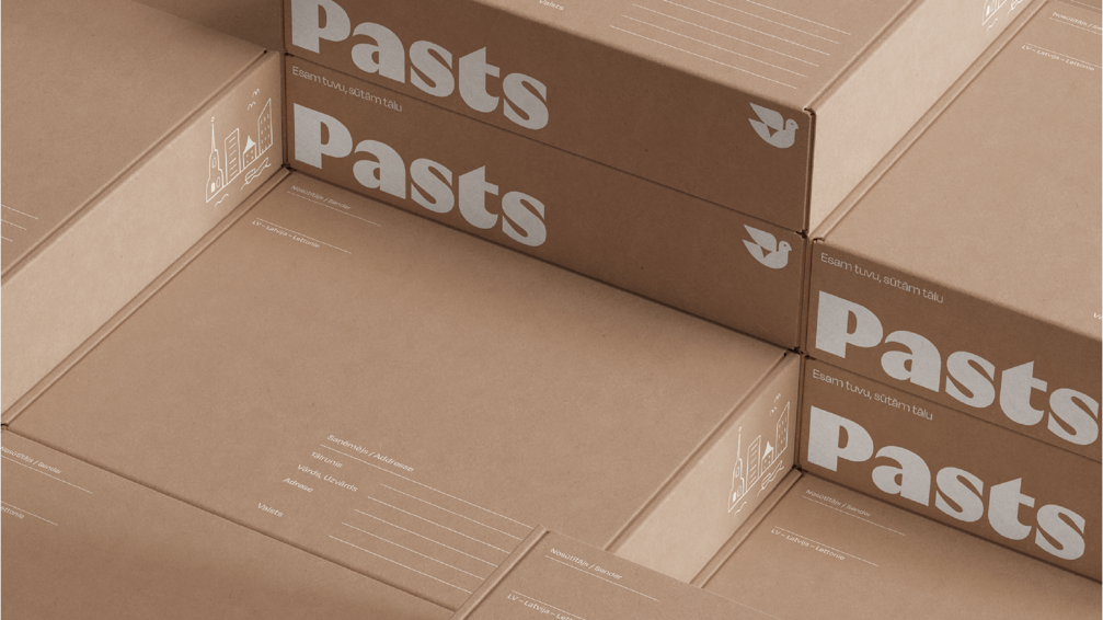
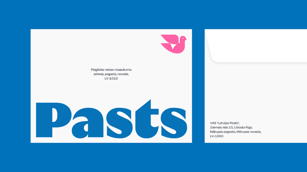
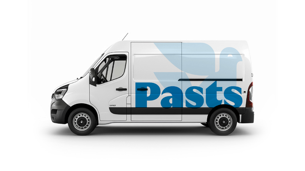
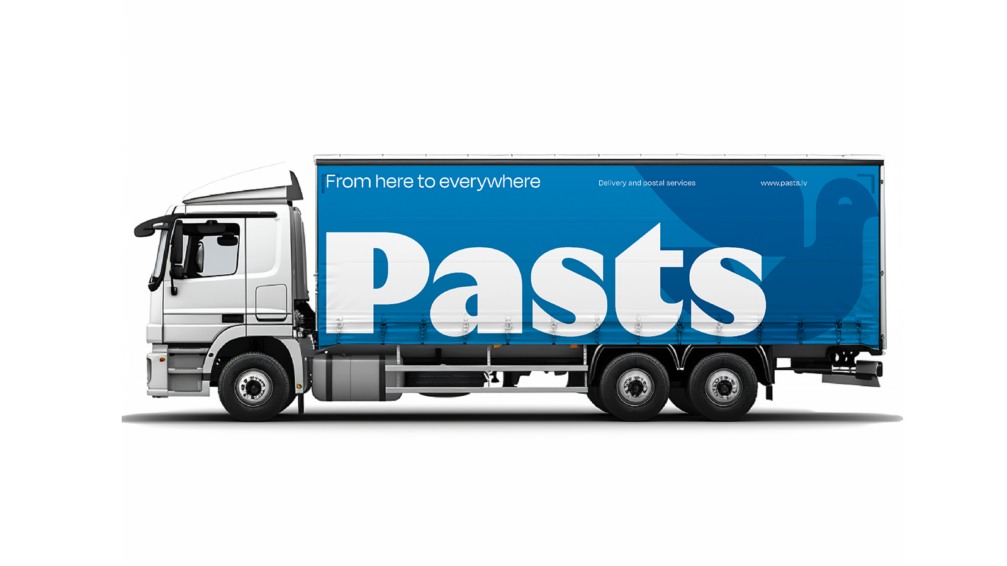
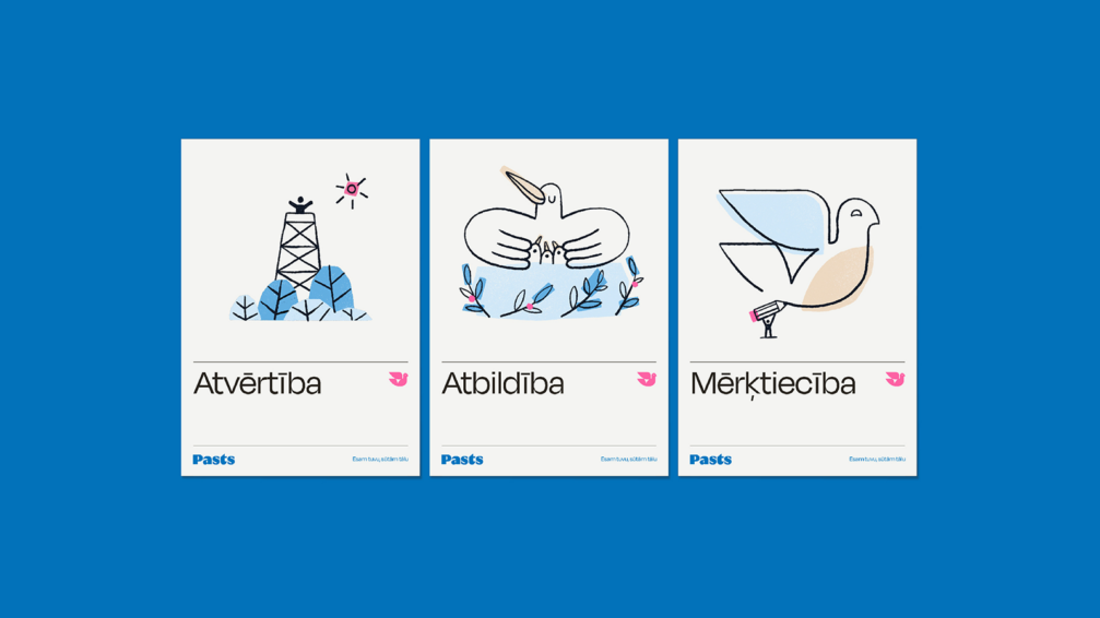
In creating the new visual image for Pasts, the designers sought to reflect both postal traditions and the company’s future ambitions. An expressive bold font was chosen for the Pasts wordmark, with contrast and detail created by the nuanced shapes of the letter terminals. An essential part of the new identity is also the composition, which determines the bold use of the wordmark. Pasts’ new symbol — a bird — reflects movement, speed, and restless diligence, even in the early hours of the morning, while also paying tribute to the old postal traditions.
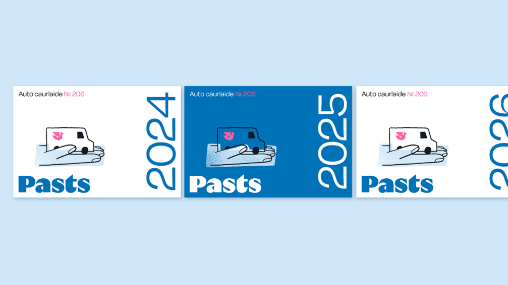
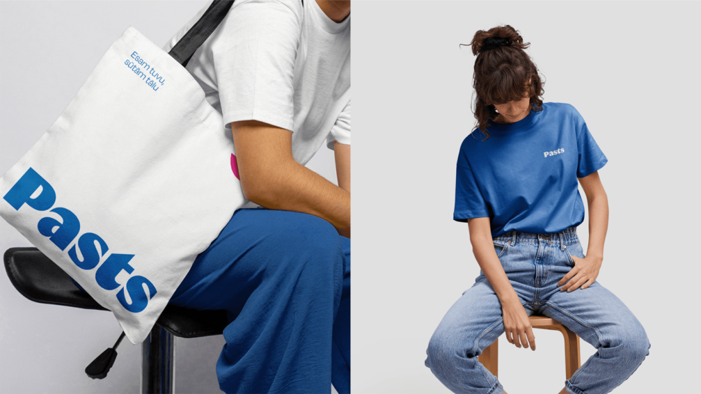
The existing blue tone of the Pasts’ parcel lockers has been retained as the primary colour of the new visual identity. The designers explain that this decision was made both for economic reasons and to maintain brand recognition. However, the accent colour has been changed from the familiar yellow to bright pink. This colour was chosen in collaboration with postal workers, and Kid Design considers it a bold and original choice that reflects Pasts as an innovative, dynamic, and friendly company. To further enhance the image of a friendly and open company, illustrator Agris Čaurs has created charming illustrations that complement the communication materials of Pasts in both physical and digital environments.


The authors emphasise that the most important aspect of the new visual identity is the combination of all elements and their mutual interaction, where bold accents and compositions are accompanied by open and friendly communication. Along with the introduction of the new identity, the company’s vehicle park will be gradually renewed, and the digital platforms Pasts.lv and Mans.pasts.lv have already become more user-friendly.
Authors: Magic — Andris Rubīns, Rihards Ginters, Lelde Dālmane, Laura Lapiņa, Reinis Piziks, Sanda Ķestere; Kid Design — Jānis Kozinda, Maija Rozenfelde, Jānis Kokarevičs, Melisa Debora Kaškura, Arnis Artemovičs .


Viedokļi