The publishing house Neputns has issued a bilingual edition of the liturgical play Ordo Virtutum in Latvian and Latin by the mediaeval mystic, composer, and poet Hildegard of Bingen. The ancient text is complemented by illustrations created by artist and poet Linda Mence. The colourful, detailed, and multi-layered drawings interpret the virtues praised by Hildegard in a poetic and symbolic way. The book was designed by artist Anta Pence.
Hildegard of Bingen (Hildegard von Bingen, 1098–1179) was a mediaeval mystic, poet, composer, healer, abbess, and preacher. During her long life, Hildegarde wrote down and interpreted her mystical visions, studied medicine and healed the sick, composed music, led a monastery, and even created her own language. Linda Mence, who conceived the idea for the book published by Neputns, notes that the translation and illustrations of Ordo Virtutum are «an attempt to listen to the words of the mediaeval mystic, allowing them to greenness in voice, thought, and hands».
Hildegarde wrote the liturgical play around 1152 in the then newly built Rupertsberg monastery. Ordo Virtutum is an allegory that tells of the soul’s journey back to God. In the play, the soul has become acquainted with the body and worldly life, succumbed to the temptations of the Devil, and now, wounded and full of remorse, wants to return to God. The soul is aided by a group of Virtues led by Humility (Humilitas). Together with the other 15 virtues — female voices — Humility helps the soul return home while fighting the Devil.
Linda first read Hildegard’s text four years ago when she was studying at the Art Academy of Latvia and learning about the first female authors. Linda saw Ordo Virtutum as a possible basis for her own creative project, such as set design or costume sketches. The idea to illustrate the play came when she began working on her master’s thesis; the artist reveals that drawing people is not her strong suit, and Hildegard’s allegorical work offered the opportunity for broader interpretations.
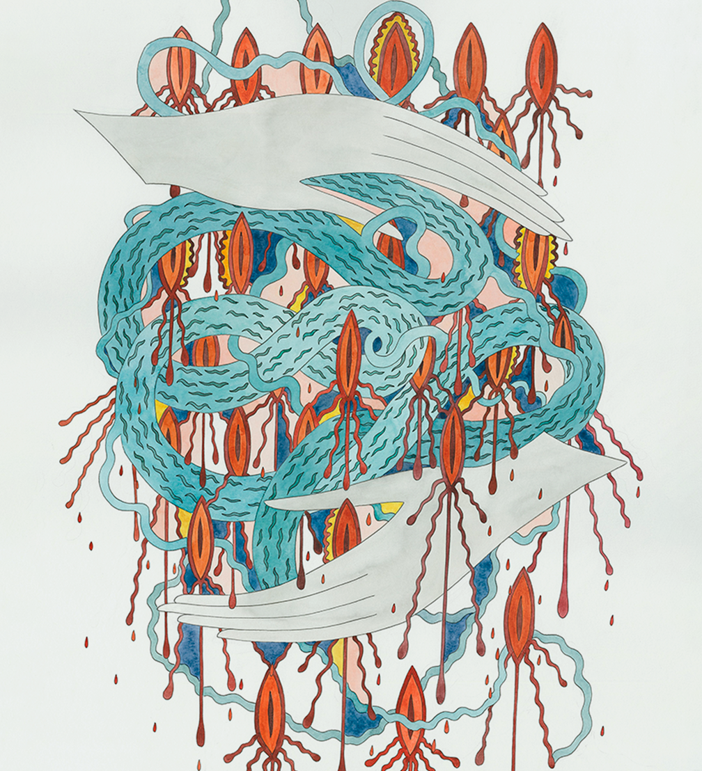
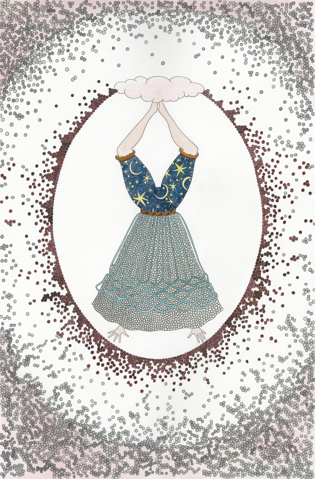
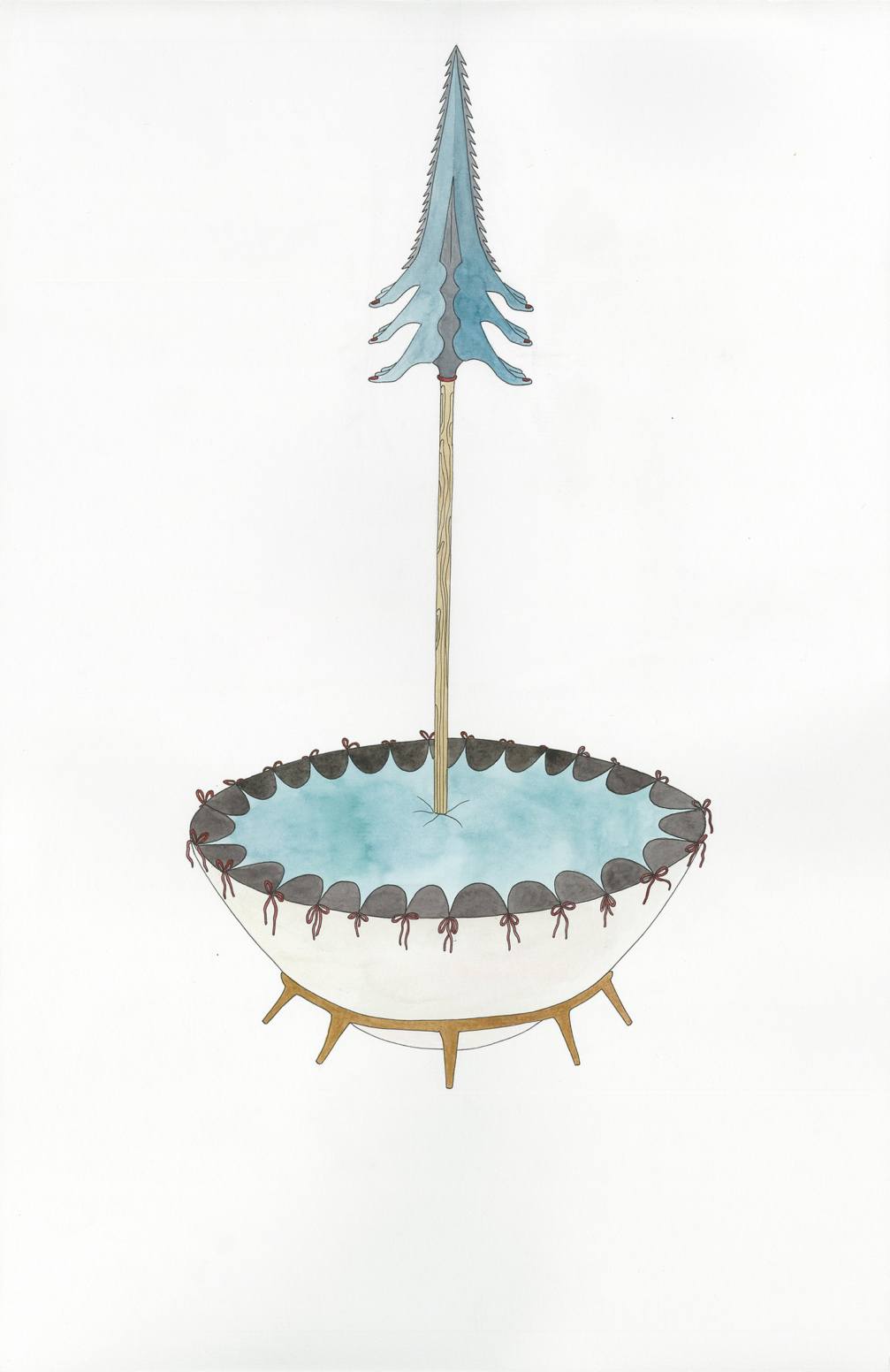
Ever since Linda first learnt about morality plays — a theatrical genre that originated in the Middle Ages — she has always been fascinated by the fact that actors on stage were able to embody seemingly intangible things — human virtues and vices. Similarly, Linda has managed to bring Hildegard’s characters to life in her colourful, finely crafted illustrations. «Hildegard’s virtues cannot be accurately translated verbally, but I can find visual images for them that I can fill with what is important to me,» the artists explains.
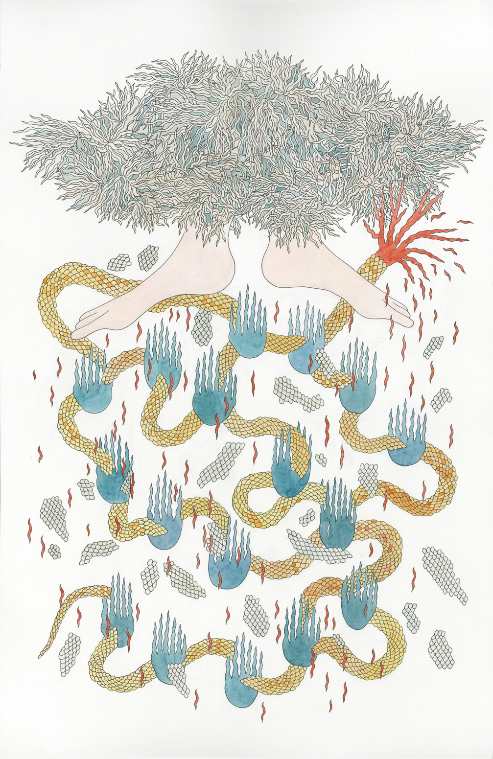
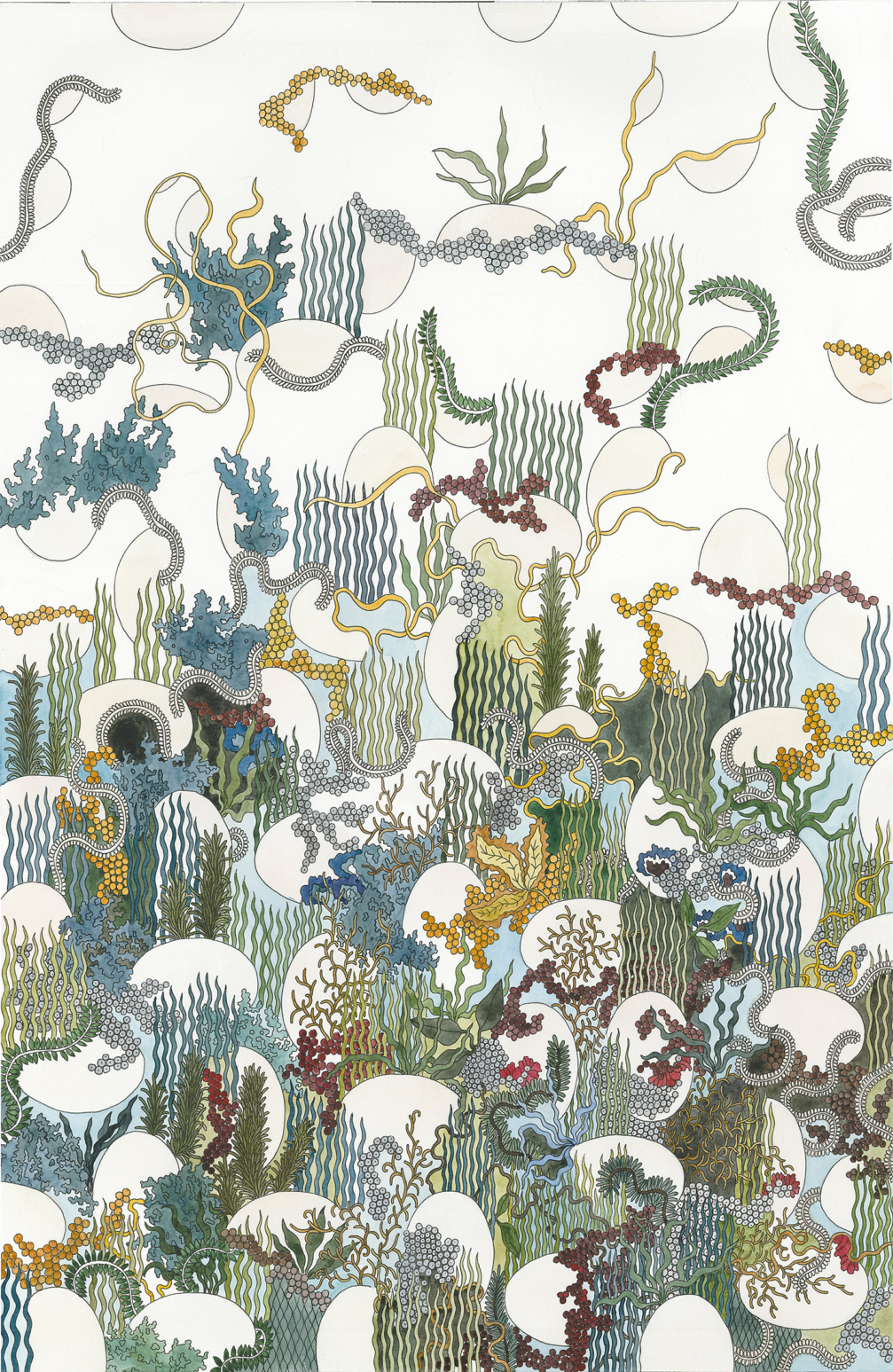
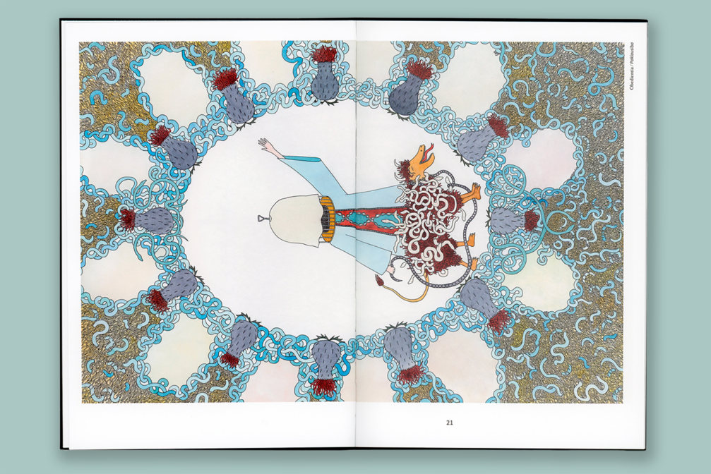
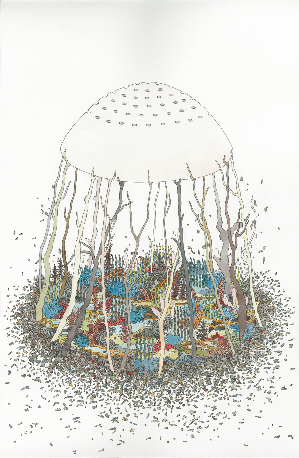
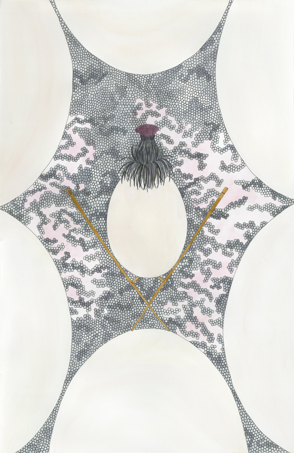
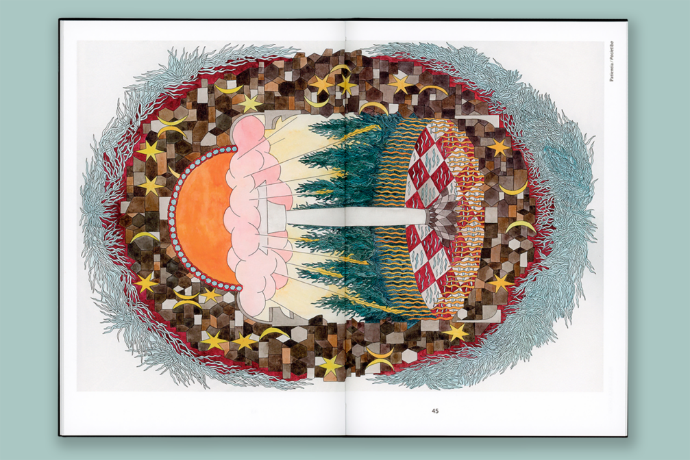
The illustrations refer to Hildegard’s text and at the same time reveal Linda’s own feelings and experiences. For example, the illustration for Modesty (Verecundia) shows feet crushing a snake, which directly echoes the text of Modesty in the play: «I cover over, drive away, or tread down all the filths of the Devil.» At the same time, the footprints are a reference to a sculpture by Anda Poikāne, an artist close to Linda. «I found it very amusing to draw Modesty, who is also fierce and tenacious,» says Linda. A similar contrast is also included in the illustration of Humility, where the high status of the queen of virtues is depicted as striving upwards, while the essence of humility is symbolised by the grass.
Plants are present in many of the illustrations. Linda explains that the plant motif is related to Hildegard’s concept of «viriditas», which could be translated as greenness, which gives life to both plants and people. «Every era seeks its own salvation, and perhaps Hildegarde’s idea of human responsibility in maintaining the greenness can offer us some advice,» Linda writes in the introduction to the book. Similarly, almost all of the drawings feature an egg, which Hildegard saw in her vision as a symbol of the universe.
The book was designed by artist and designer Anta Pence, who created a modern and minimalist framework for Linda’s drawings. «Hildegard’s texts were written several centuries ago, but when I saw Linda’s illustrations, I immediately thought of the book as a modern version of the Ordo Virtutum, emphasising the mystical, fairy-tale atmosphere created by the artist,» says Anta. The cover of the publication uses individual graphic elements from the illustration of Patience (Patientia) to «tell a miraculous story, while preserving the joy of discovery of the magnificent images inside the book.» Two fonts, Hoefler Text and Source Sans, were used for the text layout, distinguishing between the historical Latin text and Mārtiņš Laizāns’ translation in Latvian.
The book Ordo Virtutum is available on the Neputns website.


Viedokļi