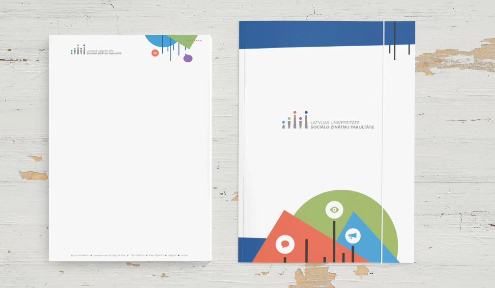
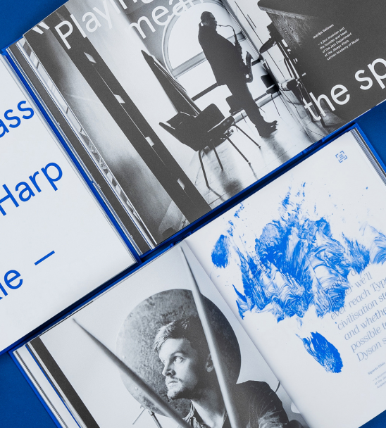
Graphic design studio «WIG» has completely rebranded the identity of University of Latvia Faculty of Social Sciences. A system of graphic elements has been made, inspired by the style of Bauhaus.
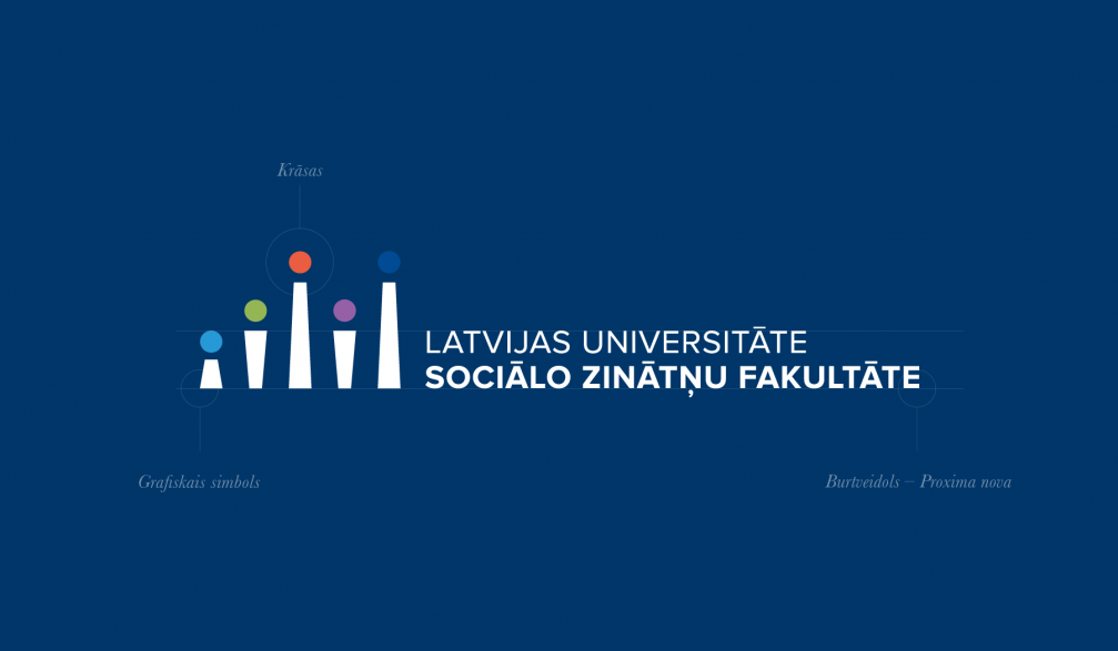
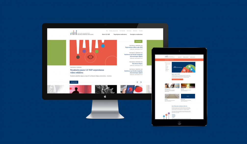
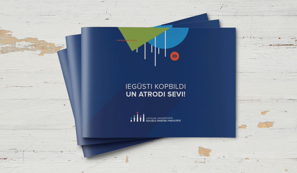
A full style book has been created for the faculty: a logotype, a colour palette and fonts, a website, various stationery items, souvenirs and interior elements. A new visual identity requires consistency, and it is a lengthy process, especially in large institutions, and it shows the openness and commitment to change of the faculty’s management.
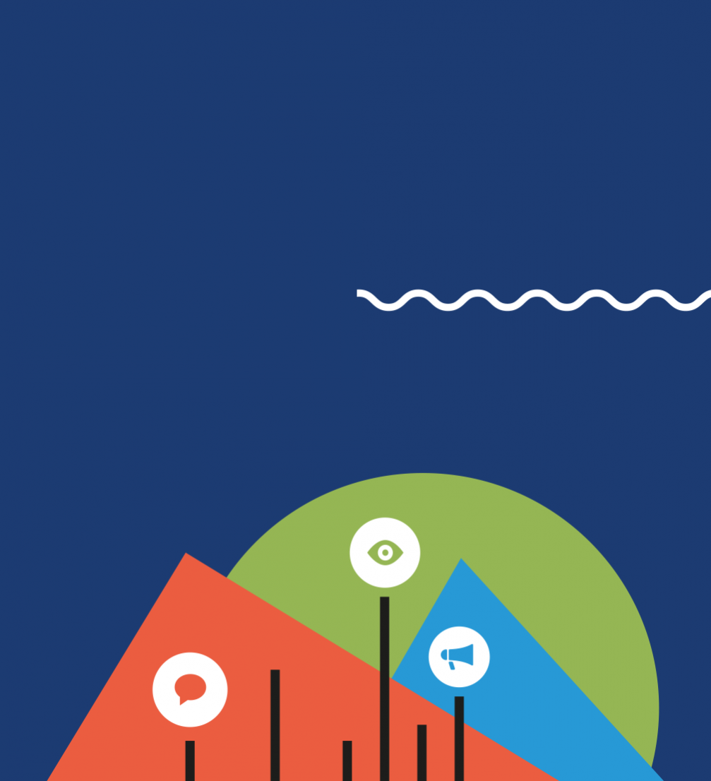
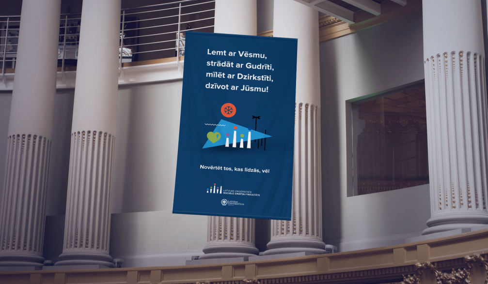
«The initial assignment was to design a new logotype. We made the first sketches, and the client rewarded us with the freedom to do more. There was only one condition: the little people should be kept in the logo, as they symbolise values important for the faculty — man in the centre of attention. We left 3 figures and added another 2 — representing the 5 study programmes that the Faculty of Social Sciences offers,» explains Dāvis Vilcāns, graphic designer at «WIG».
«In the process we were looking for balance, because the design needs to speak to the future bachelor students who want to study in a contemporary school, as well as represent the University of Latvia, which is rich in traditions. The identity we made will be used for both freshmen’s parties and PhD papers,» adds designer Orians Anvari.


Viedokļi