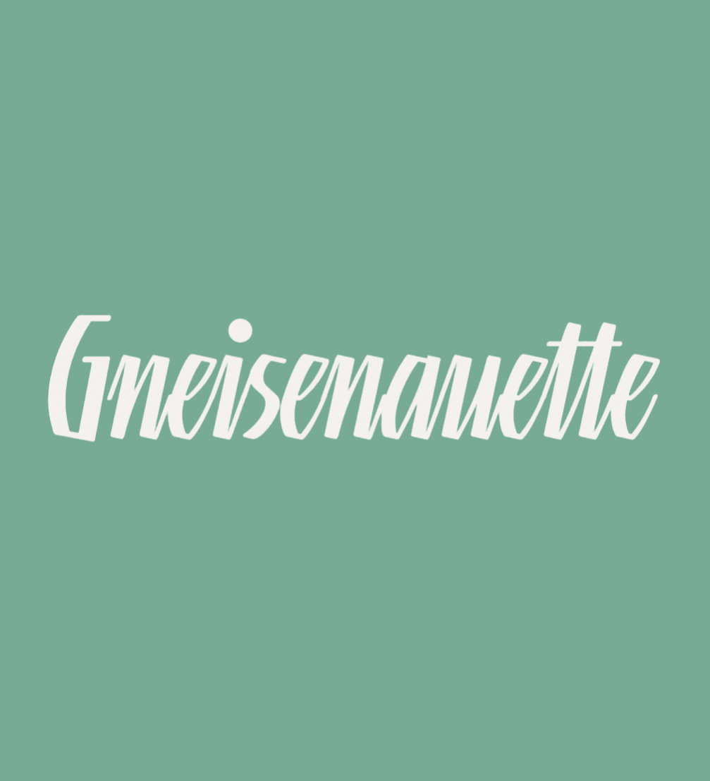
Last year, the typeface «Gneisenauette» by graphic artist and letter designer Gustavs Andrejs Grīnbergs was recognized thanks to the global font company «Monotype». It published a very detailed article about the typeface on its blog and called it a «hidden gem».
Latvian graphic artist and typographer Gustavs Andrejs Grīnbergs was the one who adapted Western fonts for Cyrillic, Greek, Turkish, and, of course, Latvian alphabets for the company «Tilde» and for the needs of «Diena» newspaper. The designer has also created around twenty original font families, including the popular ones, as «Linotype Brewery» or «Rowena».
«Gneisenauette» by Grīnbergs is a part of the Take Type Library, selected from the contestants of Linotype’s International Digital Type Design Contests of 1994 and 1997. The contest in 1997 received 800 typeface submissions. «Gneisenauette» didn’t win, but it did receive a special recognition. It was digitized and sit alongside the prize–winning designs on the Linotype’s Take Type Library CD.
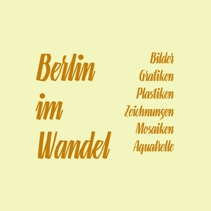
The handwriting font is available in eight weights. «Linotype’s» «Gneisenauette» is a dynamic font which also reflects a bit of the optimistic spirit of the 1950s. The font is best used for headlines or middle length texts with a point size 12 or larger.
One of the largest players in the field of fonts is «Monotype», which over the years has acquired several medium–sized font companies, including «Linotype», to continue working with its partners. One of them is Grīnbergs and, last year, his «Gneisenauette» was featured as a «hidden gem» in the «Monotype’s» blog article, written by designer Anthony Noel.
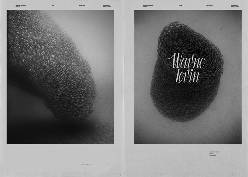
He emphasizes the simple, assertive, rough–hewn aesthetic of the typeface that makes it a distinctive voice in the middle ground between elaborate calligraphic typefaces and the abundance of scratchy, hand–made lettering fonts. Noel describes it as perfect for posters and book covers. While the Monotype’s type designer Terrance Weinzierl calls it punchy, cool, and retro chic.
According to typography expert Stephen Coles, «Gneisenauette» is at the top of his «Weird and Wonderful» typeface list. «What I love most is that it has a very unusual lettering-inspired style that works in a variety of different contexts,» says Coles in the «Monotype’s» article. «Most script fonts are either very obviously retro, or very contemporary, but «Gneisenauette» doesn’t have an apparent origin. It looks like it could be from the 1920s, or maybe the 1950s, but it also feels very current and fresh—like it could have been drawn yesterday.»
Grīnbergs himself says that «Gneisenauette» was inspired by the Blackletter (Fraktur) letters. He especially emphasizes the importance of the legacy of German type designer Rudolf Koch (1876–1934), who has always been Grīnberg’s absolute authority. «Gneisenauette» is a very old girls’ name and the designer chose it because it is strange and uncommon.
«As it developed, I cleaned off the details I could live without and the freestyle script got the accurate, disciplined, mechanical look it has today,» Grīnbergs explains in the Monotype’s article.
More on «Gneisenauette» read the article of «Monotype». FOLD’s interview with Gustavs Andrejs Grīnbergs is available here.
Viedokļi