
Last week, reports appeared in Latvian media about Saulkrasti Municipality’s expenses for the development of a new visual identity on the eve of the territorial reform. The new brand concept has been portrayed as «drawing eight straight lines and describing a peaceful and family-oriented municipality». We asked graphic designer Krists Dārziņš, the author of the new visual identity of Saulkrasti Municipality, to explain how much work has actually been put into the eight lines of the logo.
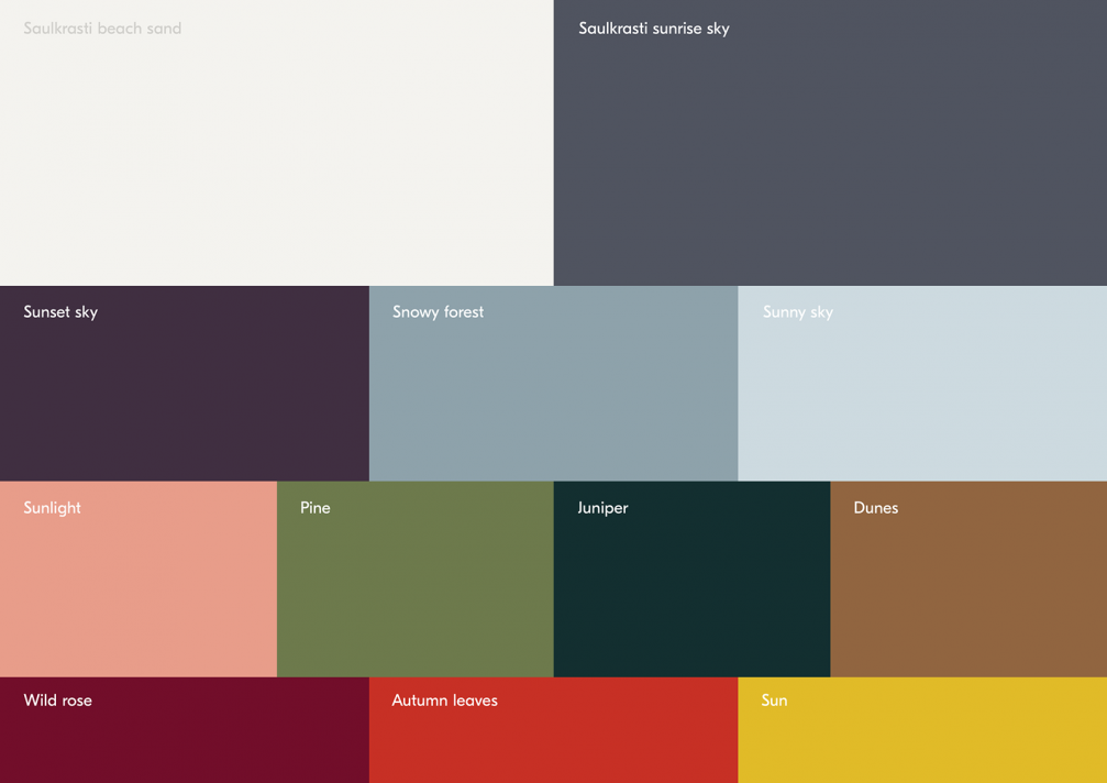
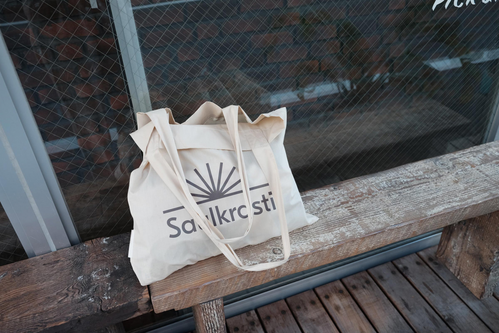
One of the main development angles for Saulkrasti, and also one of the reasons for reinforcing its brand, is the transformation of the town from a seasonal resort to a place where residents and guests have access to high-quality infrastructure, culture, and tourism throughout the year. Therefore, the new visual identity no longer makes use of the intense shades of blue and yellow which are characteristic of seaside resort towns and draw associations with seasonality. «The previous Saulkrasti logo was visually oversaturated impeding its perceptibility and use in day-to-day communication. With the media changing and the digital space becoming increasingly important, it is vital to create a visual identity that can function across various platforms,» explains Krists Dārziņš, Art Director of the Riga branch of branding agency «Azai Studios». «The previous visual identity of Saulkrasti hinged only on the use of the logo — whether to place it at the right or left corner — which is inconsequential. The aim was to create a visual identity that the majority of residents can identify with and that reflects the soul and future plans of Saulkrasti. Also, it was important for viewers to be able to recognise Saulkrasti from the colours or sun rays included in the visual identity.»
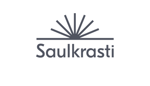
The new symbol of the municipality is the image of a sunrise on a stable, even foundation — the horizon or coastline, forming a peaceful and balanced, but also active mood. The design language is laconic and easily perceivable. «We’ve heard people say that the logo is too simple, but we believe that it’s wonderful if a logo easily stays with you and even a child can draw it with crayons, which would not have been possible with the previous one,» Krists says.
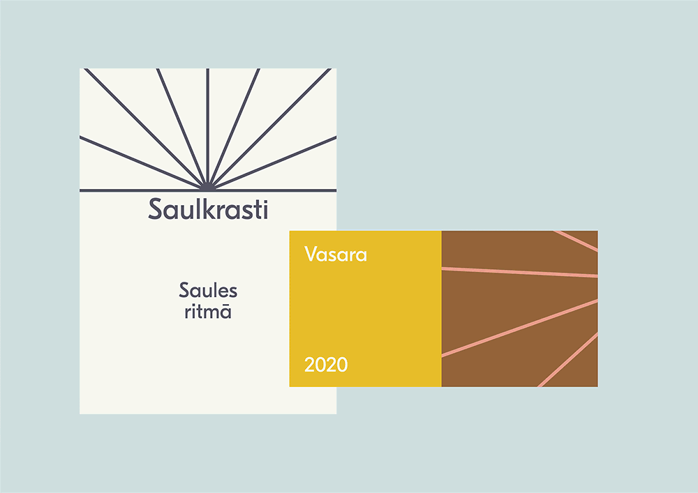
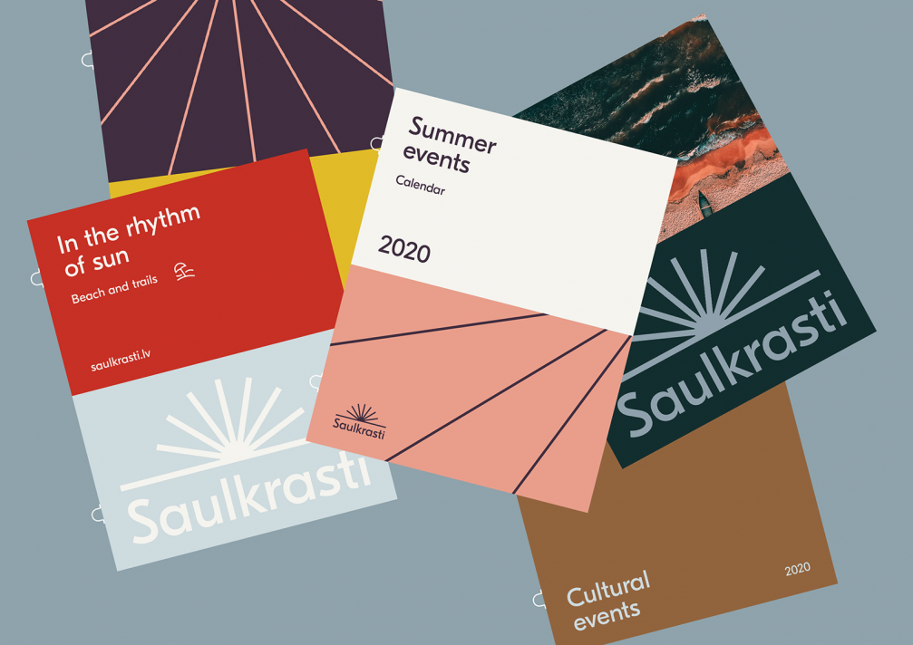
In order to create a distinct and unified image of the municipality, related brand derivatives have been created for all Saulkrasti municipal agencies. This will improve communication efficiency and better reflect the municipality’s mission, vision and values, while also promoting the uniqueness of the municipality on a broader scale. Krists explains: «From the very outset, it was a given that the visual identity will be used by various municipal agencies and not all of them have an in-house designer to expertly craft posters, brochures or signage. In drafting the guidelines, we aimed to make them user-friendly, not requiring extensive design experience to use them. To make the process even easier on the staff of the municipality, we made all the templates, colours, graphics and the logo available on the «Canva» platform which the staff are already familiar with thus saving working hours and promoting the creation of visually unified material.»
The full set of guidelines for the Saulkrasti brand is available here.


Viedokļi