
Riga City Council has updated its current visual identity to be used in digital communication, public outdoor space, and for representation purposes abroad. The renewed identity is based on the keys of Riga, which have been a symbol of the city since the 13th century.
The brand design studio Overpriced, which has also worked on the visual identities of Saldus and Valmiera municipalities, has recently renewed the visual image of Riga. «The main goal of the new brand identity was to bring order to the existing communication, not to introduce a completely new image of the city. In some sense, that’s a direction we are moving towards in our everyday practice — to restore and build on existing foundations rather than starting from scratch. Therefore, we were pleased to create new tools for Riga, for the city to continue the ongoing conversation with its residents,» explains Eva Abduļina, graphic designer at Overpriced.
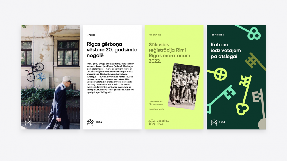
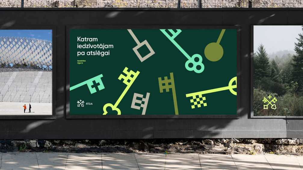
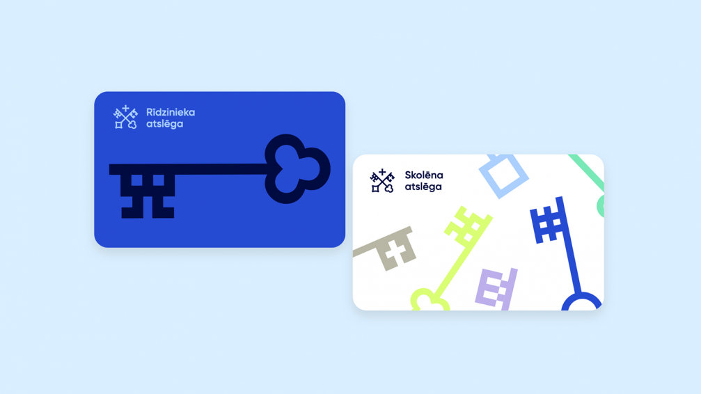
The updated graphic identity combines various elements from the keys of Riga that have historically been used in the coat of arms and coins of the city. The keys have been given new forms every century, but the crossed keys under a cross pattée are a constant element, which roots the new, modern graphic symbol of Riga within historical traditions. «In addition to their historical importance, the keys symbolise the relationship between the city and its residents. One key belongs to Riga, the other — to each one of us. Through this we emphasise the need for engagement, interaction, and creation of shared well-being in our environment,» says Eva.
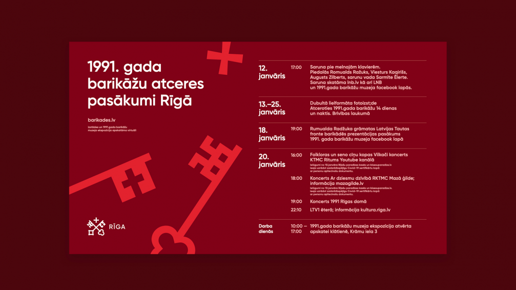
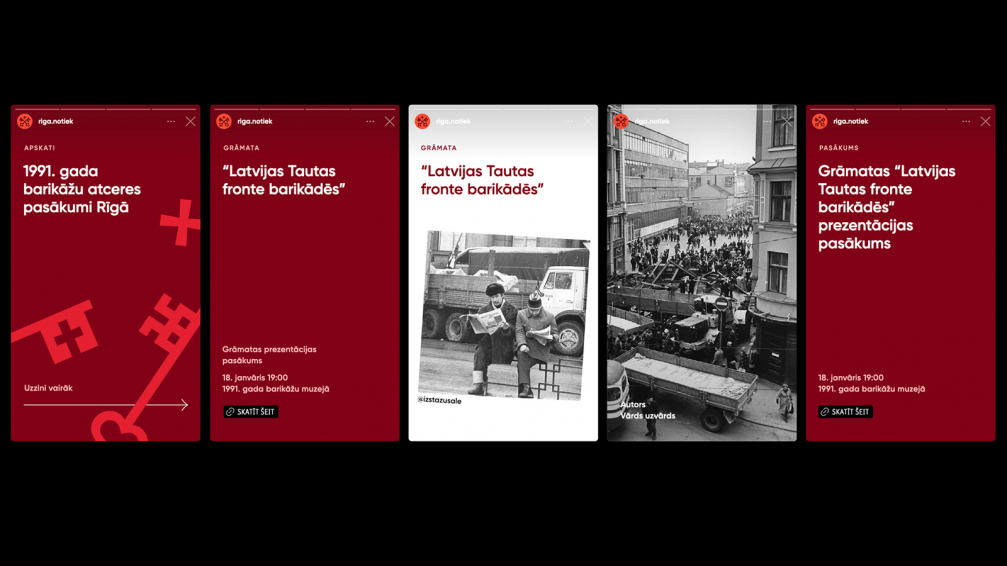
To fit within the existing visual communication of Riga, the new brand is designed to be relatively reserved, while emphasising the readability and clarity of the symbol. The colour palette reflects the geographical context of the city and its location in the north of Europe, while shades of grey are accompanied by bright accents, such as Roof Tile Red, Cornflower Blue and Cucumber Flesh Green. Gilroy has been chosen as the main typeface — it has a wide range of thicknesses, is easy to read, and suitable for both digital and print communication materials, as well as signage in the urban environment.
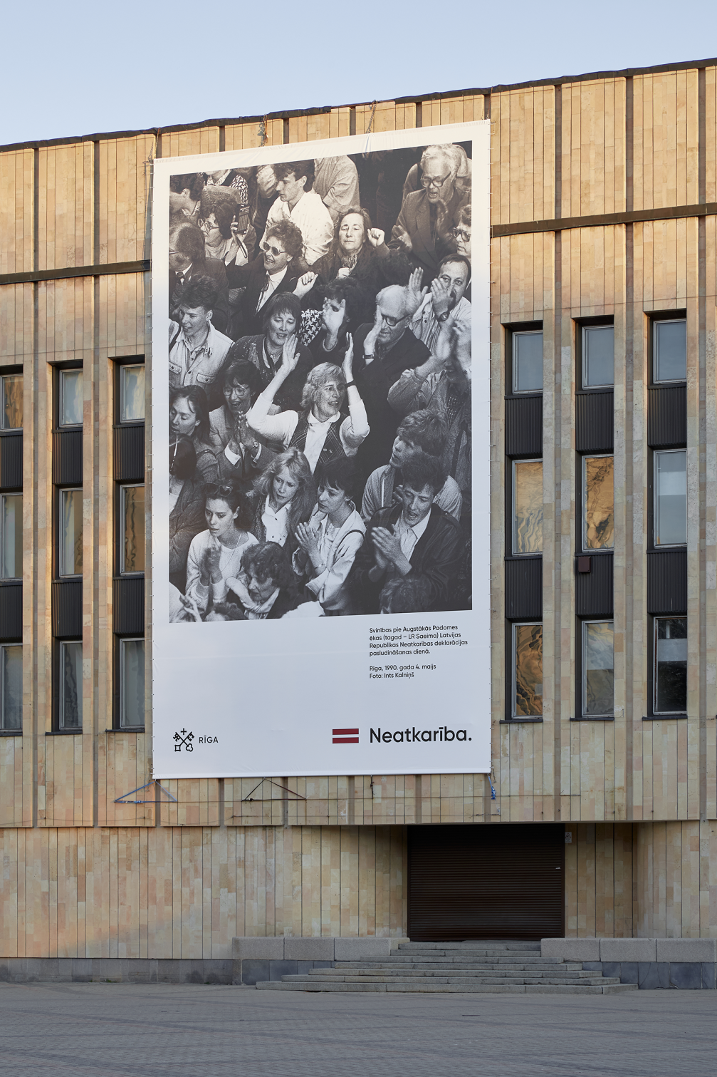
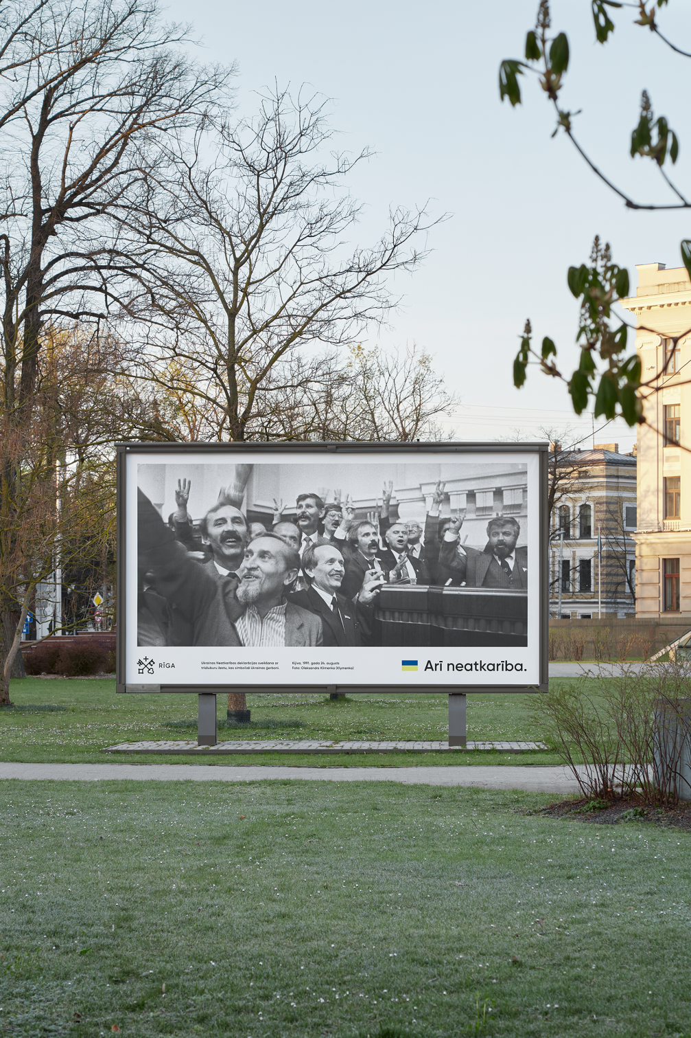
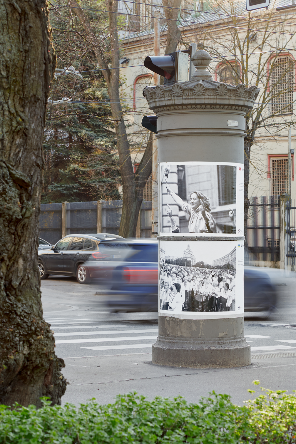
The new city brand was first introduced to its residents during the campaign of the 4th of May festivities, which displayed large format photographs from the independence restoration period in Latvia and Ukraine in the urban environment of Riga. Given previous interpretation problems of visual campaigns of city festivities, Overpriced aimed for a direct visual language that generates a clear sentiment and responds to the current political context. The visual campaigns of the Family Month, as well as the upcoming Midsummer celebration, will be also created by Overpriced.
The visual identity of Riga was last updated in 2012. Since that time various unregulated uses of Riga symbols have occurred in the municipality. Besides renewing the city’s visual character, general guidelines for its use and a style book have also been developed. There have been changes in the social network accounts of the city as well — their number has been optimised to five and a uniform design has been introduced, emphasising their affiliation with Riga.

Viedokļi