Animation by Katrīna Sadovņikova
The most prolific book designer in Latvia, Belarusian-born Alexey Murashko, won a bronze award this year at the prestigious European Design Awards for the publication Andris Eglītis. Pale Chopped-off Parallelogram. In the Nice Touch section, Alexey shares three items and one technique that have helped to create both this and his other books.
Nice Touch Editorial September 1, 2023
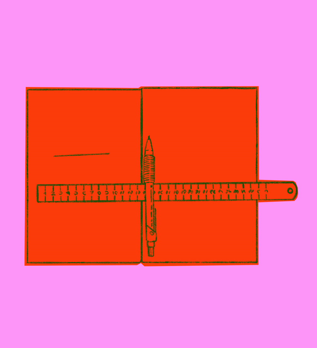
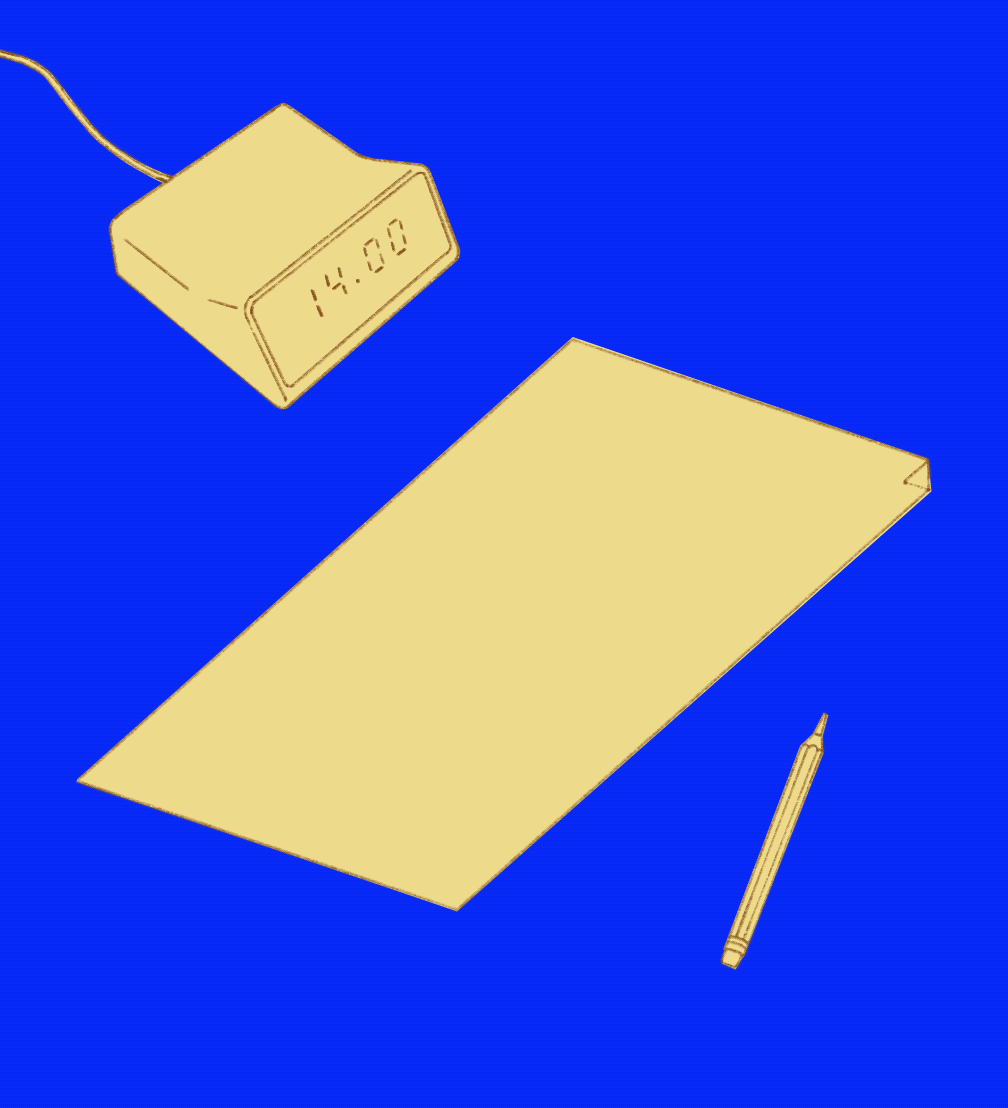
I got my steel ruler from a printing house in Belarus. It is compact and durable, with smooth edges and clear divisions — everything in line with GOST standarts. I’ve had a printing house fold a book flap incorrectly because they had a weird, unreadable ruler with a worn zero mark. That’s why you’ve got to bring your own ruler.
The second item is a Staedtler mechanical pencil, 0.9 mm, soft graphite. It is easy to draw a rough sketch with such a pencil or cross something out; everything is clearly visible, yet it isn’t a marker that can’t be erased. My first Staedtler pencil was also from Belarus, and when I lost it, I ordered a whole package of the same ones on eBay, and I still use them.
I also carry Jost Hochuli’s book Detail in Typography with me. Although I no longer need it myself, I often play the role of an advisor, and this book gives good insight into how to work with text. It is a concise encyclopedia on readability and the aesthetics of text composition, written and designed by Hochuli, one of the best book designers in the world. The book is still in print, as it remains relevant despite being first published in the 1980s.
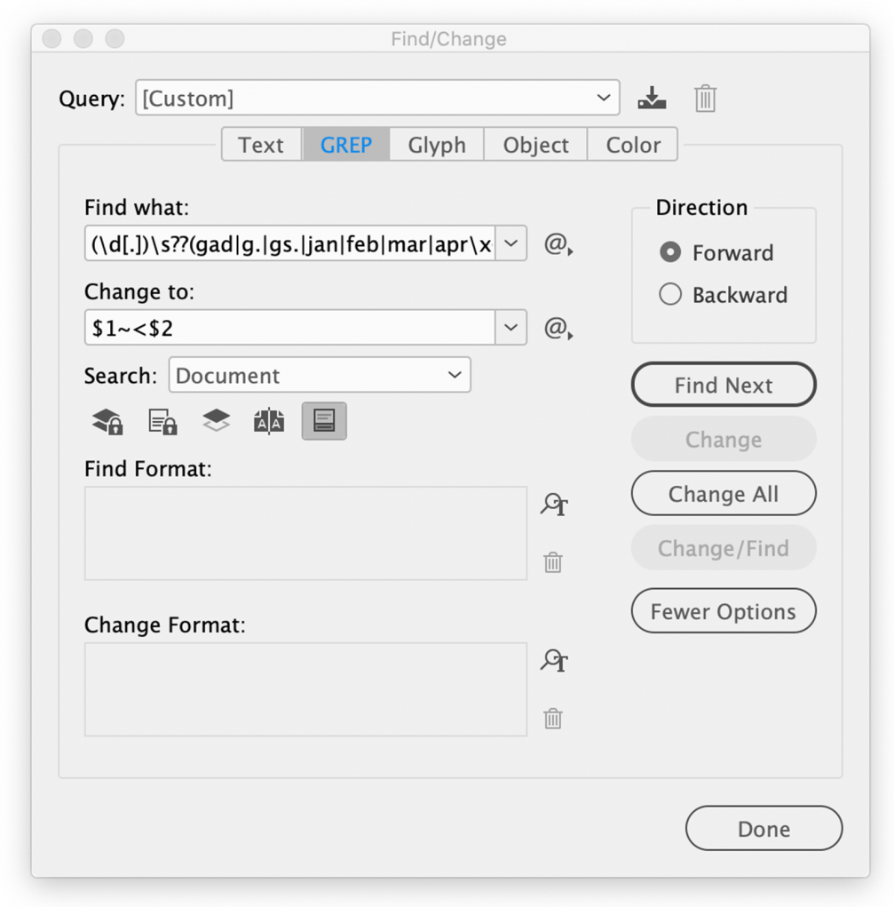
I also want to share an intangible thing that is very useful in working with text — a GREP function combination in InDesign, which automatically adds ordinal numbers to frequently used Latvian words with the typographically and syntactically appropriate reduced space. The full code for the search text is: (\d[.])\s??(gad|g.|gs.|jan|feb|mar|apr\x{012B}|maij|j\x{016B}n|j\x {016B}l|aug|sep|okt|nov|dec|lpp|sēj|pant|punkt|apak\ x{0161}punk|grup|tabul| rindkop|klas|att|pielik|proj|vari|pila|sesi|s\.) Sometimes, depending on the typeface, the following replacement code gives a better result: $1~%$2 Those who’ll get it, will get it!»
We’ve written about Alexey Murashko’s awarded book Andris Eglītis. Pale Chopped-off Parallelogram before. On September 6, Alexey will present this and other most interesting, challenging, and special projects at the Design Conversations organised by the Museum of Decorative Arts and Design.

Viedokļi