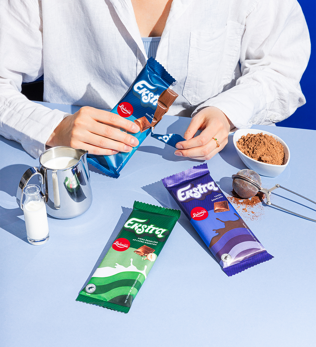
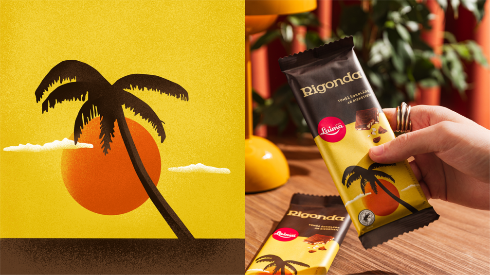
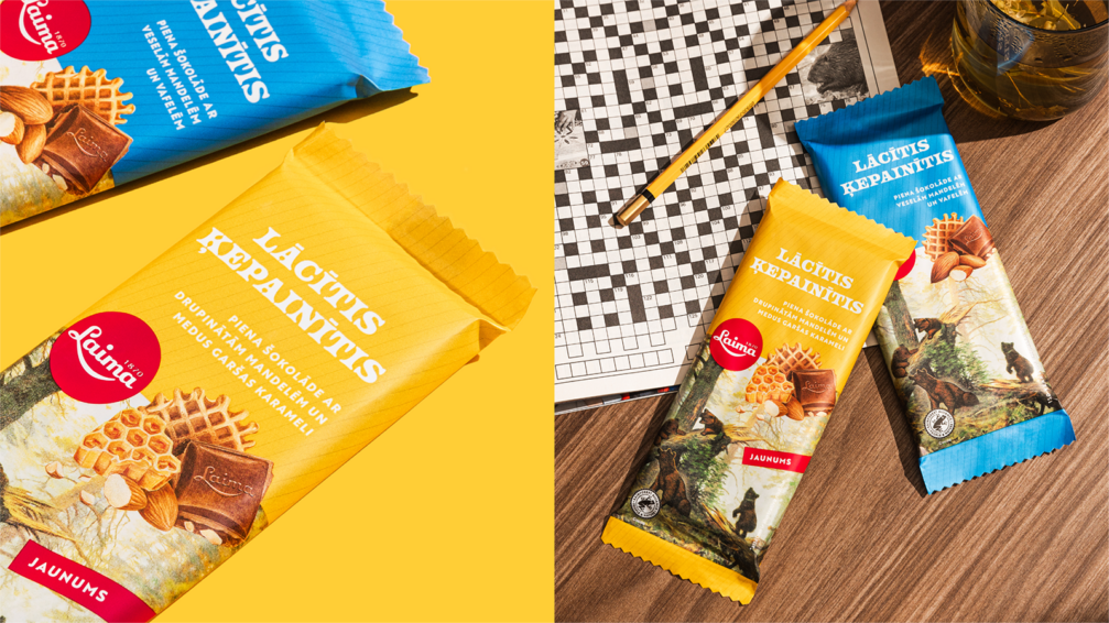
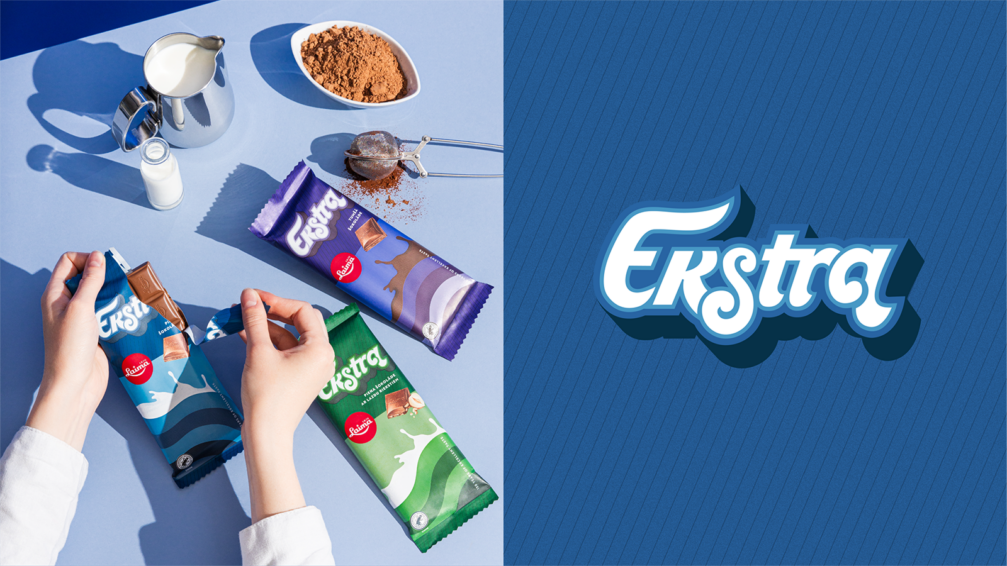
Laima’s range of sweets includes products that have been known for several generations and whose history dates back almost a century. Over time, the design of the packaging had lost its artistic character. To bring it back, design studio Kid Design has revived the packaging design of Laima’s classic line of chocolate bars, highlighting the characteristics of the different sub-brands and creating a nostalgic feel with a human touch.
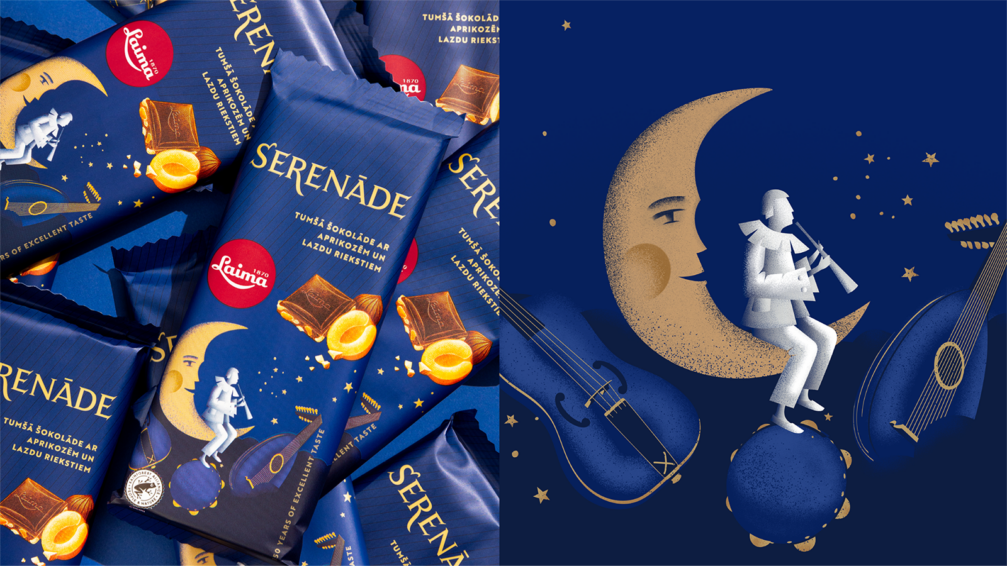
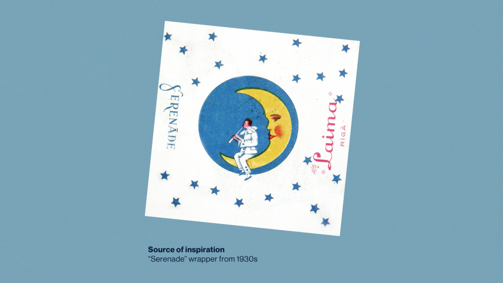
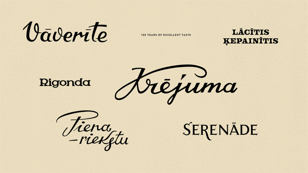
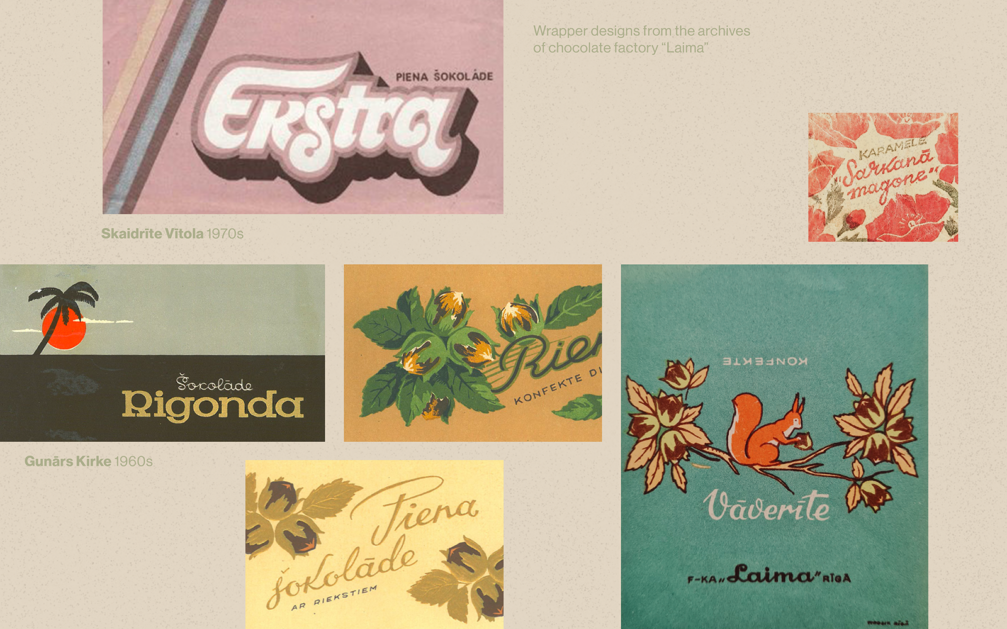
«The original sketches for Laima’s packaging designs were made a long time ago, when artists drew by hand, and there is no denying that handmade work has a different aura. When we analysed the designs through time, we found that many of the nuances have disappeared over the years, such as the musician sitting on the moon in the Serenāde packaging. When designing the new look, we thought about the feeling we wanted to bring back and looked for the most characteristic features. Several wordmarks had lost their original characteristics due to the perfection of digital layouts. The aim was to bring back the naturalness and nostalgic feeling of the design with the touch of a human touch. For example, if a name has two a’s, each one is deliberately made slightly different. All the sketches were done by hand, as in the past, and then, of course, transferred into digital graphics,» says Maija Rozenfelde, Partner and Design Director at Kid Design.
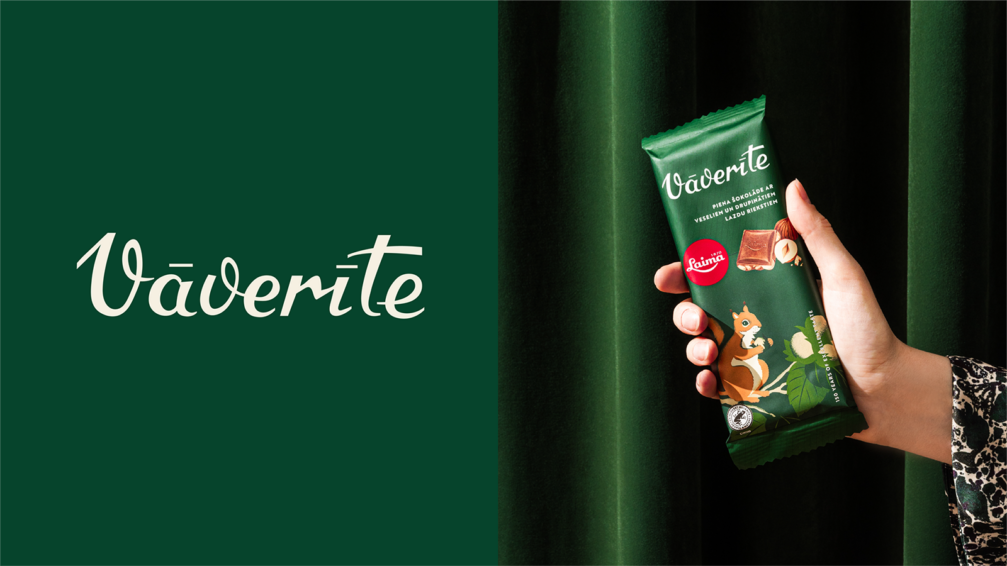
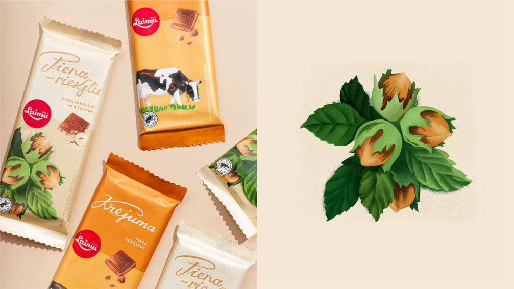
The Kid team points out that the nostalgic design is not only aimed at those who are already familiar with Laima’s classic sweets. According to Brand Capital research, retro design not only warms the hearts of the older generation, who associate the look with sweet childhood memories, but also young people, who romanticise things and designs from a time they have never experienced themselves. To give consumers a glimpse into the flavours of the products, while retaining the retro feel, Kid enlisted illustrator Liv Eichmann to create watercolour drawings.
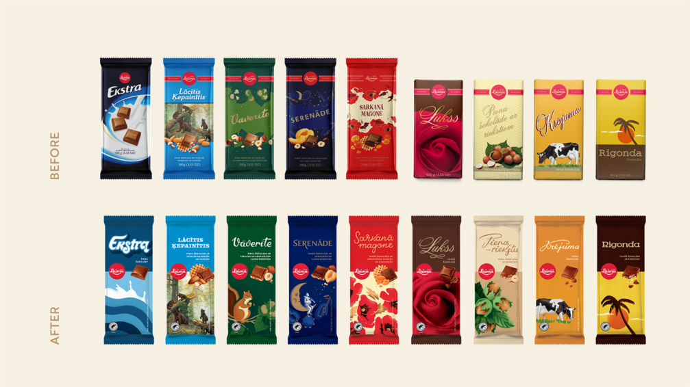
One of the designers’ main tasks was to tidy up the design architecture to make it easier for consumers to identify Laima products and the various sub-brands on the store shelves. Over time the design had become inconsistent, including various unnecessary elements, inconsistent brand volume on different packages, and no clear definition of the relationship of the sub-brands to the Laima brand. To refine the design of the refreshed chocolate bar packaging, the Kid team carried out in-store tests, assessing both how the Laima section looks on the shelves and how shelf positioning affects the visibility of the Laima logo. Work on the packaging of Laima products is still ongoing and the new design of the sweet boxes and packets will soon appear in the shops. «We are very pleased that the designers have managed to preserve the historical connection and emotional elements of the iconic Laima products, creating a modern version of a classic,» comments Kristīne Mūrniece, Marketing Manager at Laima.


Viedokļi