During the recent Riga Type Week the graphic designer Mikus Vanags shared his experience, gathered while creating fonts. One of the main points of the lecture was that in typography, technical skills are not crucial but supportive — one can begin to draw letters using already familiar programs and methods. For those who were not able to attend, Mikus has put together a summary of his talk, including examples of his own typefaces, a list of recommended literature and practical advice for beginners in type design.
Type design
Similarly as spoken word, the visual form of type is a way how an author can communicate to the reader, and for graphic designers type is an important means of visual expression. I got to know type design during my studies in Estonia. I learned that type design doesn’t depend on the technical side of it, and a designer can be lead by his creative idea using solutions that seem appropriate for the particular task.
First steps in type design
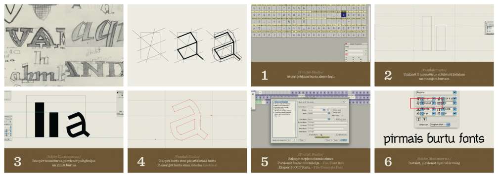
Typeface design usually starts with making fast sketches that help to grasp the intended mood and visual characteristics. To turn typefaces into fonts for daily use, specialised font making programs are needed, out of which «Fontlab Studio» might be the most popular choice. If someone wants to create a font, but has no previous experience, here are some simple steps for beginners:
- open any type character window in «Fontlab Studio» and draw 2 rectangles — for the lower case and upper case letters;
- copy the rectangles into «Adobe Illustrator», add guidelines and draw the letters as imagined in the appropriate size and alignment;
- copy the character into «Fontlab Studio» at the appropriate letter and correct the character’s metrics;
- copy all necessary characters, add font information (File/Font info) and export the font in OTF format (File/Generate Font);
- after installing the font it can be used in any program. If the font doesn’t include character pairs (as in this case), a good alternative for beginners is to use the built–in «Optical kerning» function.
This is a fast and simple solution that allows to do the creative part of making a font in already familiar programs. If someone has a desire to make fonts, the technical side should not be an obstacle.
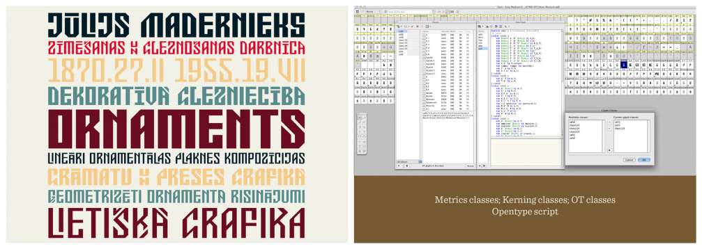
«ETNO»
«ETNO» is a font I created inspired by the work of the Latvian artist Jūlijs Madernieks. An important feature of Madernieks’s decorative typefaces is a large variety of characters’ forms in a united graphical style. That served as a starting point for a font, where each character would have variations, allowing to line up letters in a graphic rhythm.
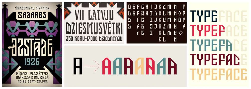
To create fonts with a large number of characters, it is convenient to use «Classes» (Metrics, Kerning, Opentype), which allow to organise and edit characters by selected criteria. To realise the idea of several variations for each letter, I learned «Opentype» programming and created instructions that choose the character by what is located next to it. Even though programming is not intuitively known to and understood by designers, in font design it is comparatively easy to learn and provides the opportunity to create unconventional solutions.
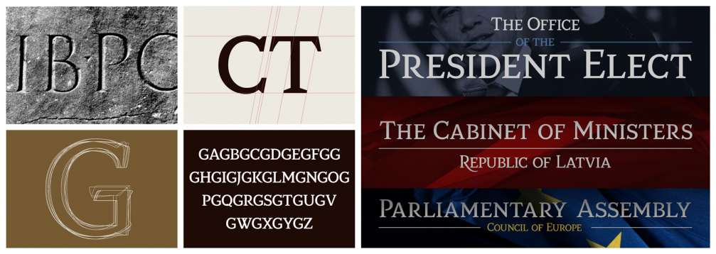
«Justicia»
«Justicia» type family was created as a contemporary solution to traditional «Roman Capitals» typefaces. Even though the visual characteristics were clear to me, making of fonts is rarely a smooth and linear process. Conformity of a character is determined by its form and visual harmony with all other characters. Sometimes it can take dozens of attempts to find one solution that seems to be appropriate and fit in.
«Aspasia»
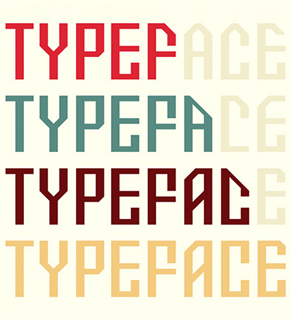
«Aspasia» was created as a low contrast, geometrically shaped, decorative type family. The overall mood is Art Deco, and details are made with references to typefaces found in Latvian printing houses. In addition to the already known technical solutions, in this project I used «Multiple masters» and «Python scripts» tools as well, which make font design considerably easier and automate part of the technical process.

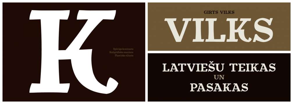
«Vilks»
«Vilks» is a typeface, based on the work of the Latvian artist Ģirts Vilks with an emphasis on calligraphic form of letters. Font design is to a large extent intuitive and based on a feeling, therefore the technical knowledge matters only in making the work process easier and giving a chance to fully implement the ideas.
Literature
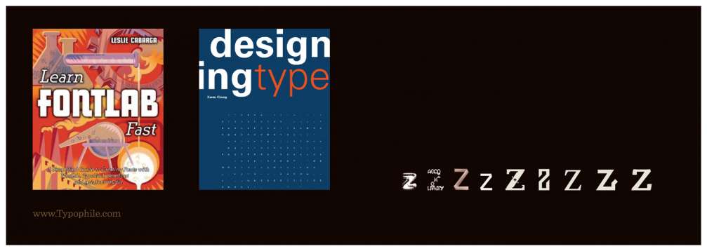
Currently, the available literature on font design is really diverse, however, there are only a few books about the practical side of it. Out of those I can mention two that were significantly helpful for me:
- «Learn Fontlab fast» by Leslie Cabarga — a handbook about «Fontlab Studio» program and an overview of the available tools,
- «Designing Type» by Kareng Cheng – a handbook about the visual and practical side of making typefaces with an analysis of the structure of all letters of the alphabet, the most common characters and their historical development.

Viedokļi