«Adwards» 2014 design and print category was not only the biggest, but also the strongest, and it was where this year’s winner was found — the visual identity of Eastern Latvia Concert Hall Gors.
When we had distributed all the gold and silver medals, and it was time to decide who the winner of the highest award would be, head of the «Adwards» jury Saneel Radia warned us: «Don’t take it for granted that the largest entries always win these competitions.» The discussion on the three Grand Prix nominees — LMT rebranding, Song and dance festival logo and the visual identity of Gors concert hall — was long, and the arguments were compelling. I never had imagined we would be discussing regional development at an advertising competition. All three works speak of Latvian values and identity, all three are conceptually and visually impressive. We compared them by the clarity and uniqueness of the idea, complexity of the task, aesthetic qualities, technical nuances, and a range of other criteria. And it was Gors that stood above the most integrated of campaigns and the most poetic of all technical solutions. Gors spoke to those members of the jury whose origins are in Latgale and to those who were visiting Latvia for the first time alike, because it is deep, beautiful and meaningful.
Brand developer Inese Apse–Apsīte tells about the process how Gors came into being: «Gors, the embassy of Latgale, is a very bold step: the client did not walk the conventional path, but brought their ideas and needs to us, brands nest «Matka». When we started searching for a design partner, succession was crucial — will the designer be able to «get» the big idea without making it smaller, but also without blowing it up, making it too abstract, incomprehensible, or romanticised. The idea of Gors is brave — instead of speaking about the functionality of a building, we created a concept that stands for the awakening of an entire region, the local castle of light and place of rebirth. And here the task got complicated.
How can one find a simple, yet beautiful symbol that would embody the spirit of survival, spite, courage, depth, and richness of a whole tribe — Latgalians? How can one create a design that is not alien to the local understanding of beauty, yet speaks to high–class design connoisseurs worldwide? «Asketic» did it, by choosing an organic and comprehensible symbol for viability — language, Latgalian language. This was a great teamwork, design went hand–in–hand with the strategy and the mission, and besides that, it is vital, humorous, it lives and breathes in the space, materials, interior.»
Graphic designer Miķelis Baštiks continues: «The visual identity derives directly from the idea of the embassy of Latgale and its name, Gors, that «Matka» came up with. I personally think that this play between the brand’s story and graphic language is the reason why the outcome does its work and speaks to people. It’s a good confirmation that this kind of collaboration — brand’s strategy and visual identity — can bring much better results than each of these things separately, which unfortunately quite often is the case, and that leads to either unproductive theorising or decorating without a deeper understanding of the meaning.»
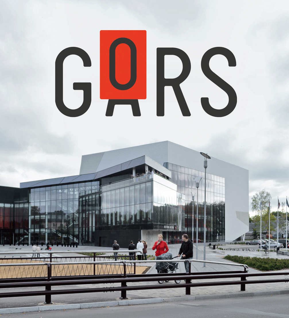
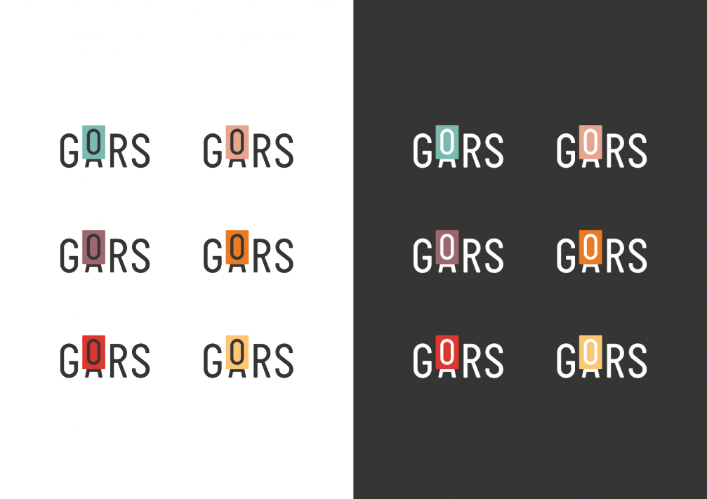
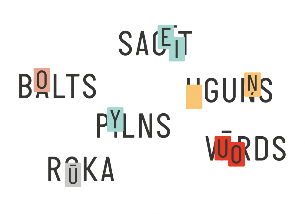
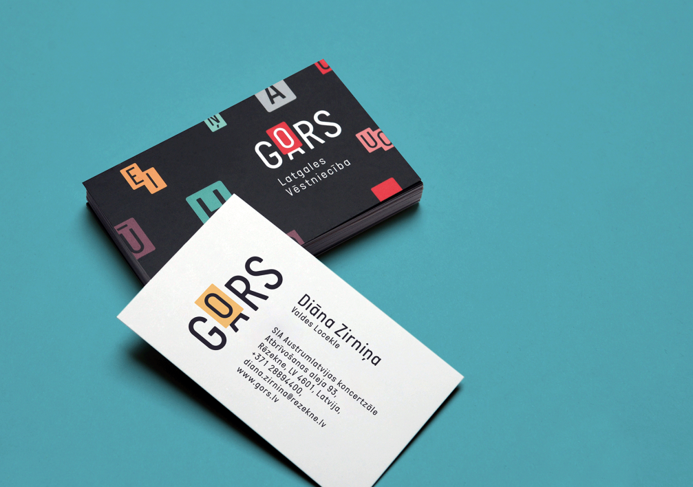
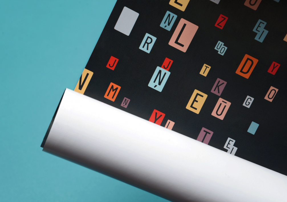
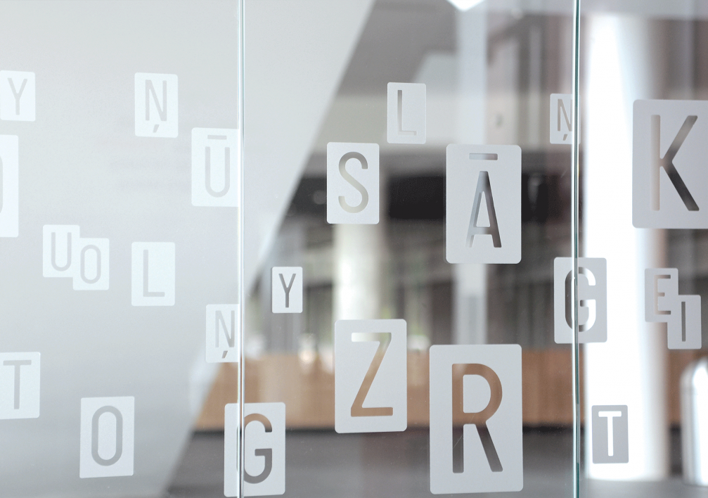
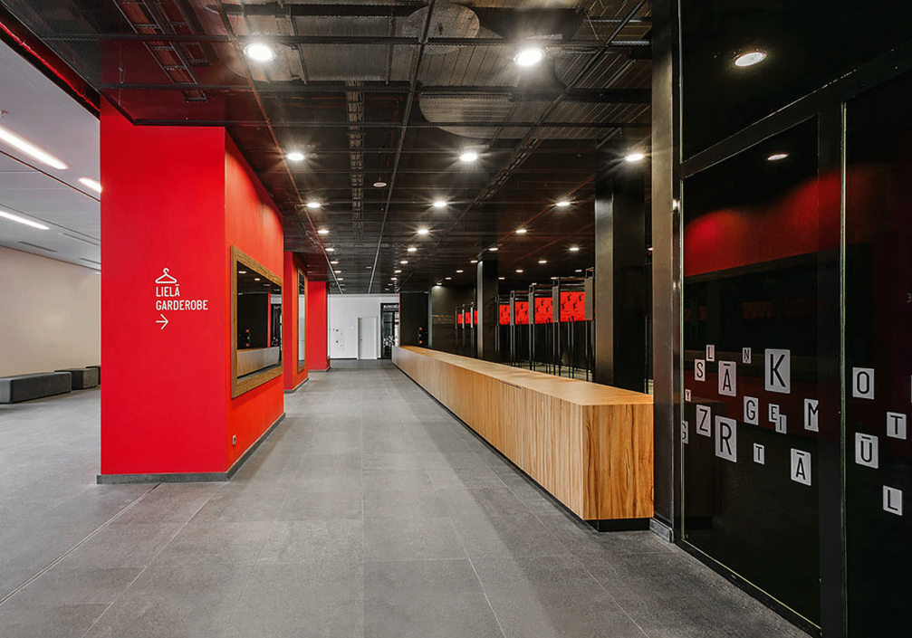
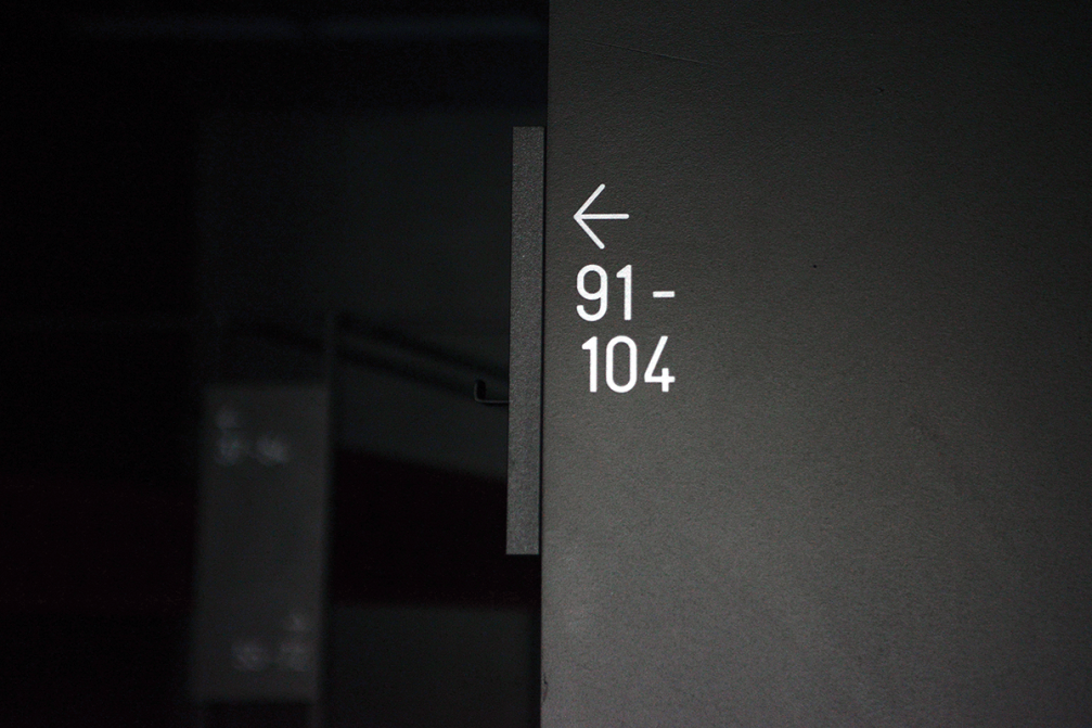
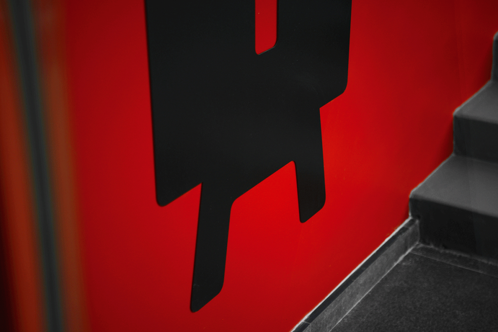
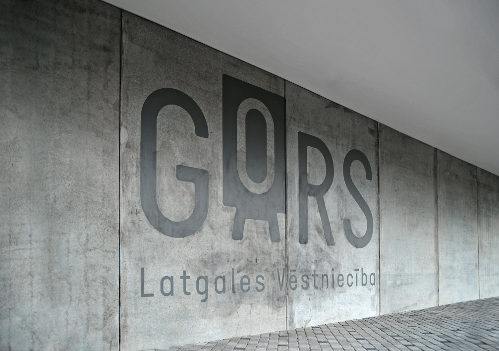
The task of «Asketic» was to create a visual identity concept and guidelines that the administration of the concert hall could use according to their needs, for instance, to make a signage system in the building, business cards, invitations and souvenirs. The identity highlights and celebrates the most important heritage of the Latgalian culture — its language. Bright colours identify and emphasise fine differences from Latvian language — in the logotype of Gors the letter «a» is covered by a colourful label «o», and so on. The logotype comes in six colour variations, reflecting the diversity and radiance of life and music.

Viedokļi