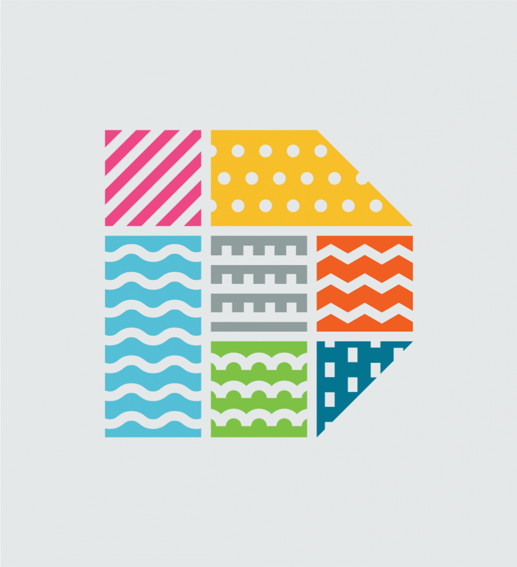
The second largest city of Latvia has acquired a new, joyful visual identity and a slogan that is open for interpretation. The rebranding is the work of «Norrskog» graphic design studio from Daugavpils.
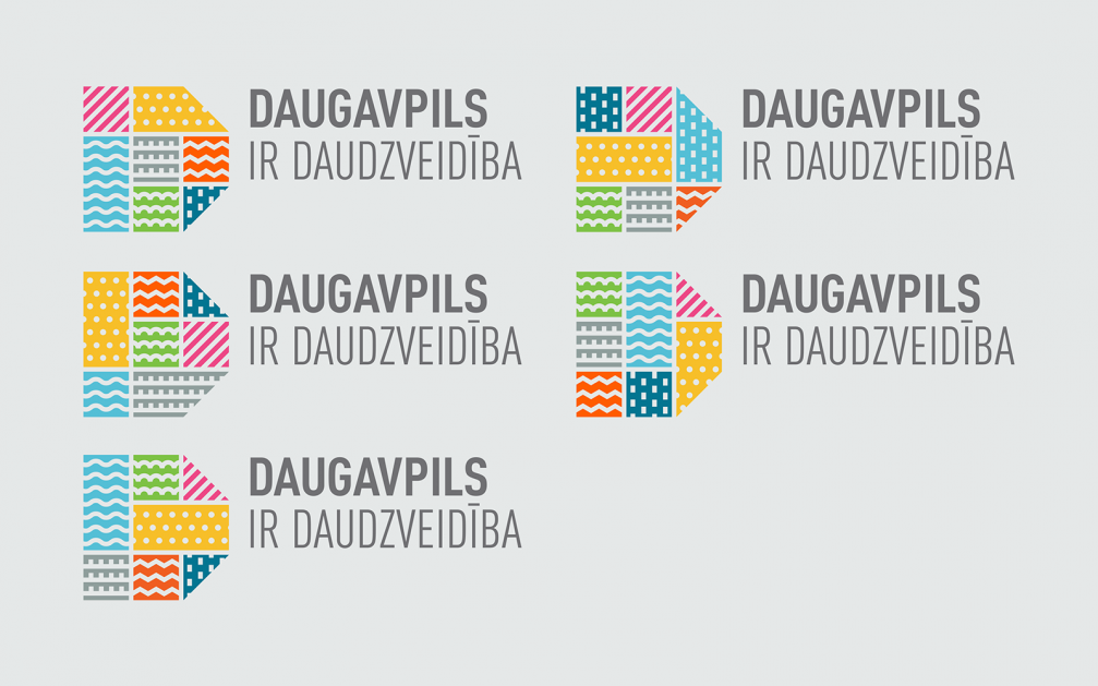
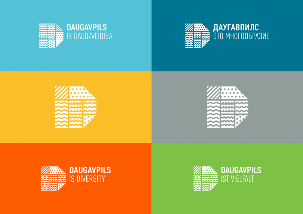
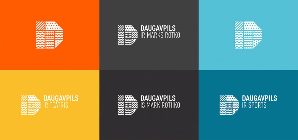
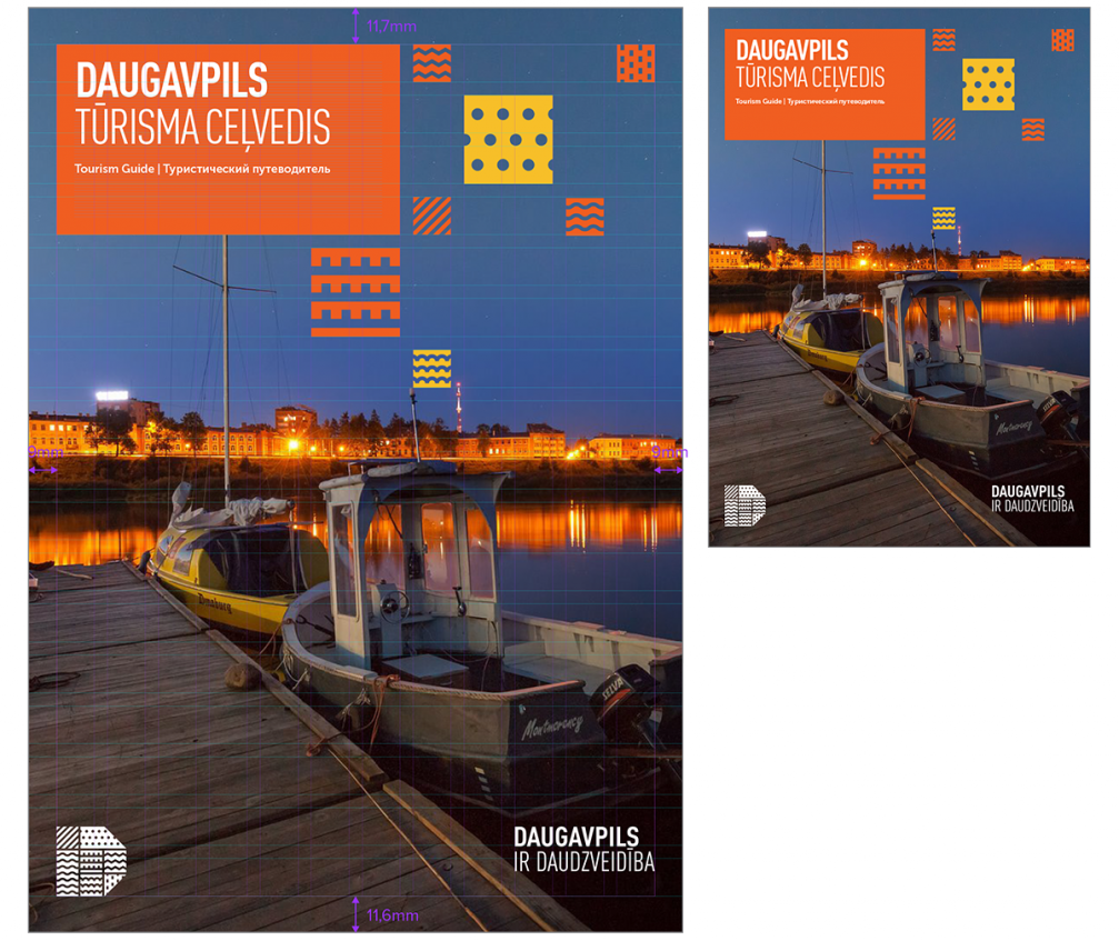
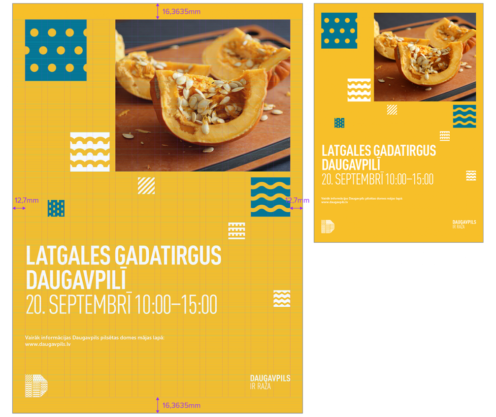
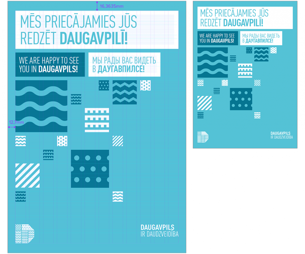
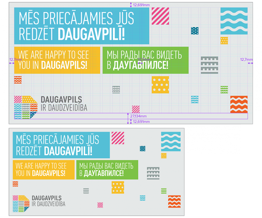
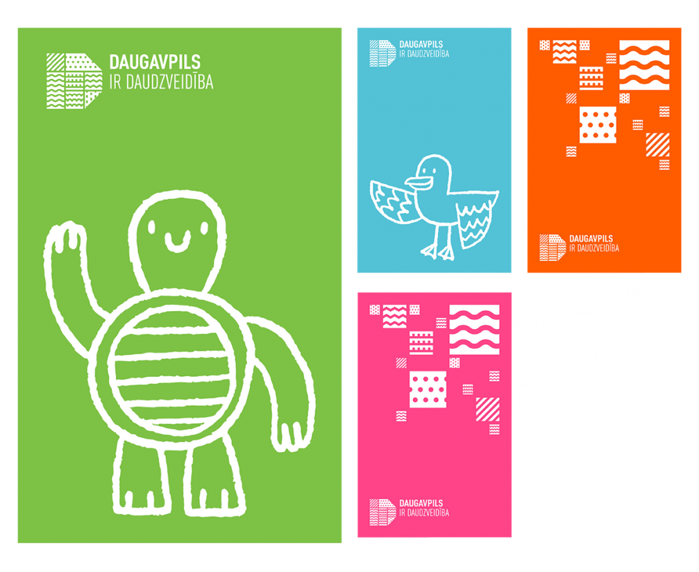
The new visual identity of Daugavpils aims to represent the historical and current diversity of the city — it has a rich architectural heritage, a multicultural society, an energetic business and education environment. The new logotype and slogan both are dynamic, adjustable according to different occasions, for example, city festival, promotional materials about culture or education, personal greetings. Anyone can relate to the slogan by making a part of it themselves.
Slogan
The new slogan for Daugavpils follows the formula «Daugavpils is …», similar to what Amsterdam, Glasgow and Aarhus have done. Any word or phrase can be added to it, which makes the slogan functional, not lyric, and tells about real things. Since historically the city has always been diverse, its branding should be universal, attractive to different target groups. The main slogan of the city is «Daugavpils is diversity».
Logotype
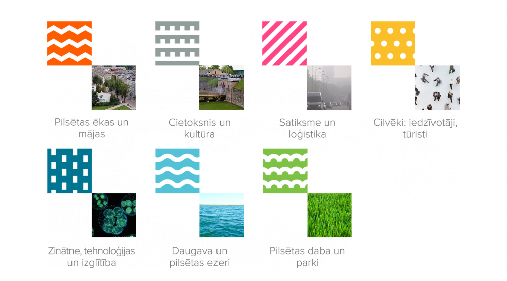
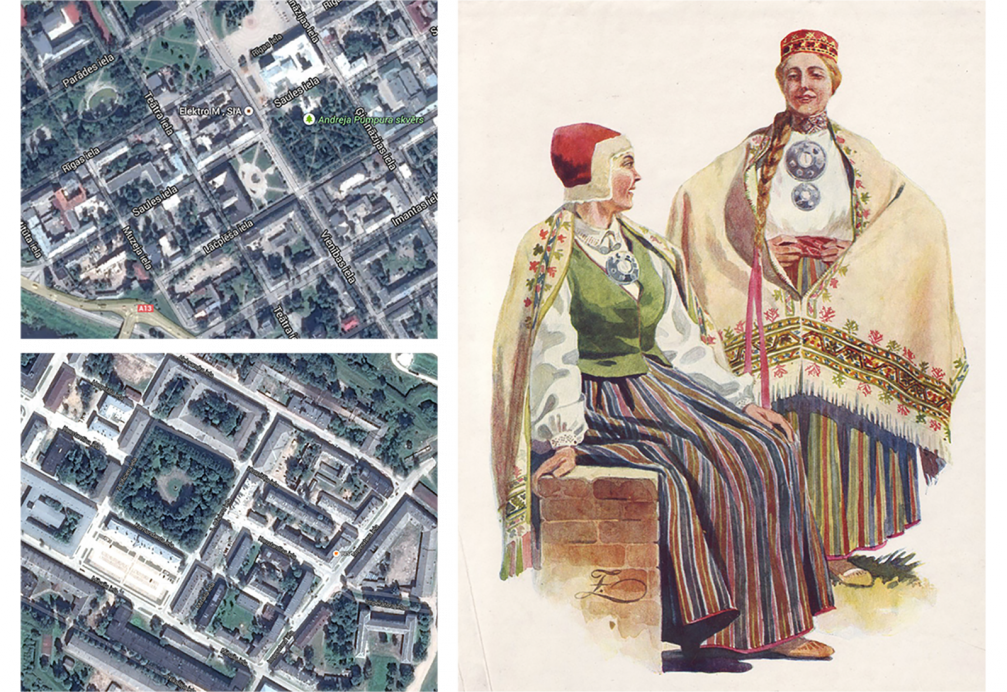
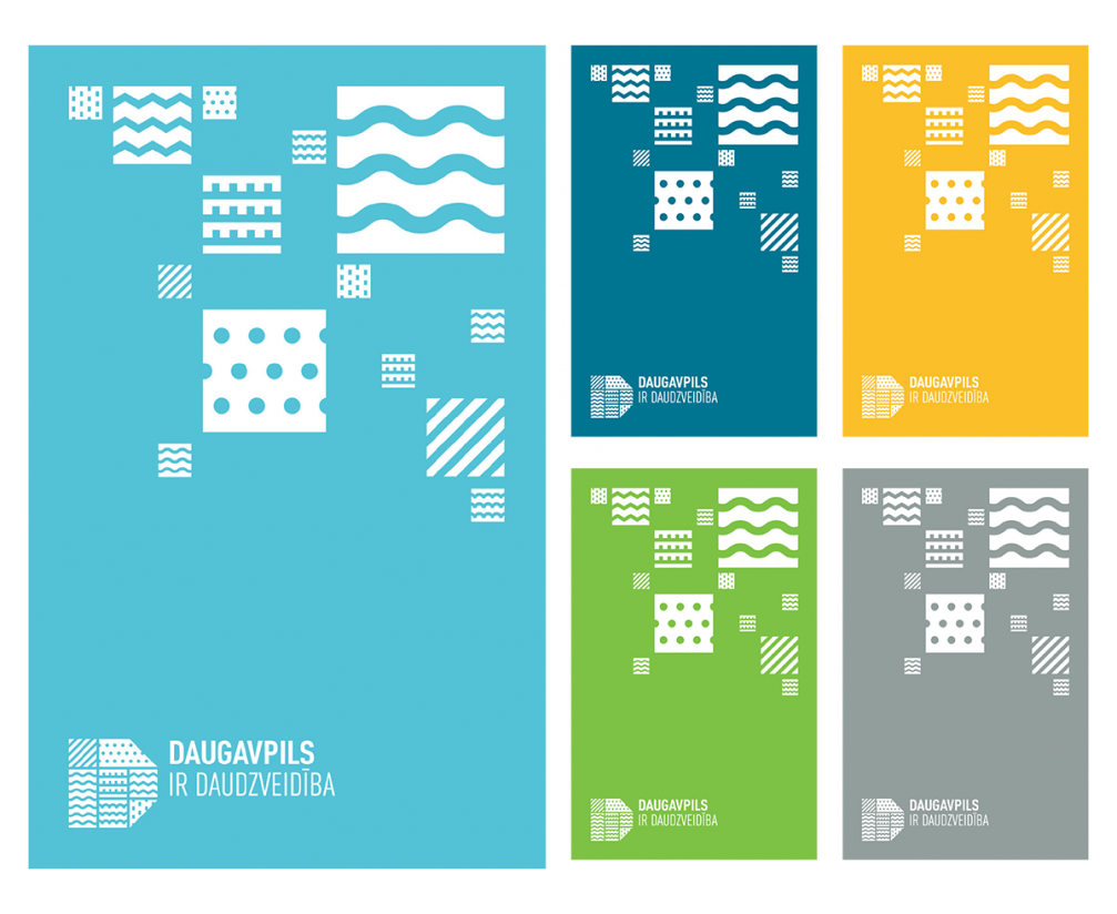
The graphics of the logotype symbolise the city’s diversity. Each pattern in the logo has a meaning: the pitched lines are roofs of buildings, but the wall represents the fortress and the culture inside it. The diagonal lines mean traffic, logistics and movement; the dots are people, but the dotted lines symbolise science, technologies, production. The wavy line is the river Daugava and the lakes of Daugavpils, but the semicircle pattern stands for parks and nature in Daugavpils. The geometry of the logo is based on the explicitly regular 19th century plan of Daugavpils and its fortress.
The logotype consists of two parts: a symbol and two lines of text. The word «Daugavpils» stands out and is higher in the hierarchy of text.
Author
Creative director of «Norrskog» agency, author of the visual identity Anatolijs Vjalihs is a young graphic designer, patriot of Daugavpils who, together with like–minded peers, organises creative industry events «Heyday». In 2013 we published his proposal for a wayfinding system in Daugavpils. Anatolijs acquired the right to work on the rebranding of Daugavpils through a procurement.
The new visual identity for Daugavpils has been officially approved in November 2014, but a confirmation of the head of the municipality is still pending. The visual identity of the city has been created in line with a new visual identity for Daugavpils fortress, which we are planning to publish soon.

Viedokļi