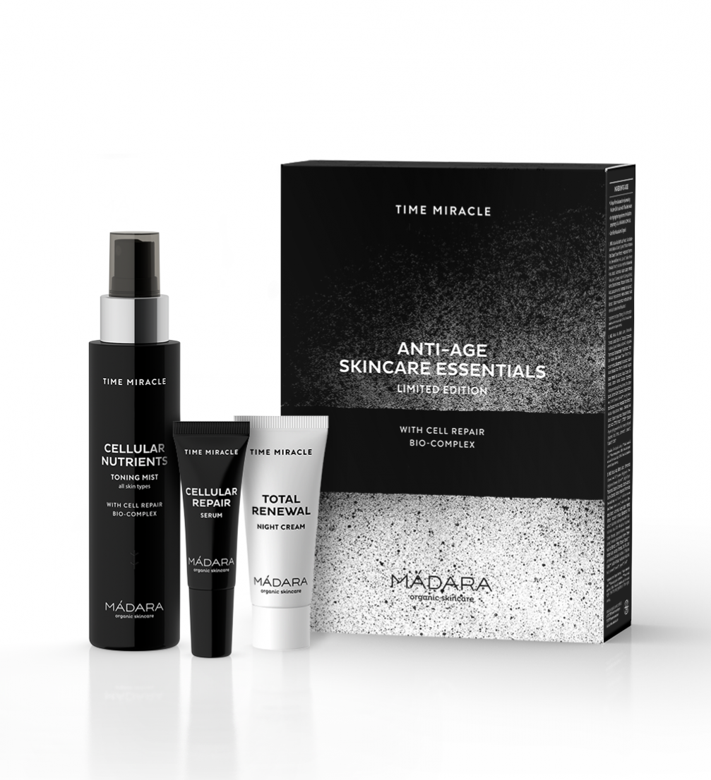
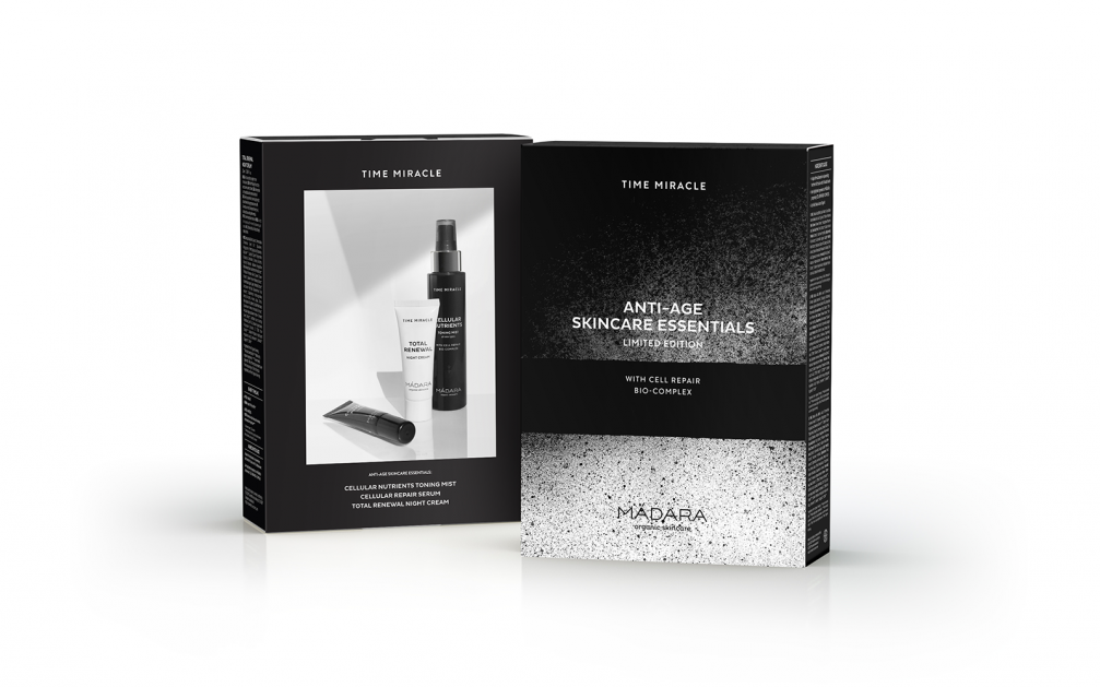
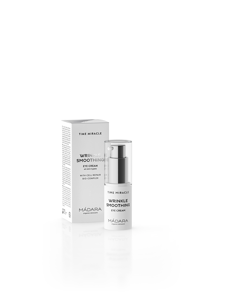
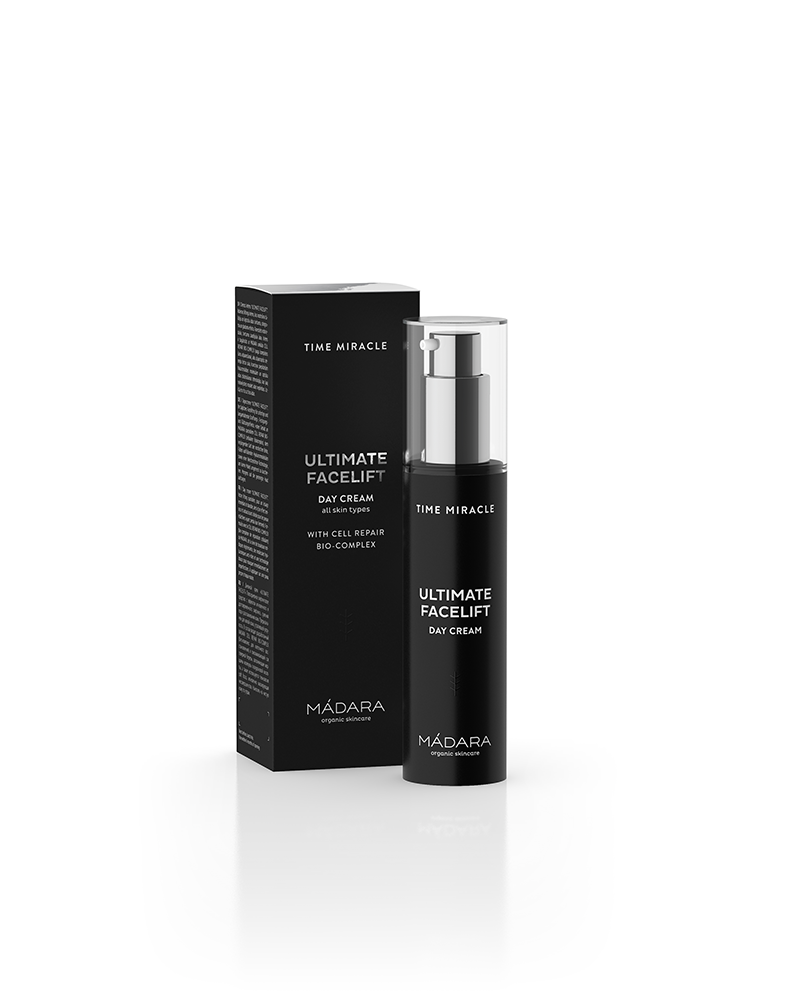
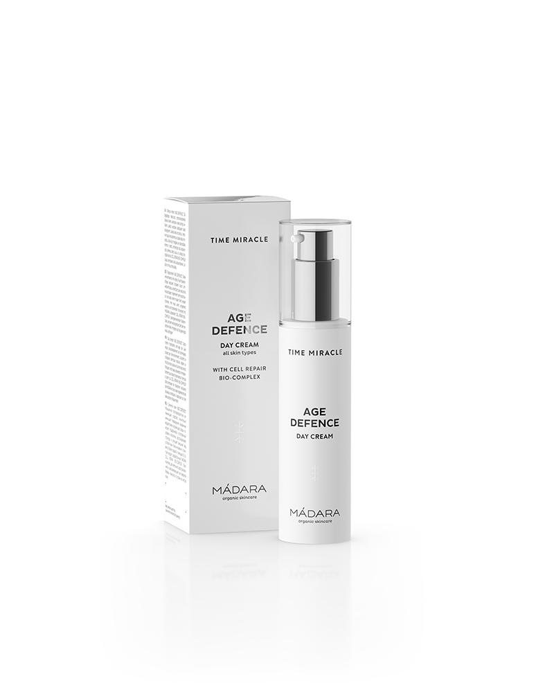
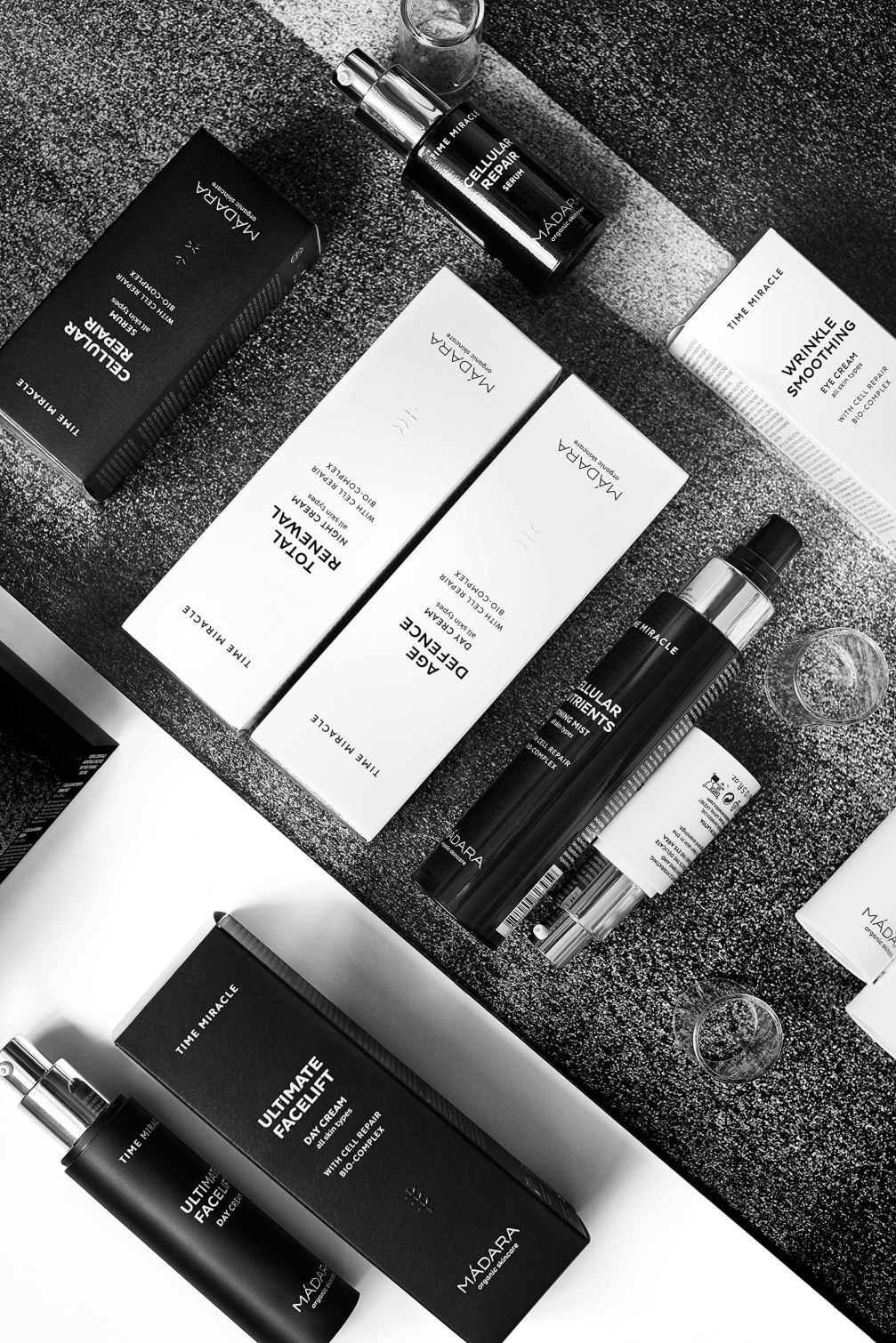
Graphic designer Liene Drāzniece has created a new, more sophisticated packaging design for «Madara Cosmetics» anti–ageing product line «Time Miracle», getting rid of all colours but black and white.
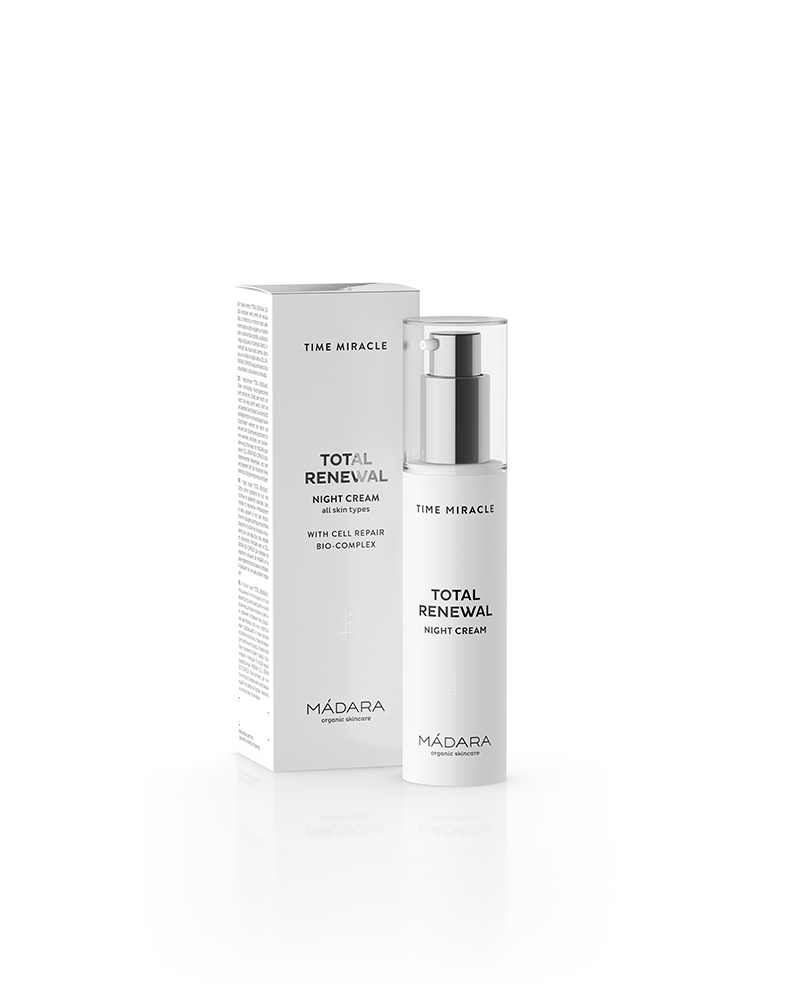
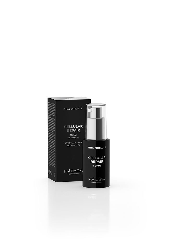
«Time Miracle» products in white boxes are for everyday use, but the black ones are for occasions when the skin is tired and needs intensive stimulation. Both white and black products end up on the cosmetics shelf, creating a black–and–white composition which is a graphic interpretation of the bark of a birch tree. Birch is the very base of this line — in the search for the most effective ingredients to battle skin ageing, «Madara Cosmetics» has replaced water with birch sap which is rich in vitamins, sugars, proteins, amino acids and enzymes. Getting rid of colour in the packaging is also related to the products’ target audience. «The beauty that a woman acquires when she finally accepts herself doesn’t need to be highlighted with bright accents anymore,» designer Liene Drāzniece comments.
Liene says that finding the right card for the boxes was a real struggle: «Coated cards are too smooth for our taste, they lack the natural texture of paper, while uncoated cards are too absorbent and attract dirt. We have practiced printing on the underside which has a more pleasant texture, but in this case the producer doesn’t guarantee a consistent quality, which means that the next run can differ from the previous one. There is also the white shade factor — it has to match the white of the bottle. When we were finally satisfied with the card, the next problem came up — the black design printed too dim on it. So for the black boxes we had to return to the previous card’s reverse side.»
In addition to the black–and–white visuals, the tactile qualities of the packaging also vary — each box has a different symbol embossed. «There’s quite a lot of after–treatment for this line: five different cliches for the embossings, two different foil stamps for each box. The black glossy foil on the white boxes contrasts nicely with the materiality of the card,» Liene explains.
There’s also a sample set in the product line whose packaging design was made more attractive with the help of artist Daiga Krūze, but the background used in product shots is a paper sheet found in the trash bin at the printing house — the splashy texture is a result of cleaning the printing machine. An interesting graphic work created by accident.

Viedokļi