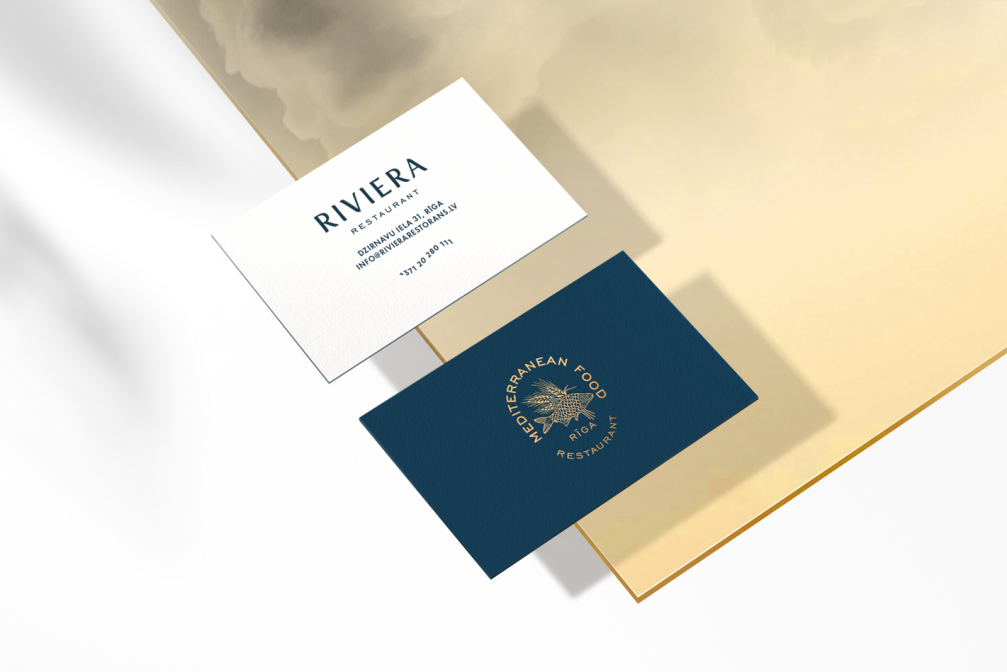
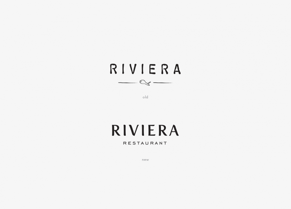
The popular restaurant «Riviera» in the Quiet Centre of Riga has recently acquired a new visual identity created by graphic designer Jānis Andersons and his studio «Field». While retaining the characteristic elements of its earlier design, the visual communication of the restaurant has become more sophisticated and contemporary.
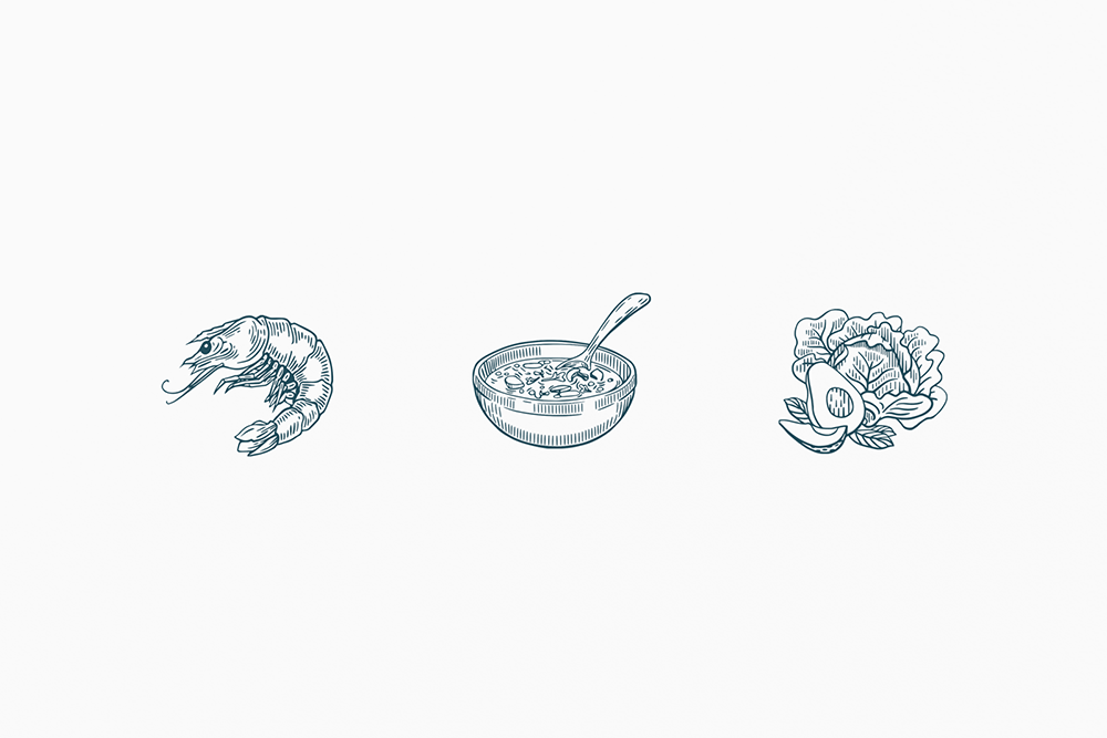
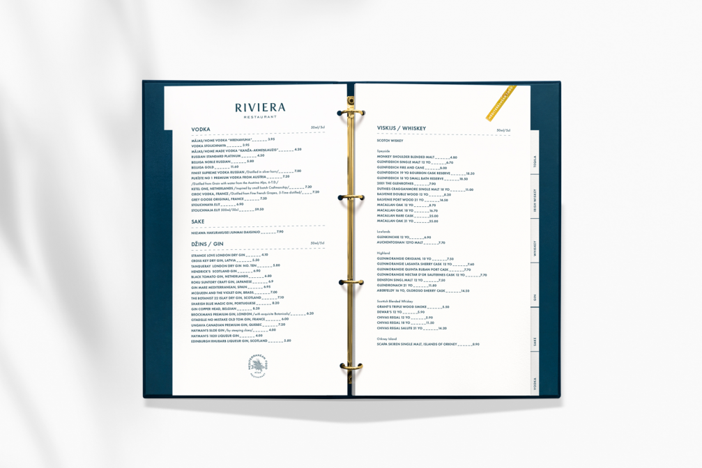
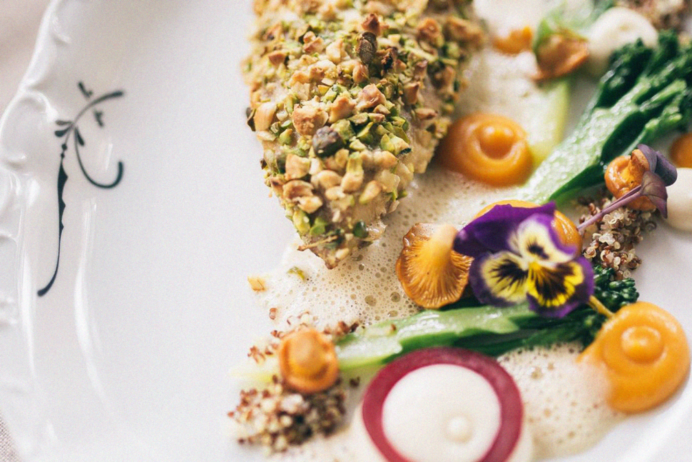
The aim of the visual revamp was to present the restaurant’s values and experience accumulated over many years in a modern way. «It was important that the visual changes, both for the staff and the restaurant’s regular guests, were organic and understandable. I tried to tell in a clear and simple way about the origin and quality of the food, its ingredients. Illustrations were created to help structure the restaurant’s extensive offering,» says Janis Andersons, author of the new image.
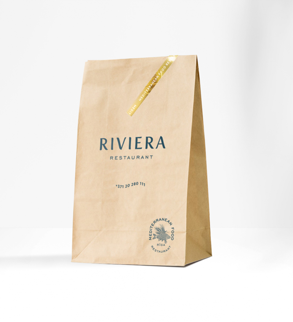
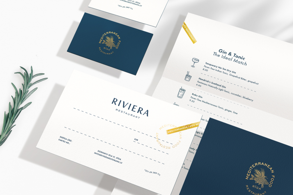
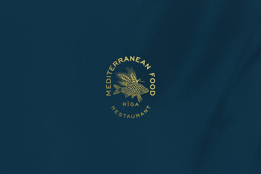
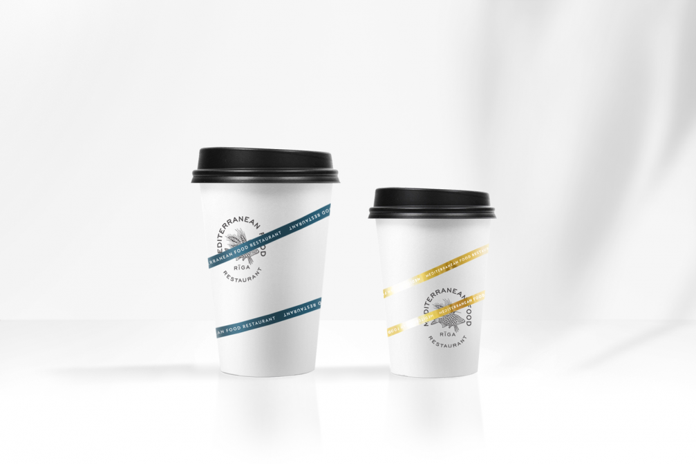
The «Riviera» logo retains the characteristics of its former visual identity — the portrayal of movement and the Mediterranean feel. The visuals are supplemented with various stamps that emphasise a careful approach both in the service culture and in the preparation of the food.
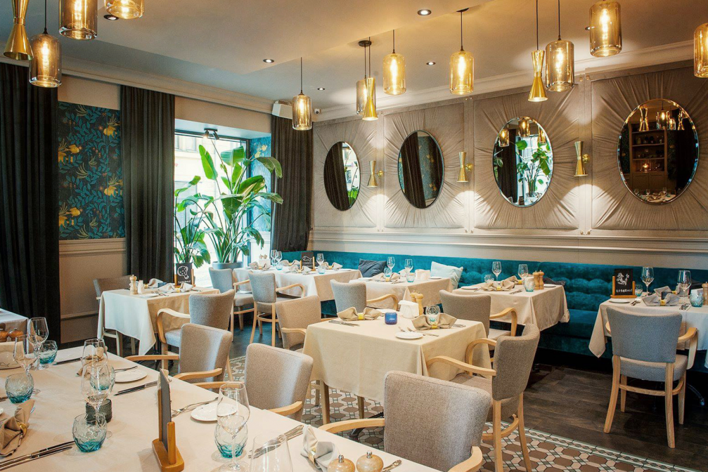
As the restaurant’s owners gradually transformed the interior, its distinctive colours were transferred to the new graphic identity, and subtle gold accents were added. The new visual style has been used in all of the restaurant’s visual materials and packaging, including those for takeaway food and drinks — to create a recognisable character beyond the walls of the restaurant as well.
Jānis Andersons’ studio «Field» specialises in packaging and branding design. Among its best-known works are the brand and packaging of the coffee «Kalve» and the visual identity of the «Imagehouse» store.

Viedokļi