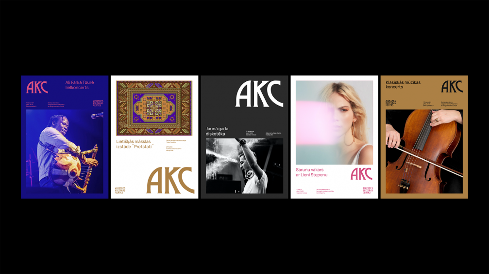
The design studio Asketic has created a simple but bold graphic identity for the Alūksne Culture Centre. The visual system allows to quickly prepare communication materials for events, using elements that refer to the building of the culture centre and its history.
Ingus Sproģis, graphic designer at Asketic, points out that the main task for the studio was to create a simple, modern, and easy-to-use system for visual materials — a platform that would help to reflect the extensive cultural programme offered by the Alūksne Culture Centre. «The centre is home to an amateur theatre, an applied arts studio, a choir, and several other initiatives, as well as hosts regular concerts and theatre performances. That’s why we created a system that would allow to maintain a unified visual image and highlight the individual character of each event,» says Ingus.
Given that the programme of activities of the culture centre is relatively full, it is important that the necessary communication materials can be prepared quickly and easily. To facilitate that, Asketic defined a clear information structure and a few simple steps that allow to adapt the identity to different formats and media.
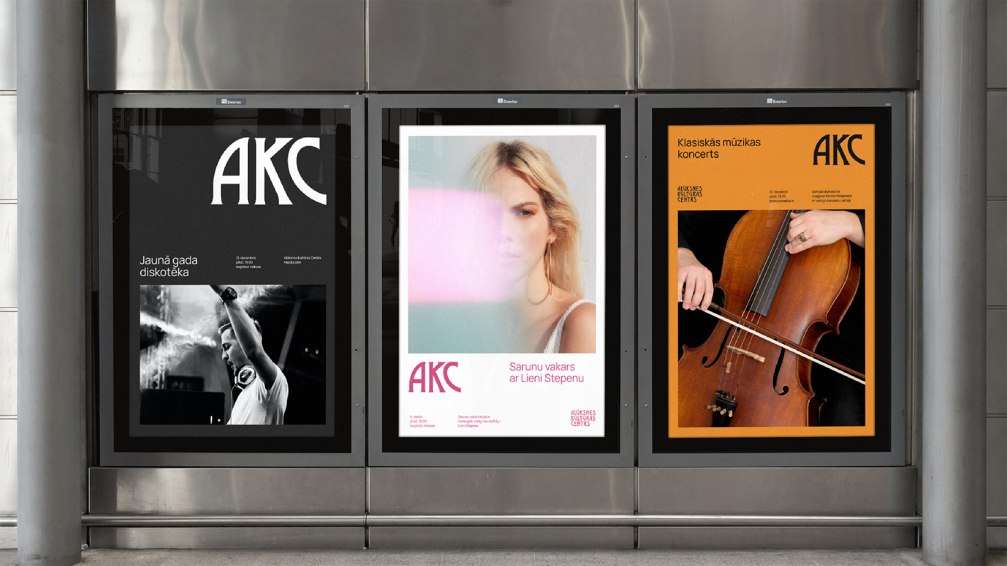
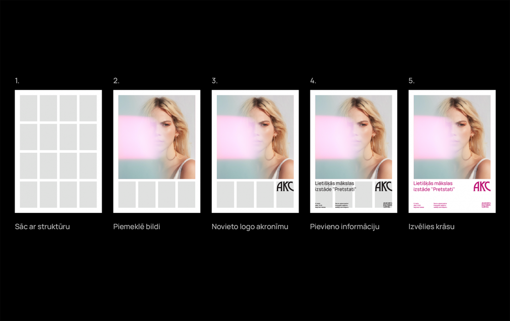
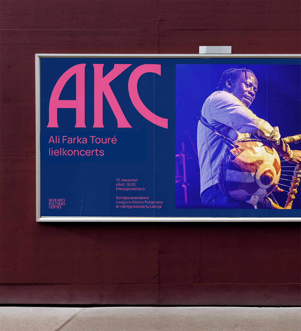
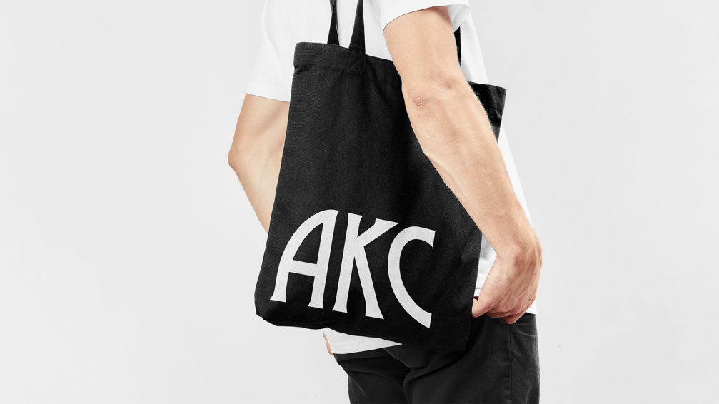
Ingus notes that in creating the visual system, the studio wanted to combine the history of the culture centre with a modern and sustainable graphic language. It is based on a clearly defined grid, supplemented by the acronym «AKC», which can be used oversized, thus achieving a convincing visual image and promoting the venue. To reflect the mood of each event, the tonality of the visual materials is adjusted to the image of the particular event.
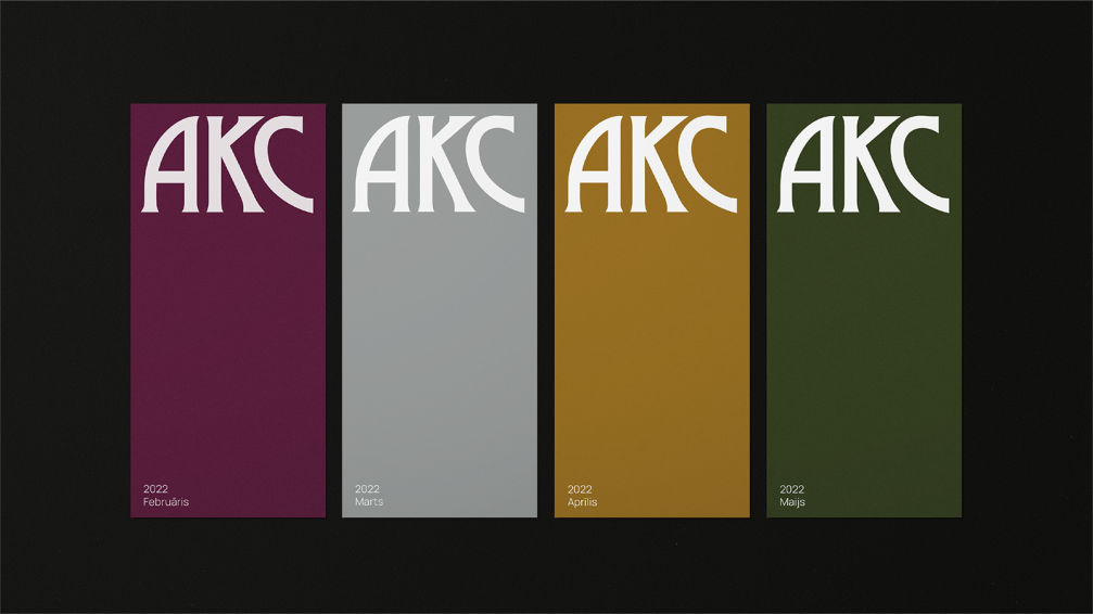
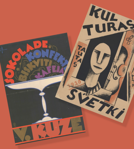
The elements of identity refer to the building of the centre and its history. It was built as a beer brewery in the 19th century, but in 2015 it underwent a significant renovation, during which a modern hall was added to the Alūksne Culture Centre. The grid used in the visual system cites the new part of the building, which is in the style of modernism, but the new logo refers to the historic building and the old logo of the culture centre. The tonality of the building’s interior is interpreted in a colour palette, which is used in the corporate materials and souvenirs.


Viedokļi