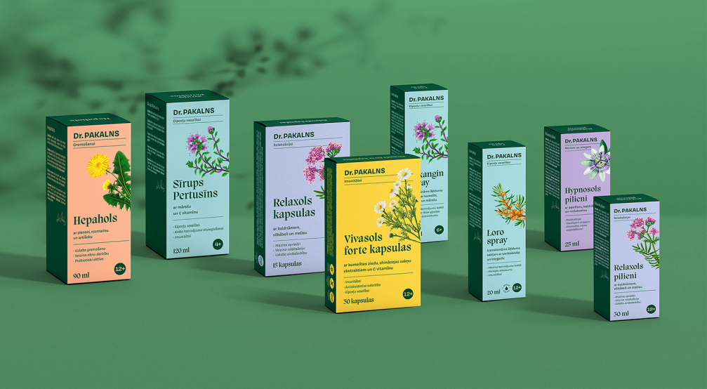
Dr. Pakalns supplement brand is based on the idea of personality, nature, and science. By renewing the product packaging design, the communication and design agency Brandbox wanted to strengthen the brand’s values by highlighting the ingredients of the preparations, categorising them through colours, and placing the most important information about the product’s effect on the packaging.
Riga Pharmaceutical Factory, the company which owns the brand Dr. Pakalns takes a leading position in the production of herbal medicinal products among the Baltic countries, accounting for up to 80% of the total production. Dr. Pakalns product line was created in honour of Dailonis Pakalns, a pharmacist and doctor of biological sciences, who has developed the composition of the supplements by carefully analysing and studying the effects of plants on the human body
When they started to work on the new packaging design of Dr. Pakalns products, the Brandbox team saw several problems with the previous design — the medicinal products intended for different needs looked identical and the packaging lacked clear information about the use of the supplements. Also, the brand name, which was displayed as a signature, was hard to read.
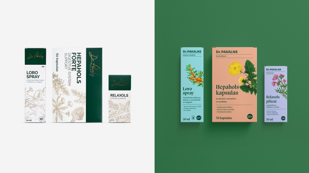
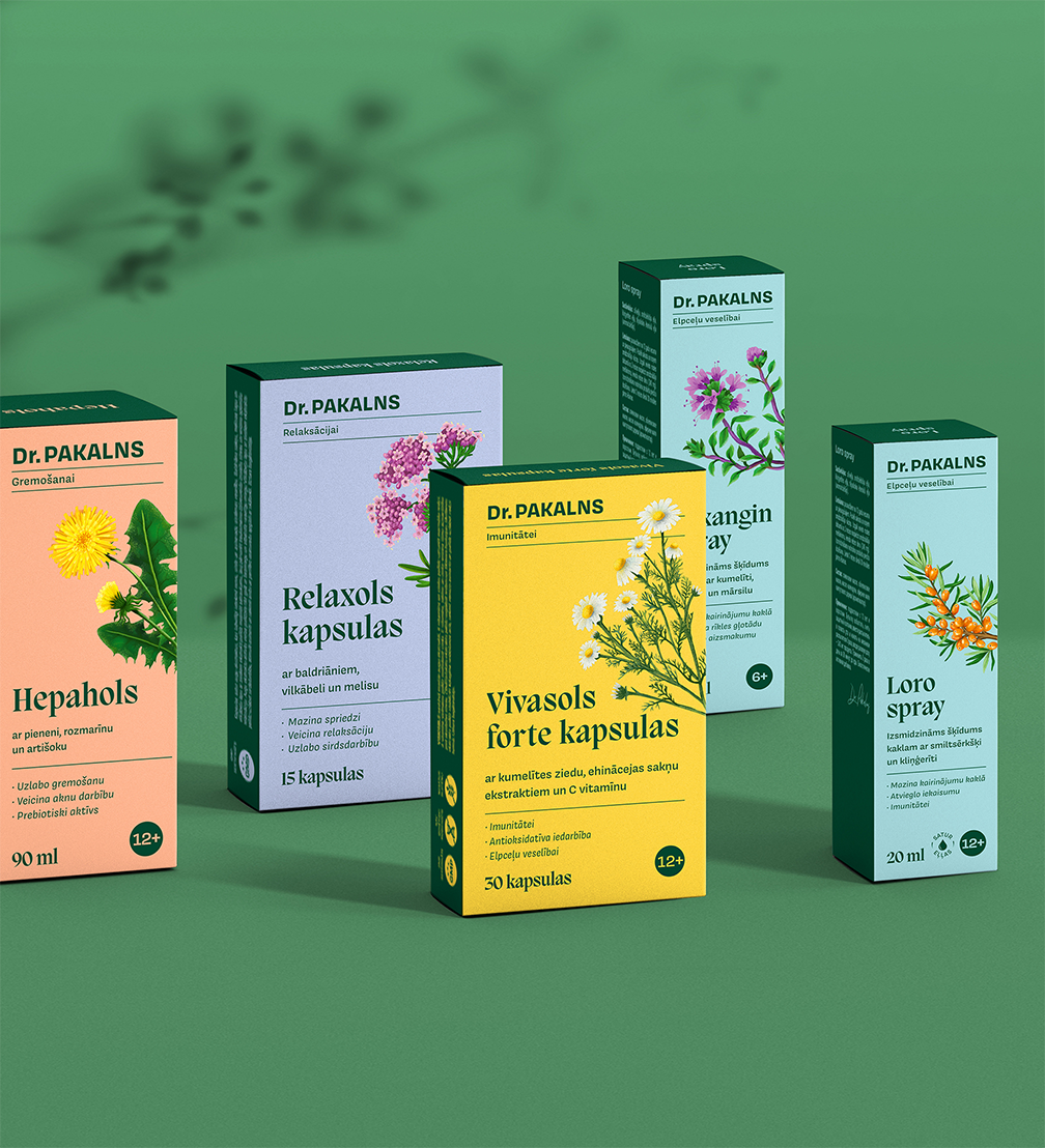
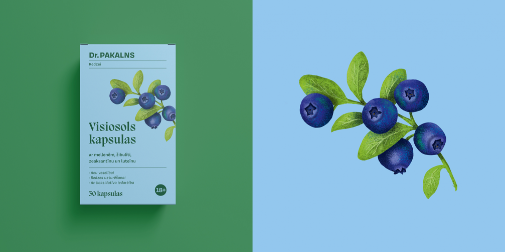
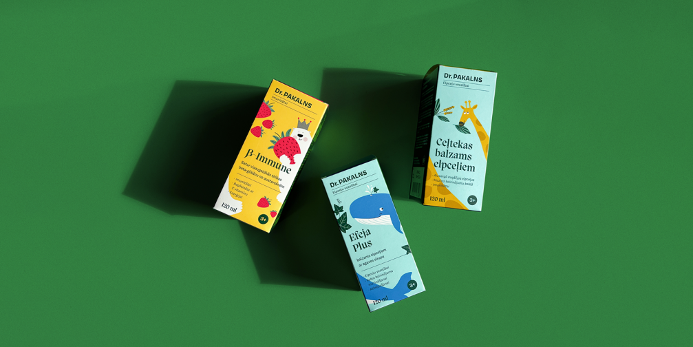
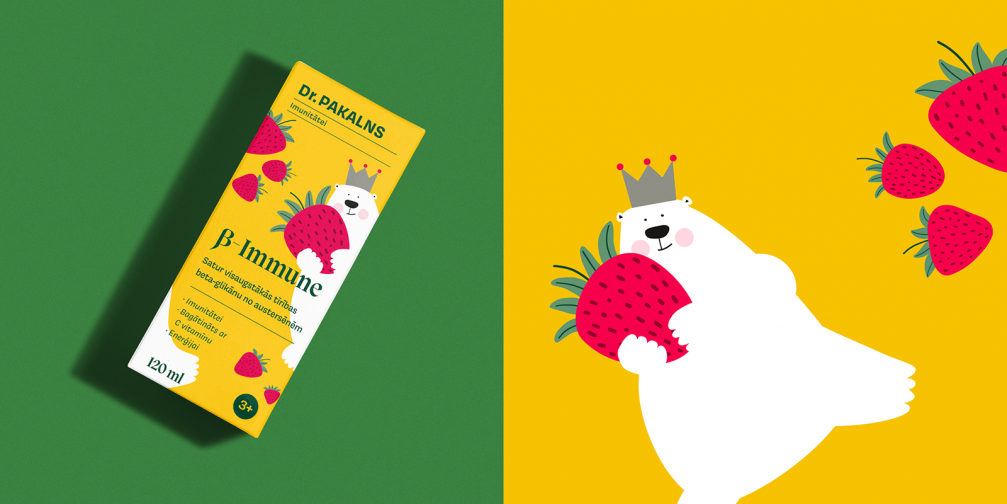
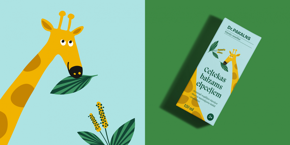
With the new packaging design, a colour system has been created, which allows different categories of medicinal products to be distinguished. For example, all products for the respiratory tract are marked with a turquoise hue, those for immunity — with yellow, thus making the work of pharmacists and the choice for customers easier. In order not to lose the connection with the previous design, the basic dark green colour of the brand was kept, while the signature of Dr. Pakalns now acts as a testament to the unchanging recipe and quality.
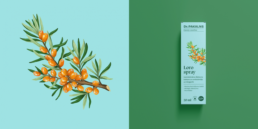
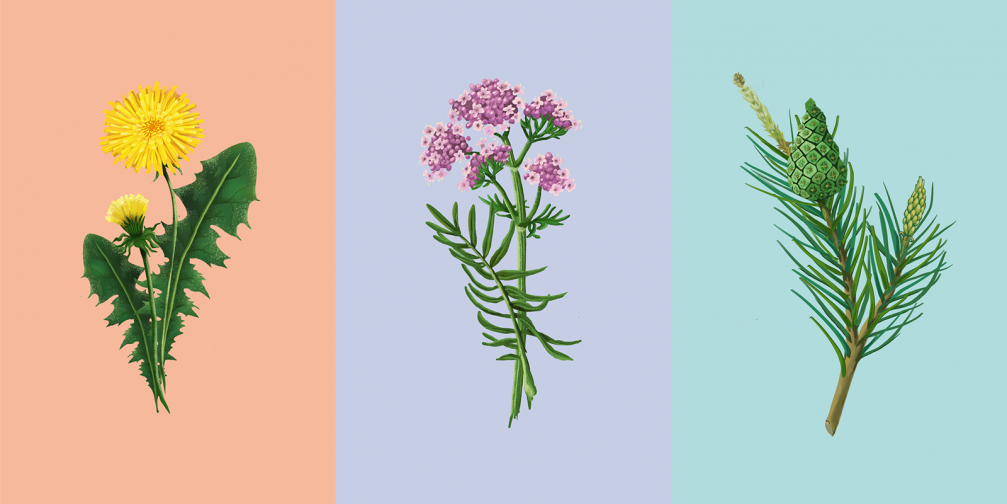
In the packaging design, the brand’s connection with nature is emphasised with illustrations of medicinal herbs that stand out against the monochrome background. Drawings of plants have been inspired by illustrations in old botanical books. Additional personality is given to the package by the chosen typeface, whose rounded shapes echo the flora. To appeal to and encourage the youngest users of natural supplements, the packaging for the children’s product line is decorated with friendly animals.

Viedokļi