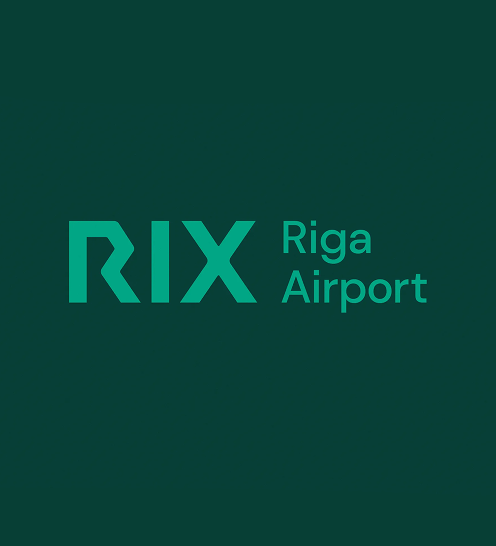
Riga airport will start implementing ambitious development plans this year — the construction of a new passenger terminal and the work on RIX Airport City will begin. Following its goal to become a travel hub for the Northern European region, the airport has changed its brand and will be known as RIX Riga Airport from now on. The brand strategy and the new visual identity, which features an arrow as a key motif, have been created by design studio Asketic in collaboration with advertising agency Wknd.
Riga airport is the largest in the Baltics and its future ambition is to compete with airports in the Northern European region. «New development projects, as well as the goal of becoming an important regional travel hub, have made it necessary to create a comprehensive, competitive, and modern airport brand, which includes our values, our promise to our customers and partners, as well as our vision of RIX as one of the best-connected business and travel hubs in the region,» explains Laila Odiņa, chairwoman of the board of RIX Riga Airport.
The new brand was developed by design studio Asketic in collaboration with advertising agency Wknd. «The task was to create a visual brand identity that could compete with the best airports in Europe and be flexible enough to meet the requirements of the airport city with a clear sub-brand structure,» says Miķelis Baštiks, chief designer at Asketic.
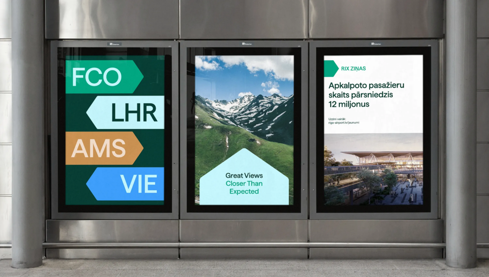
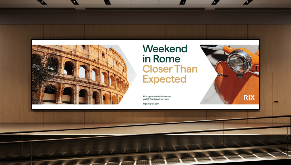
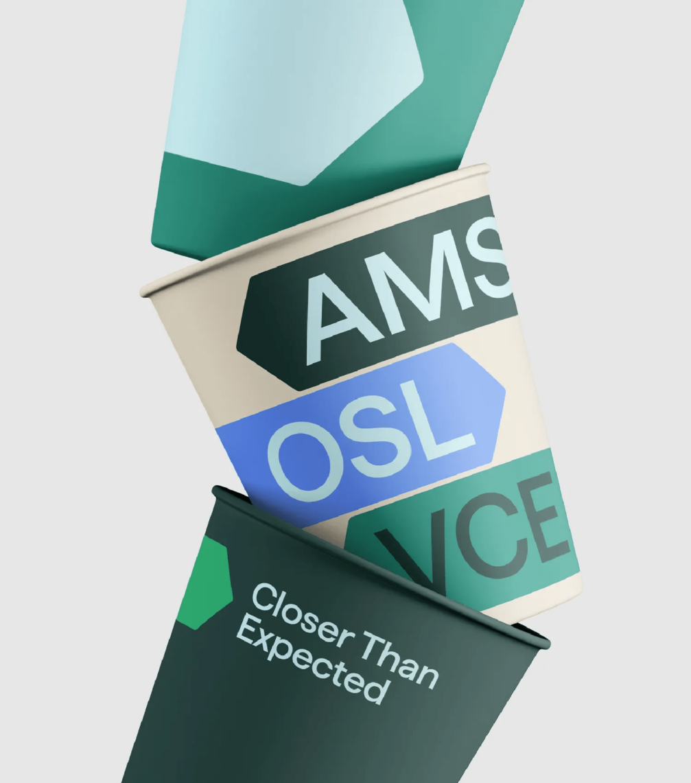
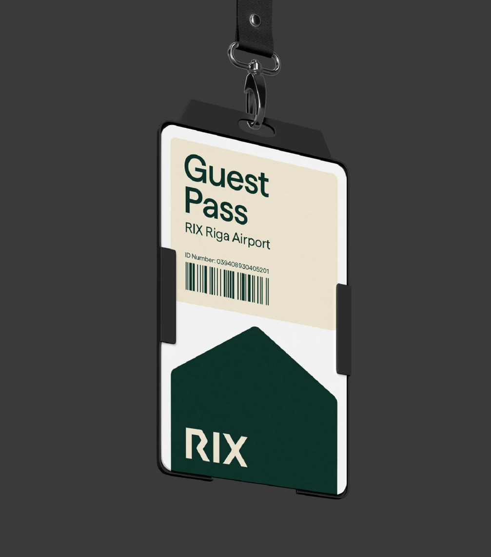
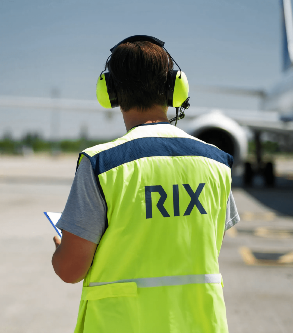
The new name of Riga airport — RIX Riga Airport — retains the internationally recognisable airport code RIX, which is popular among the airport’s employees and business partners, while the full name has been simplified and made closer to everyday use. The brand strategy also organises the many sub-brands managed by Riga airport into a single portfolio, providing them with a unified visual identity and names. The brand slogan «Closer Than Expected» encompasses the idea of connectivity and easy accessibility both within the airport and the city and in a global context.
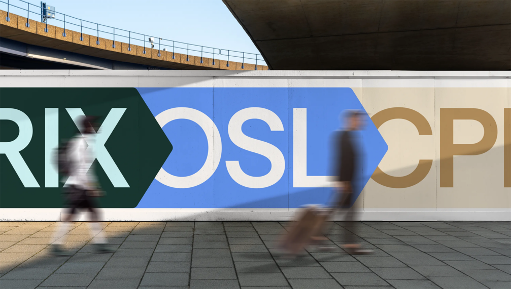

The key element of the visual identity of RIX Riga Airport is the arrow, a simple and universally recognisable symbol that everyone associates with direction and movement. This simple geometric shape has been further developed into the composition of visual materials and various graphic elements and has also served as the basis for the new logo. Miķelis says that in the process of developing the wordmark, the studio tried countless combinations of the three letters RIX, looking for inspiration for the detail in the earlier logos of Riga airport. Miķelis emphasises that the design of the wordmark was determined not by its beauty but by the need to make Riga stand out among other destinations. Just as every place has something unique, its logo must retain some distinctive or even quirky nuances that give it character. Given that the airport is also the face of the country, the colours chosen for the visual identity — earth tones, greens, and blues — evoke Latvia’s nature.
The introduction of the new brand of RIX Riga Airport will take place gradually until 2028 in order to use the funds allocated for this purpose rationally and sparingly. This year, the new visual identity is planned to be introduced in more than half of the communication materials: the digital environment, records, souvenirs, signs, terminal information materials, clothing, transport, etc.


Viedokļi