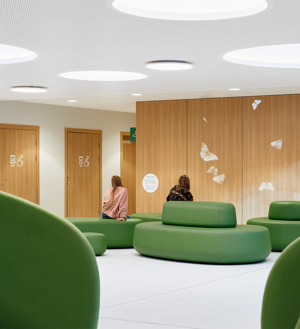
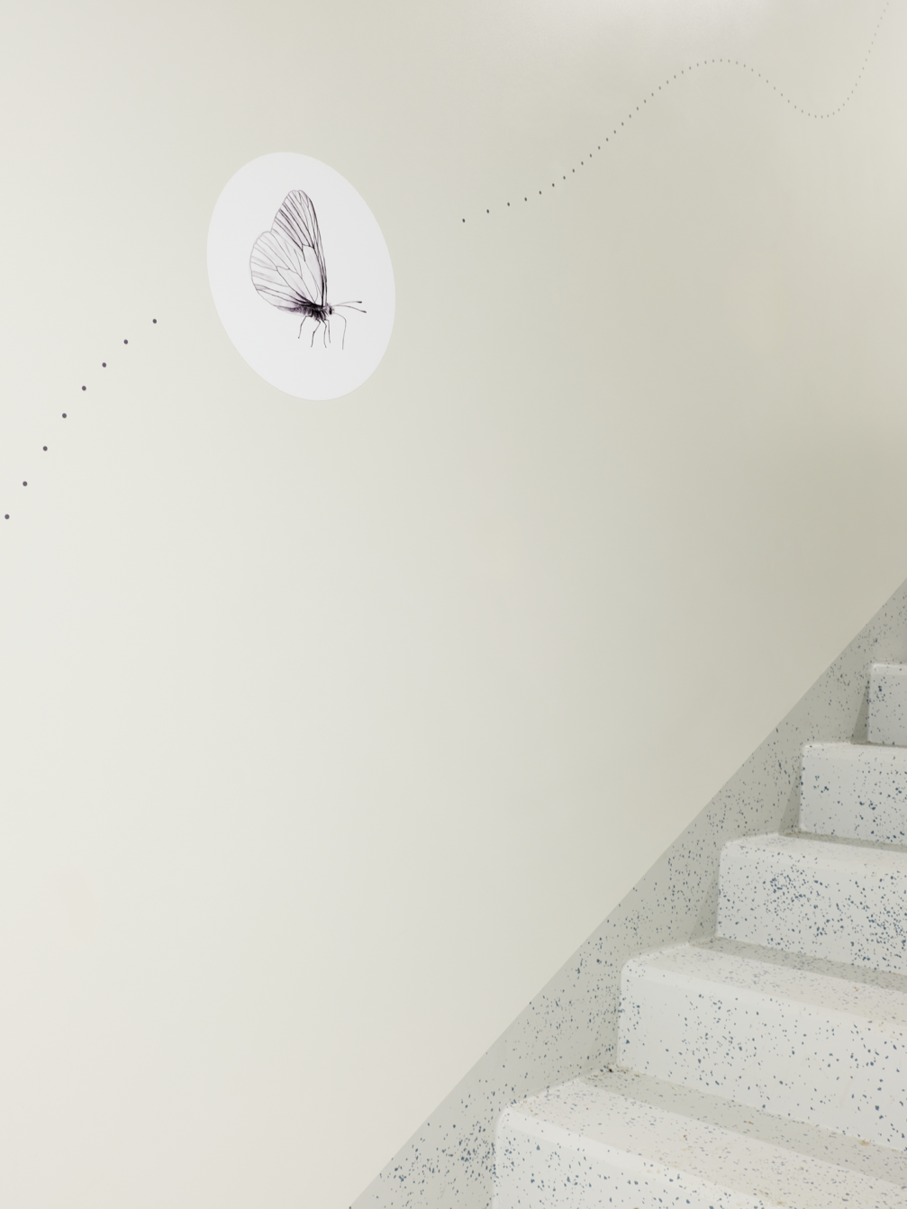
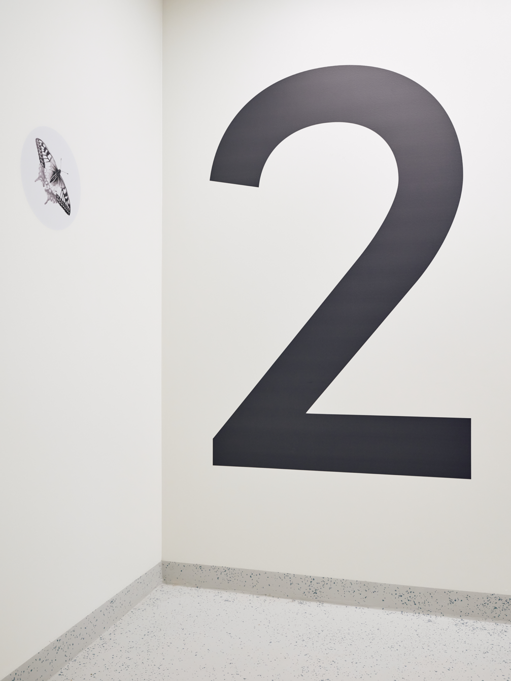
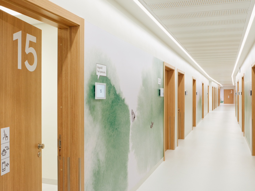
At the end of last year, the Children’s Clinical University Hospital in Riga opened a Children’s and Youth Mental Health Centre. The graphics and navigation design of the centre were developed by design studio H2E, which aimed to create a safe, inclusive, and inspiring environment that helps overcome anxiety and is easy to navigate. The main motif used in the interior of the centre is the butterfly, a symbol of mental health.
The Children’s and Youth Mental Health Centre works to help children and young people with mental health problems in both outpatient and inpatient settings. The new building, designed by the architecture office Nams, offers spacious and modern facilities for counselling and a wide range of therapies. In order to support visitors and reduce their distress, it was important to create an environment that is easy to navigate, eliminates confusion about the course of the visit, and allows both socialising with other visitors and distancing oneself from the surroundings if necessary.
The graphic design of the centre’s interior, with the butterfly as the main motif, combines functional solutions and storytelling, thus accompanying and supporting visitors both practically and metaphorically. «The butterfly is both a symbol of mental health and an example of completeness; the vibrancy of its wings is inseparably linked to an exhilarating flight. And its life cycle, from egg, caterpillar, cocoon, and finally the glorious butterfly, is symbolic of the path of human personal development. The Mental Health Centre is a place where everyone has the opportunity to let the light into their cocoon. A place to explore one’s worth and gain confidence in the possibility of a new life. The conviction of one’s own magnificence,» says Ingūna Elere, leading designer at H2E.
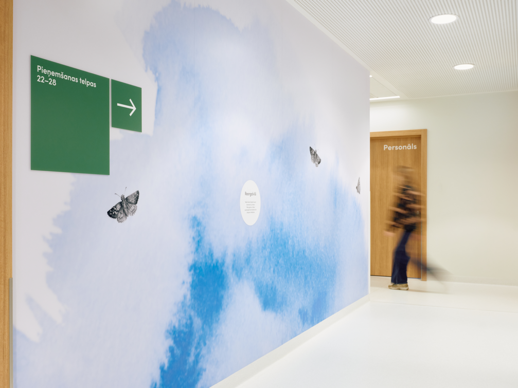
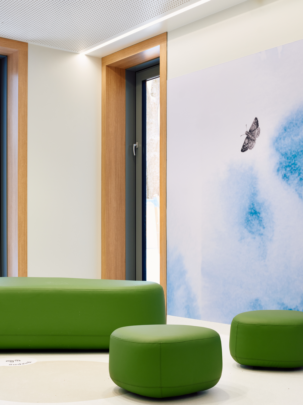
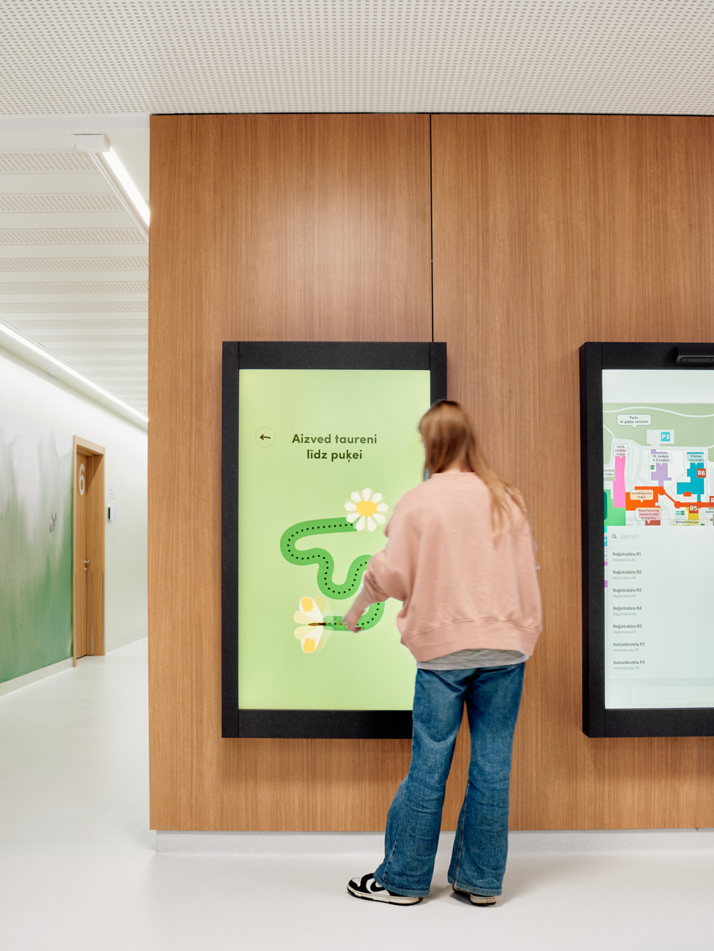
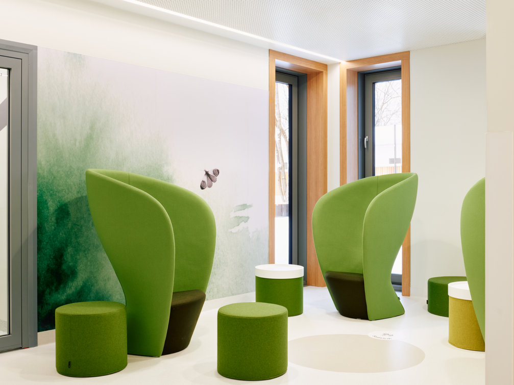
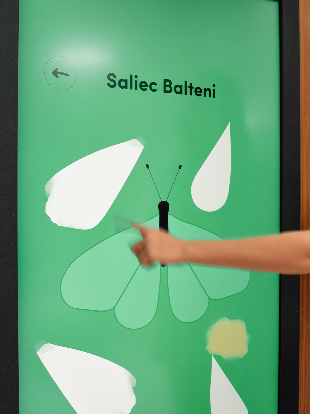
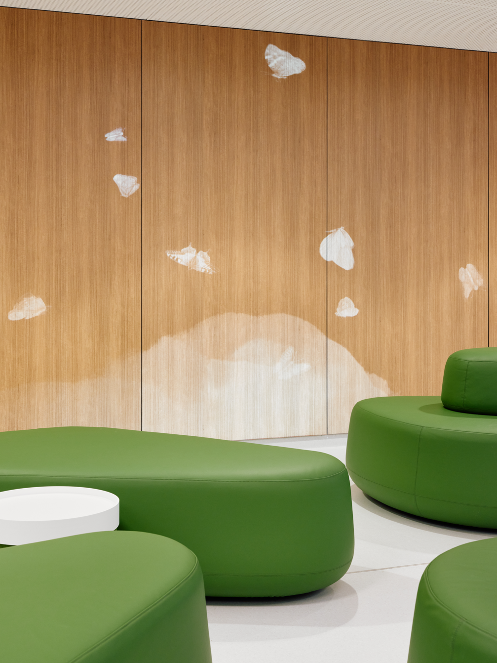
The drawings of butterflies found in Latvia and the different watercolour gradients, which indirectly depict the butterfly’s flight, serve as identifying elements that distinguish different departments and spaces with different functions. The use of natural tones, several shades of blue, green, and violet, for the watercolour gradients helps to maintain a calm, relaxed environment without creating stark contrasts. Butterflies are also present in the multimedia solutions in the centre’s lobby, both in projections and in custom-made games. In the waiting areas, nature sounds enter the places through sound «showers», and, in the future, it is planned to collaborate with composers to create a new soundtrack. The interior is complemented by seating furniture designed by H2E — low, flowy sofas that create a sense of openness and invite socialising. If you feel like distancing yourself, there are also secluded, enveloping armchairs to hide away from others.
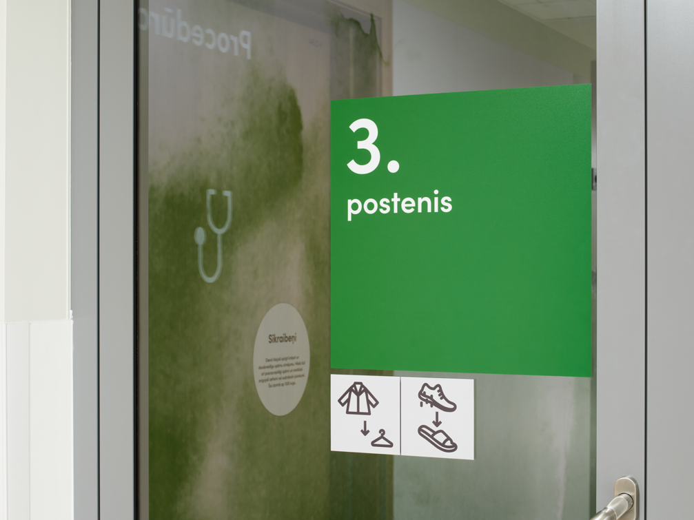
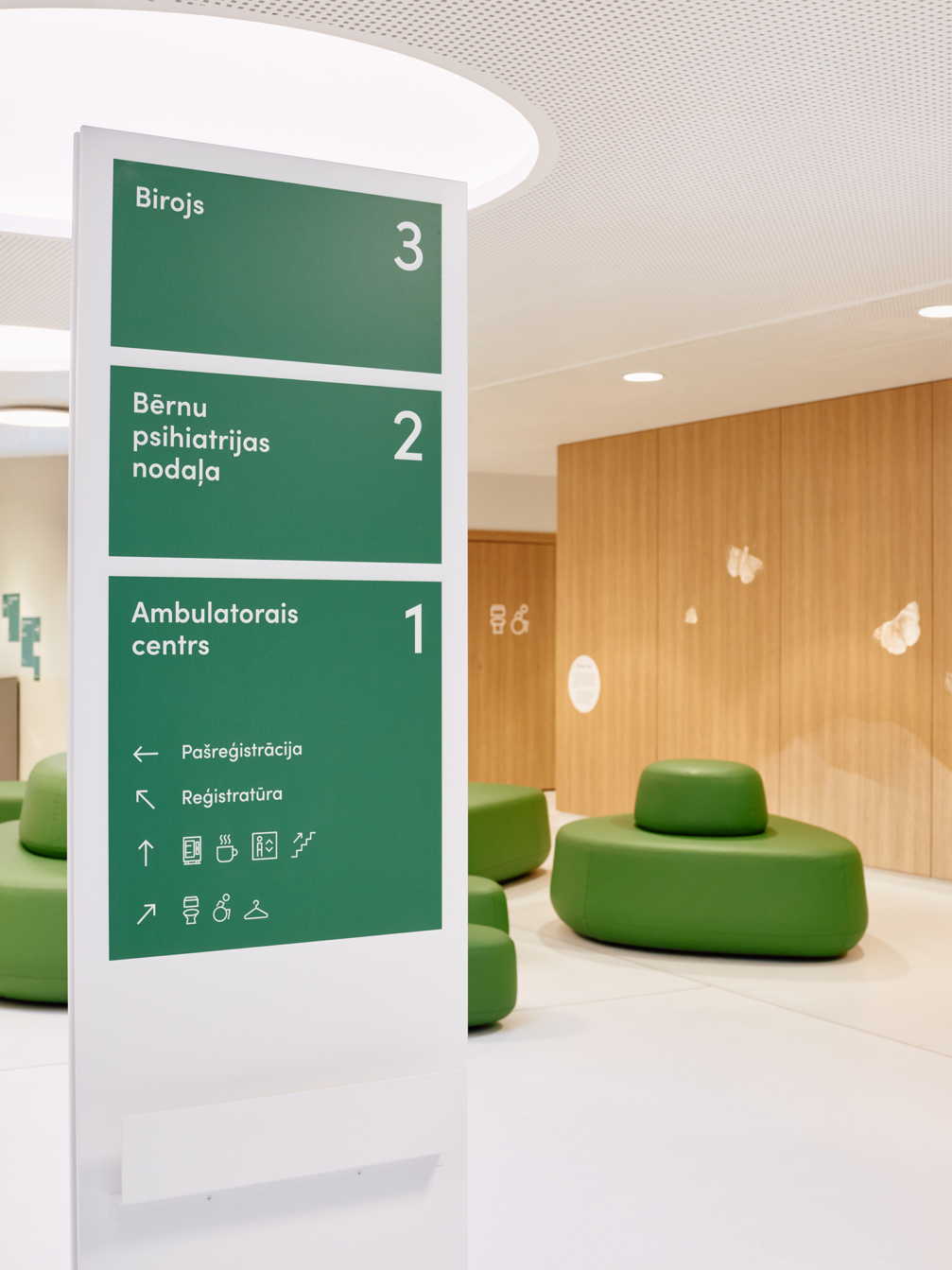
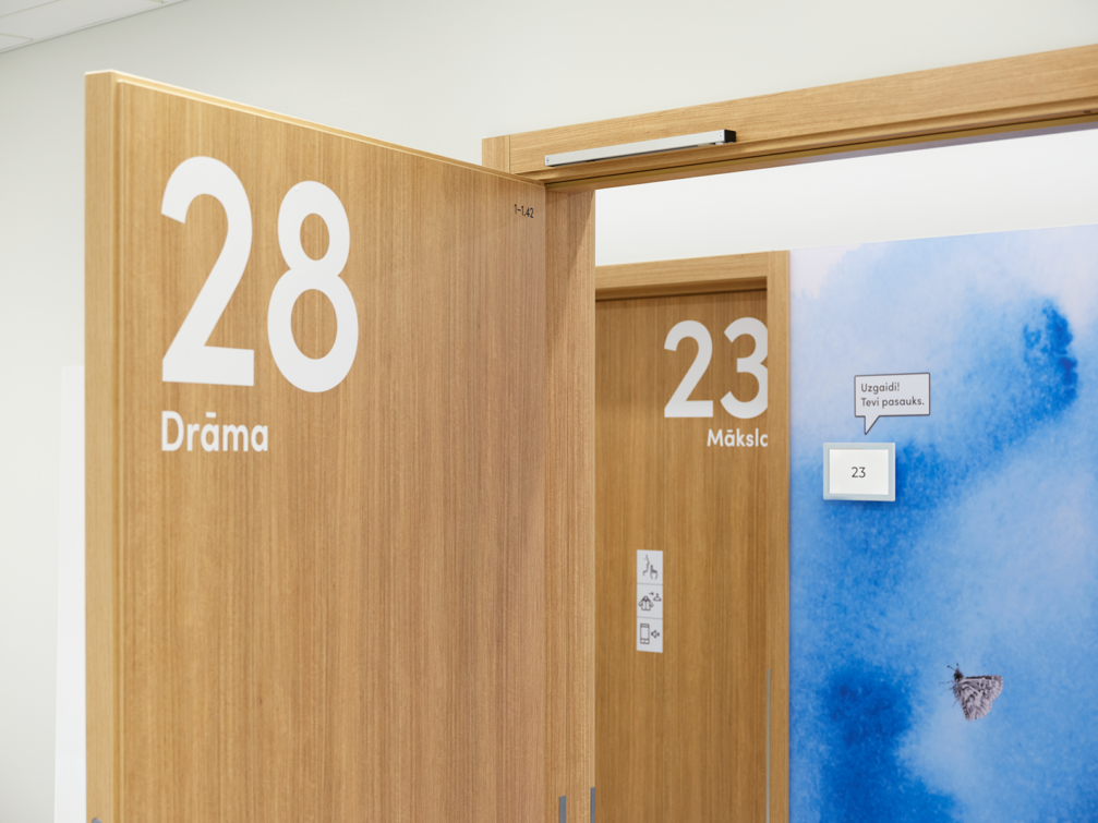
Ingūna points out that the navigation was designed with both an inclusive environment — large numbers, signs and pictograms, clear signs, screens at a child’s eye level — and the psychological comfort of the visitors in mind. The navigation symbols encourage the visitor to take the desired action, rather than being treated as warning or prohibition signs. A photograph of the room and the specialist is displayed at the door of the specialist’s office so that patients know what to expect in the room. Based on research on children’s perceptions, toilet signage is based on function rather than gender. All solutions have been tested countless times with patients, hospital doctors, and staff to make necessary improvements.
H2E has worked with the Children’s Clinical University Hospital on the design of the Children’s and Youth Mental Health Centre, as well as on the graphic design of the Day Inpatient Facility and MRI rooms, and the Epilepsy and Sleep Medical Centre, on which the studio has been working, will soon open.
Viedokļi