
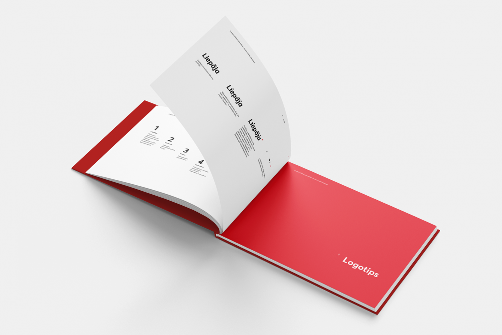
On October 12, the new, unified visual identity of Liepaja municipality, designed to create clarity in city administration, and a unified image for Liepaja’s residents and visitors alike, was approved. The new graphic standard is created by the design studio «H2E».
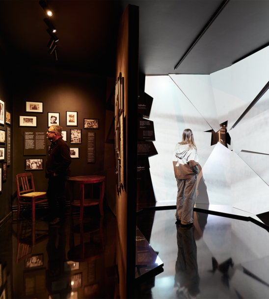
According to the representatives of Liepaja city municipality, before implementation of the unified identity, a variety of institutional brands existed in Liepaja. This approach was inconvenient since it demanded to develop and maintain the identity of each brand separately, moreover, it made communication difficult — information was often duplicated and confusing. Development of the unified visual identity was offered to several companies and, after evaluation of the proposals, the project was entrusted to the studio «H2E» — the bureau that had also developed a unified visual identity for Latvia’s public administration.
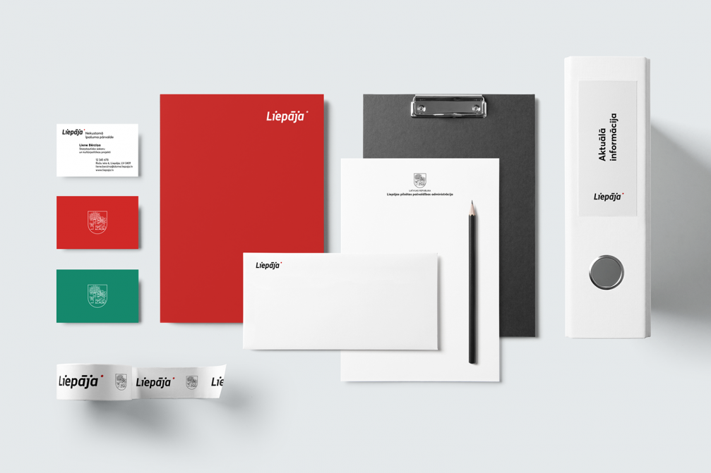
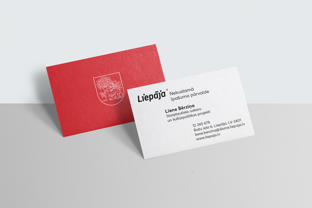
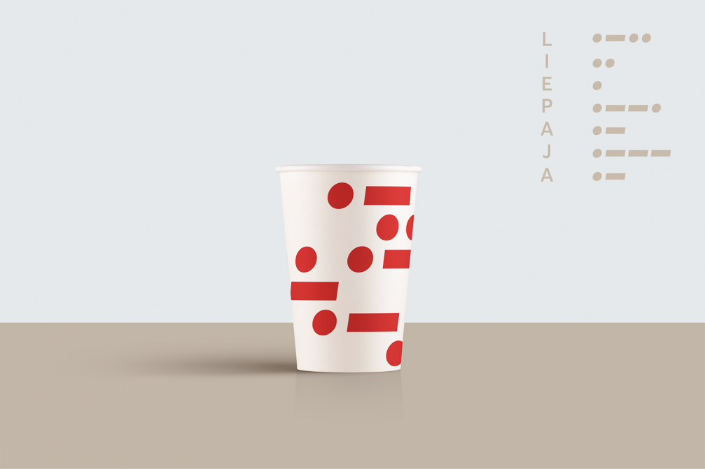
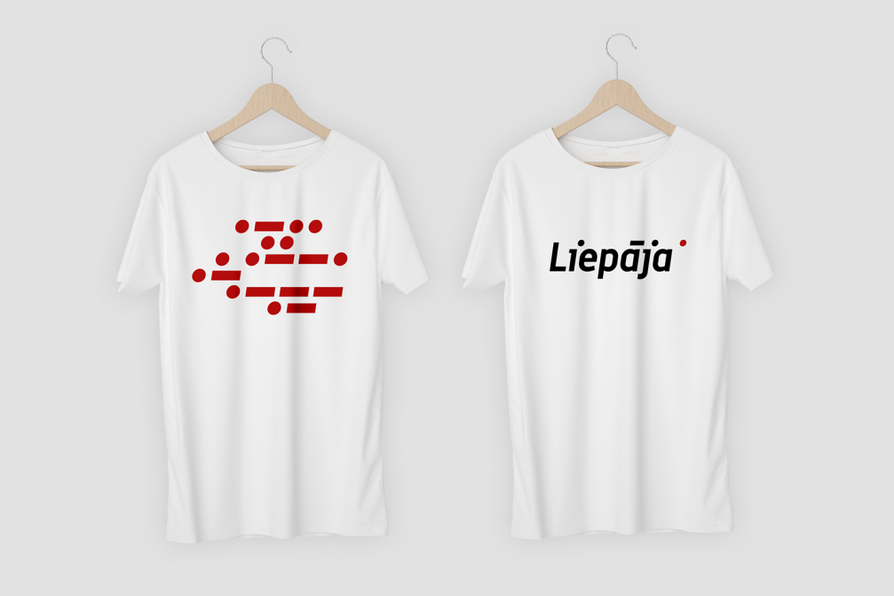
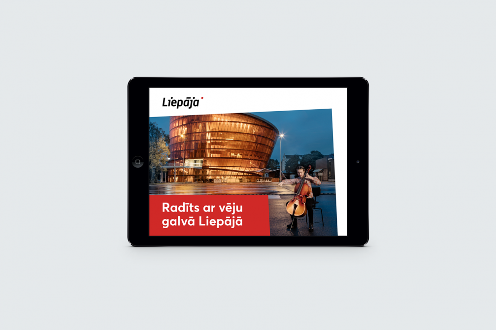
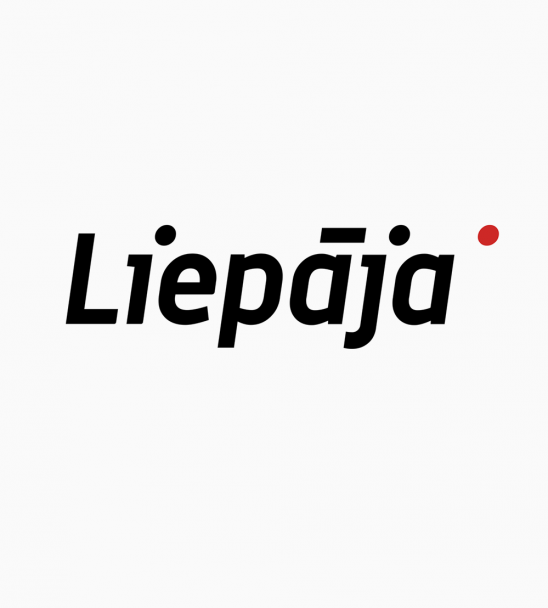
With the new identity, the designers underline characteristics of Liepaja city and its residents — the graphics represent strength, dynamism, robustness, honesty, and simplicity. Designers have respected the history of the city — Liepaja’s coat of arms and heraldic colours have been preserved but upgraded by adding a new and notable sign of recognition — the logotype of Liepaja. Designed in italics, parts of the logotype’s letters are shifted like they were scattered by the strong wind of the coastal city. The black text is brightened up by a red dot, which symbolises the beginning of new ideas and opportunities, while the diacritical marks as separate graphic units set the structure of Morse’s alphabet. The emblem of Liepaja municipal authorities now comprises the unified logotype and the name of the institution. Such solution informs about the function of the particular institution, while strengthening and unifying the image of the administration of Liepaja Municipality as a whole.
«A visual identity needs to be alive, it must be what the citizens themselves want to use,» emphasises Ingūna Elere, the creative lead of «H2E» design studio. To understand user needs, together with the authors of the marketing and communication plan for the city of Liepaja — advertising agency «Wknd» — individual and group interviews with representatives of the local government of Liepaja, residents, non–governmental organisations, entrepreneurs, and the media, as well as creative workshops were organised.


Viedokļi