
In February, the Liepaja municipality announced a significant improvement in the digital image of the city — its residents and guests now have access to a new, modern, and user–oriented website Liepaja.lv. It is created by the digital design agency «Wrong».
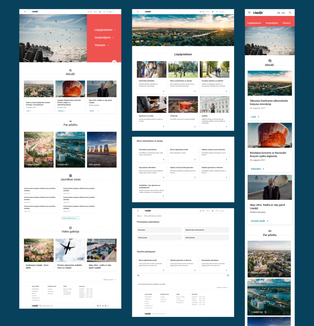
According to Liepaja city council representatives, the new homepage Liepaja.lv is a communication channel aimed at providing information access, gathering and exchange between the municipality and its residents, as well as serving as the city’s business card. For the website developers, digital design agency «Wrong», this is already the second positive experience in cooperation with public sector institutions. In mid–2016, an updated Road Traffic Safety Directorate (CSDD) website was launched, and its design, according to the authors, has significantly reduced the time spent on the page and doubled the number of visitors using smart devices.
Design as means for a change in culture
The representatives of «Wrong» Ilze Grietēna and Liene Geidāne say that the development of the website took almost a year: «At the end of January 2017, a competition was announced; in May, the results were known and we started to work. By the end of the year, the site was online and functioning. The remaining time until the beginning of February was used for input of content and additional tests.» The team of «Wrong» emphasize that the successful result was ensured by close cooperation with the Liepaja municipality, as well as its openness and willingness to participate in the design process: «Similarly to CSDD, Liepaja was also prepared to do things differently. In both projects, significant changes directly affected the structure of the page’s information, which also greatly altered how the client perceives its own website.»
One of the biggest challenges that the developers faced, was the need to break the stereotype that websites of municipalities are rarely visited, complicated and counter–intuitive. Ilze says that in the public sector not only the timeline and the scale of projects differs from the private sector, but also the client’s initial vision can be fundamentally different. «In the private sector, the user of the website is most often a customer of the company, therefore it is easier to convince the client that it is primarily necessary to ensure that the customer feels comfortable to use the page, because it will help him to find and read the necessary information and encourage him to buy a product or service. In the case of public institutions, there are many internal stakeholders, and sometimes priority may be given to the comfort of the institutions themselves, thus negating the end–user. It is a change of inner culture that does not happen within a year. Liepaja has successfully kicked it off, and, seeing that people are increasingly visiting the site and are satisfied with it, leaves us hopeful that this process will continue.»
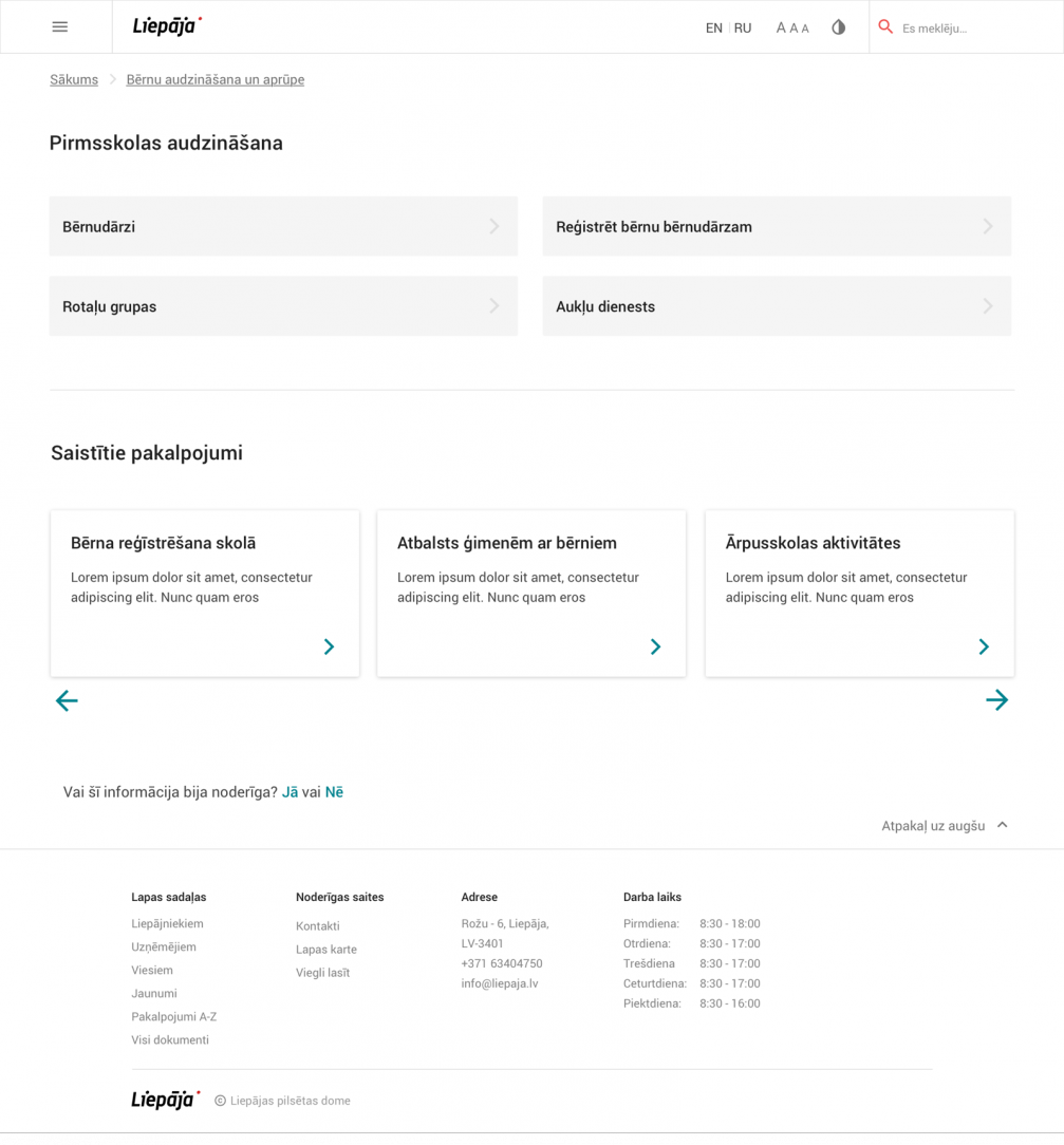
The developers emphasize that a user–centered design approach also means that the solution is accessible to all regardless of the state of health or education level: «It is the responsibility of the municipality to provide services to all its inhabitants and it must also be reflected on the website. It was important for us to ensure that the page is also accessible to people with physical impairments.» On Liepaja.lv, it is possible not only to change the text size but also to choose a specially programmed color scheme according to the specifics of the visual impairment. To ensure this, the designers consulted with the Liepaja Society of the Blind Society. Another initiative of «Wrong», almost all of the text of the website of the Municipality of Liepaja was rewritten in order to make it more understandable for the user.
Residents, entrepreneurs, visitors
When starting up the project, the «Wrong» team first studied websites of institutions abroad for best practice analysis. Among the positive examples, the authors of the Liepaja page highlight the UK government’s website gov.uk as well as the websites of Amsterdam, Boston, Stockholm, and Reykjavik. The research made it possible to put forward hypotheses about solutions that would allow the user to find the necessary information as quickly as possible, reducing the time spent on the website.
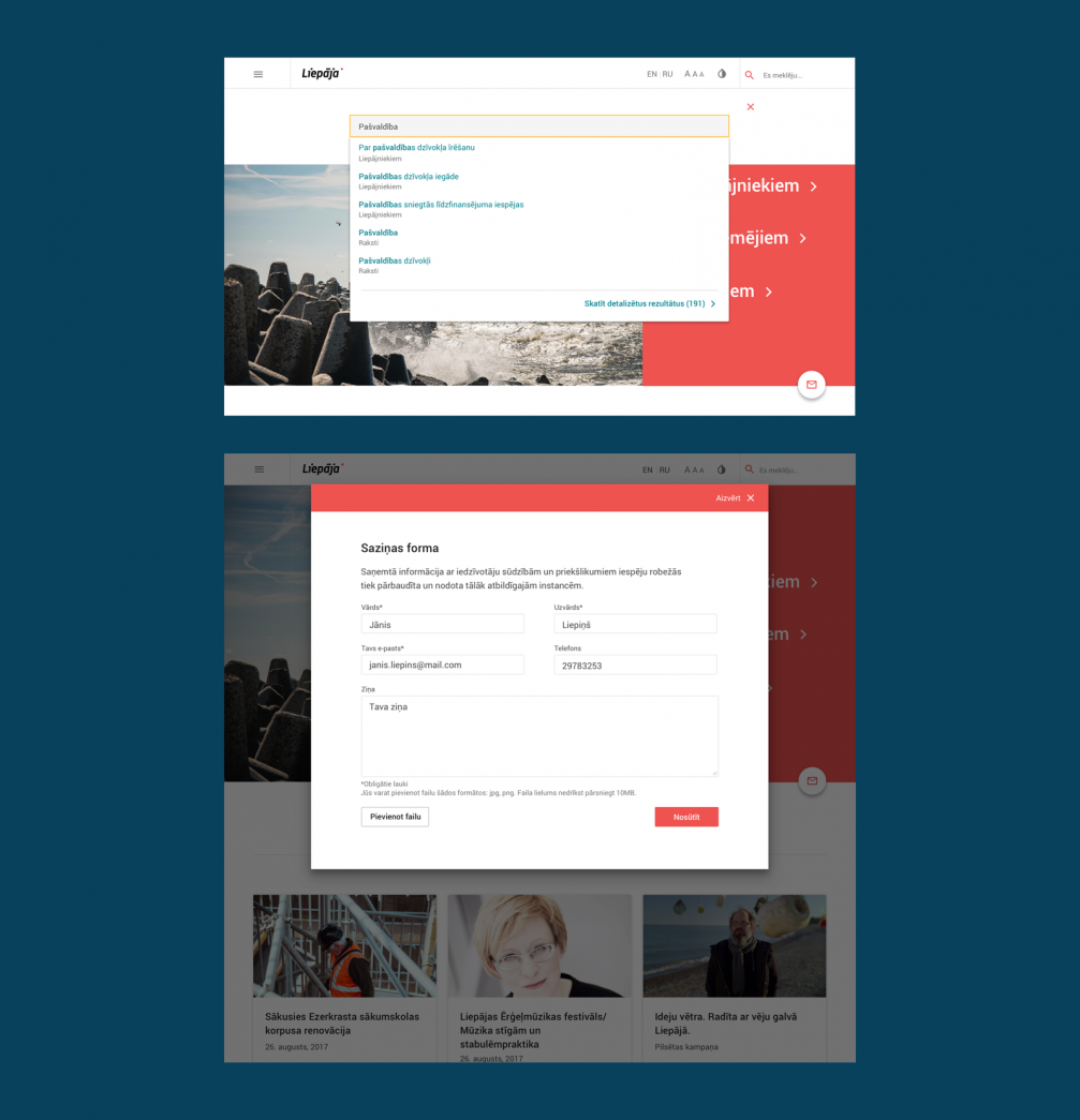
«The users of the Liepaja website is the broadest audience we have worked with so far,» admits Ilze. In order to structure the large amount of information, three primary target groups were first identified: residents of Liepaja, entrepreneurs, and guests of the city. In cooperation with the Liepaja municipality, «Wrong» conducted several series of user tests. In the first workshop, representatives of different ages and professions organized the information displayed on the website in subject blocks as well as tried to decipher categories defined by other participants. «In this workshop, we used the Card Sorting Test methodology and we were surprised how differently we think. For example, child–related services originally were placed in a section called «Family», but then we realized that modern cohabitation models vary much more, and such definition is no longer correct,» remembers Liene The second stage of user testing took place after creating the page structure, inviting potential page visitors to try a prototype with 270 views: «People were clicking, and we were watching how they did it, what paths they would go to get the information they needed. We gave them tasks and studied how they would complete them, where they would stop, and whether there would be any questions.»
The website should not be perfect
Liepaja.lv website continues to grow — visitors are encouraged to contact the municipality to indicate if something is not working or is difficult to understand. «We have incorporated a feedback mechanism — the home page provides a convenient form of communication through which the user can submit current information to the municipality, add images to the message, and there’s a question about the usefulness of the content at the bottom of nearly every article or information block. Visitors of the site actively use this communication tool to provide valuable comments on what they like or dislike and what could be improved. In turn, the municipality reacts to the users’ messages and makes changes to the content or gives us directions on how to improve its functionality. Moreover, the opportunity to contribute helps people to take it easier if something does not work as they expect to. The assumption that the page should be perfect is misleading. This is not the case, but together we can improve it,» invites «Wrong».
Liepaja.lv authors — the team of the digital design agency «Wrong»: UI/UX designer Liene Geidāne, project manager Ilze Grietēna, programmers Raimonds Sarkanbārdis and Artūrs Gulbis, creative director and designer Oskars Cirsis, and others.

Viedokļi