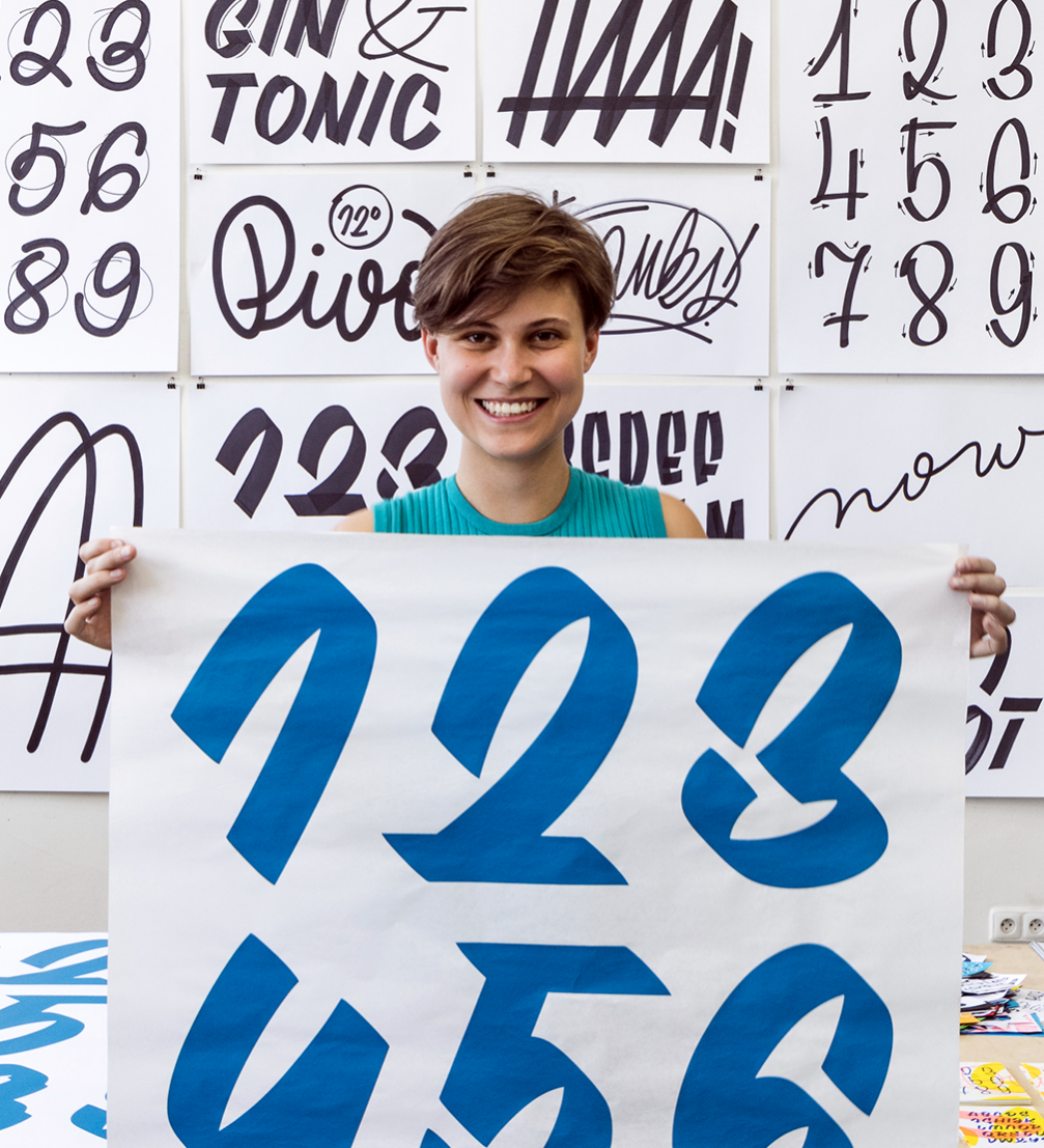
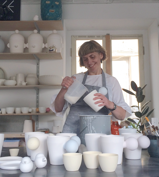
The Czech type designer, hand lettering artist and sign painter Petra Dočekalová describes her profession as an obsession with typefaces. In her PhD thesis at the Academy of Arts, Architecture and Design in Prague (UMPRUM) she studies traditional sign painting but in her daily work she creates contemporary script typefaces and experiments with street typography.
Petra Dočekalová was one of the invited speakers at the conference «Conversations on book design and publishing. Tools» organised by the platform «Latvian Literature» in Riga.
One of the main topics of the conference was the merging of digital tools with the analogue world. Hand–drawn fonts play a significant role in your work. If you could choose to work with analogue techniques only, would you do it?
I would! But only for a certain amount of time, like for a few months or so. After that I would terribly miss font work, curves, and the digitising of letters. But yes, if there were a blackout and no computers survived, I would be happy to be stuck only with markers and brushes for the rest of my life.
How do you merge analogue and digital techniques in your work? What are the benefits of each medium?
I think both analogue and digital worlds are not in conflict but complement each other and create a new fantastic art freedom. If my hand does not draw perfectly, I can always do corrections and final touches in the digital environment. And vice versa — when there is a need to add more lively forms to the design, I write it by hand.
What is the most important thing while working on a new typeface?
There are rather logical than creative issues in the first stage. You need to do wide research to make sure that the font you are planning to make is not already existing, so you wouldn’t be doing work that nobody needs. Also, the design of a new font depends on where it will be used by the customers and your design must meet these needs.
The typeface designer Nina Stössinger has said that the first time she drew a type, she felt like she was at the bottom of Mount Everest. Can you relate?
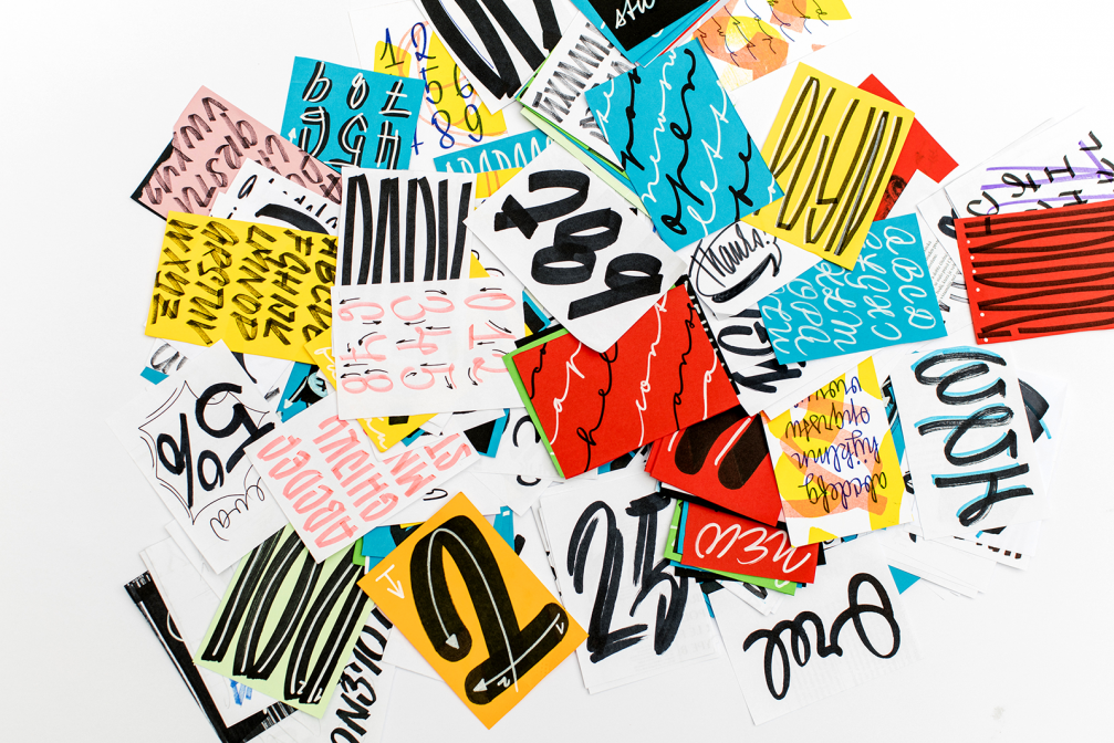
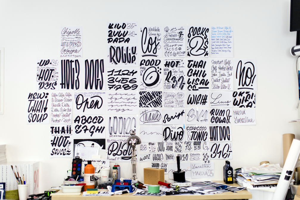
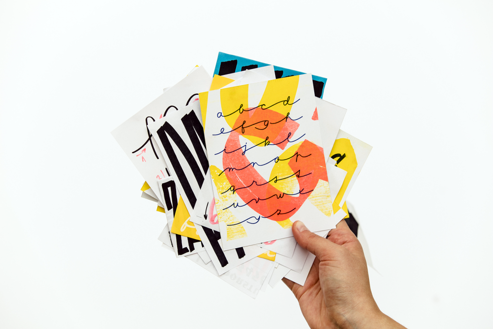
Yes, definitely. Sometimes when you are drawing a typeface the feeling is like being a butterfly, I feel like I was born to do this. I enjoy designing the curves with their beautiful shapes. But sometimes I become more like a robot because I need to make it fully functional with all the ligatures, OpenType features. Then you might start to hate it. But you just need to be prepared for that. It’s a process from the beginning to the end and you should have fun with it. A typeface for an occasional use, for instance, a poster, could be done in a few hours or over a weekend and it’s not wrong to design it like that. But making of another typeface can take up to two years because you want to make it sustainable. Sometimes, sketches for a font can be lying in a drawer for half a year, and only then be taken out to see the daylight. A font should capture the best moments of your drawing. You will spend a lot of time thinking of all the combinations, variations of shape, small size options, printing the test versions several times, making corrections, and there is still a possibility that you will not be satisfied.
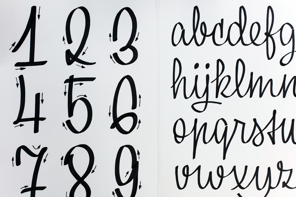
What is essential for a well–formed digital script?
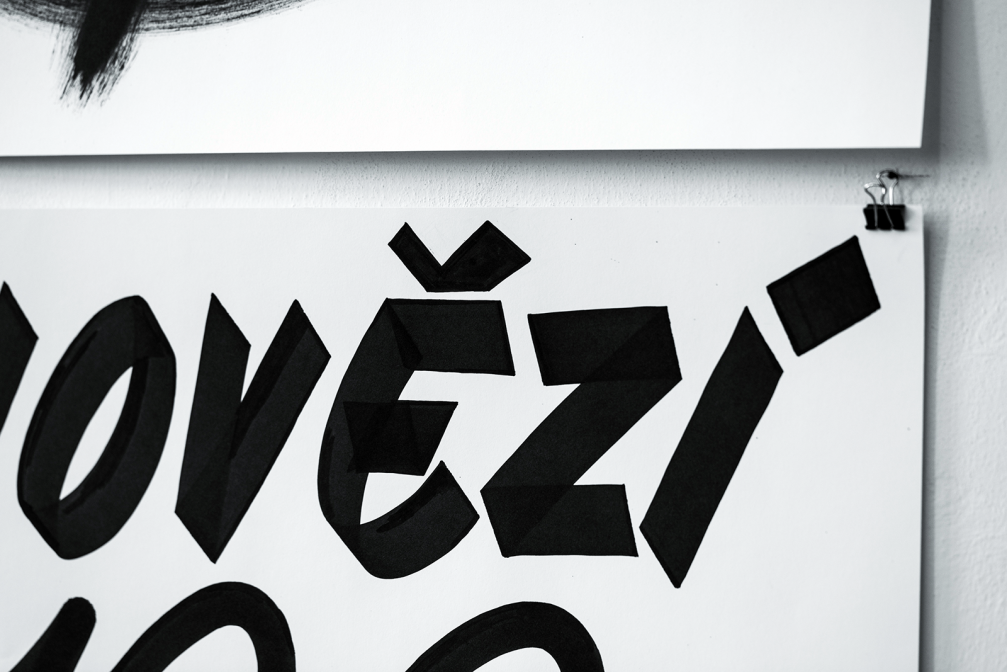
Rules and consistency. There should be a regular rhythm of the relation between uppercase and lowercase, the right length, slope. You need to be consistent in connections, horizontal and vertical lines, shading, accents. From the very beginning you need to think about so many parts of the letter, about all the variations of this font that could be in the same family. I think that the stroke looks nice only when based on a real tool. Otherwise it seems too artificial and nobody will want to use it. On the other hand, what I really hate is the digitisation of human handwriting with no graphic input — it’s just a mess. When digitised, a good handwritten script should have the feeling of natural handwriting but with no mistakes, no black spots or tiny ink drops, and with a logical connection.
In Latvia, only a few artists do calligraphy, and the Latvian Society of Calligraphers unites a small number of enthusiasts. How would you describe the situation in the Czech Republic?
It is absolutely the same. There are only about two, three people who write for a living. But there are still some middle–aged shopkeepers who can write calligraphic scripts because they were taught how to write properly in school. They are now working in bars or restaurants and writing the menus by hand but that is all. Typographers or calligraphers who write diplomas and addresses and do nice book covers is an almost an extinct profession.
In fact, terminology is also a problem. I wouldn’t call what I am doing calligraphy, instead I think calligraphy is a movement of the entire body. It is not only about controlling the tools but also your mind. I would rather call my work lettering. My daily routine consists of digital stuff but I also write by hand, I write texts for publications, I teach and I do graphic design. At the moment I am trying to teach the art of lettering to a few other enthusiasts but through an association we could organise more workshops where everyone is welcome. I hope that more and more people will try to do things by hand, not only digital. I want everybody to do scripts. I am also leading some calligraphic courses at the Academy of Arts, Architecture and Design in Prague and we hold workshops with students where we learn to write with different tools, markers, spray cans. I want them to understand that they have the option to draw by hand because sometimes I have a feeling that students have forgotten how to hold pens.
I saw on your Instagram account that you do a lot of street typography. It seems that the demand for hand lettering has been growing lately. How would you explain that?
It is popular now. People want to feel the aesthetics that is pleasing from the handmade work. When a restaurant or a shopkeeper calls me, I go there with my small backpack of tools and write my letters. For some restaurants I write every month, and some others which I go to once every six months. It just fits the trend now, that’s all.
Your Bachelor thesis was a book about the Czech typographer Jaroslav Brenda. Could you tell us more about him?
Jaroslav Brenda was a graphic designer and artist, strongly interested in typeface design. He lived for 88 years, so he went through different styles — Art Noveau, Decorativism, Art Deco, Functionalism. Now we are slowly recovering his work just because now design from 50 or 60 years ago is trendy. I believe that what he did is timeless but you can see that only from a distance, as you never think that about people of your own generation. Brenda is a forgotten star and I wanted to put him in the limelight. We want to publish another book containing only his typographic work. But I have to say that he is just one typographer, and there are many more authors from Czech Republic, like Stanislav Maršo, Jiří Rathouský or Josef Týfa who are practically unknown abroad but for us their works are milestones in typography. Now we are only famous for Ladislav Sutnar, Vojtěch Preissig and Oldřich Menhart, and I would say they are just three from the 30 that there could be.
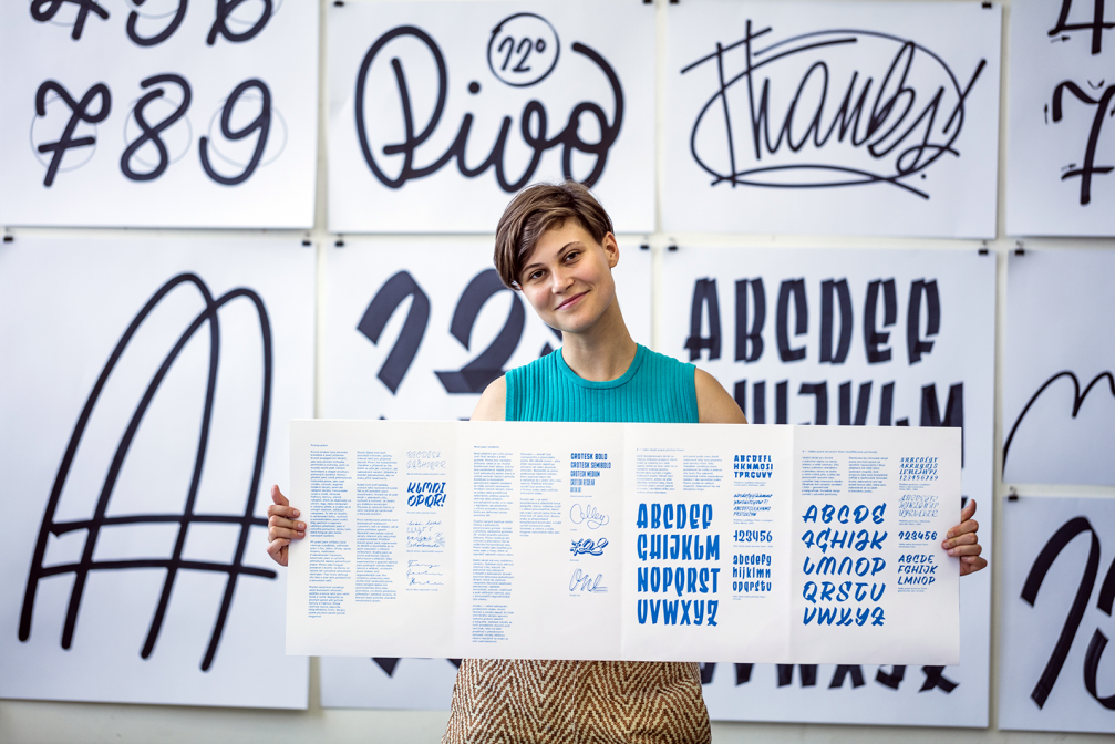
You were one of the editors of the book «TYPO9010» that looks back on 20 years of typefaces. What do you think type design will be like in 20 years?
At the moment, there is a type design boom. In our country, almost every [design school] graduate has started their own font foundry. Twenty years ago there were only shy and unconfident attempts to experiment with typefaces. Today professionals are battling each other. I would say that in 20 years fonts will be more boring than today because people are going in a rather safe direction. They don’t experiment as much as they did when the digital tools were new and they didn’t know how to work with the new computer programs. Back then, designers were trying different approaches, materials, they were like students, even going in bad directions because they just wanted to try things. Today everything is more calculated and seems too sterile for me. But there are still so many good typefaces that are possible only because of the technology, you can get to a level that wasn’t achievable 20 years ago. Overall, I am happy of any evolution and I hope that type designers will never stop experimenting.
Viedokļi