In the beginning of March I set off for Munich to spend three days together with 700 magazine geeks like me. The editorial design conference QVED takes place for the third year in turn, and each time the programme is getting better.
The only drawback — which is mine, not of the conference — is that at QVED one needs to have good knowledge of German, because there are things that are simply lost in translation. When all Germans in the audience laughed, I had to nudge a person next to me to be explained in English where the punch line was.
Day 1
After signing up, I grab my breakfast coffee and take a place in the third row just behind the speakers. I came here not just to listen to talks and watch presentations but also to get to know all the people whose work I admire.
David Moretti, «Wired Italia»
The first day is opened by the editor of Italian «Wired» David Moretti with a talk on work specific in a technology magazine. He shows how inconceivably large amount of work has to be done by a journalist, an editor and a designer in order to make an easily perceptible infographic out of a vast amount of complicated information. It’s the task of the magazine to do all the work for the reader. Graphic designers at «Wired» have very high standards: not only you have to perfectly know Adobe software but also be familiar with writing codes, doing illustration work and have to know how to set in motion an animation for the magazines iPad version. Employees are regularly trained, too.
To sum up Moretti: every little detail in the magazine’s design must be justified. Nothing is there just because it looks good.
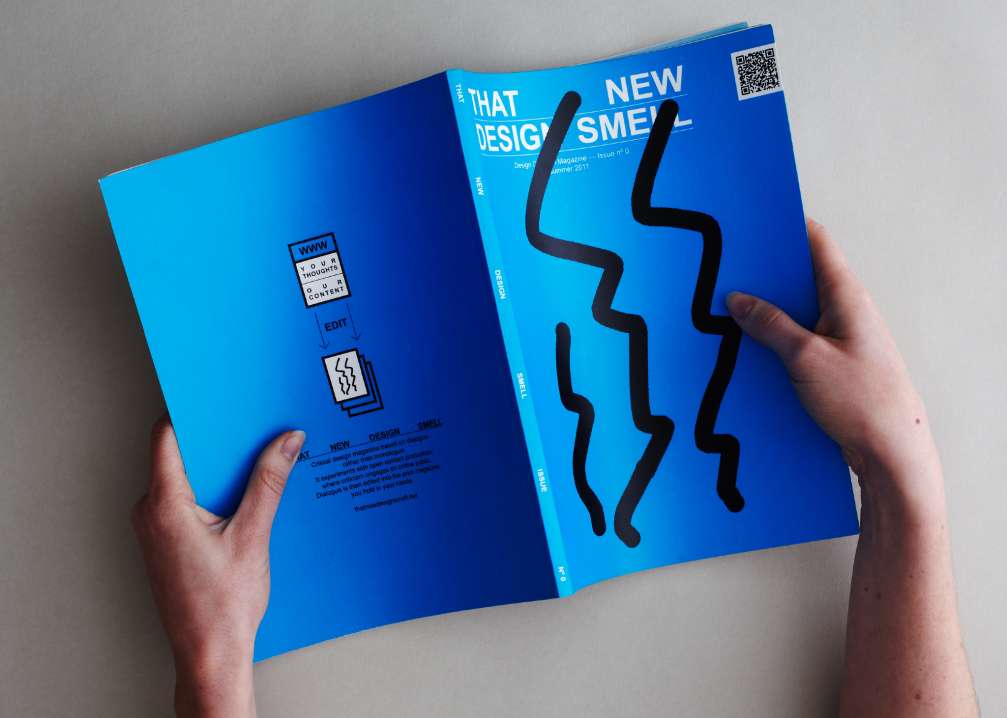
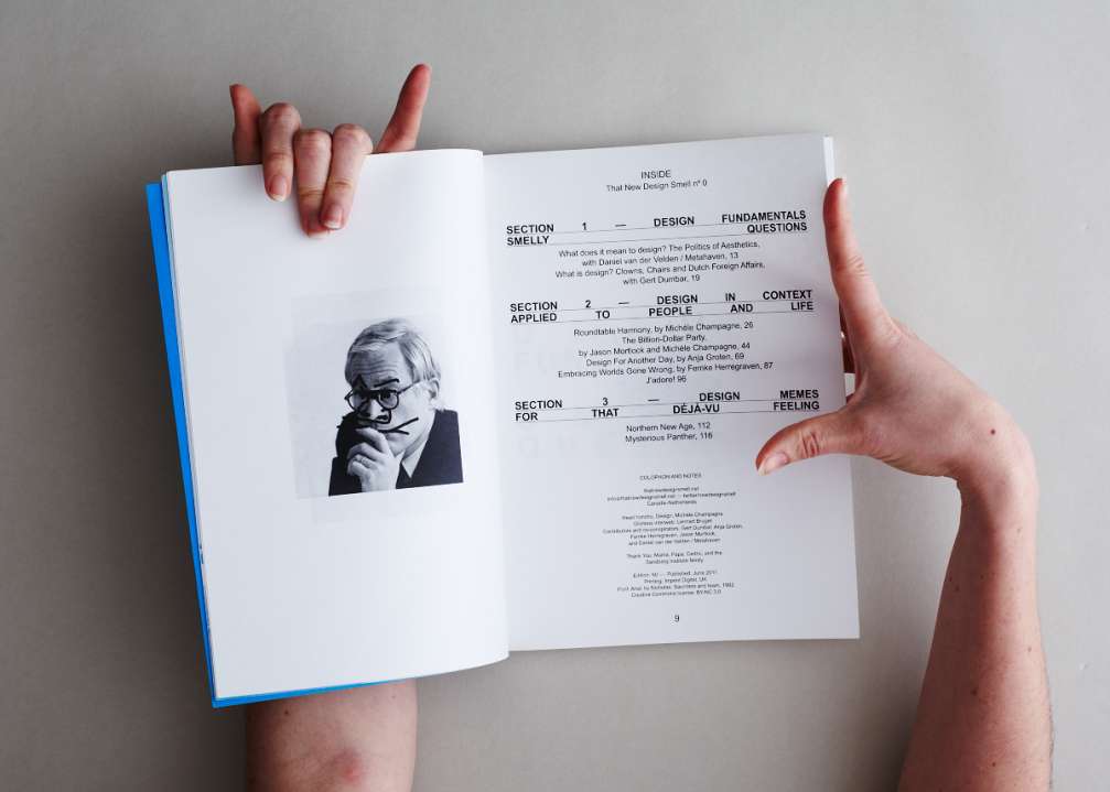
Michèle Champagne
The Canadian graphic designer and journalist Michèle Champagne works on open code projects. Printed media in her work is only a part of the whole. So, for example, at the basis of the magazine «That New Design Smell», which she publishes, is a blog of art criticism – an open forum and content created by readers and commentators. Dialogues are edited and then published in a beautiful magazine. Michele was speaking of «Mediamatic Travel» guidebook that was created by compiling most popular post on the website made by very different people from all over the world, where they described the best things and place in their home towns.
The talk is followed by a lunch break and a study of magazines found in a pop–up magazine stand located right in the hallway at the conference hall. There’s no need to go to the Munich’s famous book store «SODA books», because it has come to us itself with a selection of their best magazines.
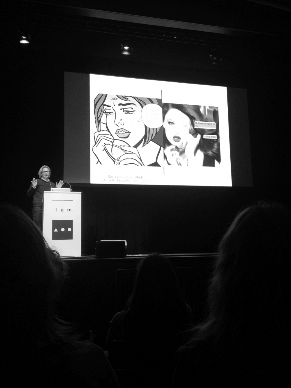
Discussion «Editorial Illustration»
Magazine illustrations are special — they complement articles and make the reader think. Or save a situation when the article can’t be completed with a good image.
The debate is joined by six well–known German illustrators. I nod in agreement to what André Rösler is saying: «A magazine’s art director is like a football coach and illustrators are players. Every situation needs to have the right player and it needs to be in the right place and task on a pitch.»
The illustrator Tina Berning shows a funny situation from her career when she accidentally submitted to «The New York Times Magazine» a photo of Pope Benedict with six fingers.
Mike Meiré
Mike Meiré has spent more than 20 years working in magazines. He shows his portfolio in which works balance on the border between shock and chic; amongst them are the art and culture magazine «032c» with a bright red cover (the name comes from the Pantone colour code) and the Moscow art and fashion magazine «Garage». He seems to be especially dedicated to the latter.
The first issue of «Garage» came out in the end of 2011 during the New York fashion week. And for the first time in the history of fashion magazines on the cover there was a female private part, not some kind of sweet face. Before the first issue came out its chief editor Dasha Zhukova invited several artists (Richard Prince, Damien Hirst, Jeff Koons) to do special tattoo designs for the magazine. Then she looked for volunteers who would want them on their skin. Damien Hirst’s butterfly ended up on some 23–year–old Londoner’s body and then on the cover itself.
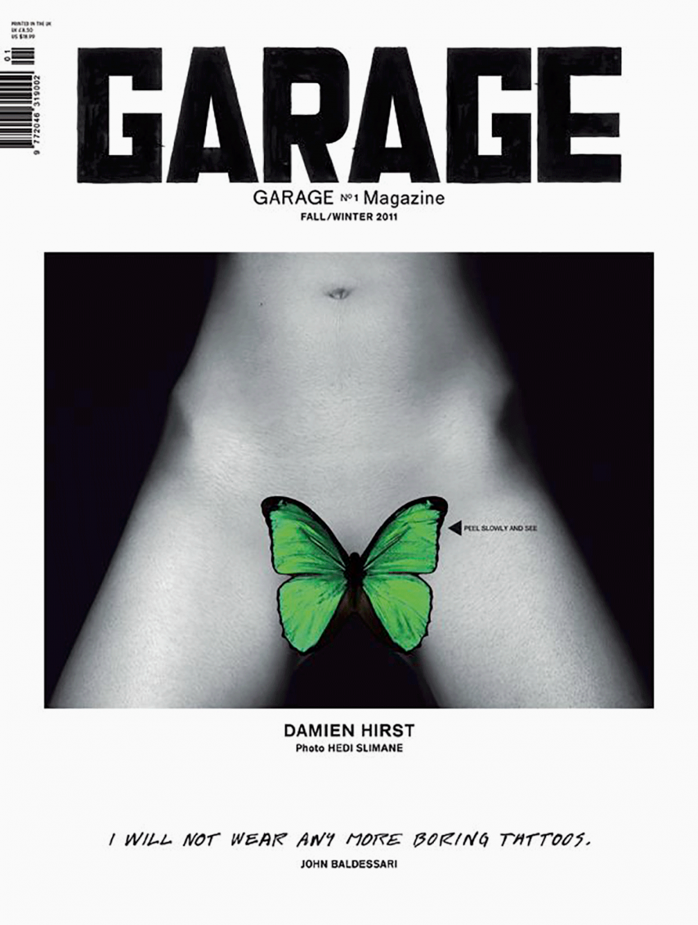
The magazine’s lawyer recommended a different picture for the cover to avoid prosecution due to such a daring photo, so in newsstands the picture was covered with a sticker. The solution was inspired by Andy Warhol’s album cover for «Velvet Underground» with the banana sticker.
To sum up Mike’s speech: «Whatever you produce, ask if it will last time. If it’s to last, use print. In not, do it digitally.»
Day 2
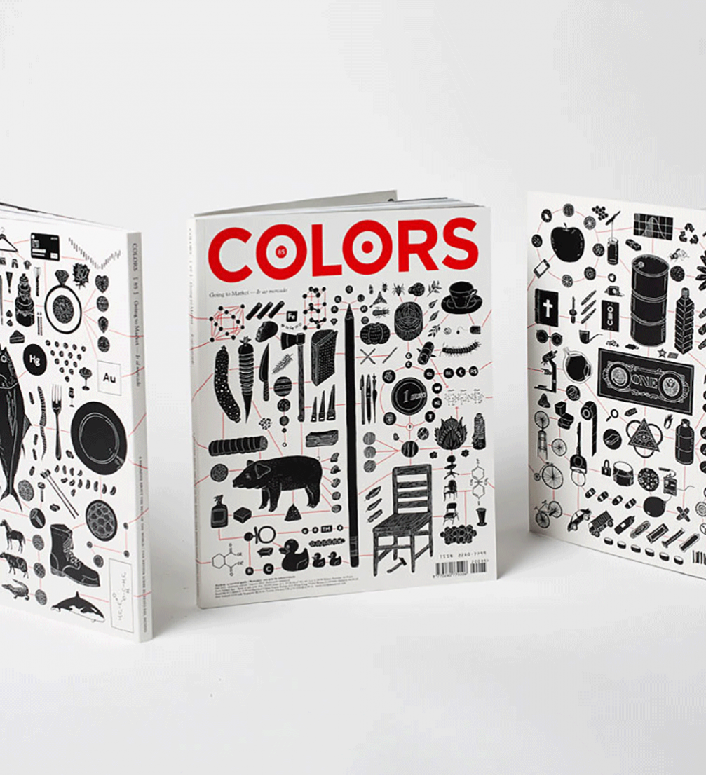
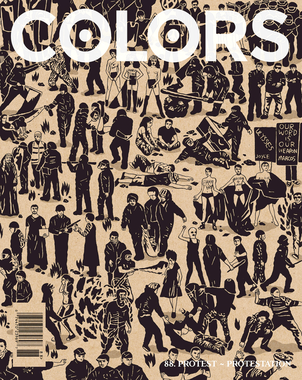
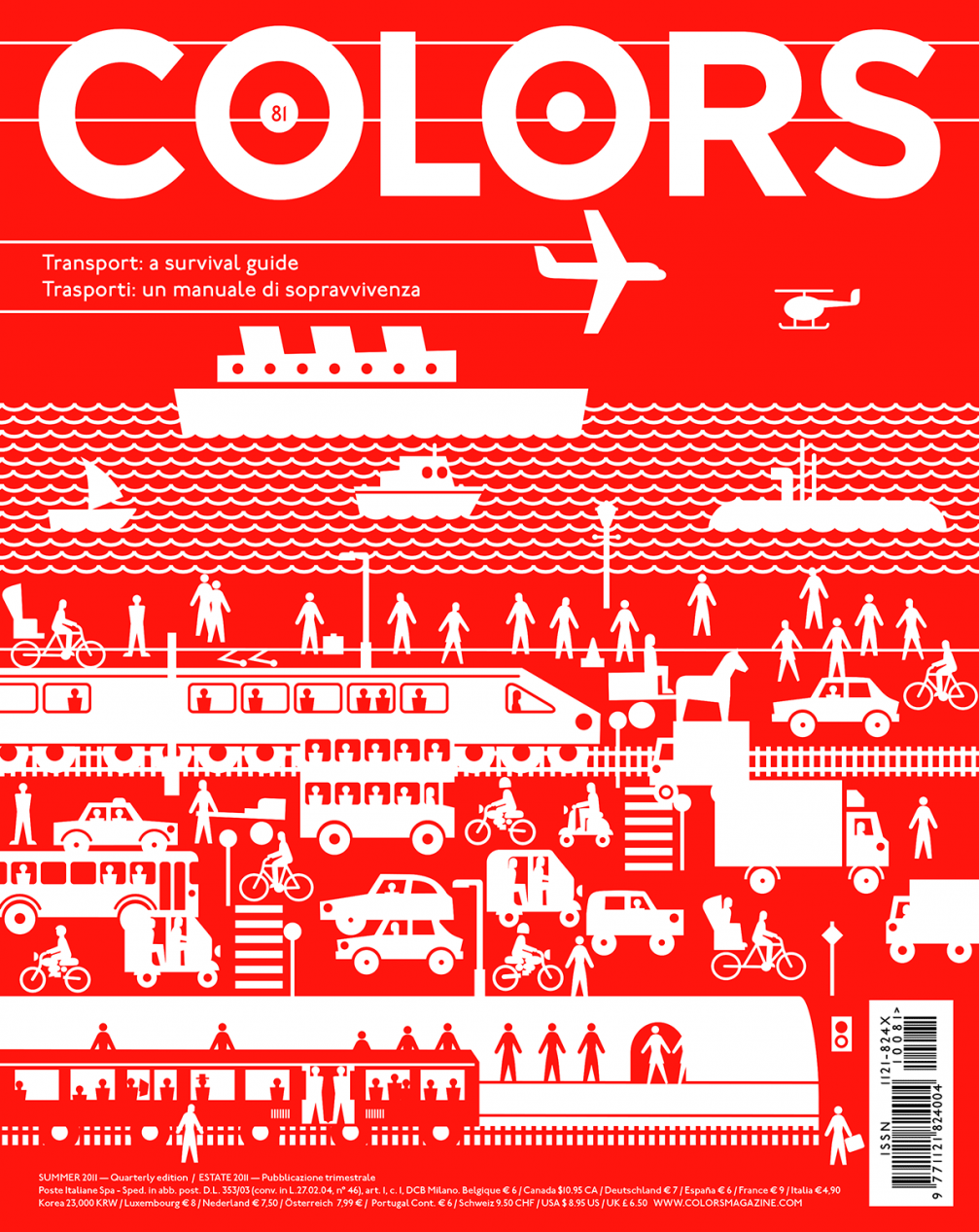
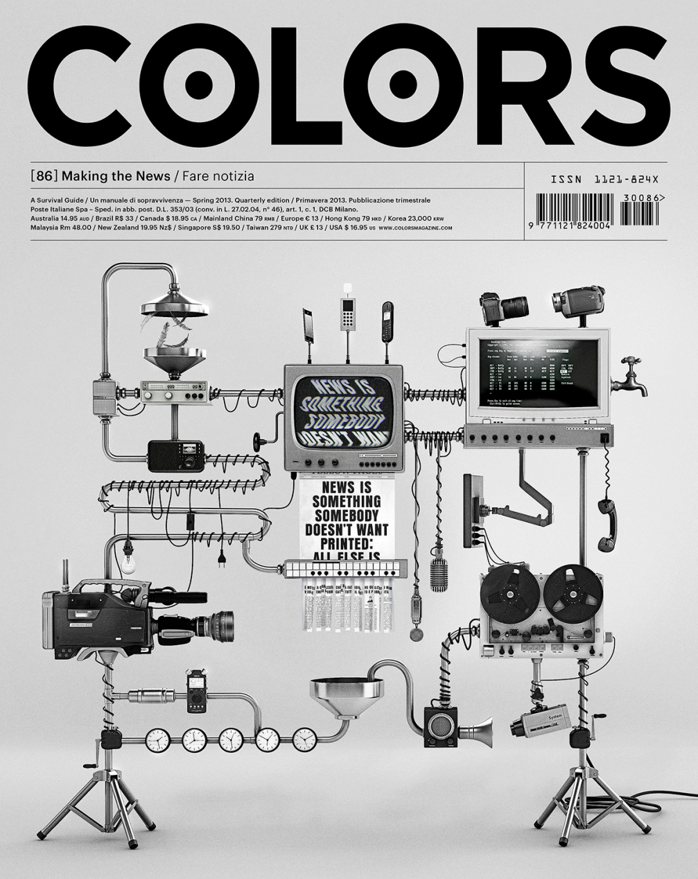
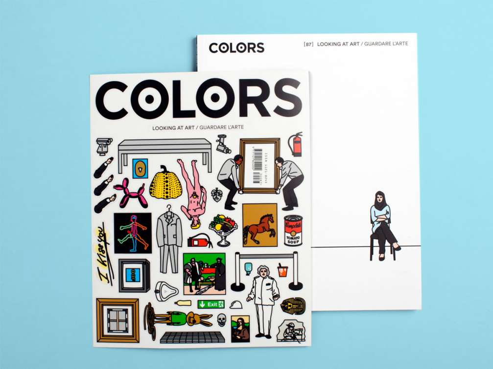
Patrick Waterhouse, «Colors»
After the breakfast coffee, cakes and chats with other participants of the conference, the second day is opened with a powerful presentation by «Colors» magazine editor–in–chief Patrick Waterhouse. Patrick talks about getting to where he is now and the everyday of «Colors» magazine. The main theme of the presentation is reporting. Making articles that shock and teach, make the reader think. Patrick highlights something that other speakers are going to talk about later as well — it is not enough to have just a magazine anymore, you should build a brand, a small world around it: exhibitions, workshops for like–minded people to meet. He repeats what we heard yesterday — everything you do, draw and write, needs to have a serious reason. There needs to be a reason for spending resources on printing something.
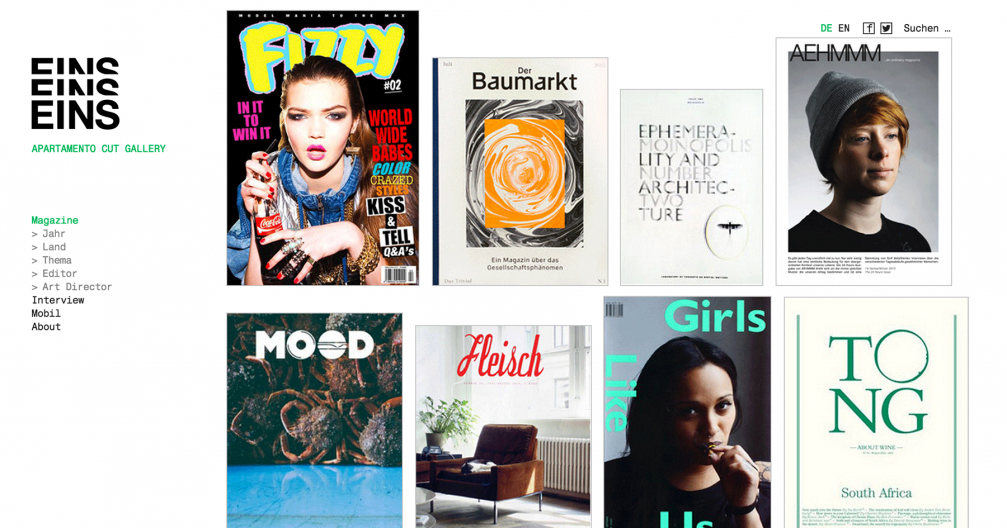
«Eins Eins Eins»
«Eins Eins Eins» is a blog made by three girls for magazine geeks with a really impressive stack of current and old magazines. Contents of the blog can be arranged by the year of issue, theme, country, editor’s or art director’s name. Authors of the blog get carried away looking for similarities in the content and design of recently published and historical magazines.
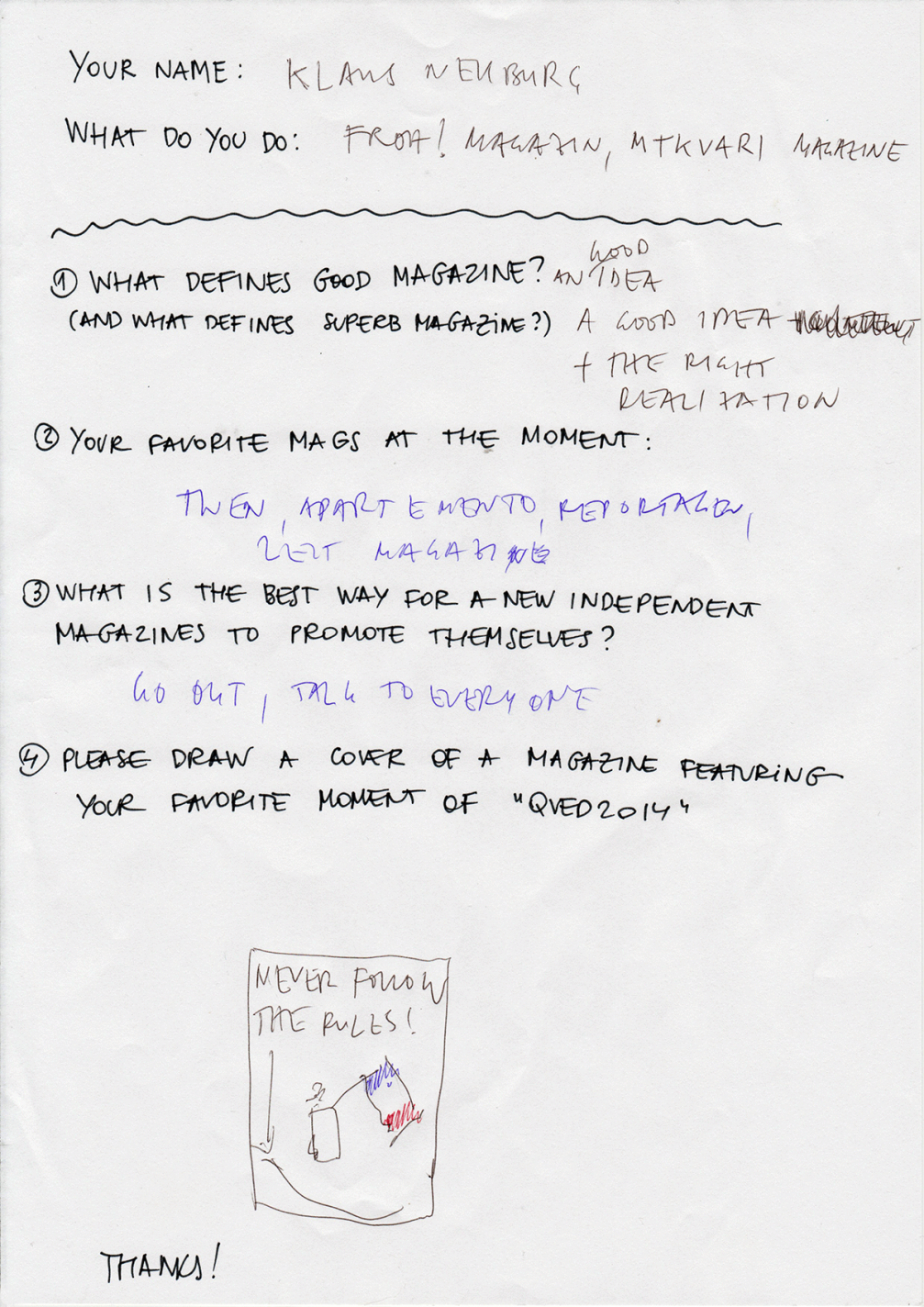
Klaus Neuburg & Sebastian Pranz
The very feminine speech is followed by two guys — publishers, designers — Klaus Neuburg and Sebastian Pranz with a story on publishing a magazine whilst being far away from home — on a journey.
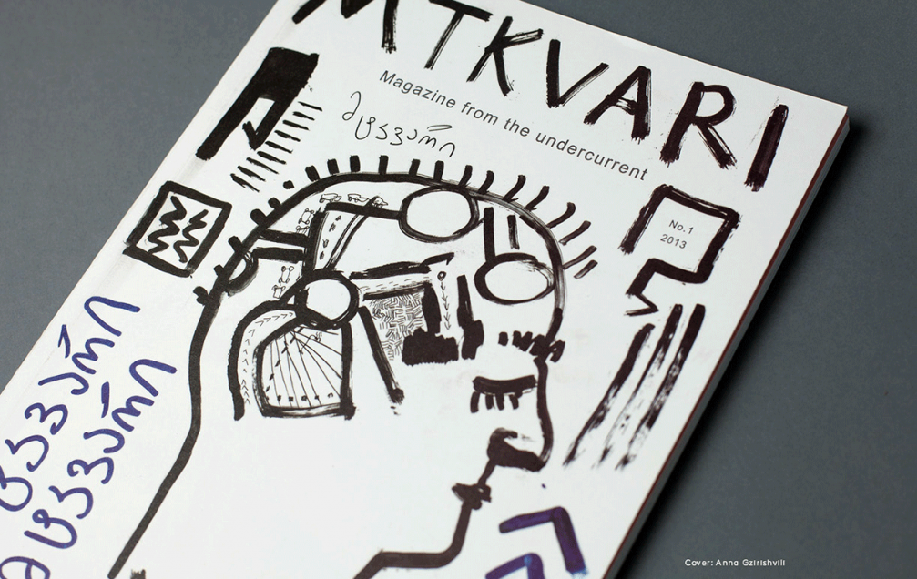
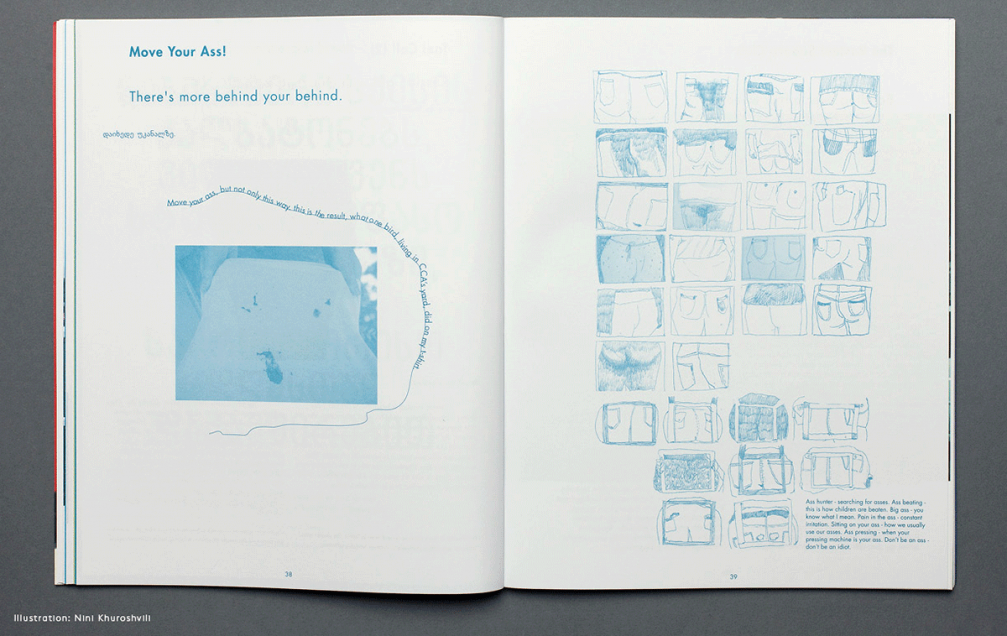
Last summer together with Goethe institute and a group of students they went to Georgia to spend two weeks making an independent magazine on Tbilisi — «Mtkvari». The content was created wandering around the city, following local residents and observing the surroundings. To get to know the city better, they took public transport to the end stop and then walked back on foot. They also chose a local printing–house for the magazine. A freshly printed, still wet pack of magazines was delivered to the opening party, that is why fingerprints can be found on some of the remaining copies.
Together they publish another independent magazine in German — «Froh!». I asked Klaus to fill in a small questionnaire.
Pekka Toivonen
The Finnish superstar Pekka Toivonen hates all colours (except black and red), makes music and goes fishing. Together with friends he has created an independent art and lifestyle magazine «FAT» (Finnish Art Today). Pekka shows short behind–the–scene video pieces of making of the magazine, and I can see that it is for real. The Finns are making something that they would like to read themselves without bothering about what would sell better.
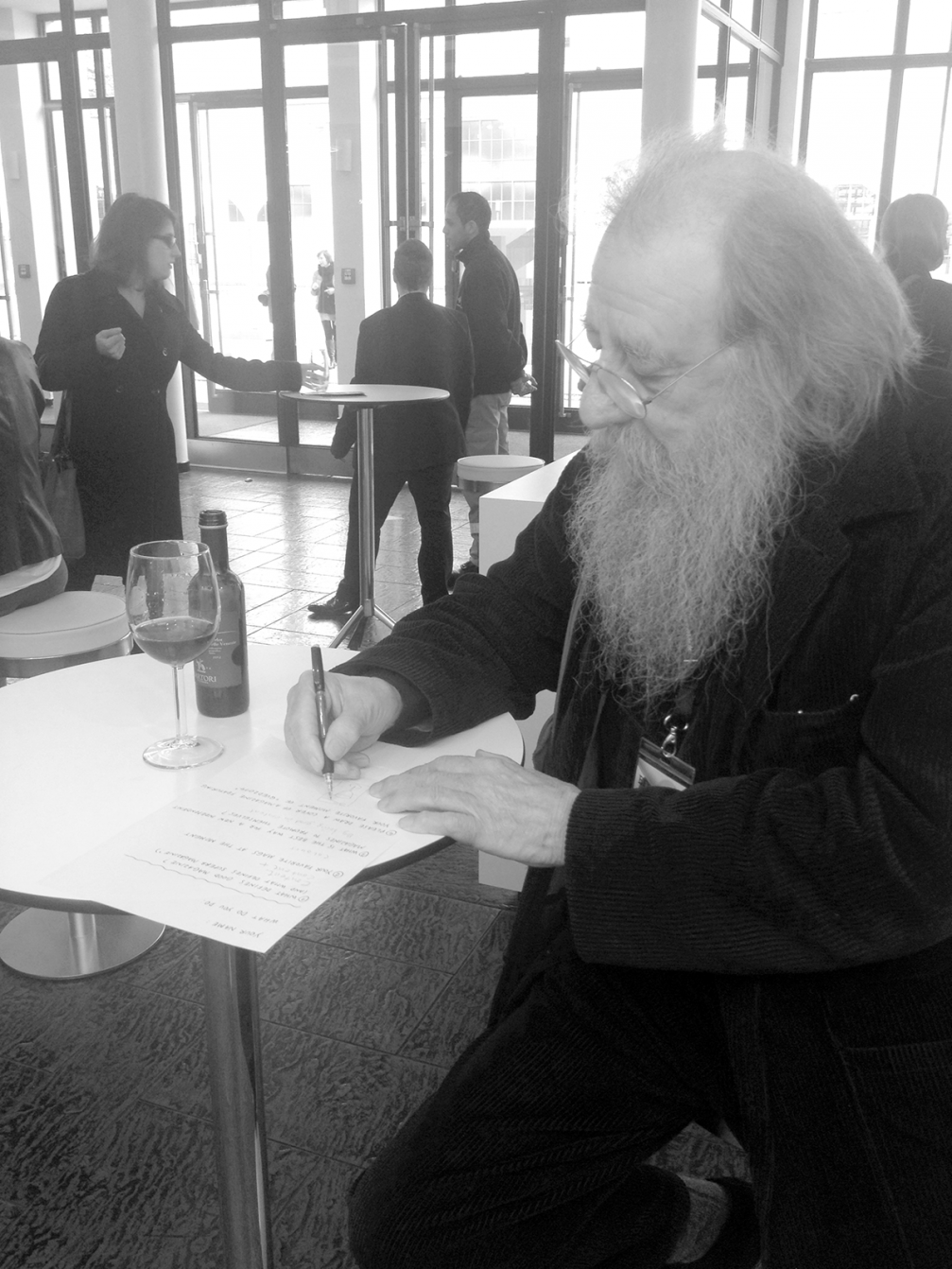
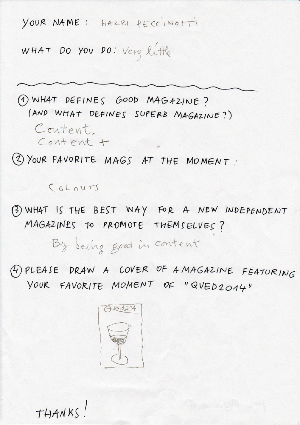
Harri Peccinotti
After the lunch break follows the long awaited talk by the legendary photographer and art director Harri Peccinotti. Harri talks an hour longer that he is supposed to, but no one minds, as listening to his stories are delightful to listen to.
He began his career in 1950s as an ad photographer and switched to making magazines in 1960s — as many other designers that were tired of advertising. Peccinotti’s name was written in history thanks to «Nova» magazine. That is where he laid foundations for the design of fashion magazines today.
The first issue of «Nova» came out in London in 1965. At a time when all the other women’s magazines wrote about how to knit a sock or clean a baby’s bottom, «Nova» was an experimental project to test if there’s a place in the market for a magazine that speaks to women intellectually, with beautiful photos — «a new kind of magazine for a new kind of woman».
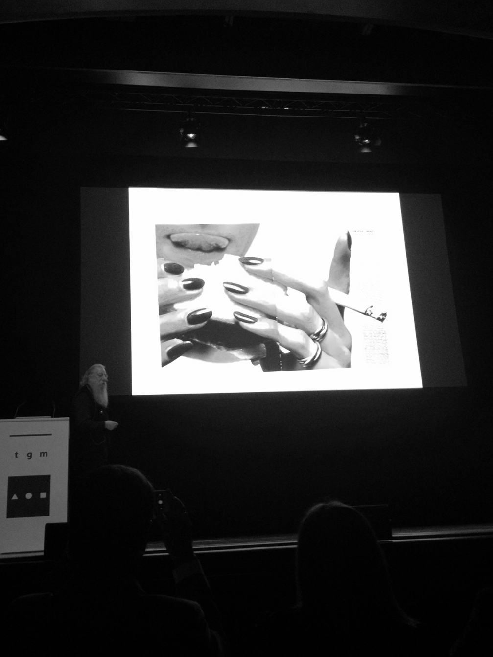
If previously there were only texts and perhaps a small illustrative portrait in the magazines, then Harri introduced fashion photography, close–ups, erotic pictures. And it turned out that women enjoy looking at other beautiful women. Harri was one of the first to photograph black models in his shoots. He also preferred girls that were different from the common standards of beauty.
In 1967 the team of «Pirelli» calendar invited Harri to work with them, and the 1968 calendar featured the first ever nipple — one for all 12 months, because the rest of the nudity got covered up. His work has been published in such magazines as «Rolling Stone», «Vogue», «Vanity fair», «Elle», «Marie Claire», «L’Officiel» and many others. Peccinotti continues to work on magazines and commercial shoots even now, when he’s almost 80 years old.
Unlike others, Harri picks a pencil for filling in my questionnaire. After finding out where I come from he says that there are beautiful girls in the Baltics. He often works with Estonian models.

Viedokļi