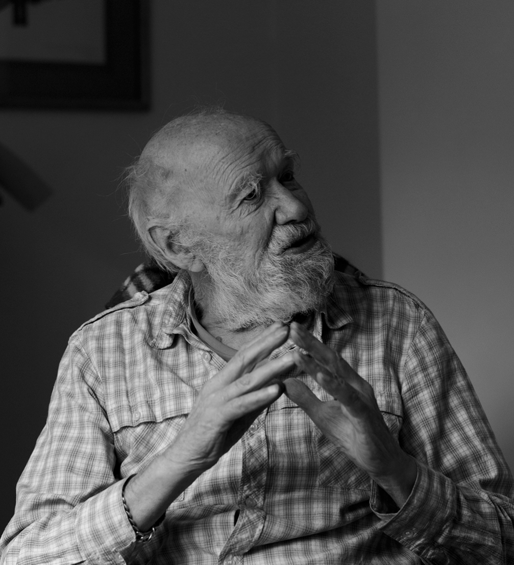
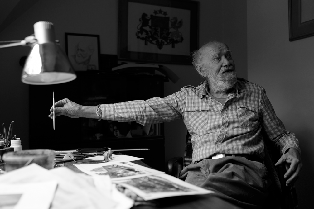
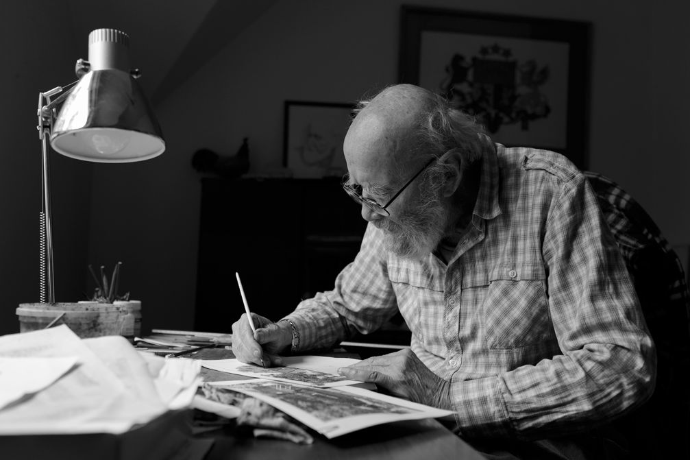
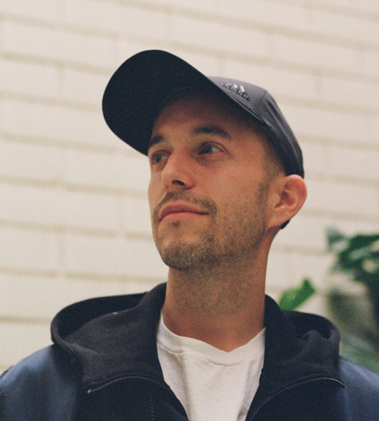
Imants Ozoliņš (1930) is one of the greatest masters of Latvian applied graphic art with an experience of more than 40 years. He has created works for factories «Uzvara», «Laima», «Dzintars», made labels for companies «Latvijas Balzams», «Aldaris», but in the 1990s worked with newly founded firms to create what we now call a corporate identity. All the graphic works are currently carefully stored in the master’s workshop in Jūrmala — in the« safe haven». Since technologies have taken over graphic design, the artist dedicates his time to his true love — Ex Libris and visual travel notes.
How did your life as a graphic artist begin?
Although I’m from Riga, I spent my childhood in Kurzeme where my father was a pastor at the Īvande and Ēdole parishes. When I was in primary school, my elder brother was already at Kuldīga Gymnasium; he was a good draughtsman. I always used to sit for him as a model, so I thought — if he is so good at it, why can’t I be?
After the war there was nothing else to do, so my brother and I came to Riga and spent six months learning the trade of car mechanics. I was responsible for drawing wall information bulletins. I remember one of the bulletins, the one dedicated to the Lenin days, came first at some competition. And so, thanks to that Lenin picture, I was transferred to the School of Architecture, Art and Crafts, which was located across the street from the circus. But first I had to take an exam. I remember the architect Edgars Slavietis telling us to draw the mask of Michelangelo’s David. I did, and he exclaimed: «Wow, my goodness! Well, you can as well complete the course right there!»
The school had very good teachers: Slavietis, Eduards Kalniņš. I studied at the department of decorative arts, and the pencil has been in my hand ever since.
Did you begin with portraits?
Yes, portraits were important to me since I was young. When I was enlisted in the Soviet army, I was lucky to get a job as a «hudozhnik» (artist) at the Officers’ House. There were some twenty candidates for the job, but in order to get it, one had to draw a portrait. To be fair, not everyone is cut out for the job, a portrait needs an effort. So there was this task and I got the job. There was a lot of work; I also did film posters. It was a regional officers’ house, and I had the chance to meet many actors of the day who often used to play there.
When did you start with packaging design?
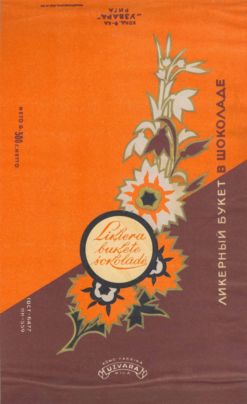
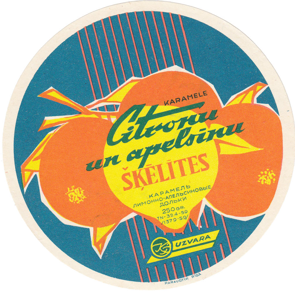
When I came back from the military service, I started working for «Uzvara» factory as a designer. I drew posters and slogans. One day I was summoned by the manager who asked me if I can draw a design for a box of chocolates. I hadn’t done anything like that before, but I made four boxes, and a committee in Moscow accepted them. This was a new territory — wrappers, packaging —, and it was all for «Uzvara», including the logo.
My first packaging design was for chocolates with liquor; I was really anxious to see it printed, I even framed it afterwards. I was really pleased to see my work appear all across Latvia, Russia, Moldova, etc. I took part in the Union’s confectionery design exhibition in Moscow. In 1956, four of my works went to the World Confectionary Expo in Brussels.
What was the everyday of the designer back then in terms of ordering, coordination?
In the Soviet times, all labelling, including tins of fish, sweets, tomatoes or cucumbers, — it all had to be approved by the Art Council at the Chamber of Commerce and Industry. But there’s no denying they were competent and objective; Aleksandrs Zviedris, Uga Skulme, etc. If you failed three times, the job went to another artist.
They had their own freelance artists. Once, when I brought them another box design, Skulme noticed me and asked where I worked. I said at «Uzvara». He asked me why I wasn’t already working for them. There was a certain comrade named Lucs, a former electrician, and he was a terrible «art critic» who didn’t like the fact I hadn’t studied at the Academy of Art. Skulme said to him, «So what? But he has the skills; he can finish the Academy any time he wants.» And so I became a freelancer for the Chamber. I was a free man — I would get a task, go home to work and then take it to the Arts Council to be approved.
But you did go to the Academy after all…
I completed a four–year evening course, but at the time I was already a member of the Artists’ Union. The first teacher I met at the Academy was my good acquaintance Indulis Zariņš. He asked, «What brings you here?» And I said, «I’ll be learning how to draw,» to which he replied: «You should be teaching, not learning!» But the diploma had its weight. I was allowed to sketch models instead of doing regular tasks, and it was a good experience.
What was the best advice you got there?
In the art school, Edgars Slavietis was our authority. He was a good draughtsman and never hesitated to give an advice. Once, he came into the workshop and said, «Ozoliņš, in my office!» I thought, «Damn, what have I done this time?» Slavietis offered me a cigarette, but I said I didn’t smoke. «You see! You already have one good feature! Do you have your sketchbook with you?» I said I didn’t. He gave me a book and a pencil and said, «Don’t walk the streets like a blind man. Look up and see the beauty! Sketch down what you see and then show me.» So I did — I drew the beautiful sculptures at the Grand Cemetery, lions and tigers at the zoo, weird characters on a tram…
In applied graphics, you’ve done a broad range of works, like labels and packaging design. Which work do you see as the most important among all that?
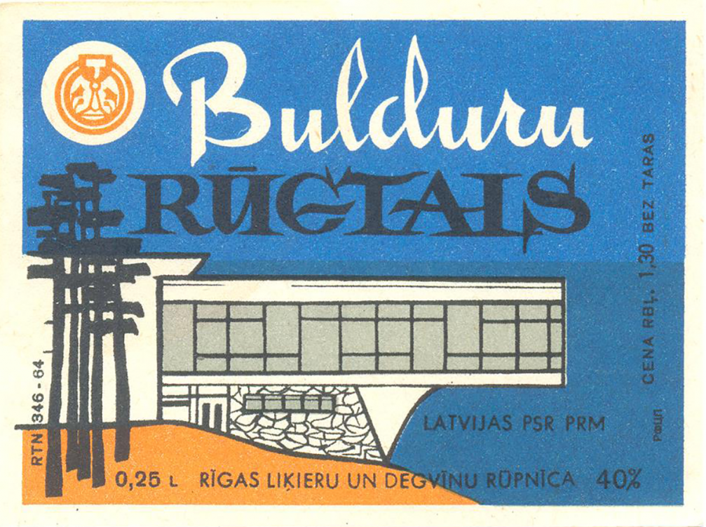
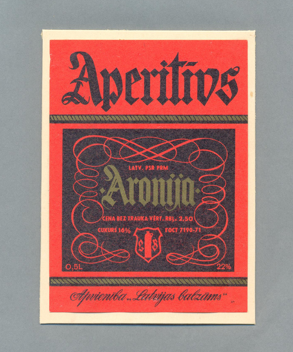
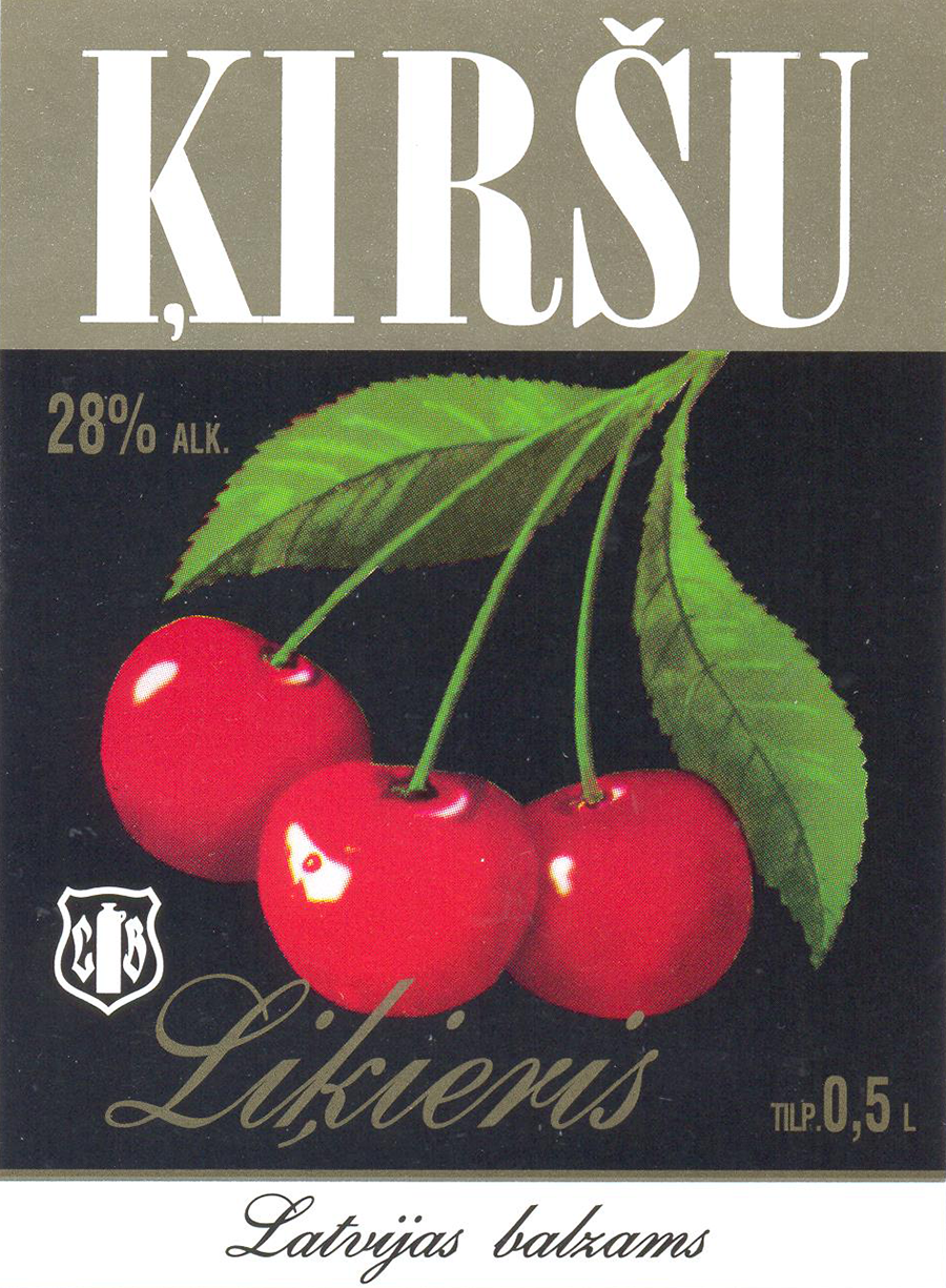
With time, I had my own niche. The entire beverage design — liquors, lemonades, beers. «Latvijas Balzams» was mine, and no one could compete with me however hard they tried. At least I managed to save the Balsam’s logo; I didn’t let anyone spoil it; it’s now the way it always was. Not that long ago I took my friends from Lithuania to Jūrmala, and we saw the «Latvijas Balzams» trademark on a shop’s sign. They said, «See, they’re exhibiting you again!»
Have you tasted every product you made labels for?
How can you draw a label if you haven’t tried what’s in the bottle? It wasn’t difficult for me to get all those beverages, unlike for other people at the time.
There was this Union boxing champion Jānis Lancers whom I knew personally. He asked for a pass to get into the warehouses, but, of course, he didn’t get one. I took him there, and he didn’t come out for three days! At parties, you had to bring your own booze, but everyone would drink themselves unconscious; no one could really handle it properly.
What is your technique?
I still work only with a brush and gouache paint. Also, my black and white graphic works don’t have a trace of ink or a pen, and no one believes me. The little pen wouldn’t do for labels, so it came to stay like that. I have tried various brushes, including Dutch and French. They are beautiful; you could keep them in a vase. But if they are worth only for their prettiness, it makes no sense! The best are the simplest Russian brushes with a sharp end and a wooden shaft. And the gouache paint from Saint Petersburg.
All labels had to be made by hand, 1:1, including the description and the price. Before the war, Artūrs Duburs used to draw them. I asked him, «Master, how do you do those tiny letters?» He said, «Son, you want to draw labels? I’ll tell you – to draw labels one has to have balls!» Sometime later we met at an exhibition and he admitted, «It turns out you do have balls!»
Your logos and labels stand out for their calligraphic qualities. How important is it to be able to draw by hand?
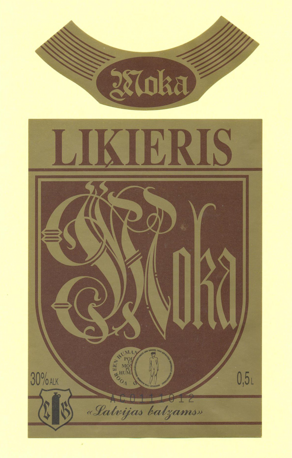
I feel sorry when I see modern packaging design — everything’s made on a computer. I accept it only as an aid. Sometimes I see my label has been remade in three versions; for example, «Moka». They just changed the background and some insignificant details. I had students from the Academy over; I invited them into the studio to draw a little, but they said, no, we don’t have our computers with us. What do you have the hands and the head for, then?
But I did have to learn the fonts; just get it done. There was this book, «300 Types of Letters» whose author Villu Toots I got to know while in Estonia. You see, there was no one to learn from; I had to study what others have done, what their forms were. Excuse me, but all these skills — they’re not from the Academy. You have to practise a lot. A nervous person, who has no patience, will do badly. To be honest, I’ve never thrown anything away. I can calmly put everything into place.
Did the ideas for label design come from the commissioner, or were they your own?
The ideas were mine; I also didn’t do much sketching. I just smoked a cigarette, had it all in my head, and just did it. Sometimes they gave me a theme to follow. Once, I had to do an urgent job — a design for a box of sweets for children. It was often the case with sweets because who else has a bigger sweet tooth if not children! I was in my studio where I also used to spend nights; I was asleep and saw a dream: a cat lies on a bed while a mouse is sweeping up the floor. So I drew what I saw in the dream. Mostly, the designs were mine; sometimes I would leaf through a children’s book. From the illustrators of the time I liked the most is Indriķis Zeberiņš, but I didn’t copy him.
What do you need to be able to work?
I turn on the radio; have music in the background and just work. Everything comes right there; I don’t wait for an inspiration. Complete silence depresses me, and the radio keeps me in touch with news. Sometimes dogs or cats come to my studio, and so the day passes. I work every day, stay with the routine. What’s the point of running around?
Several of your works are still alive and well. Do you get any financial benefit from that?
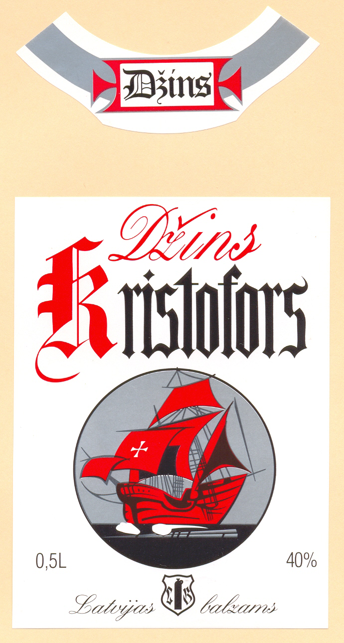
There was no copyright back then — your work was paid for a sum according to rates set in Moscow. You got 50 roubles for a label. If it had gold in it, then another 20% extra. The more you worked, the more you earned. There were competitions; for the first place you received 300 roubles. The last label I drew was for the gin «Kristofors»; it’s still on sale.
It was still during the Soviet times when Haralds Norītis, an artist from Australia, visited Latvia. He had his own advertising agency. We were introduced. He asked whether I had done trademarks and how much they paid me here. I said 120 roubles. He laughed and said, «Mr. Ozoliņš, don’t joke with me!» Norītis had just made a logo for some Canadian airline and was complaining about the short deadline of six months! We were used to getting a task one day, and it had to be ready for the next day. He never believed me. He asked why we sold our work so cheaply. But what other options? We didn’t want to starve to death.
They, however, were paid for both the work itself as well as a percentage from the print run as long as the label is on the market. One bottle brings nothing, but put them all together. If I had a chance to be on their side… oh, goodness!
How did the years of the National Awakening influence your work?
Every artist has his own signature, but we did follow world trends also during the Soviet times. We weren’t that much behind everyone. In the 1990s, there was a tendency to get rid of everything Soviet. On one hand, a logo shouldn’t be changed just like that; it must stay in people’s minds. On the other hand, there were new commissions coming in. It was the time of the first free commerce, and every firm needed its own design. The clients differed a lot.
I vividly remember one Russian client. I put five versions of the logo in front of him. He asked which I preferred myself. I said I didn’t work for the waste basket, but since he asked I pointed to one. The client wanted to know how much it cost. I said 120 roubles. 120? He had another price. I am not used to bargaining, so I just started putting away my work, but he stopped me, opened a drawer, and counted 400 roubles and another 50 for the «dinner». Is this enough, he asked. Well, of course! He had already got the taste of Europe and knew how much such work cost. In Latvia, there was no option: either you give it for the price offered or keep starving.

Is there something you know now you would’ve wanted to know at the beginning of your career?
I used to copy Sigismunds Vidbergs; then I liked Zeberiņš and Aleksandrs Krūka, who had drawn illustrations for an edition of Henryk Sienkiewicz’s writings. I redrew all the knights wishing to be able to work like him. When you copy something, you can learn the technique, analyse it through. After that, you’ve got your hands and your head — do it yourself. It’s silly to be stuck in someone else’s work. One must find his own signature. If there is hard work, it will come naturally; without hard work there is nothing. Everything is in your own hands.

Viedokļi