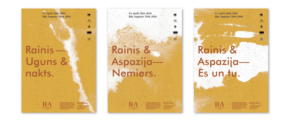
The design studio «H2E» has created a united graphic identity for all museums of Rainis and Aspazija. It is the first step in the process of designing new expositions and public spaces for three museums currently under renovation and restoration.
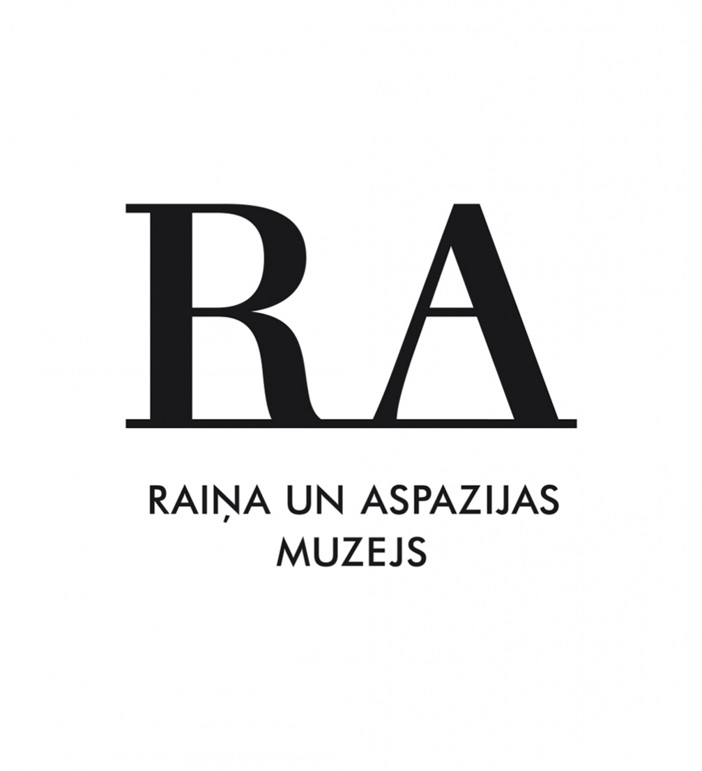
When «H2E» began working on the exposition of each museum, the first job was to define the basics — colours, typefaces, compositional principles. The visual identity is based on the initials of both poets — it is an easily perceived and recognised symbolic combination of letters.
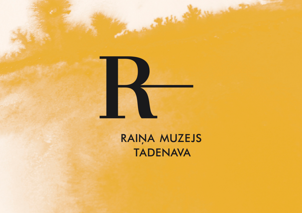
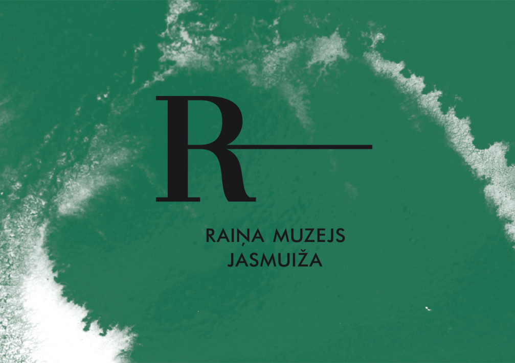
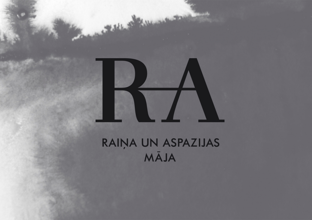
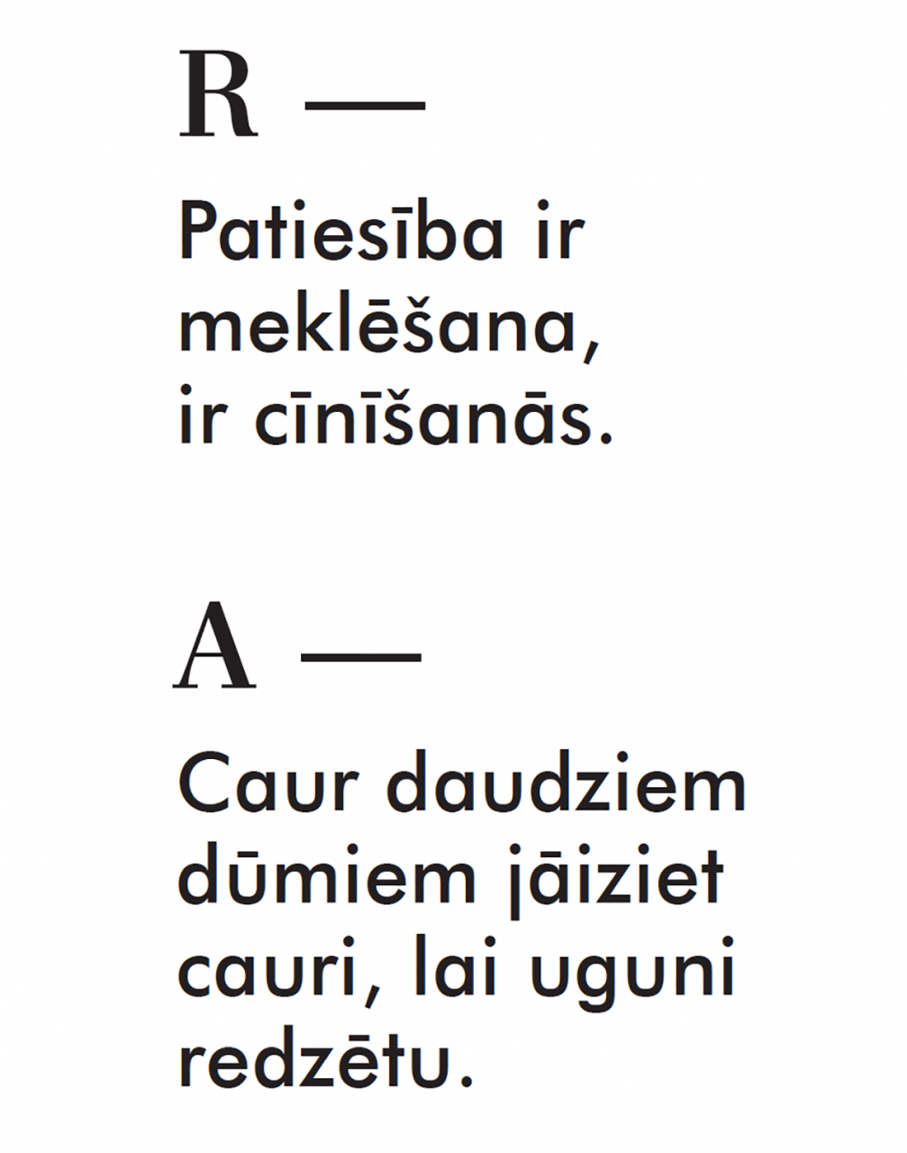
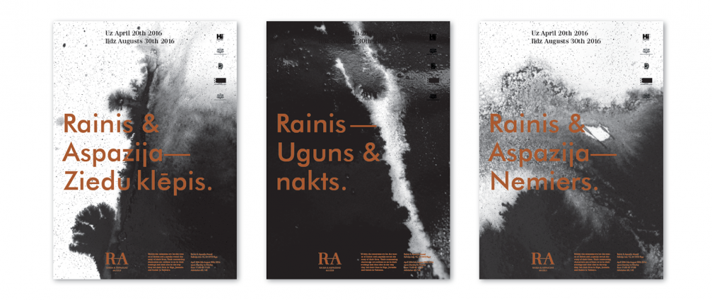
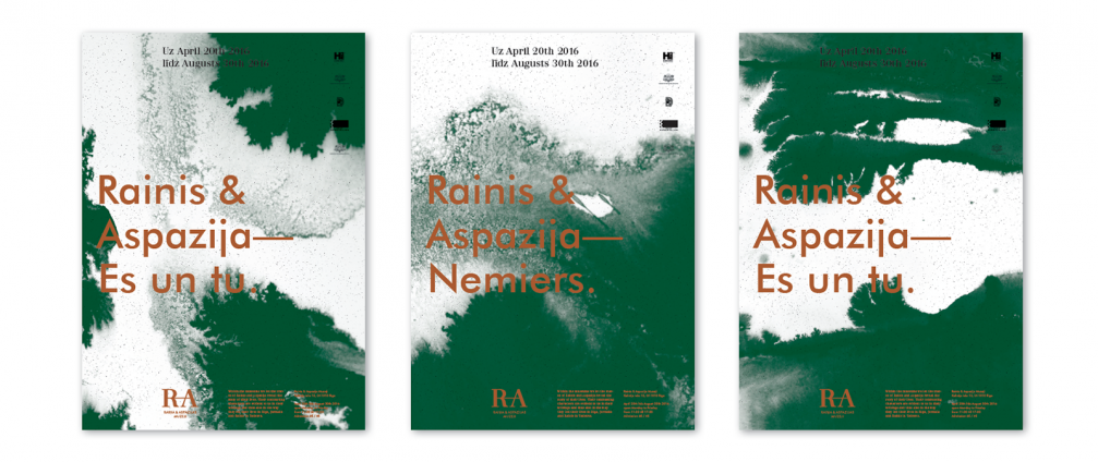
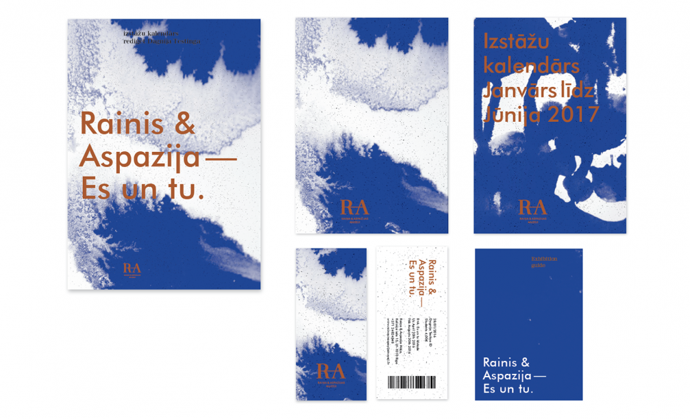
«Rainis and Aspazija had an unusually strong bond between them which cannot be depicted with an «and», & or + sign. For this reason we decided to give up any additional symbols and connected their initials with a simple line. The line first appears with Rainis. In Tadenava it is short, yet indicates a forward movement. In Jasmuiža Rainis spends his teenage years, and the line grows longer, preparing a place for Aspazija next to him. The line continues, Rainis meets Aspazija. One of the places where the poets spend their lives together, is their home on Baznīcas street in Riga. Rainis dies in their summer house in Majori, and the line is broken, but neither Rainis nor Aspazija have disappeared,» explains designer Ingūna Elere.

Choice of the typefaces is based on the different personalities and forms of expression of Rainis and Aspazija. Rainis was thoughtful, quiet and philosophical. Futura TL suits his clarity and rationality and works together well with Waldorf TL Pro, which is a static serif font with various small, expressive details, just as Aspazija’s emotional and metaphorical writings and her life together with Rainis.
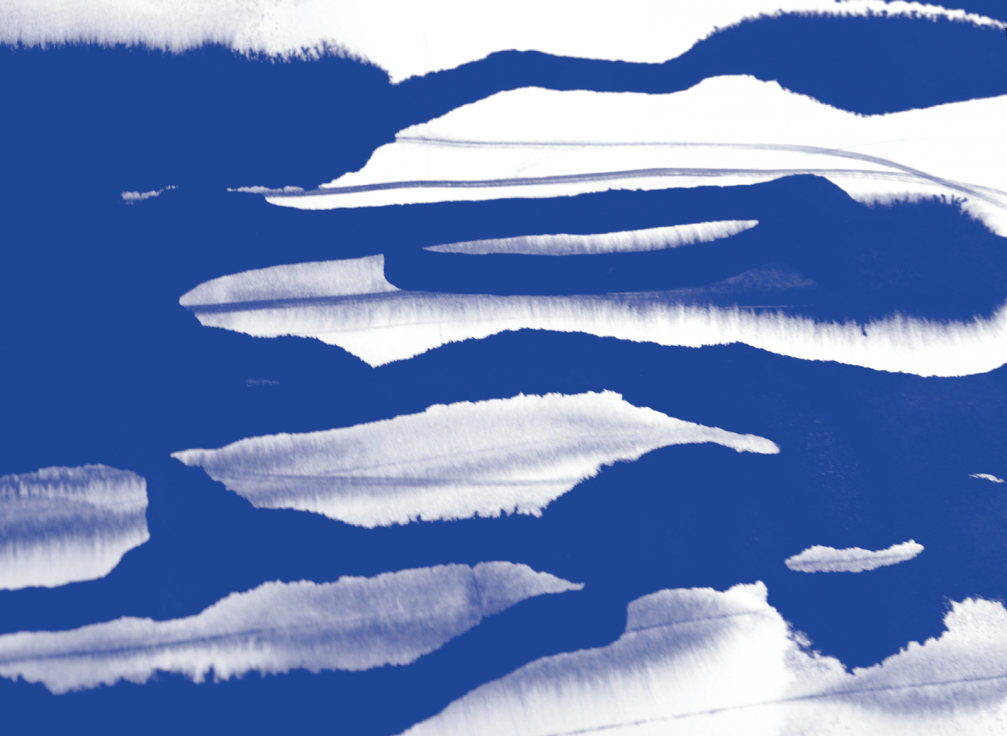
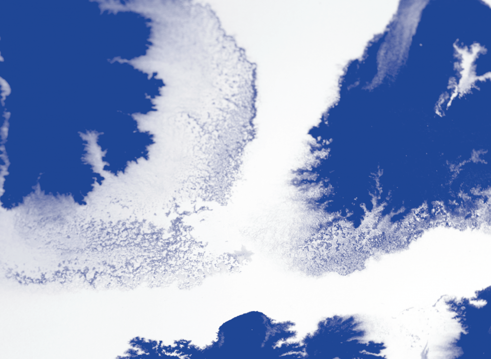
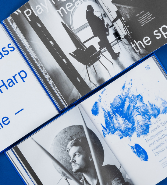
The identity of each museum features a specific colour, characteristic for its location. It is sunny yellow and evergreen for the childhood and adolescence places of Rainis, asphalt grey for the poets’ home in Riga, and deep blue for their summer house in Majori. These colours are used in ink and ash drawings which serve as backgrounds for all communication materials. Ashes represent the material heritage of Rainis and Aspazija, while ink stands for their intellectual legacy. The smart tones of copper and black are used for texts.

Viedokļi