Last year was the 90th anniversary year of Radio Latvia (Latvijas Radio, abbreviated as LR), and the public service network acquired an improved and organised visual identity, which was developed by studio «Asketic». This year, at the festival of creative excellence «Adwards» their work was awarded a gold medal. Both the commissioner and the authors look back with satisfaction on the successful cooperation.
Miķelis Baštiks, leading graphic designer of «Asketic», says that the new visual identity of LR cannot really be called a rebranding, as the aim was not to attempt to change the visual image completely, but rather to «refresh» and provide a unified system of graphic elements, «so that even ten years later the brand would still look decent.» He points out that the radio has always primarily been an audial medium, but today one also has to think about the brand outside of the FM waves — the content is also available online, radio personalities take part in various events, therefore it is important that the visual image, too, reflects the high quality requirements which have always been integral to the audio content. «We started thinking about Radio Latvia’s visual identity, almost for the first time in 90 years. In 1925, when the Radio was founded, and in the pre–war time there was no need for it, and during the Soviet years nobody really cared about it. The LR brand seemed to be out of date, but there was no real need for visual changes before a new website was made and the use of social networks became more wide–spread. A few years ago we created a new channel «pieci.lv» and realised that we are not so senile and that if we wish to go the multimedia way, we finally have to think about what we look like,» adds the marketing director of LR Andris Morkāns. He proudly admits that the initial idea of the LR visual identity development had not been as grand as it grew later on.
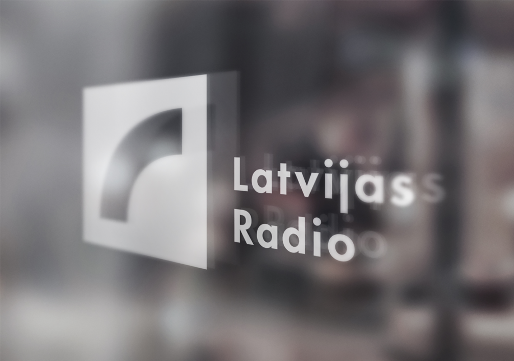
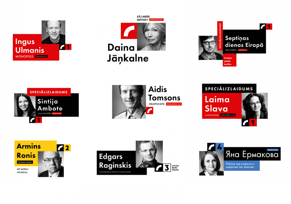
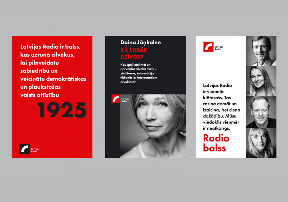
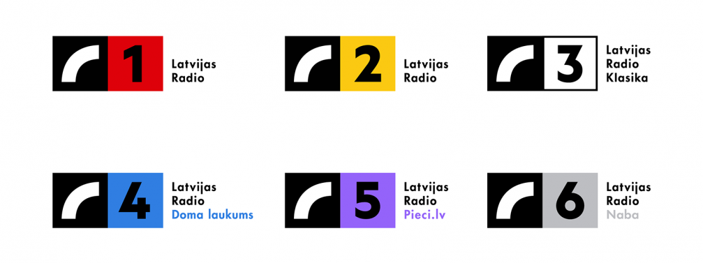
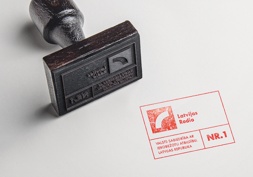
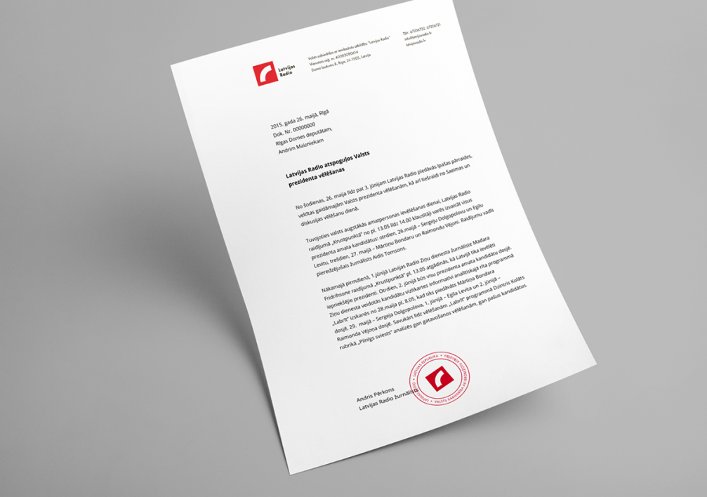
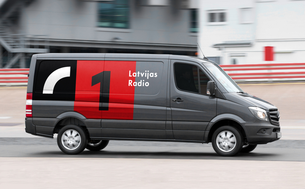
After winning the competition for the re–design of the visual identity for Radio Latvia, the designers at «Asketic» began several months of work on the brand strategy. Various materials were developed, including a system of logotypes for the six Latvia Radio channels and unifying graphic elements, LR and LR 90th Anniversary logos, templates for record keeping, communication, presentation materials, as well as the brand–book, which provides guidelines for the use of the visual identity. As an indirect benefit from the new identity Andris Morkāns mentions the signboard «Latvijas Radio», which decorates the facade of the building since last year, lighting up at night.
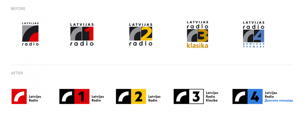
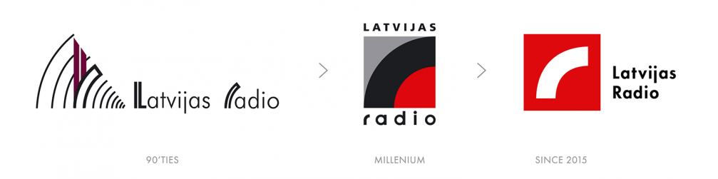
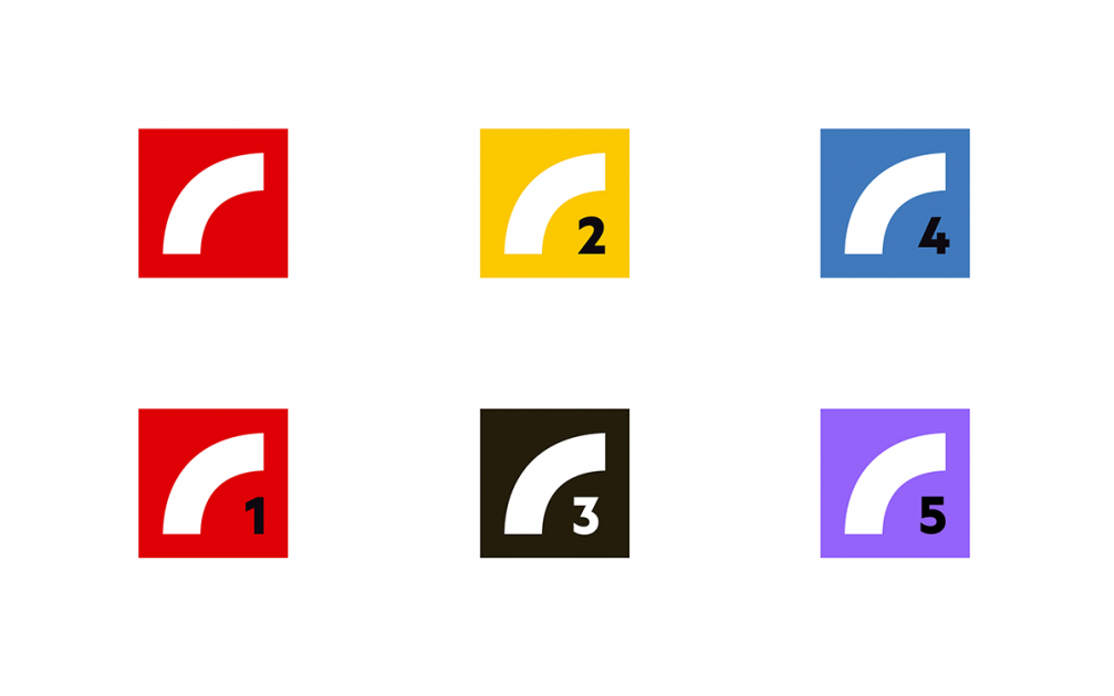
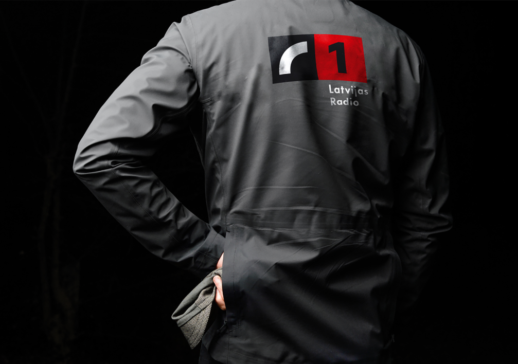
Since the 1990s, the main symbol of the LR logo is the radio waves, reduced to quite a laconic form by «Asketic». Generally, the characteristic colours of the channels have been kept, since the audience is already accustomed to them. «We discussed the change of channel colours, but, when working with such an established brand as LR, one has to be careful. Radio Latvia has strong traditions, well–known broadcasters, and colours create strong associations. It would be difficult to justify why the yellow of the most popular Latvian Radio channel LR2 should be replaced with, let’s say, red as in the flag, no one would understand this. Our main task was to improve the existing visual language. Besides, the transition had to proceed in such a way that people wouldn’t start sorting into the «old» and «new», thus the change of LR visual identity was not especially announced,» explains Miķelis Baštiks. He adds that the golden LR Classics logo is to be used only in fine print works, otherwise the black and white version is for the digital environment and everyday use.
When asked about how the new visual identity has entered Radio Latvia’s everyday life, Andris Morkāns says that they have «lived» with it already for one and a half years — the transition is gradual, but permanent. The new logos are now used in printing new materials and also indoors after renovations. ««Asketic» has set the quality bar high, which means we can never make anything less good,» says Andris Morkāns. He admits that there is still plenty of work and that LR visual changes have inspired new ideas, for example, the visual image of different radio programmes and radio recording studios.

Viedokļi