Riga Technical University (RTU) has completed its first academic year with a new visual identity designed by studio «Teika». In spring, the work was selected as one of the finalists of the National Design Award of Latvia. Liene Gaspažiņa, director of design studio «Teika», told us more about the rebranding of the largest university in Latvia.
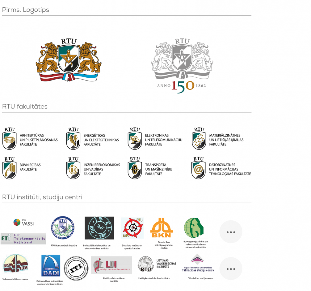
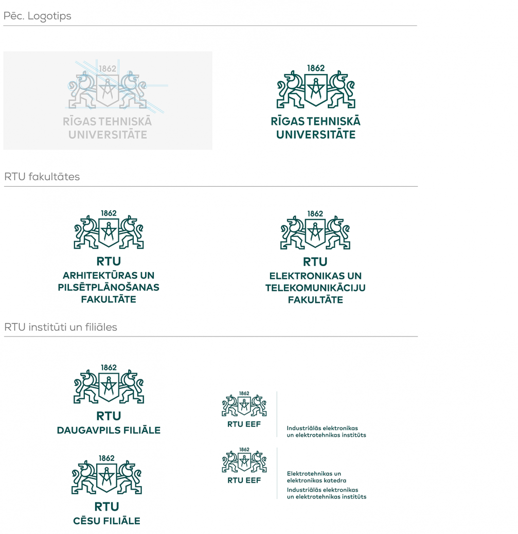
Developing a new visual identity is one of the steps towards RTU’s development goal — to become the leader of higher education and research in engineering sciences in the Baltic region. «In order to become an internationally competitive brand, the university’s graphic identity had to become visually strong and, above all, unified,» comments Liene Gaspažiņa, director of design studio «Teika». Initial work with focus groups involving both current and prospective students, teaching staff and entrepreneurs, allowed to find out that the university’s brand needs a modern form that could be associated with an innovative and creative approach to science and would talk to students in a relatable language, while respecting the established values and traditions of Latvia’s oldest university. «Our main task was not to change but to develop — to review the existing brand values, to preserve and highlight the important, to give up unnecessary elements that don’t add any value, and to find a suitable, strong and distinctive graphic style,» Liene continues. Under her leadership, a transition took place — from a fragmented system where each faculty had its own graphic identity to a unified brand that would strengthen RTU’s image and promote its visibility.
Logo
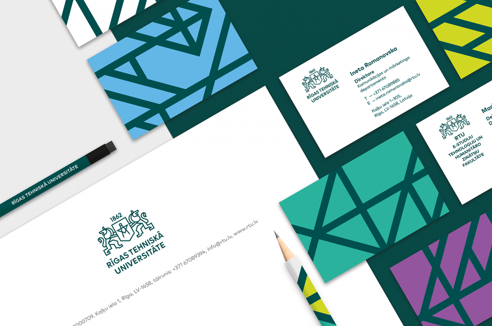
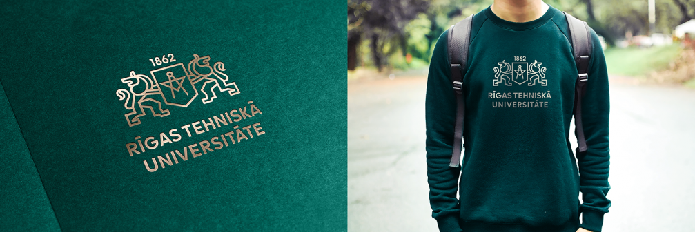
The modernised RTU graphic sign maintains the symbolism of the historical coat of arms. It is characterised by clean lines, mathematical accuracy and laconism, which reflects the essence of engineering. It has become monochrome and easier to use in both print and digital environment.
Typeface
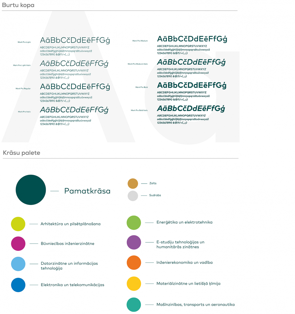
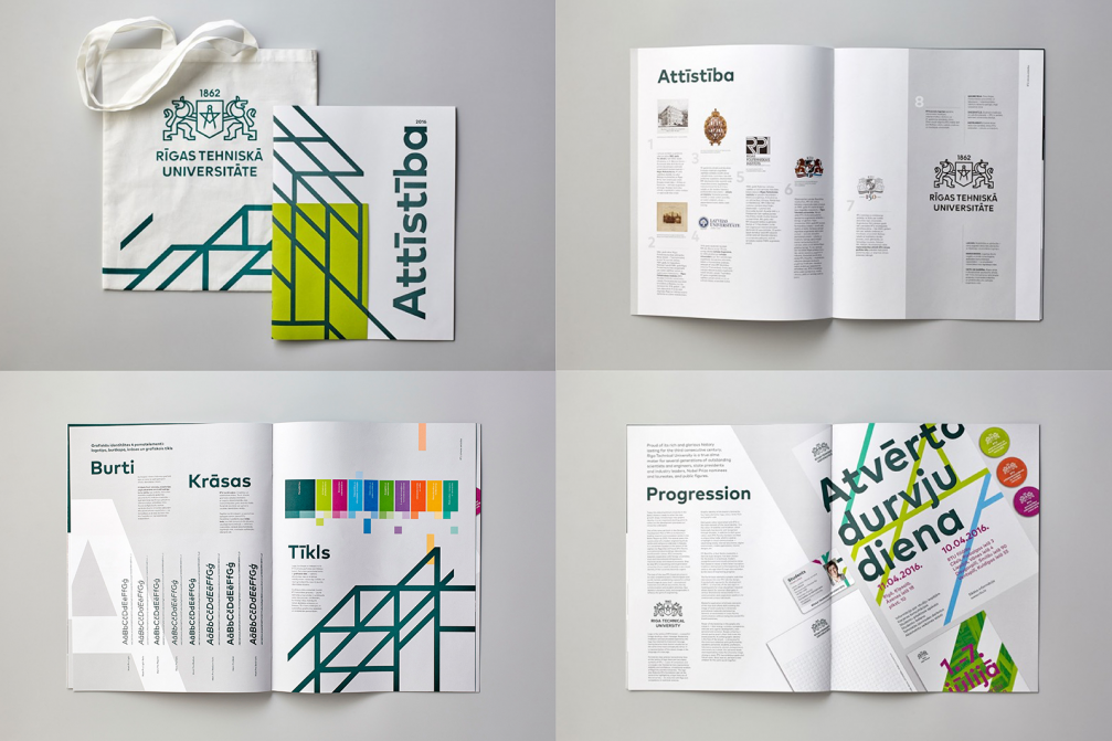
The primary typeface of RTU’s visual identity is «FF Mark Pro» — a technical, modern, readable and visually powerful font family, which builds on the previous century’s classic lettering traditions — the era when Europe was taken over by a wave of engineering development.
Colour palette
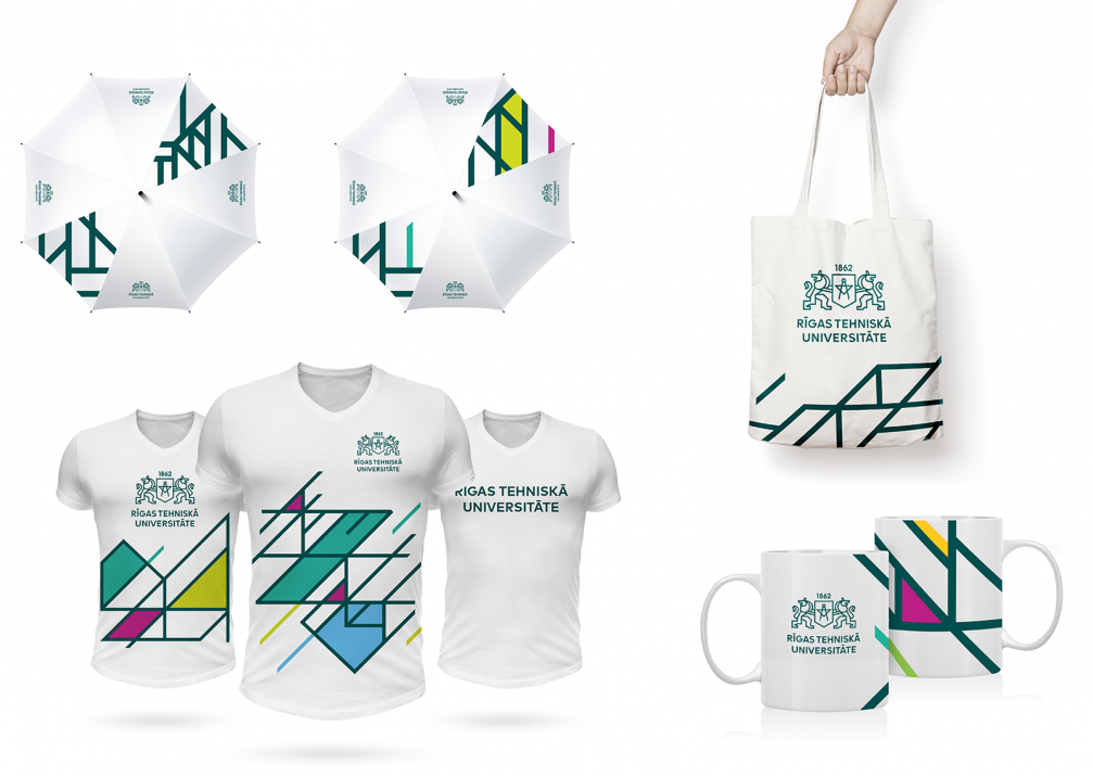
The deep green of RTU is a recognisable element of the university’s graphic language that has been established through decades. It is a colour of tradition and stability. In addition to that, each faculty is assigned its own colour code that, combined with the green keynote, is used as an accent in visual communication: advertising and representation materials, record keeping, division of departments, the digital environment, mobile applications, interior.
Grid
The fourth element of the visual identity is a graphic grid which adds a vivid and dynamic character to all RTU communication materials. The grid is variable both in form and colours, it represents a meeting place where the search for new ideas goes on in all directions and levels — by coming together of prospective and current students, experts, scholars and entrepreneurs.
FOLD:
— RTU is a large institution with a strict hierarchy. What was the work process with the client like, how were decisions taken?
Liene Gaspažiņa:
— In general, the work proceeded constructively. In the beginning we created a decision–making structure that allowed the project to push ahead relatively quickly. Projects of such scale can’t be developed in a democratic way within a realistic period of time, so the initial decisions were taken in a narrow opinion impact group that included the team of «Teika» design studio, head of RTU Marketing Department, the Rector, and invited employees in accordance with the theme of the presentation. However, the final choice was in the hands of the Senate, which meant a vote «for» or «against» changes. That was the most risky moment, since the work of one and a half years could be rejected. For this not to happen, it was important to listen to the recommendations of teachers and opinion leaders in the meetings, to implement the necessary changes, improvements. Our greatest satisfaction was the students’ support and desire for a modern look for their university.
FOLD:
— Were there any designs that the client rejected?
Liene:
— The process, of course, is not complete without compromises. We suggested to highlight RTU’s core competence — specialisation in engineering sciences — in the logo. We wanted to give more weight to the word «Technical». Regarding the faculties, our proposal was to drop the word «Faculty» from the names and keep only the name of the industry in nominative case. For example, instead of «Faculty of Construction and Engineering» there would be just «Construction and Engineering», thus kind of «privatising» the sector by the form and sound of the words.
FOLD:
— How was the new visual identity introduced to all the departments of RTU? Does «Teika» continue working with the university?
Liene:
— The identity is being independently introduced at all university levels, strengthening a unified image. In our opinion, the most successful way to fully implement the design without losing any visual qualities, is to work in close cooperation with the authors. But RTU is subject to procurement procedures, so the next period tender conditions already required advertising agency expertise, and we were not able to continue the cooperation.
A good graphic identity should be able to live without the author’s hand on its pulse. Knowing how active the RTU brand is, how it produces new marketing materials every day, it was clear that we need to create a dynamically applied graphic design structure, one that doesn’t restrict the client with countless «this is allowed, this isn’t allowed» rules. After completion, the project should allow the client to work independently. We developed a brand book as a set of tools that helps the RTU team in to introduce a unifying, recognisable handwriting in this never–ending process.
FOLD:
— What would you reply to those who have pointed out the similarities between the logo of RTU and the new visual identity of Gdańsk University of Technology?
Liene:
— The two universities share not only their profile and historical heritage, including historical graphic language, but also a common sense of time when the changes have been introduced. At the time when the logo of Gdańsk appeared in the public domain, the logotype family of RTU had already been developed and design of other visual identity materials was well under way. It is common practice to create logos that refer to historic coats of arms when the task is to develop and modernise, not to change radically. Design reveals itself in details, so it should be obvious for a professional that both logos differ in their visual language and graphic features.
Project team: Liene Gaspažiņa, Ieva Timoško, Verners Timoško, Aija Bigača, Šarlote Abiļēviča, Zane Poča, Santa Ēdolfa, Liene Kupča.
Viedokļi