
At the end of October, the new visual identity for Valmiera city was launched, created by brand design studio Overpriced. Since then, it has received both praise and critical remarks. Based on a slogan «Evergreen City», the new image of Valmiera aims to show the city as a progressive and appealing place both for its residents and guests.
The work on Valmiera brand began early this year and was carried out by the advertising agency McCann Riga and brand design studio Overpriced in collaboration with Valmiera municipality, residents of the city and other partners.
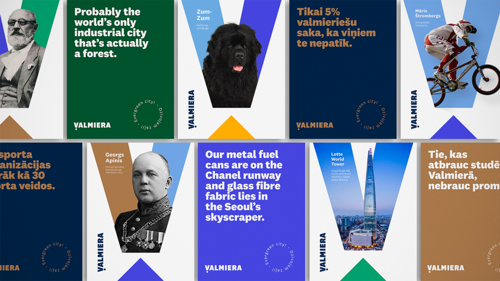
«The idea of the new identity is to represent Valmiera on the global stage. The identity has to encompass entrepreneurship, sport, social life, culture, as well as to address potential investors. The aim of the brand is to show all the values and activities of Valmiera in a very focused way,» says Evija Krištopane, representative of Overpriced. The core values of the city are wellbeing of the locals of Valmiera, enjoyment of life, and nature; they are part of all the above-mentioned facets of life. The new slogan, «Evergreen City» (in Latvian — «Dzīvojam zaļi!»), also points to these qualities and has served as the basis for the visual solution.
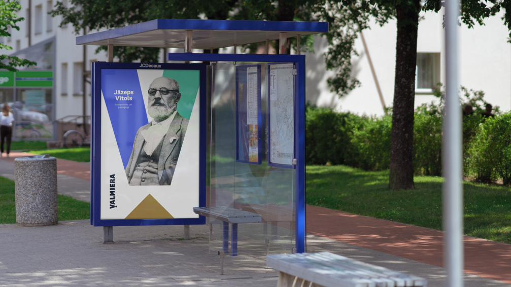
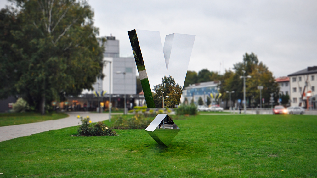
«The logo of Valmiera is ascetic and easily recognisable. It represents Valmiera as a safe, stable, ambitious, convincing, modern, and progressive city. The logo is based on a symbol — the Growth Medal of Valmiera. It carries the idea that everyone who has contributed to the development of Valmiera with their ideas, energy, and work deserves a growth medal, and can celebrate success together,» comments the Design Director of Overpriced Aigars Mamis.
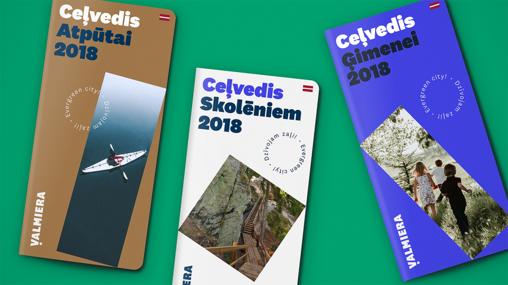
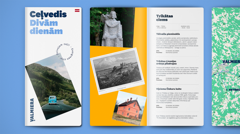
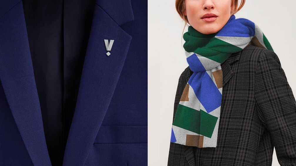
Primarily it is planned to use the full word «Valmiera» in the communication materials, but the symbol «V» with a diamond at the bottom or the Growth Medal can be used as separate elements, for example, in souvenirs. The designers have used the typeface National 2 for the logotype, describing it as «misleadingly simple with sophisticated details», while its bold forms convey the «confident and brave image of the city».


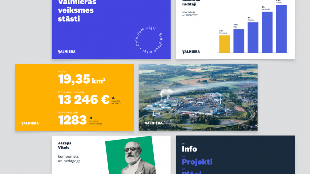
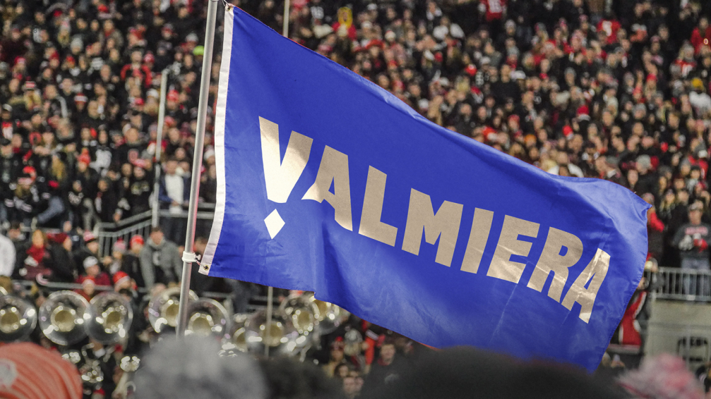
The authors of the visual identity of Valmiera have paid special attention to the colour palette. The logotype features the yellow and blue of Valmiera city flag, making them a bit brighter for fresher and more contemporary feel. In addition to different shades of blue and warm yellow, the designers use also gold, green and white. Each of the colours has its own meaning, based on the connection to the city.
The municipality of Valmiera informs that after the national holidays they plan to launch a communication campaign to introduce the new visual identity to broader society. Meanwhile, a detailed explanation by Overpriced and the brand book can be found here.


Viedokļi