Books on bookstore shelves can be split into two camps — one camp contains publications with chaotic, loud covers, and the other is a group of vivid, dignified publications that quietly fight for attention with design that delights the eyes, touch and mind. Alexey Murashko belongs to the second group. He is a graphic designer, and winner of Best Artist at the book art competition Zelta Ābele in 2017. His works reveal a courage to experiment, and an admirable attention to seeming details.
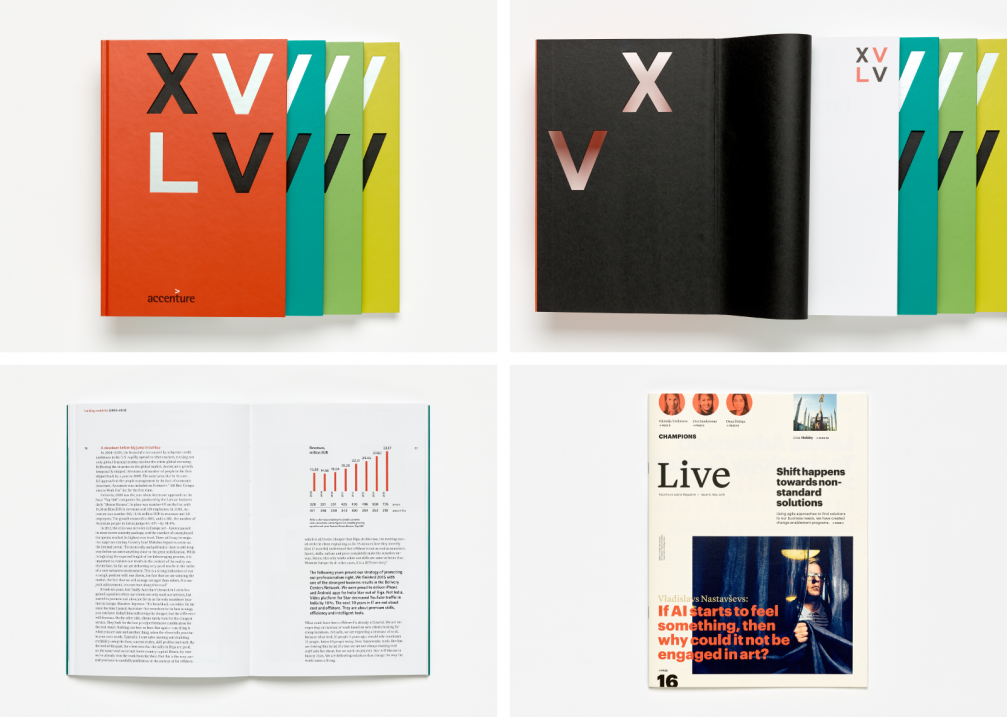
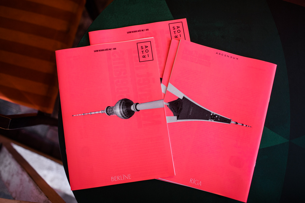
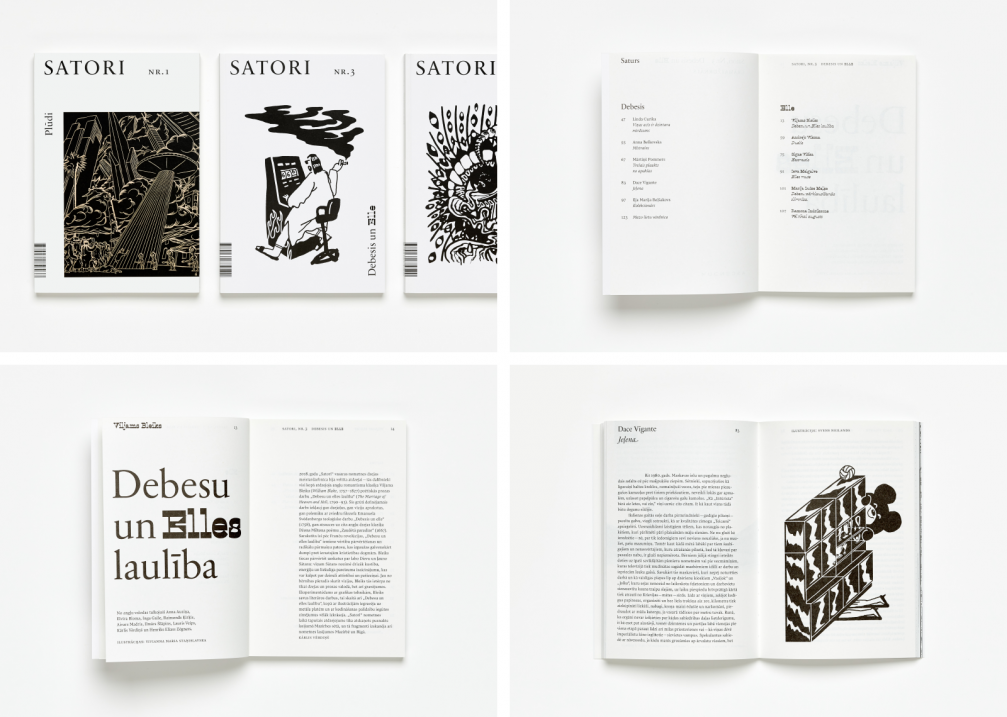
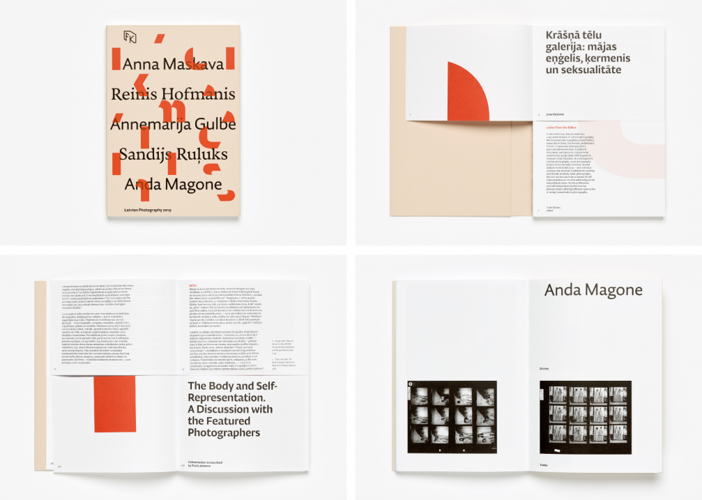
Listening to graphic designer Alexey Murashko, one can only wonder at how it is possible to grasp all the ins and outs of the profession in such a multi–faceted way, to comprehend the book production process from A to Z, to be able to coherently explain any technical detail and to justify design choices that are rooted in imaginative thinking and a deep interest in cultural history. «Book publishing is a field in which you need precise knowledge of content creation, the work of an editor and proof–reader, how to process an image, of printing and various technologies. In order to be able to attain the result that you want and can clearly visualise, you have to have an idea of how to control and lead this process,» Murashko says. Murashko came to graphic design from the completely opposite field. He studied criminal law in his native Belarus, but when the computer and internet era began he became carried away with the digital world and taught himself graphic design. After twelve years in Latvia, and having been the Creative Head of a design agency, Murashko still does not have a diploma but makes up for it with an impressive portfolio. Parallel to designing books, he also designs magazines and catalogues (for example «Latvian Photography 2019» published by FK, and several publications by Satori), corporate publications (a book and magazine for Accenture), he works with environmental graphic design (the Z–Towers project) as well as typeface design.
«The digital world lost its attraction in my eyes. It started to bore me. A book is an attempt to establish a mood, to prolong it. As long as there are public libraries and bookshelves in people’s homes, you can return to a story again and again. Websites that I put a lot of effort into ten years ago do not exist anymore. Screens develop and improve, but paper ensures an image’s depth and adds details that do not always come across on a screen even if they have the highest resolution. Books that are structured in a complex way cannot be replicated electronically. To leaf through a print copy is still more comfortable.» Murashko uses the phrase «complex books» several times during our conversation. According to him, these are books with added value that not only convey the essence of their content in an interesting format, but that create a special experience wherein the publication becomes a unique object.
«The content, as well as conversations with clients give me hints. There is even a layer to academic books or collections of scientific articles in which I can find room for metaphor or graphic playfulness. I present each publisher that I work with, with a number of steps that could make their book more complex and more individual. This is so that next time we would be able to go a step further and do something even braver,» says Murashko.
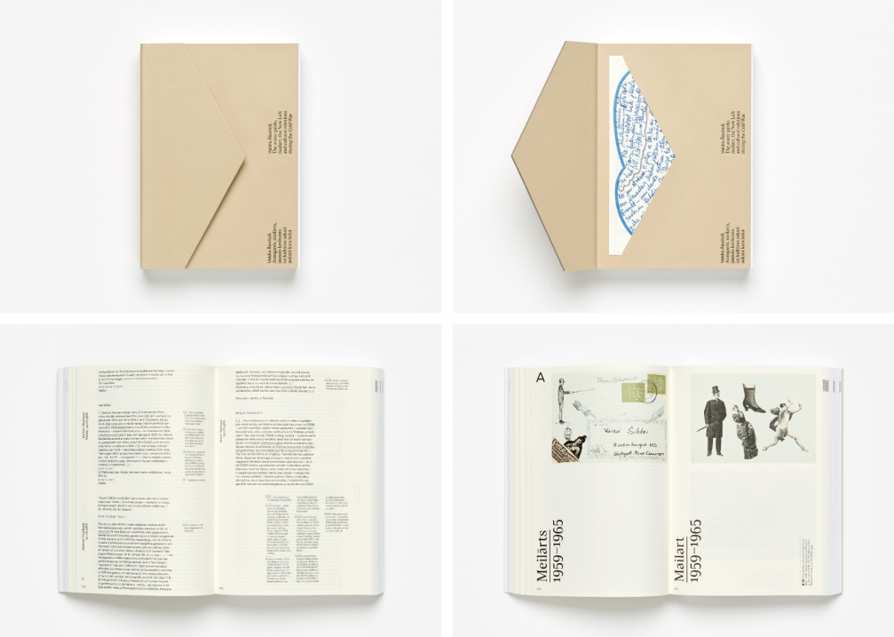
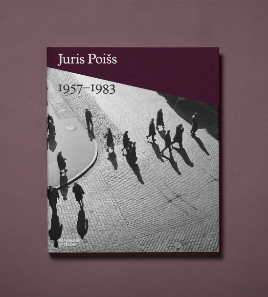
The designer praises the production quality in Latvia. At the same time, he emphasises that overall our local publishers are, at the moment, not ready to create publications structured in a complex way that have a lot of added value, for example, compilations of reproductions, critiques, or documented testimonials. «There are, however, books that fit these criteria, for example, publications by Neputns or the Latvian Centre for Contemporary Art. This includes the book on artist Valdis Āboliņš. There are, however, only a few such projects. This has to do with limited resources and the size of the market. But it is precisely complex studies with many–voiced, structured stories that win awards at prestige book competitions,» Murashko observes. The book «Valdis Āboliņš. The avant–garde, mailart, the New Left, and cultural relations during the Cold War» weighs one and a half kilos, but is comfortable to use and its 664 pages are held together by binding with reversed edges. Recalling the theme of mailart, the thick cardboard cover has been designed like the triangle of an envelope and special markings help find the English text in each chapter.
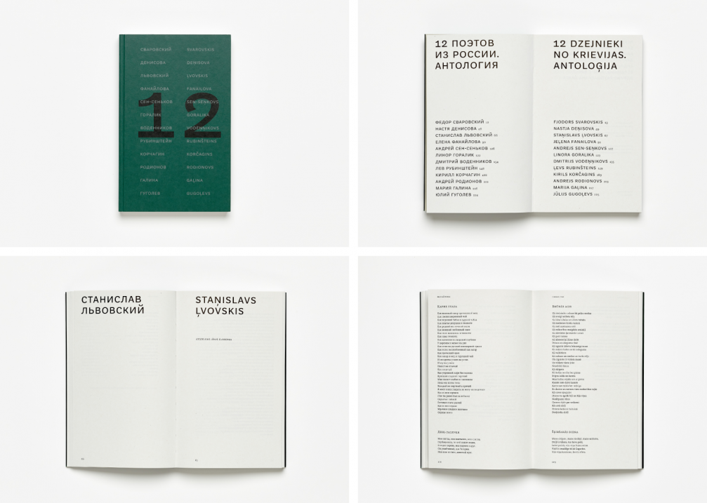
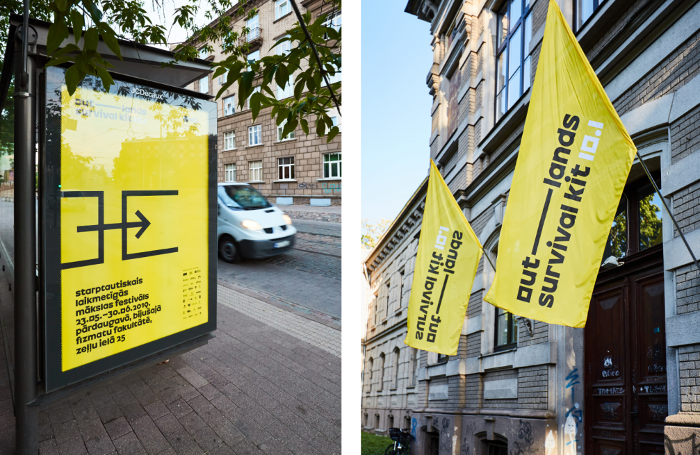
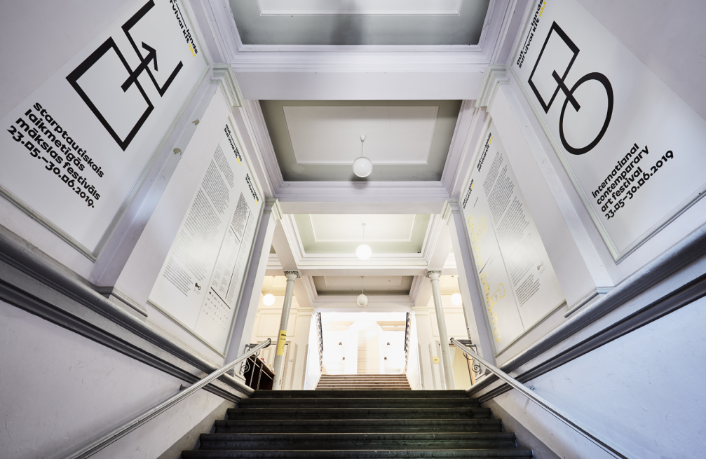
Last year Murashko was awarded at the book art competition «Zelta Ābele» for his work on the book «12 dzejnieki no Krievijas», and for designing the series «Public Space», both published by Orbīta. He emphasises that this achievement would not have been possible without the symbiosis between the literary and the artistic. «The story of the series «Public Space» begins with two requests by Vladimir Svetlov — the first was for the books to be bound in hard covers, and the second was for there to be a photo on the cover. I certainly accomplished this,» smiles Murashko, who glued all 1500 covers with his own hands. He paid special attention to the material of the covers, which was processed so as to quickly look aged. The theme of the photobooks gives them a retro feeling, but Murashko calls himself an opponent of direct stylisation. «I need space for my own interpretation. I created the font that is used for the titles on the covers and the title pages of the Orbīta photoseries myself. I was inspired by historic examples. In some sense the font harkens back to historic prototypes, but is at the same time a contemporary approach. The content, on the other hand, showcases classic academic Soviet font. Some may read this as retro, but others may see this as an ironic comment,» says the designer pleased by readers’ varied reactions. Murashko tries to include information about what paper and fonts he has used in the colophon of each book in this way paying homage to the creators. The designer’s own font, Outfit, was used in the visual identity of the art festival Survival Kit in both 2018 and 2019.
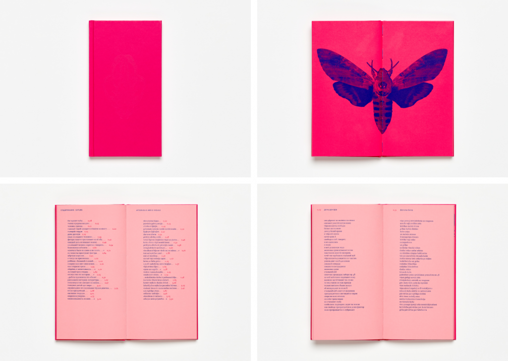
Murashko acknowledges that he cannot afford to have one creative style, or his work would all look too similar. «I could do that in a larger market, but I work in an environment where only a few publishers work with contemporary, progressive bookbinding. My voice cannot drown out theirs.» Murashko’s books stand out, not only with their thoughtful font selection but also for their bold colour choices. An example of this is the cover of Jeļena Glazova’s book of poems «Alkatība» which dazzles in fuchsia pink. «At first I imagined the cover as a sort of black hole. I wanted it to make you feel depressed, but this concept did not prove popular so we came up with something drastically different — an uncompromising version in bright pink that makes your eyes water, because «Alkatība» is about a powerful emotional burden,» comments the designer.
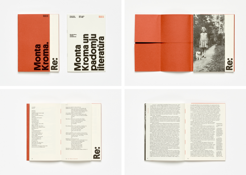
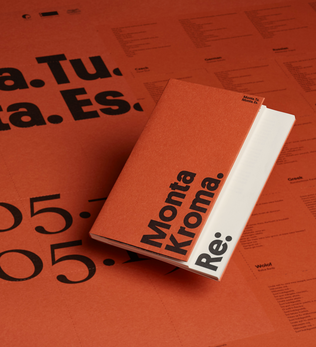
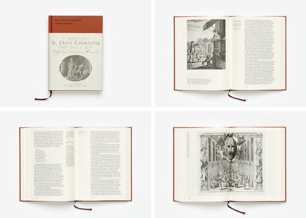
In another recent book of poems, «Monta Kroma. Re:», the unusual terracotta tone that was used wove through the entire series of events that Punctum dedicated to the poet. «Studying Monta Kroma’s personality and creative body of work, I found that the poet used to be an ardent communist in her youth. I remember the red pioneer neckerchief from my childhood. It was bright at first, but it would fade in the sun with time and the tone changed. I remembered the Italian paper Materica by Fedrigoni that I have wanted to use for a long time. The paper has a material quality to it, and leaves a tactile impression that many readers miss. When the design was finished, and we started to assemble the bibliography, it turned out that Monta Kroma’s first book had a pioneer on the cover. This is a story about the importance of being open and free in order for this kind of discovery to find you. Imagine the conceptual pleasure when you understand that her story had started at the very same point! Through the power of coincidence, everything came together,» enthuses Murashko looking back at the project. The same terracotta colour completely envelops Deniss Hanovs’ academically laconic study «Dons Žuans atgriežas».
No matter how free from dogmas contemporary book art can be, Murashko emphasises the importance of paying attention to context:
«A certain thing can work for one project, but not for another. There are no bad fonts, rather there are fonts which can look great in an unexpected context, even if they are terrible in themselves. Glossy varnish can look cheap, or it can fit in perfectly somewhere else. But something that is meant to be read always has to be comfortable to use. I also consider any attempt to mock the reader wrong, unless it is an experimental publication meant for a narrow circle of readers.»
When asked about reference points and sources of inspiration from the world of book design, Murashko mentions international peers such as Ludovic Balland, Gaston Isoz, Piet Gerards and Irma Boom.
It is important to know when to stop in any field of design, to not exaggerate, or to say too much. Murashko agrees and reveals that he can sometimes even be too precise and has to fight this impulse every now and again. «A few years ago I made a decision that if I ever waver between a more complicated and daring, and a calmer and safer version of something, that I would always choose the one that is less harmonious. If I were to always follow the logic of calm, then I would most likely not progress, and would not be able to take the next steps. In this way I liberated myself. The various experiments and solutions that I have chosen thanks to this rule have led me to visually more complex results. You might not always be able to see them from the outside, but these details are very important to me. My work is made up of such details. Suitability and context are still, however, most important to me — there is a difference between a contemporary photography festival, where you can afford to go a little wild, and an academic publication. The space between these extremes can be filled with a variety of interesting versions. And maybe some day a publisher will show up who will want to present something academic in a very contemporary, experimental way. I am ready for a project like this,» concludes Murashko.
Translated by Jūle Mare Rozīte
Viedokļi