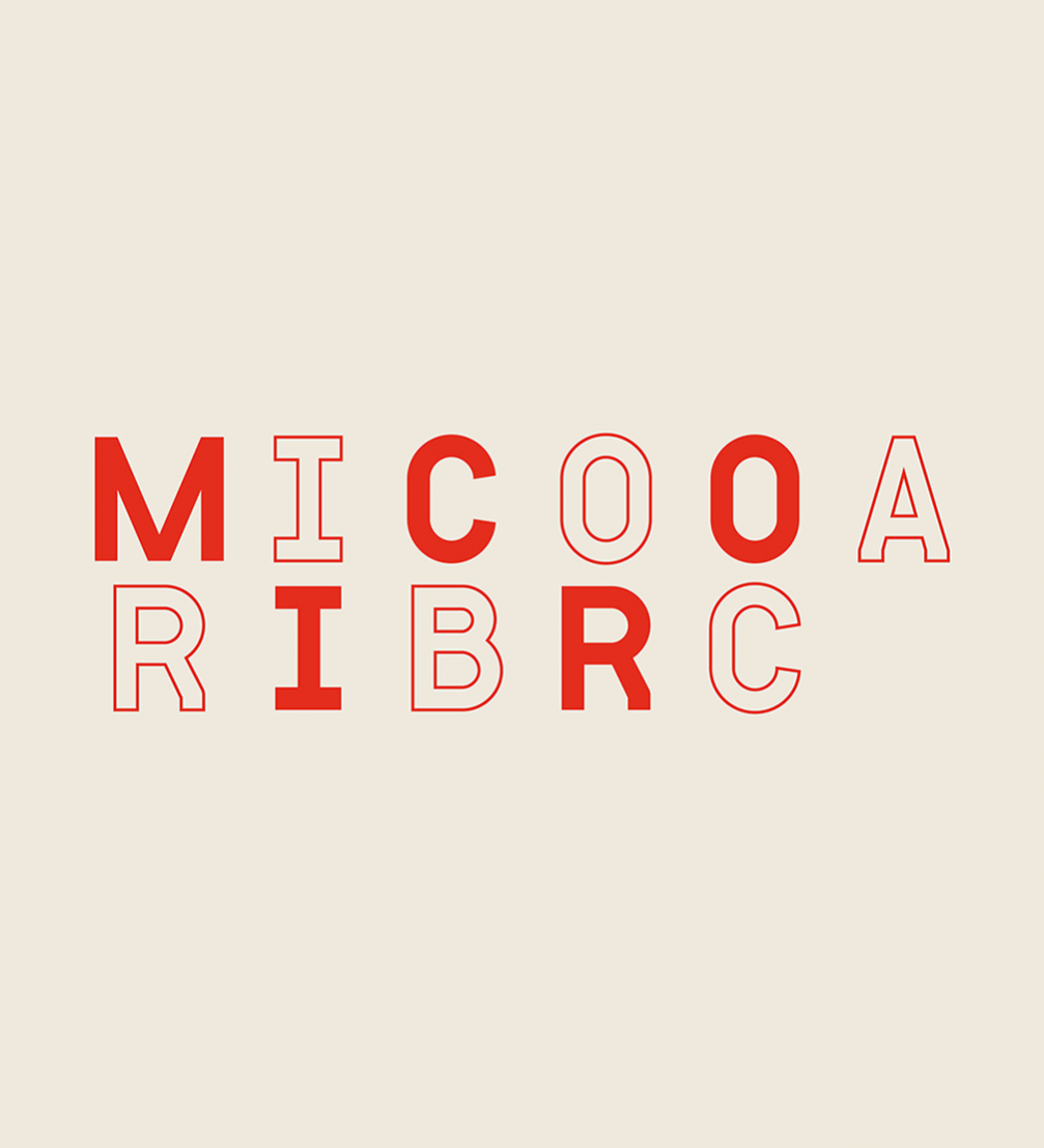
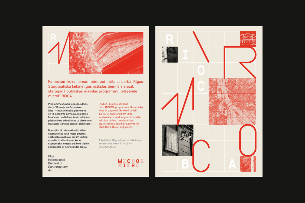
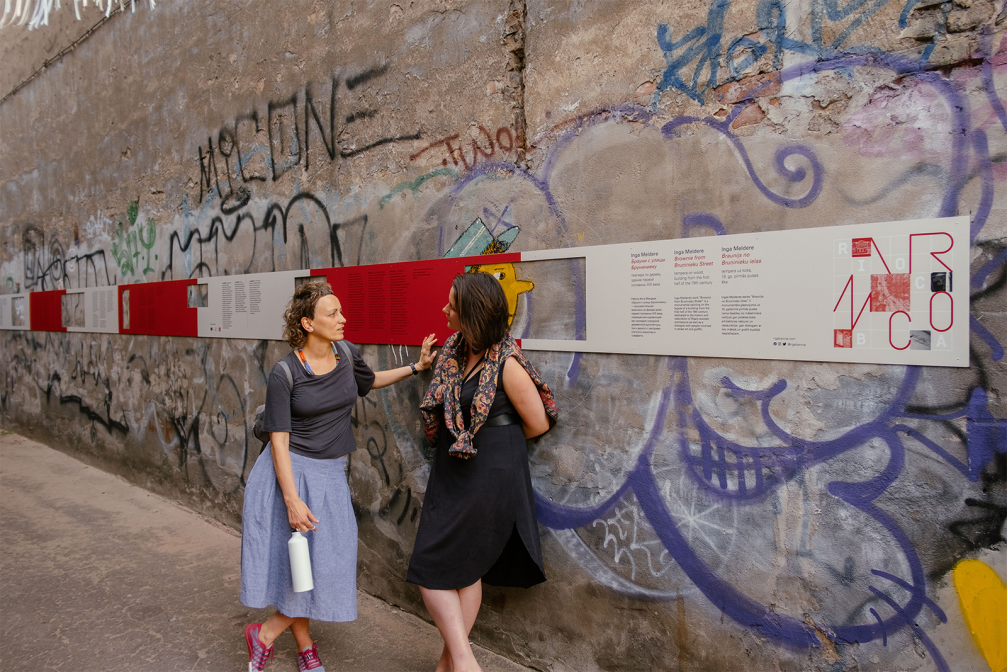
This year, when the Riga International Biennial of Contemporary Art (RIBOCA) does not take place, the «microRIBOCA» programme, which brings art into the urban environment, continues to hold public interest. Design agency «Norrskog» has created its own distinguishable visual identity for the micro-biennial.
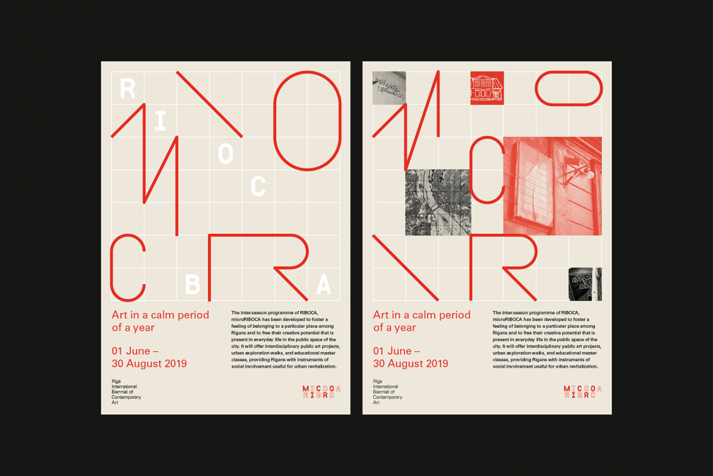
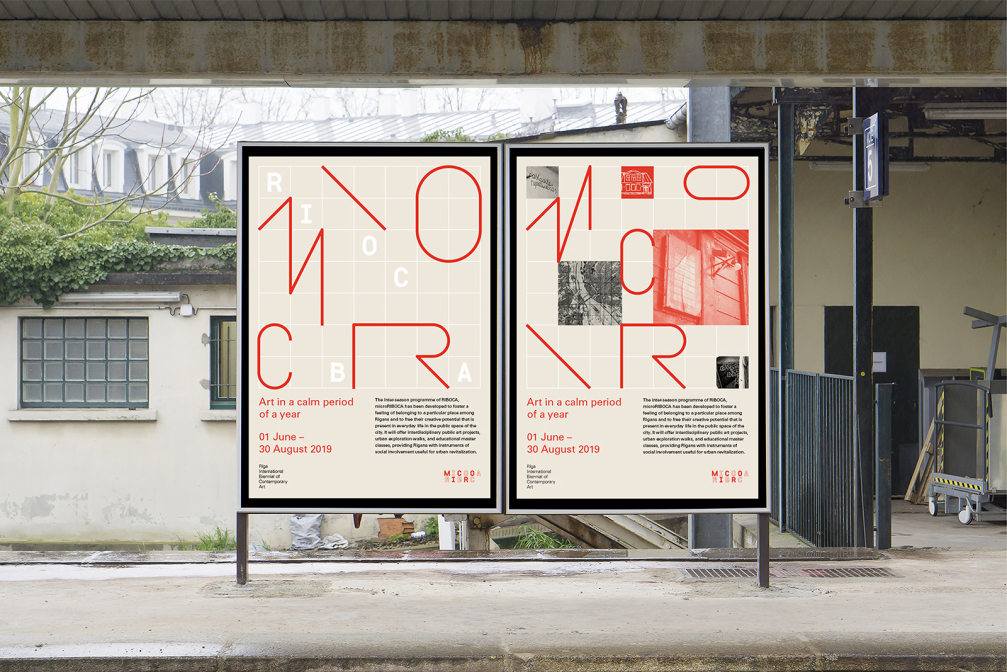
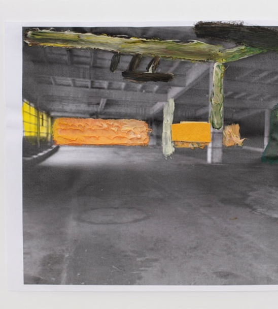
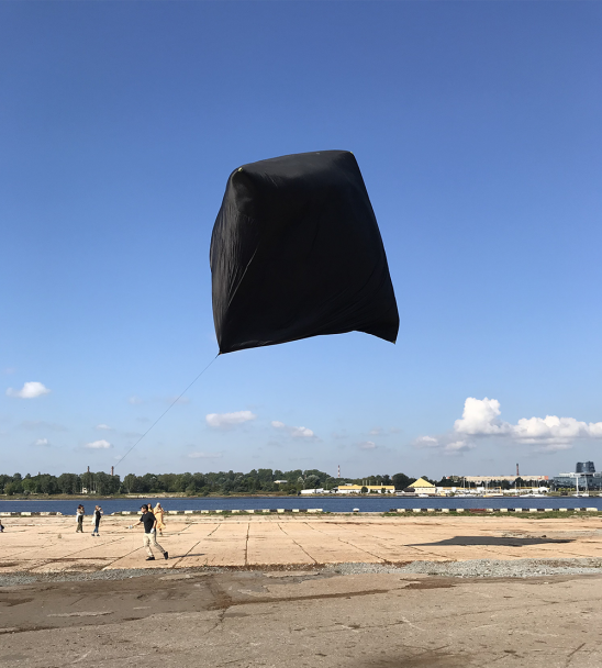
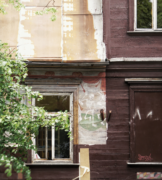
The inter-season programme of Riga International Biennial of Contemporary Art, «microRIBOCA», is dedicated to art projects that encourage people to think about the everyday life of city dwellers, the codes of communication of street life, the cultural and social potential of public spaces, and the creative ideas that occupy the minds of Rigans. The artists taking part in «microRIBOCA» focus on the relationship between citizens and the urban environment in their works. The programme offers interdisciplinary public art projects, urban exploration walks and other activities, providing residents of Riga with tools of social involvement useful for urban revitalisation.
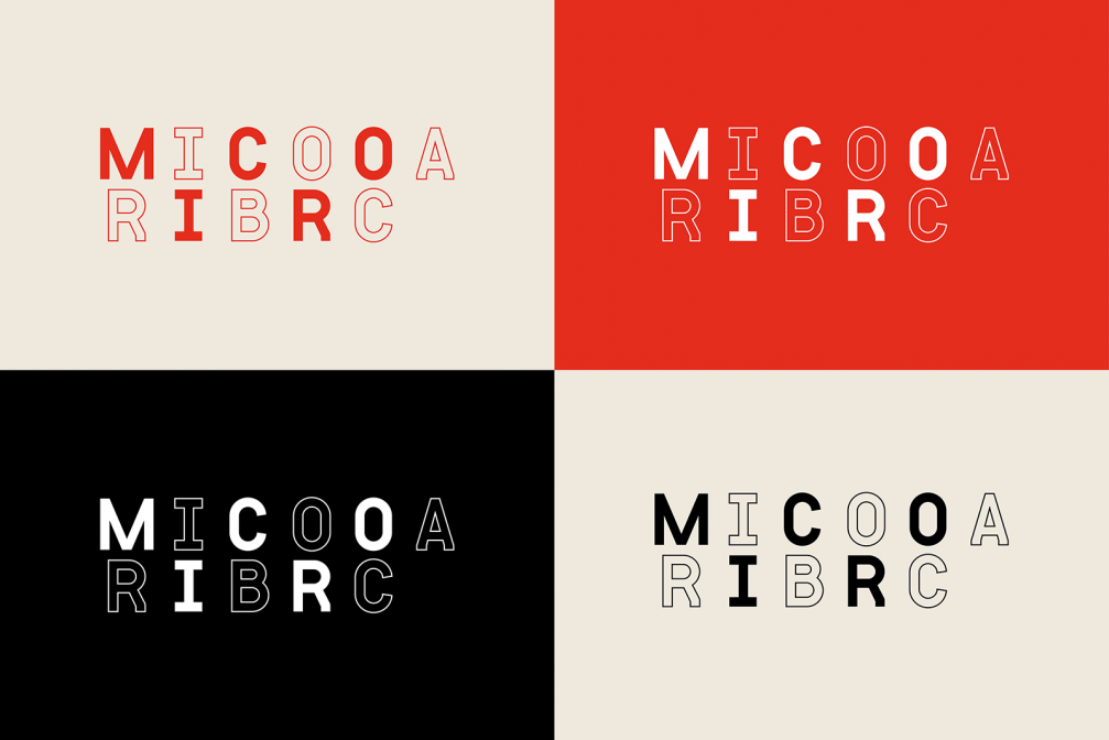
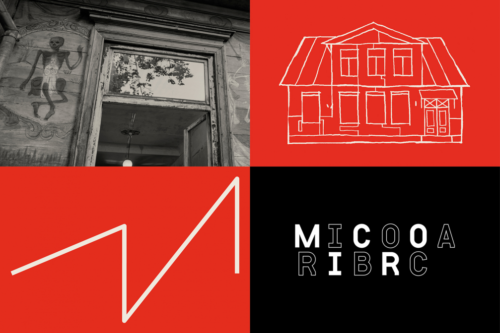
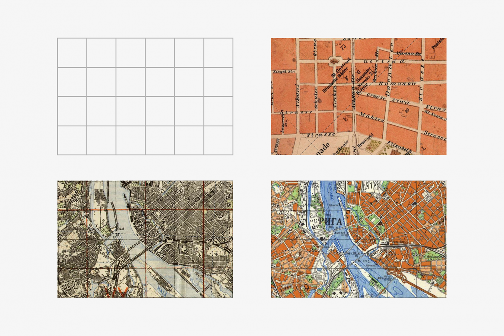
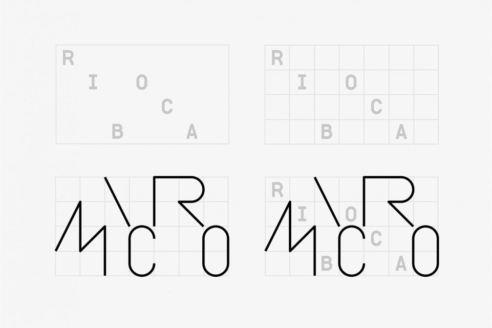
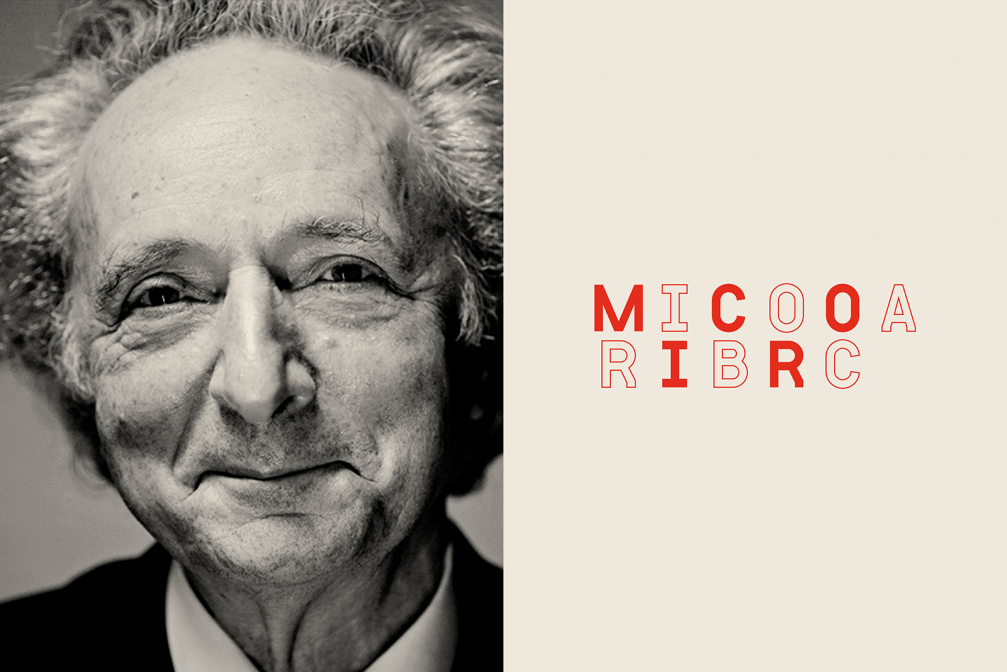
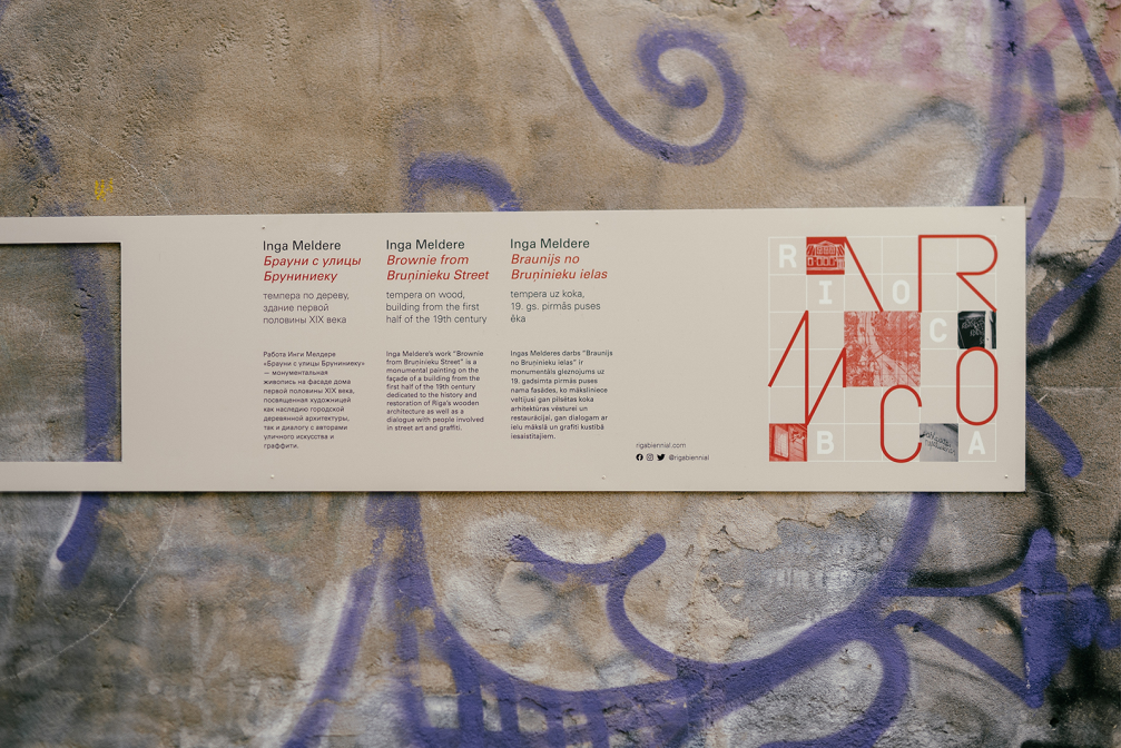
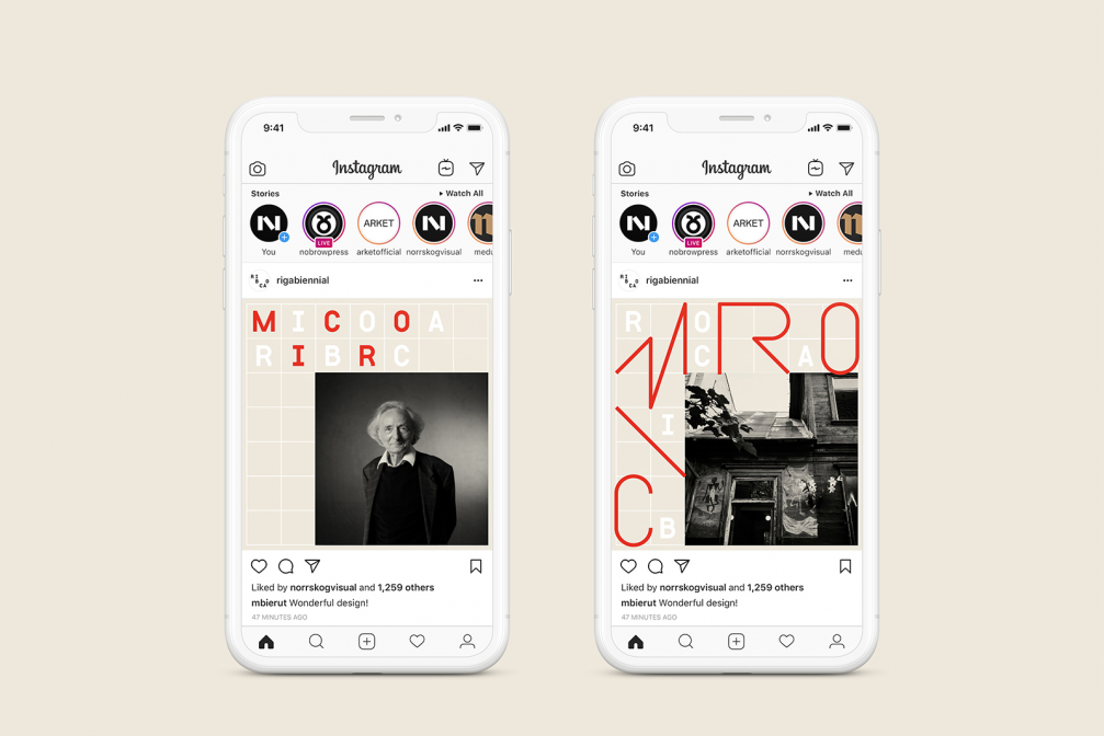
«In line with the thematic focus of «microRIBOCA», the visual identity of the programme is based on a city map grid, street network, and lines representing movement, communication, progress,» says Anatoly Vyalikh, founder of design studio «Norrskog». Letters and images are arranged in the base grid, making the visual identity easily adaptable to the various communication needs and formats of different events: posters, postcards, videos, and books. The graphic design also resonates with the logo and lettering of the 2018 Riga Biennal. The primary colours of RIBOCA are also preserved, tuning them to be slightly warmer and friendlier.
Viedokļi