One of the biggest brand changes in Latvia in 2019 was the transformation of the technology and entertainment company «Lattelecom» into «Tet». The new brand strategy and visual identity was developed by advertising agency «TBWA\Latvija» and design studio «Asketic», and the implementation in all areas of the company was managed by «Tet’s» own brand, marketing and PR team.
«Tet», a provider of telecommunications, television, internet, and electricity services, is one of the largest and most valuable companies in Latvia. It was founded in the early 1990s as «Lattelekom», but in 2006 became the more English-oriented «Lattelecom». In the compound, «Lat–» indicated an affiliation with Latvia, while «–telecom» referred to telecommunications and internet services. As «Lattelecom» had since then gradually evolved into a technology and entertainment company, venturing into new non-telecommunications business lines and expanding into markets beyond Latvia, the current brand no longer reflected the company’s current scope and geography.
However, the brand «Tet» was not invented this year, as one of the company’s branches had already been offering electricity and smart home services under the name. The two letters «t» were inherited from «Lattelecom», while the «e» between them denoted electricity. As «Tet» was considered to be «Lattelecom’s» first successful attempt to provide services outside the telecommunications industry, it largely symbolised a fresh start. Opinion polls also showed that «Tet» is perceived as a simple, understandable and accessible name. A strategic decision was made to develop the already tested brand rather than look for new versions.
The brand’s new visual language was created at design studio «Asketic». Graphic designer Miķelis Baštiks explains the approach: «The brand’s concept «humane technology» suggested that the design of the logo should also take a humane approach. Therefore, we used letter shapes that indirectly refer to flowing, human handwriting as well as lowercase letters. We deliberately avoided sharp, aggressive and technical forms in the visual communication.»
The shortness of the brand’s name and the letter structure allow the logo to be used both as a wordmark and as a graphic symbol. Therefore, «Tet» did not need a separate graphic sign. «This is especially important at a time when people are increasingly seeing a brand in the form of an icon on social networks rather than on a large TV screen or an outdoor signboard,» says Miķelis.
The company officially became «Tet» on April 1, 2019, having invested about half a year in developing the new brand. «In fact, we are still learning how to apply the visual identity in real-world settings that are simply impossible to predict during the design stage. So we continue to adapt it to our needs while trying to stay true to the original philosophy,» says Tomass Delle, brand manager at «Tet».
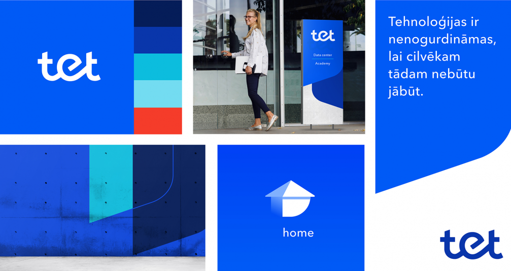
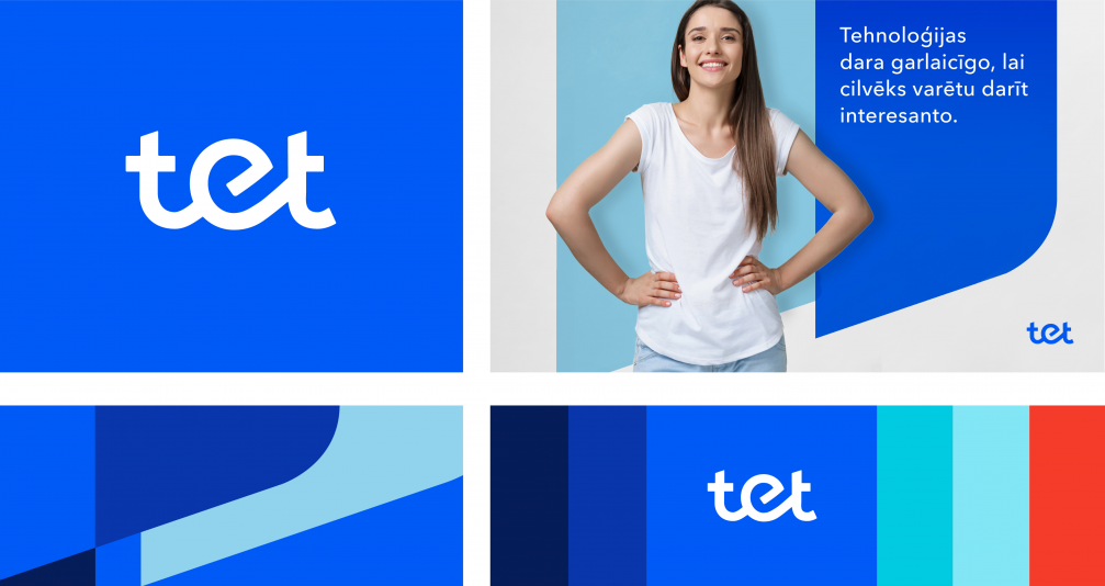
In the spring, the company rebranded its stores, offices, cars and many other visuals, transformed its self-service website «My Lattelecom» into «My Tet», and renamed its Wi-Fi networks. Along with the rebranding, a shift in the culture, business approach and communication of the company was initiated, aiming for a greater openness and simplicity. This is reflected in the blue colour palette of the visual identity — it is business-oriented but friendly at the same time.
Speaking of graphic design details, Miķelis Baštiks explains that the company name’s structure with two lowercase letters «t» is challenging. The difficult thing was to balance the letters optically by carefully placing the round «e» in the centre of the logo. At the same time, the «t» shapes had to be designed to not resemble crosses.
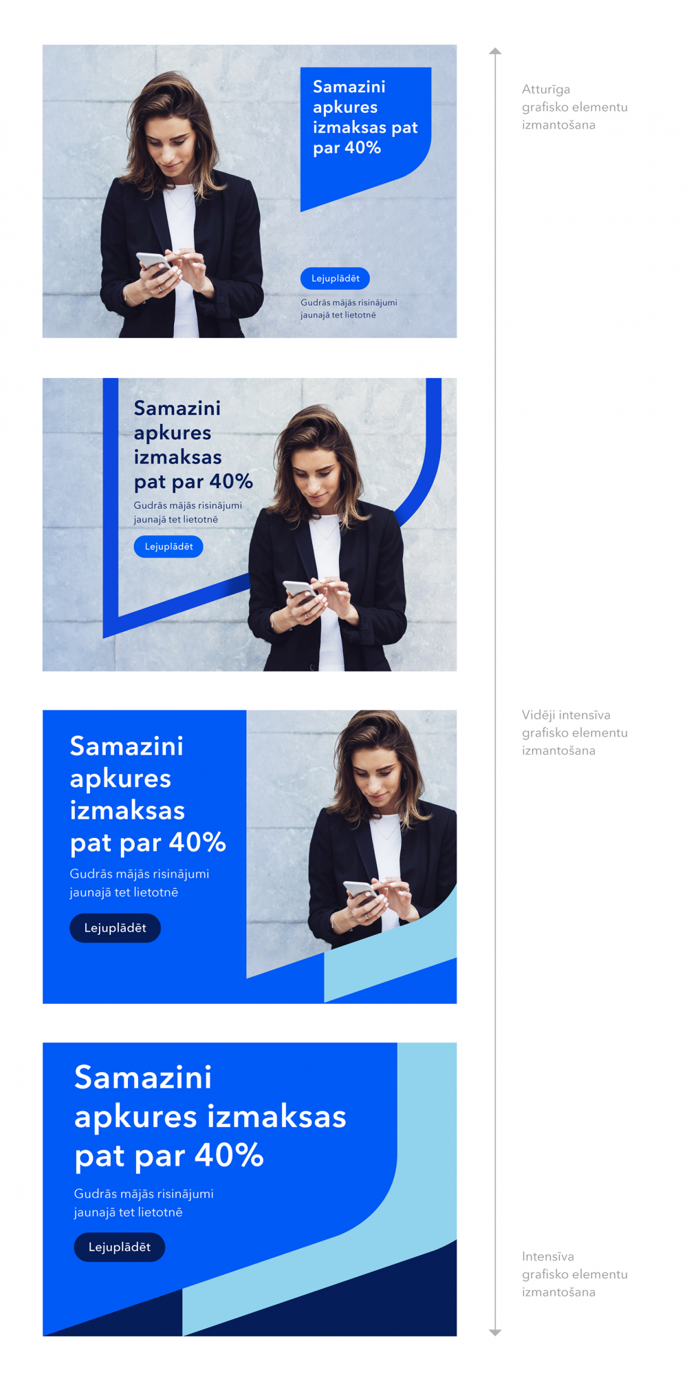
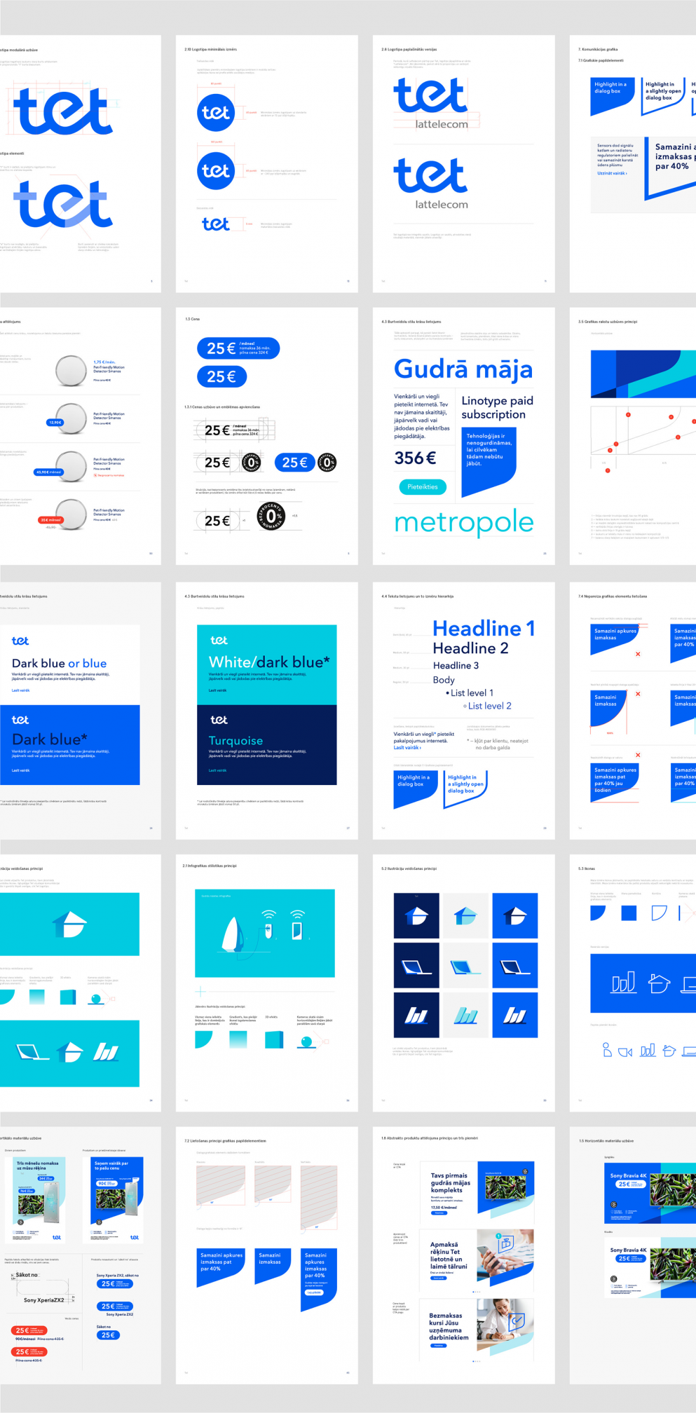
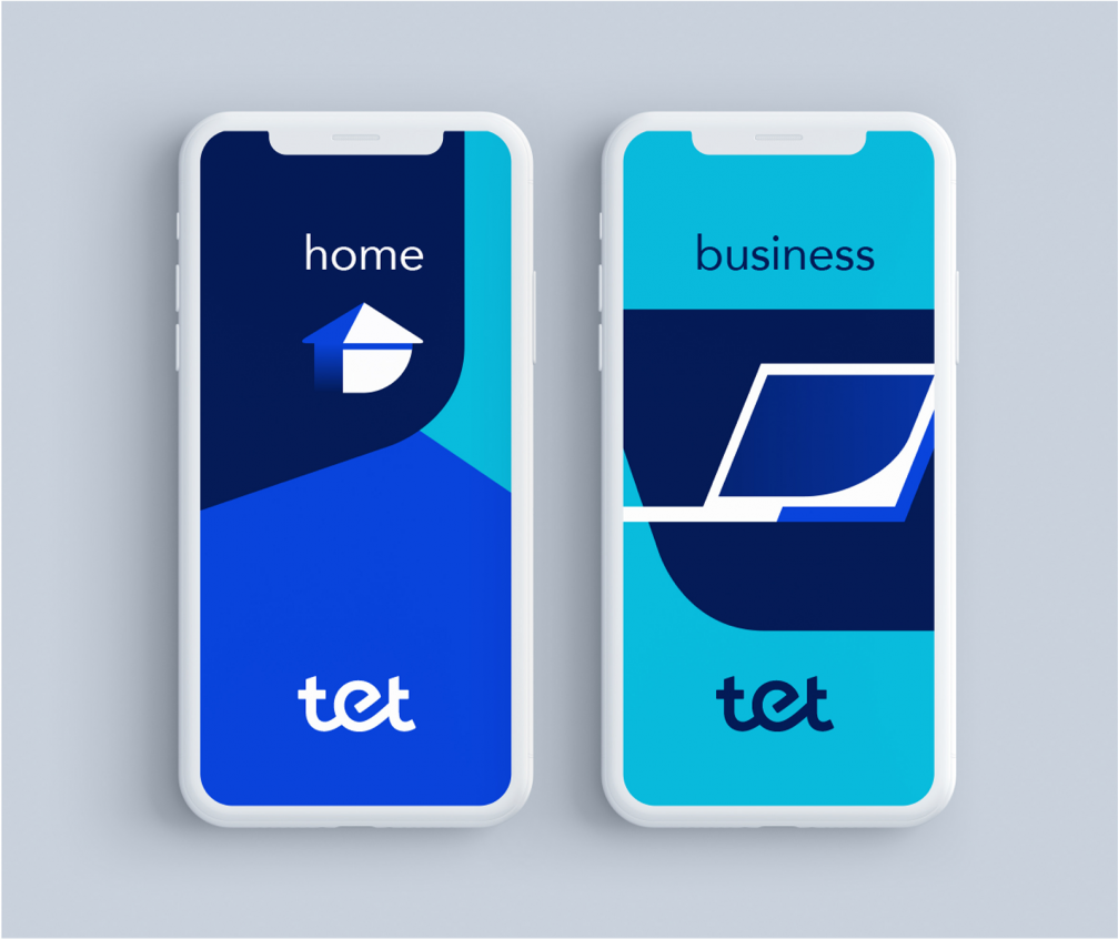
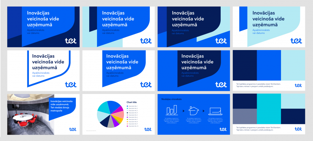
The basic element of the graphic language is a stylised speech bubble, which can be combined with various photos and colours. The volume of the visual language can be decreased to make it more reserved, or, conversely, «turned up» if the need arises. Detailed guidelines have been developed for the brand that include text formatting principles, the use of colours and various graphic elements, as well as suggestions for creating illustrations and icons for a variety of visuals.
The strategy and communication of the «Tet» brand was developed and implemented by the advertising agency «TBWA\Latvia», while the concept and guidelines for the brand’s visual identity were created by the design studio «Asketic». The brand is managed daily by «Tet’s» in-house branding, marketing and PR team.


Viedokļi