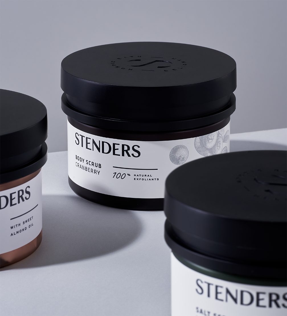
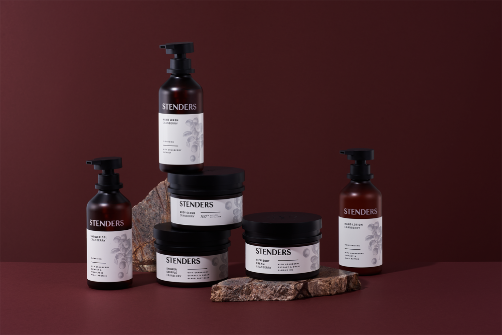
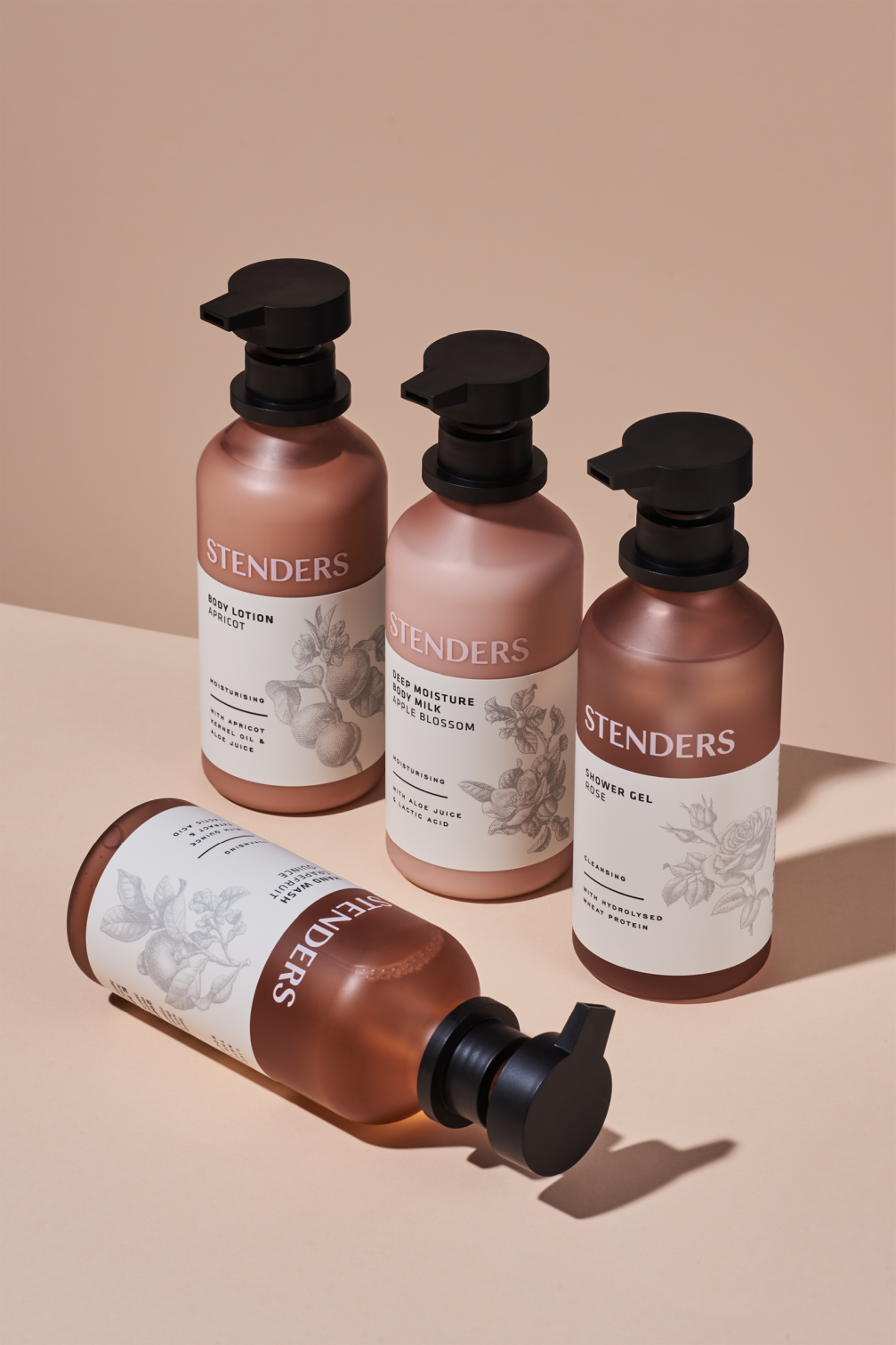
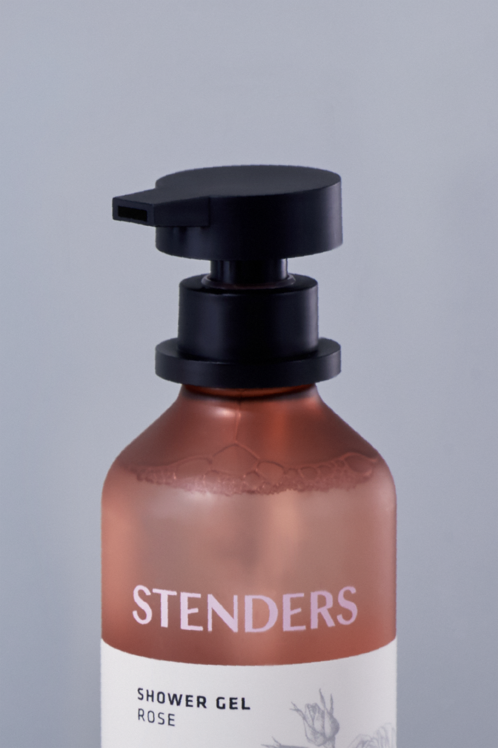
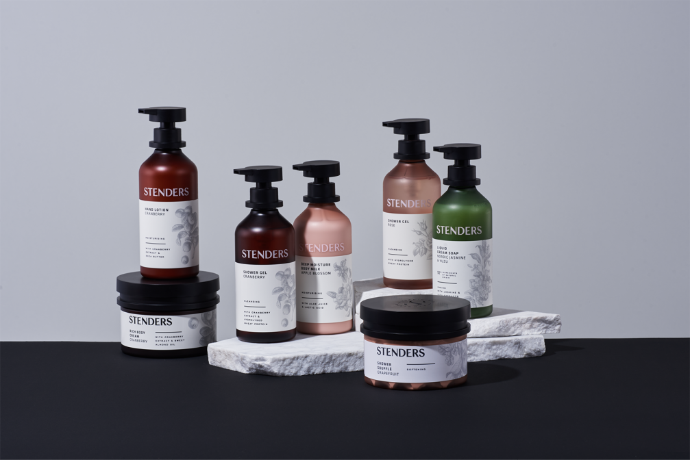
Along with the renewal of the brand strategy and identity, the cosmetics manufacturer Stenders in cooperation with the design studio Kid (previously known as Nord ID Riga) has implemented a time-consuming process rarely experienced by Latvian brands — the design development and production of its unique packaging design.
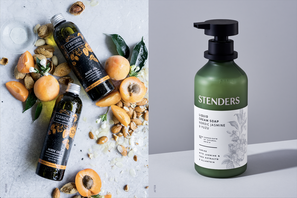
Three years ago, when Stenders started a rapid growth in the export markets, the company decided to change the focus of its brand and design from a locally romantic perspective to Nordic minimalism, getting rid of everything superfluous. After two years of intensive work, development, and testing of countless samples, the products with the new packaging design have reached store shelves.
Kristīne Grapmane, executive director of Stender», says that, one of the biggest challenges, when renewing the brand strategy and identity, was to preserve the essential values of the company and transform them into a new, modern form. It was important that the design resonates with global beauty and wellness trends to allow Stenders products to become design objects in bathrooms all over the world — whether in Latvia, China or Australia.
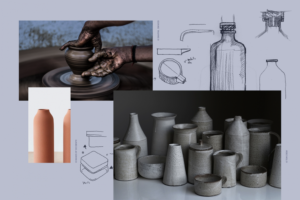
Despite the global goals, the design studio Kid sought inspiration for packaging design in local values. «The conceptual motif of bottles, cans, lids, and corks is borrowed from the traditional forms of Latvian ceramics, thus symbolising the striving for a slow, cyclical approach to life,» says Maija Rozenfelde, design director of Kid.
Viedokļi