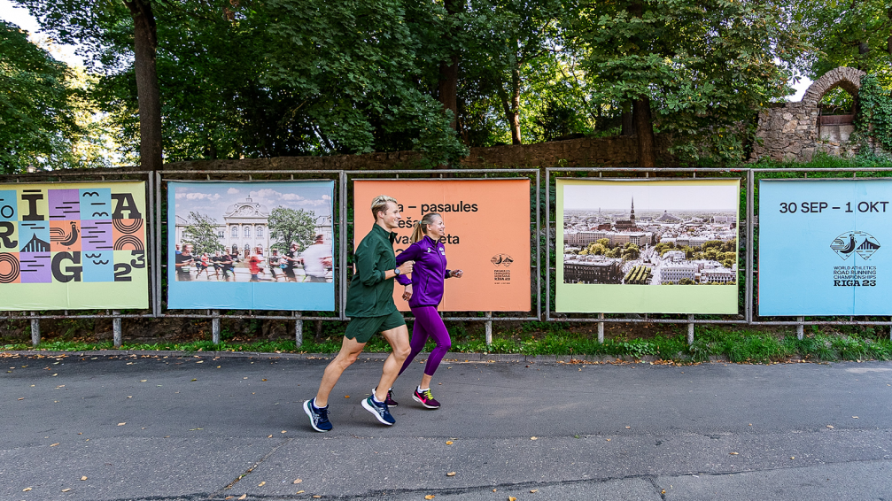
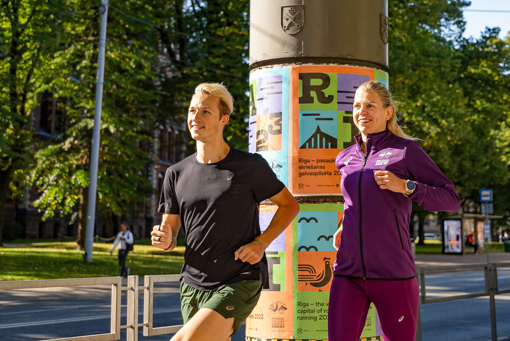
On Sunday, October 1, the World Athletics Road Running Championships 2023 in Riga will bring together professional runners and running enthusiasts from all over the world. This will be the first sporting event of this scale in the Baltics. To promote the image of Riga, design studio Reflect has created a vibrant and lively visual identity for the championships, quoting the city’s symbols. Meanwhile, designer Maija Rozenfelde, who created the design of the medals, was inspired by Latvian painter Niklāvs Strunke.
Matīss Zvaigzne, lead designer at Reflectt, reveals that work on the visual identity began in 2021, before it was known where the World Athletics Road Running Championships 2023 would be held. Event agency Nords Event Communication, which also organises the Riga Marathon, hired Reflect to create a website that would help convince the international athletics association World Athletics to bring the major sporting event to Riga. This is a special honour, as this will be the first World Athletics Road Running Championships.
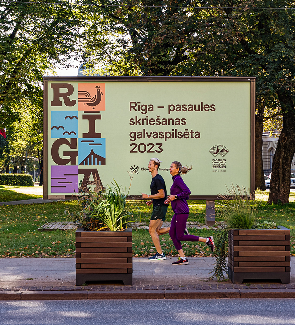
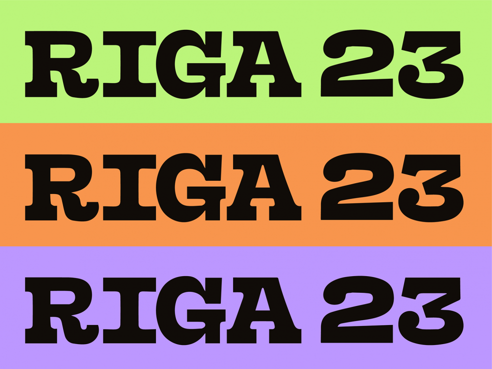
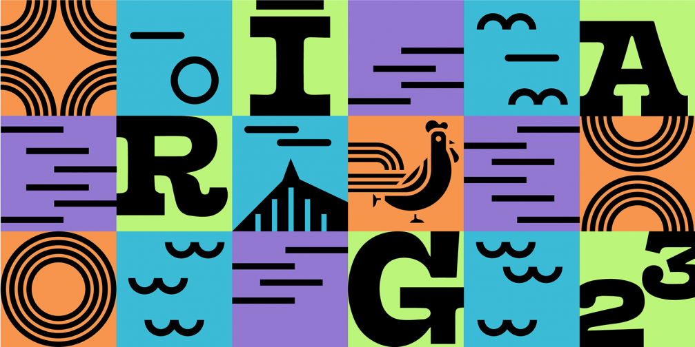
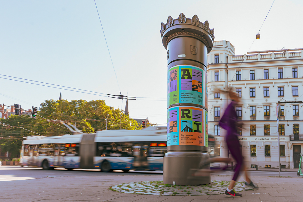
In creating the visual identity for the championships, the studio’s task was to follow the guidelines set by World Athletics and to create a sense of Riga as the venue at the same time. «We were given detailed guidelines on what to include, what not to include, how the logo should be used, what fonts should be used, etc. We studied examples from other events and came to the main conclusion that the image of Riga should be integrated into the design. We realised that we would not be able to incorporate the new identity of Riga into the logo, but we could use other codes of Riga,» says Matīss. «For example, a variation with different shades, which the Riga Municipality has also been using in its communication since the new identity was introduced. Although the shades are different, the feeling is similar.»
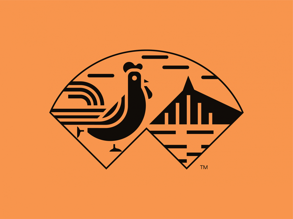
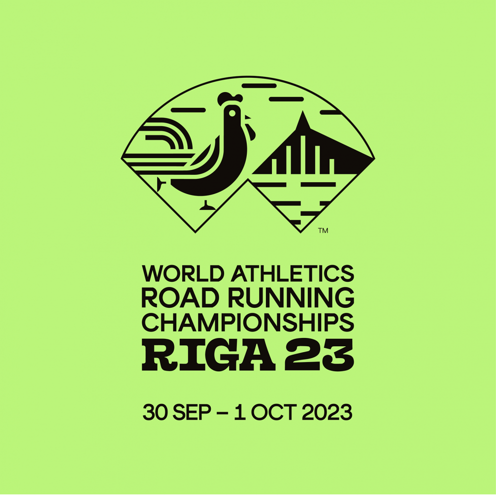
The logo interprets the Riga border mark created by designer Valdis Celms, which will be visible to runners arriving from other countries on their way from the airport. As Matīss points out, this will help to create an association with Riga as soon as you enter the city. The wordmark in the logo is complemented by other symbols of the city — the rooster on the steeple of St. Peter’s Church and the National Library of Latvia, known as the Castle of Light. Each of them represents one bank of the Daugava. The running rooster is a nod to the Riga Marathon logo, in which Reflect has placed a runner instead of a rooster on the spire of the St. Peter’s Church tower. Matīss hopes that it will be a reminder that runners are welcome in Riga not only for the championships but also the Riga Marathon.
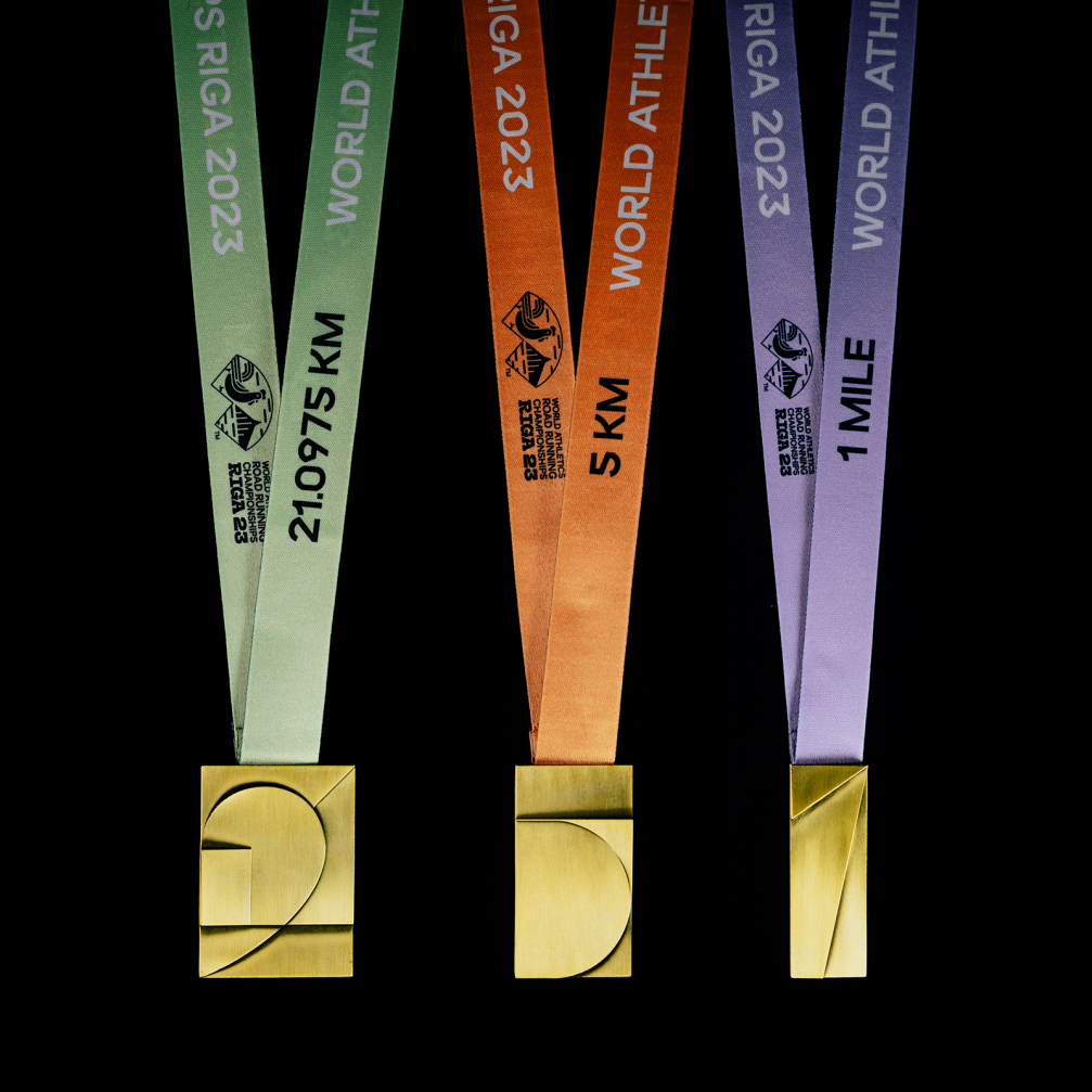
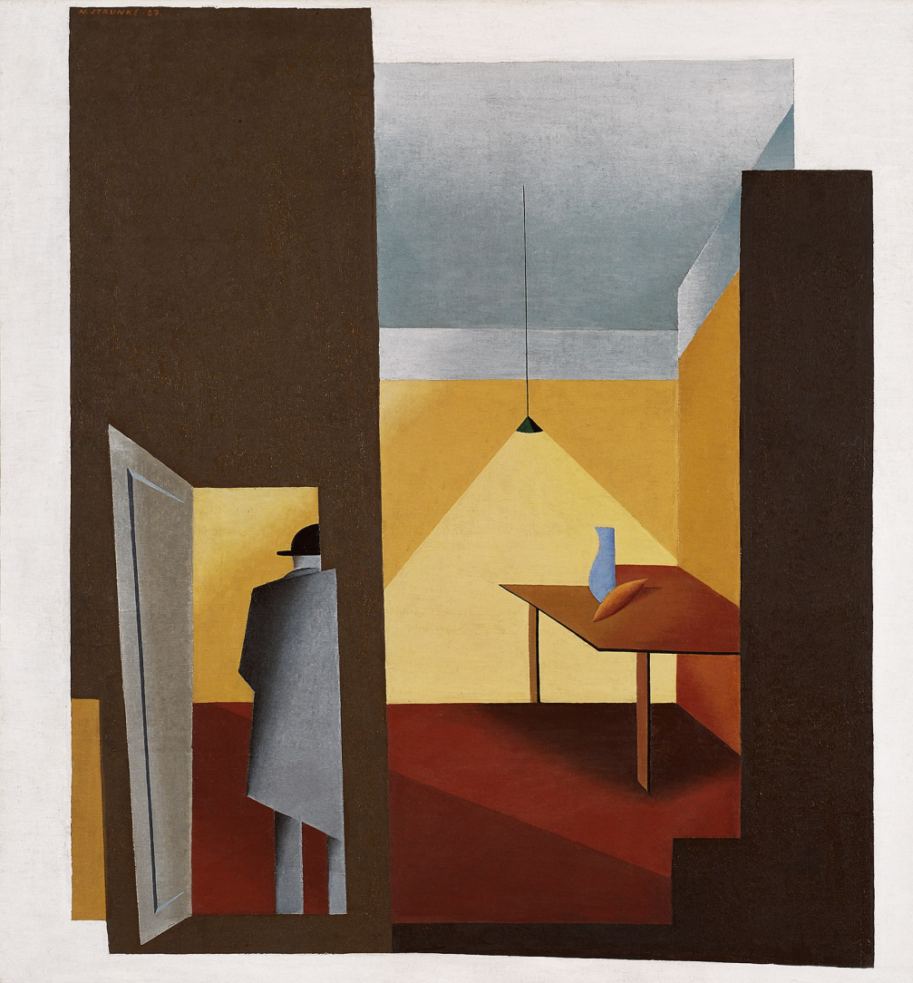
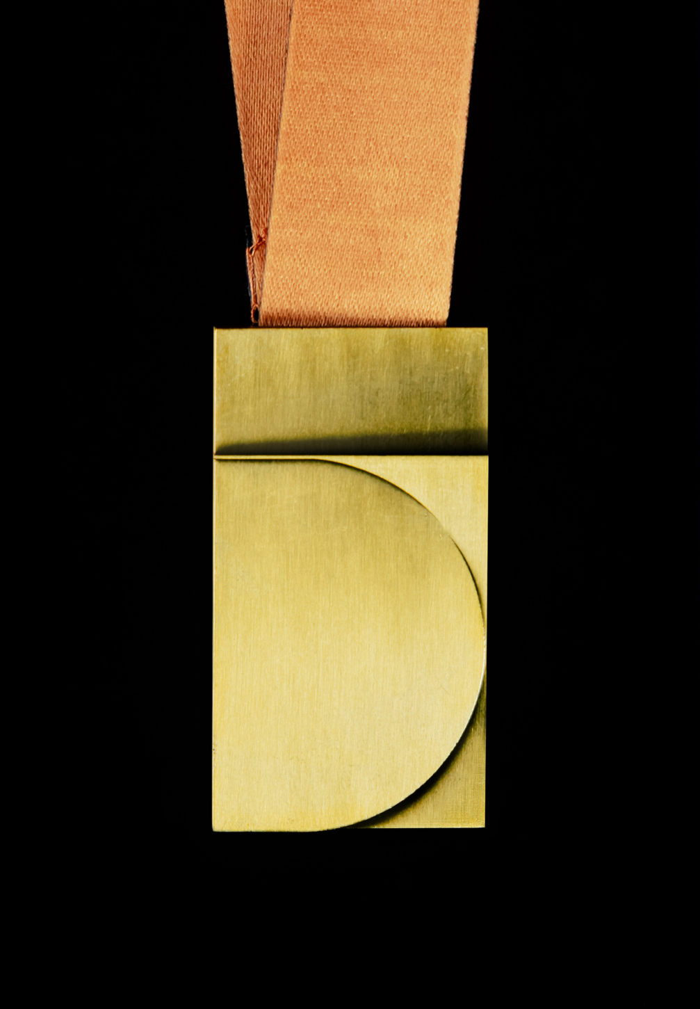
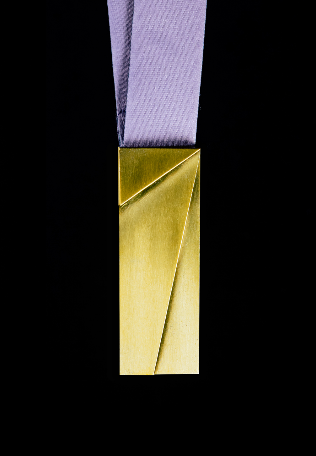
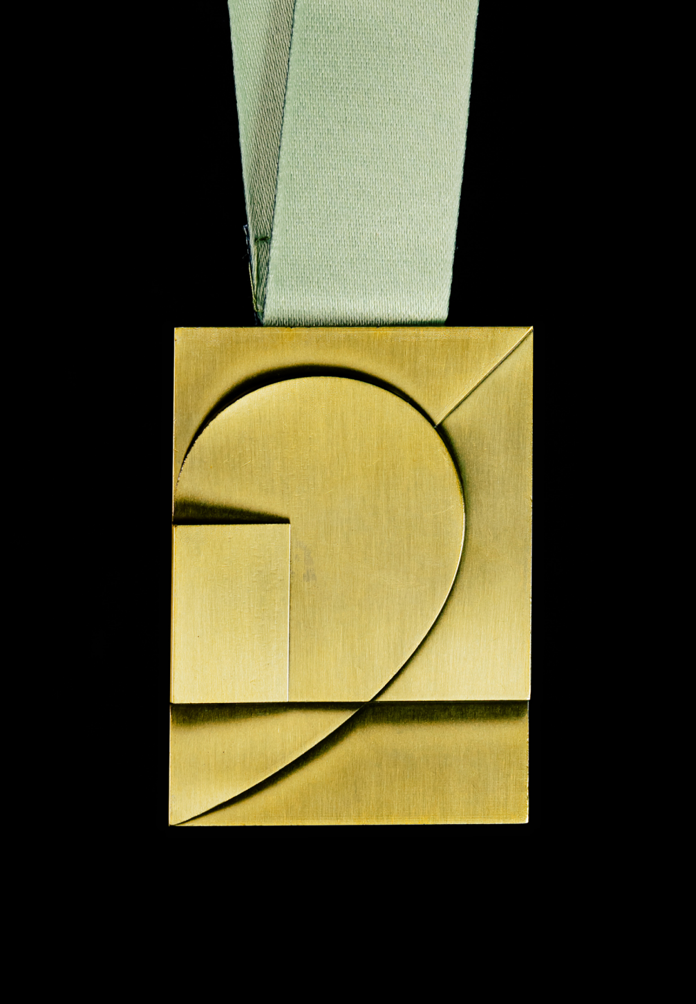
The medals awarded to both professional runners and mass runners also reflect Latvia’s cultural values. The medals have been designed by Maija Rozenfelde, the leading designer of the Kid studio, who was inspired by the painting Man Entering a Room by Latvian modernist painter Niklāvs Strunke. «The idea behind the design of the medals is rooted in the geometry of running, which is formed by the position of the body, the angle of the step, the rhythm of the breath, and the speed of the pulse. The design of the medals at the World Athletics Road Running Championships reflects the multifaceted journey to the finish line of each participant. The design also plays on the length of the running distance (1 mile, 5 km, 21 km) — the longer the distance, the more strategic and precise the effort, and the more facets to overcome,» Maija explains the concept. The medals are made deliberately heavy, symbolising the hard work of the participants.
Viedokļi