This week, Riga is buzzing with one of the most anticipated events of this year — the XXVII Nationwide Latvian Song and XVII Dance Festival. This time the occasion is special because the Song Festival celebrates its 150th anniversary. In honour of this, the design studio Kid has created a visual identity that aims to return to the essence of this tradition — the genuine emotions that awaken in every festival participant.
Last autumn, the design studio Kid won the competition for the development of the visual identity of the XXVII Nationwide Latvian Song and XVII Dance Festival with a concept that connects contrasting ideas — the richness of tradition that has been accumulating for 150 years and the courage to create a new beginning while preserving the essence of the festival and evoking emotions just like in the first Song Festival.
Since the first Song Festival in 1873, where 1,000 singers participated, it has grown into a large-scale movement. This year, it will involve around 40,000 participants, with over 1,600 collectives in Latvia and more than 100 in other countries preparing for this event. Undoubtedly, this tradition has made a significant contribution to shaping Latvia’s national identity and has motivated countless people to sing and dance.
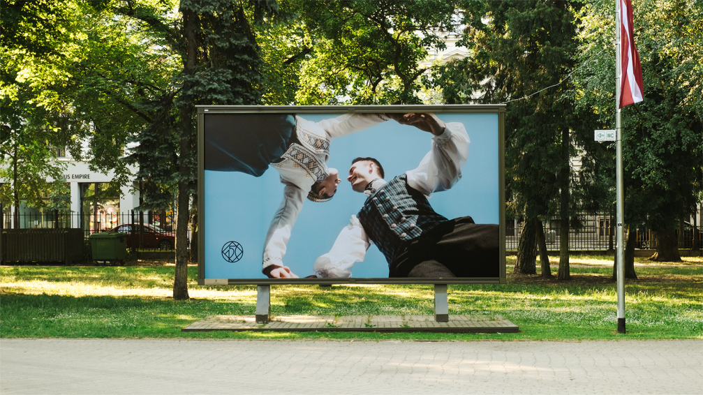
As Kid points out, the foundation of the festival is formed by each individual participant, and therefore, in developing the concept of the visual identity, the team surveyed approximately 200 participants to find out where their connection with the Song and Dance Festival began, why it is significant to them, and what associations it evokes. Although everyone has their own reasons for singing, dancing, and participating in this grand event, the unifying basis is being together and feeling the forty thousand personal stories coming together as a whole.
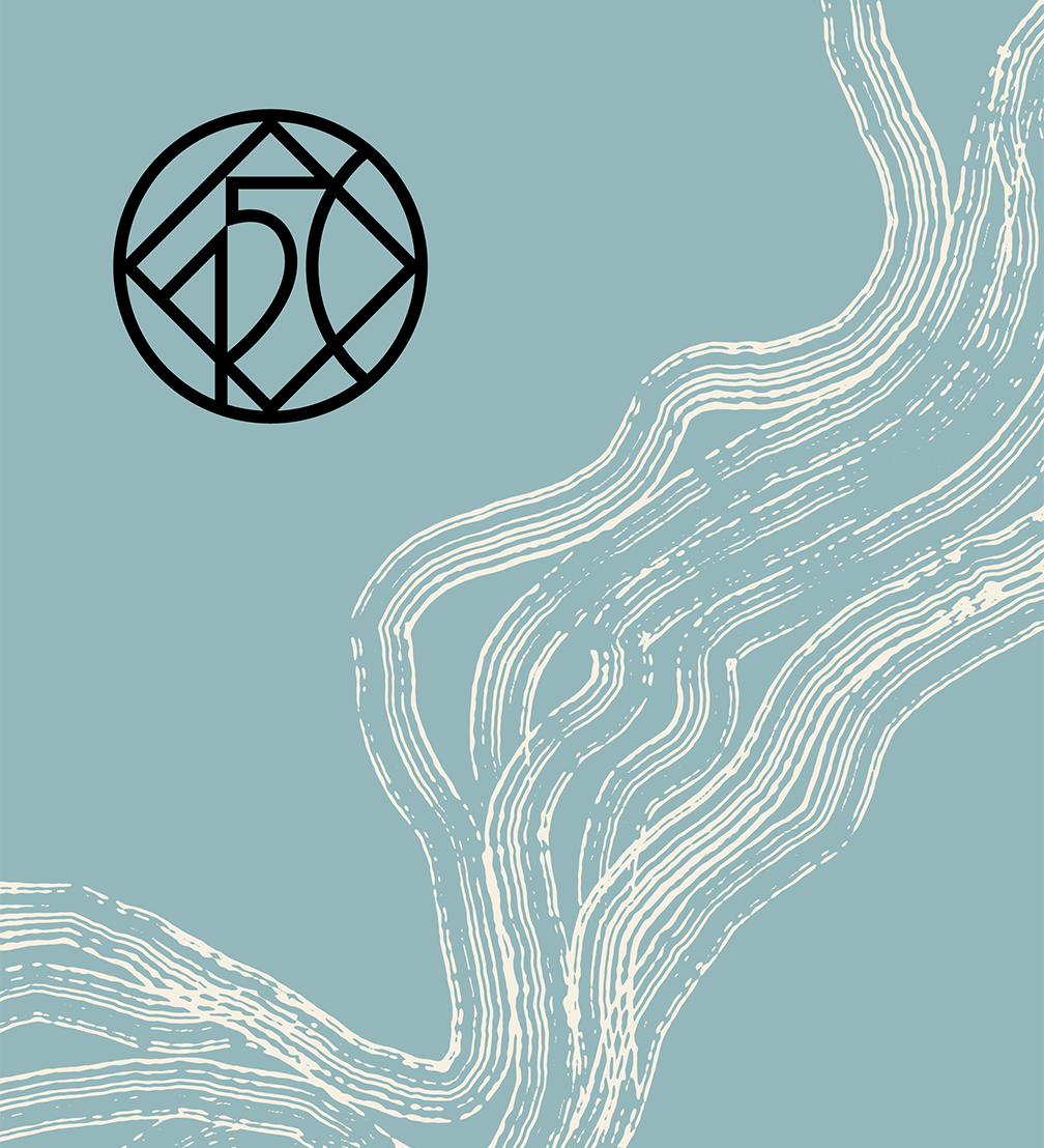
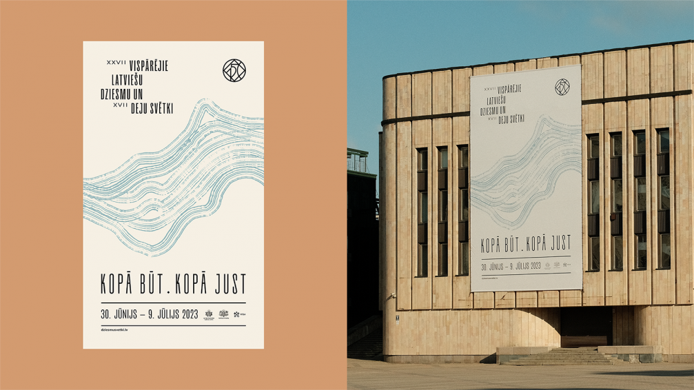
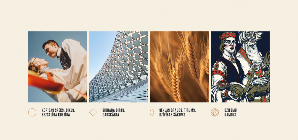
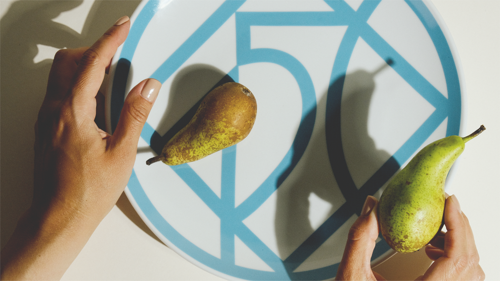
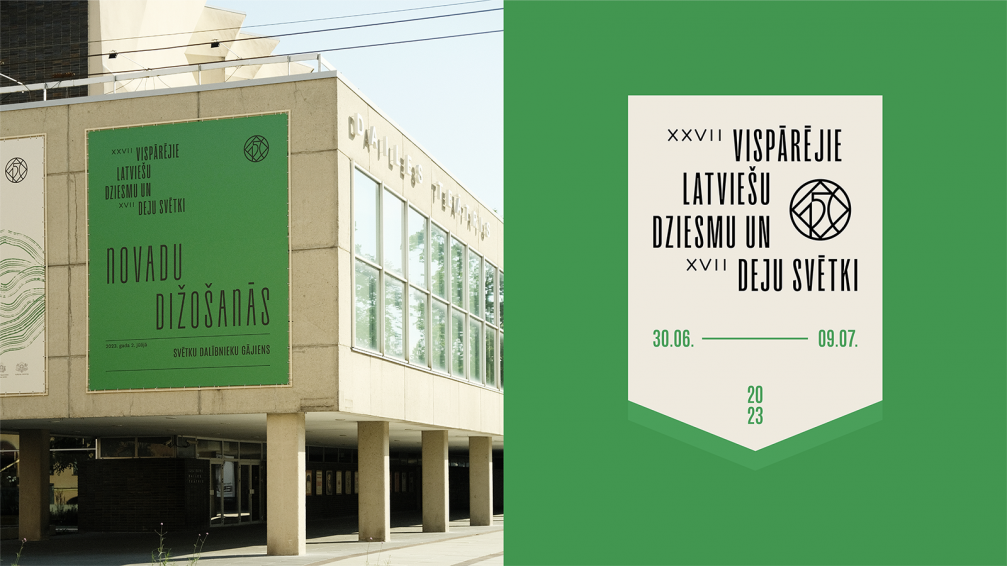
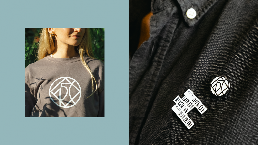
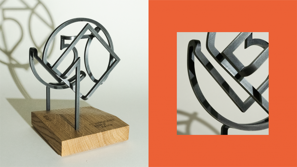
The visual identity of the festival consists of three main parts — the 150th-anniversary monogram, the wordmark, and additional graphic elements and compositional systems that complement the message behind the identity. The monogram is formed by several geometric shapes, each representing a certain value, intertwining into «dziesmu kamols» (a yarn ball of songs): the circle symbolises the power of community, cycles, and infinite movement; the diamond with equal sides is formed by the Sun symbol and indicates a yearly cycle, it also resembles the silver birch leaves on the Mežaparks open air stage; and the grain shape in the monogram represents life, beginnings, and continuance.
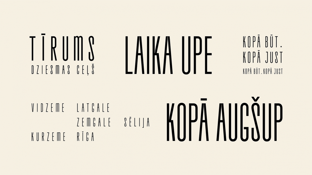
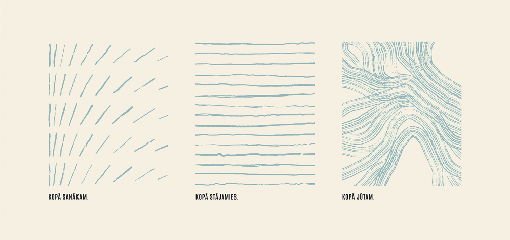
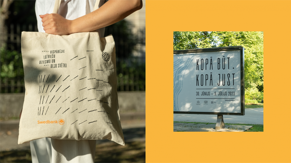
The typeface TT Frantz B was chosen for the wordmark of the Song Festival as its proportions resonate with the proud posture of festival participants. In the composition of the wordmark, one can see both the choir singers ascending to the grandstand and the rhythmic flow of dancers. An essential part of the identity are the graphic elements used in communication — lines that create various rhythms, symbolising coming together and shared emotions. The identity is primarily based on a light colour, signifying the grain — beginnings and pure ideas. The soft colour is complemented by accents — the green characteristic of Mežaparks, the sandy brown of the Baltic coast, the warm yellow of the sun, the vibrant red of poppies seen in folk costumes, and the ash-grey-blue of the river Daugava.
Authors: design by Maija Rozenfelde, Nauris Jostsons, and Jānis Kozinda; project management by Sallija Zute and Arnis Artemovičs; design of visual materials for external communications by Jānis Birznieks; photography by Jānis Romanovskis and Nauris Jostsons; metal artist — Modris Svilāns.

Viedokļi