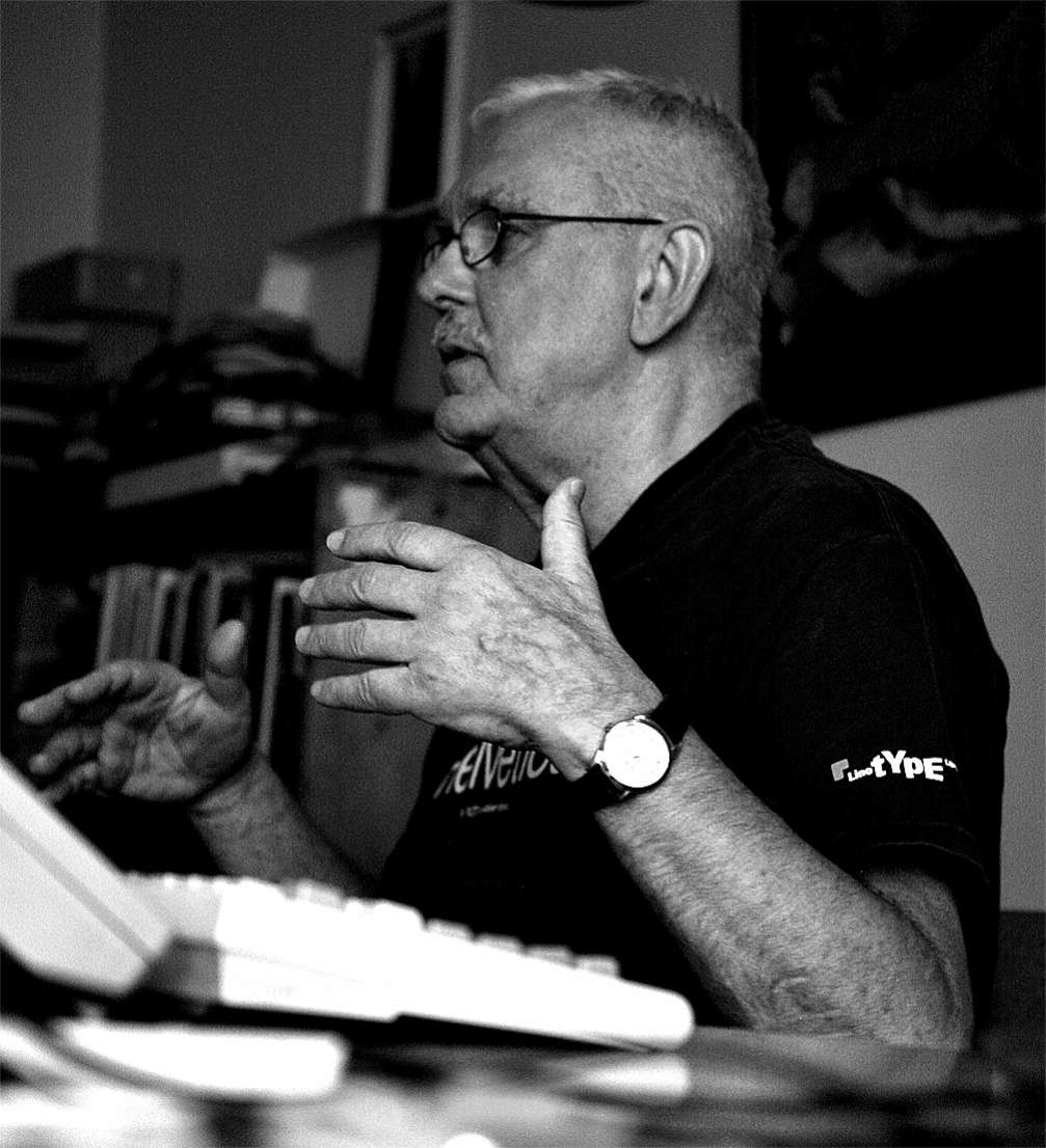
Latvian graphic artist and typographer Gustavs Andrejs Grīnbergs was the one who adapted Western fonts for Cyrillic, Greek, Turkish, and, of course, Latvian alphabets for the company «Tilde». Gustavs began adapting at the beginning of and for the needs the «Diena» newspaper. The designer has also created around twenty original font families, including the popular ones as «Robusta», «Linotype Brewery», and «Rowena».
Is creating fonts your day job?
Yes, since the beginning of 1990s; I chose this, and I feel free in this niche.
How did you come to such a niche field as typography?
It was actually the only thing that interested me. When I used to work with applied graphics, colours for me were always of second rate. My imagination and creative thought were always after a black–and–white solution. Only later I artificially «invite in» colours and it can be noticed straight away. Other people’s vision begins with colour.
How did the transition from applied graphics to creating digital fonts happen?
In the nineties, Kirils Šmeļkovs, chief artist at the first major Latvian newspaper «Diena», invited me to work with them. Back then there were no Latvian fonts to be used in the newspaper printing. It coincided with my interest in working with digital possibilities and graphics. There was only a couple of «Macintoshes» back then in Latvia — at «Diena», at the University of Latvia and the Cultural Foundation. There was only one for the whole office of «Diena», with a very small screen. It was used to write business letters, and, when letters where not written, I would sit there and learn a program called «Fontographer». In the beginning, I didn’t even know that everything must be saved; everything I made disappeared, and I was upset that I couldn’t save anything. This is how fonts where created for «Diena». After a while, another «Mac» was shipped in for «Diena», but what was its name…
…«Classic»?
Yes, yes, a black–and–white one. The Supreme Soviet also had one. Once I had to finish a job for «Diena», and journalist Pauls Raudseps sneaked the computer out so that I could do that.
Before the internet, where did you seek for examples and inspiration?
There were letter catalogues, if one could get hold of them. Or we just took over from magazines. From time to time, some magazines from abroad did turn up behind the Iron Curtain. The we, graphic artists, examined their headlines and imagined the lacking characters. One couldn’t ask for any copyrighted solutions, either we tried copying directly or invested our own inspiration. We also had «Letraset» catalogues with transfers, which was a very useful study material. I would say about my work that I have been deeply influenced by German artists and designers, more than the English or American. It was easier back then, because there were fewer materials, and one could freely make everything, whereas now we live in such a dense space that it is difficult to begin anything.
What do you think then — do we need new fonts or have we enough already?
I think we do need. I can say about myself that I react to specific signals. Maybe it’s not good, but what encourages me to work is that I see something wrong. I react to faults, not to something beautiful. I do marvel at it, yes, but I will never want to challenge it. On the other hand, if I see something lacking, I want to remake it. It is only that I must be careful, so that I don’t make something similar. It needs to be better; it needs to be something else.
You have an experience in not only creating your own fonts, but also in adapting other designers’ works in Latvian.
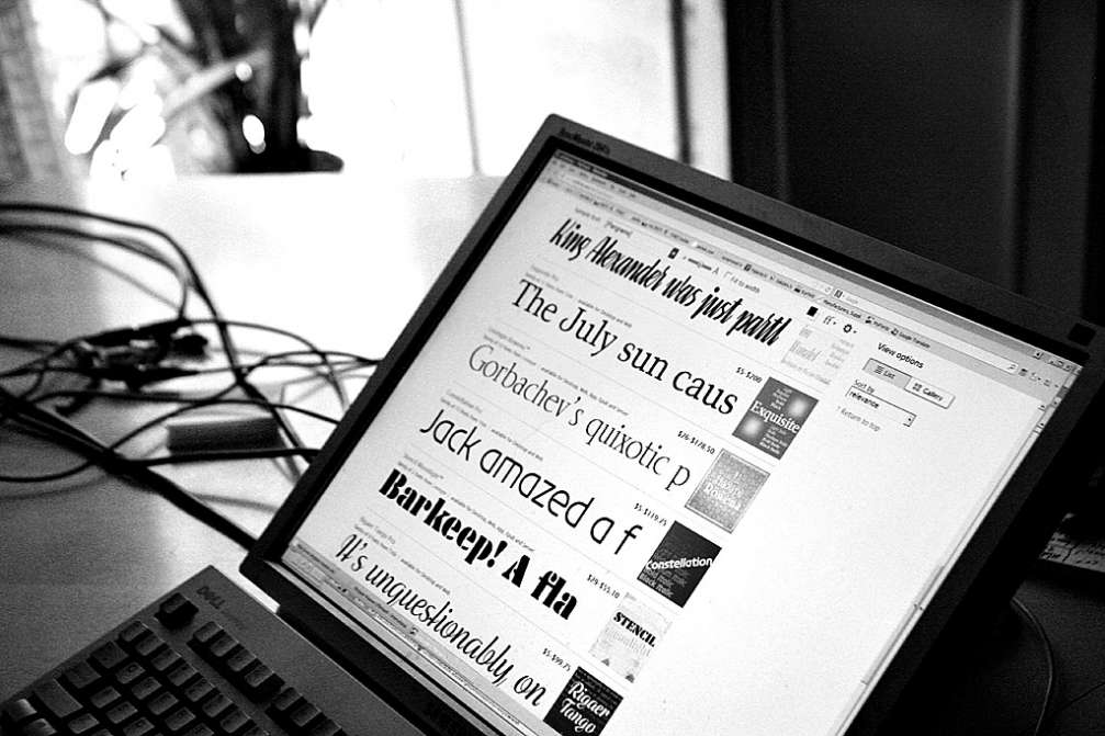
Yes, I adapted «Century Old Style» for Diena, the universal «Helvetica». I’ve had to add not only Latvian, but Russian and other languages’ letters to fonts as well. When working with other designers’ fonts, one has to dance in step with them. You can’t step on the feet you’re dancing with. Sometimes I can create a whole font from just a fragment.
What are the recent directions in your creative work?
In the nineties I made more than 1000 font adaptations for Latvian, Baltic, Eastern European alphabets and over 300 font adaptations for the Cyrillic script. In the last ten years I’ve been mostly focused on creating new fonts. During this time over 20 new typefaces have been made — «Robusta», «Linotype Brewery» and others. Each of the font families contains from 1–2 up to 50 different fonts or letterforms. Afterwards they become exclusively licenced for distribution for «Linotype» and «Tilde». These companies complete my fonts technically and adjust them for installation in the computer and distribution in font shops on the internet. That sets me free of technical and sales issues, and I can devote my time to the creative process.
The fact that you have seen times when everything was drawn by hand, what influence has it left in you?
I can’t let go of anything that I haven’t evaluated for a long time. I am glad to remake what has already been done. I don’t think there is anything complete. Something lies in a drawer, and I look at it after a while — this won’t do, and neither this, and I must do this again, and I can’t let it go unless it’s ready. There are people who quickly make something and leave it, and there are such who can’t let go. It probably comes from the times when one had to do everything thoroughly by hand. There were times when it was even difficult to draw parallel lines or make a right angle.
So this means that typography requires pretty big patience.
When all characters are put together, often they don’t fit. Then you have to go back, cross it out, start anew. This means working forwards and backwards. All the work is like this doily, like making a rag quilt. There are so many units of information that you have to skip from one item to another. I even counted once — 100,000 different points and tails, which must be kept under control. It is nerve–wrecking.
A regular user cannot appreciate the work invested in a good font. Does typography make any difference?
They cannot, but it makes a big difference. I would prefer if people would say after seeing my work: I’ve seen this somewhere else. And I would then ask them: where exactly? And it would turn out that they haven’t. Letters have joined in; they fit organically, like a brick in a wall.


Viedokļi