For centuries signs and their letters have been an integral part of a city. Direction signs, advertisements, station names are the most popular and at the same time unprotected typographic examples that change with the time, lose their function or simply are painted over or removed. To preserve a part of this historical heritage, the photographer and enthusiast of the project «Profane Fonts» Gatis Vanags has created the book «Letters. Signs. Environment» whose opening celebration will take place on December 17.
The project «profane fonts» started in 2011, when the first pictures of eye–catching letters and signs were taken not knowing anything about their authors, who most likely lacked an art education. Later the range of materials expanded, keeping the name of the project that stands for secular, often unprofessional, yet interesting urban typefaces.
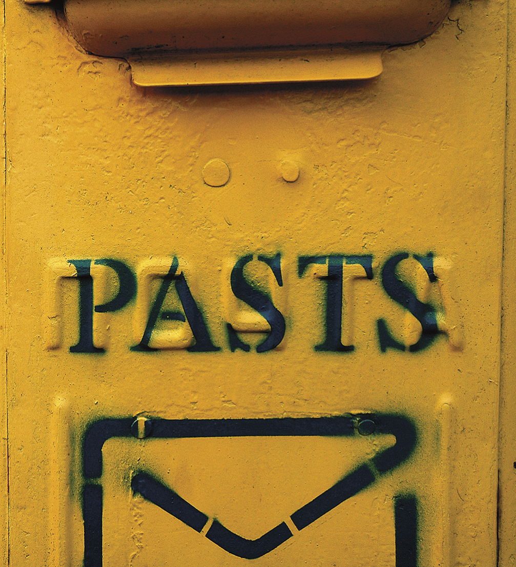
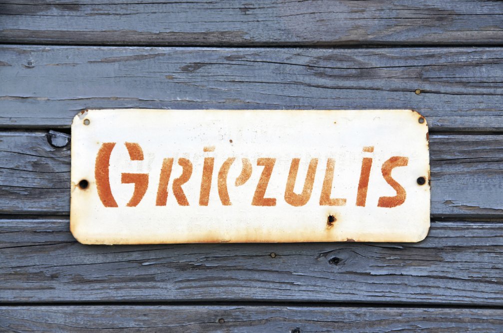
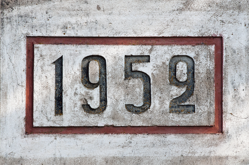
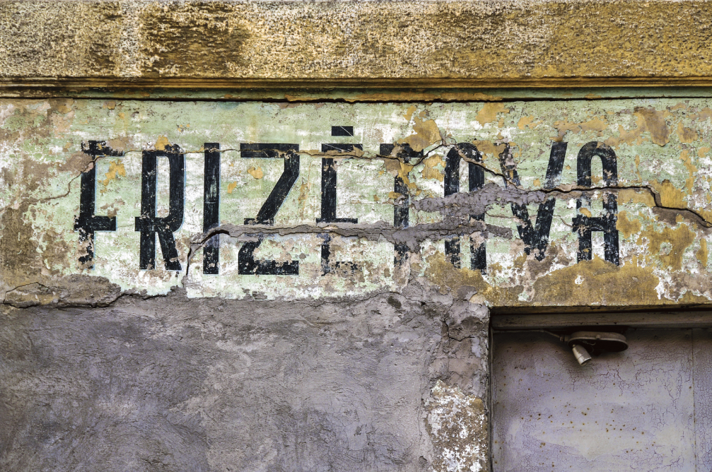
At the beginning the idea to document the signs came from graphic designer Mikus Vanags, but later photographer Gatis Vanags took over the baton, taking pictures of interesting typefaces from «pre–computer» era. While continuing to collect the material, he gradually began to systematize it for his book «Letters. Signs. Environment» («Burti. Zīmes. Vide»), supported by the State Culture Capital Foundation. His works along with some contributions from other photographers are published in several thematic chapters: railway information signs, location and direction signs, signs for public institutions and advertising, ghost signs or almost disappeared advertising wall paintings, signs on building facades, address plaques as well as monuments and memorial signs.
For a better depiction of the informative environment during a certain period of time, almost every chapter in the book features historic photographs from private collections and museum archives. The readers will most probably be those interested in typographic, graphic design and history, however, Gatis Vanags hopes that it will be a source of inspiration for everyone to pay more attention to the surroundings and even notice some true gems of letter design. In the foreword of the book the well–known architect Pēteris Blūms confirms this idea by writing: «It is such a unique feeling of discovery to find texts, paintings, lines coming into view through layers of paint on an old façade in an old city. You understand that this was written for your great–grandfather’s generation and back then it was only a piece of information, but for us it is a cultural and historical sign. And a treasure.»
At the beginning of the book Gatis Vanags provides insight into the typographic in Latvia’s urban history and reveals why research is so interesting: «Many of the found typefaces are unique, created by an artist or an ordinary craftsman. There are many technologies used in making of the signs — they are painted, cut from wood, formed of cement and even welded. Anonymous authors have used fonts known only to them. Often these examples surprise with their originality and very successful interpretation of the text.»
The opening event of the book «Letters. Signs. Environment» will take place on December 17 at 18.00, at the premises of Riga School of Design and Art, Lāčplēša iela 55, Riga.


Viedokļi