
Typeface «Pilot», created by Aleksandra Samuļenkova, was published a few months ago by the type foundry «Bold Monday» in the Netherlands and already has received one of the most significant awards in the world of type design — «Certificate of Typographic Excellence» by The Type Directors Club. It is the first time that the award is given to a Latvian designer.
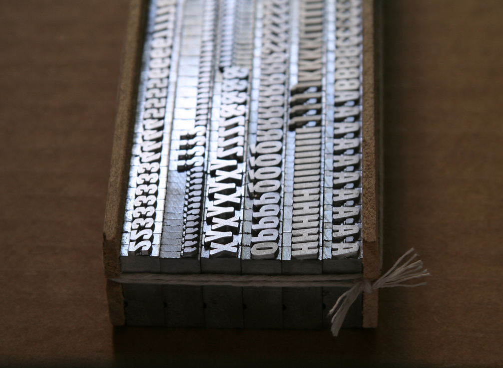
The first sketches of «Pilot» were created in 2012 during Aleksandra’s Master studies in the Type & Media program at the KABK in The Hague, which is often referred to as a hotbed of typographic design. «Pilot» is one of the very few contemporary typefaces that are also available as metal type (Black Italic capitals, figures and punctuation in 24 pt, available from «Swamp Press») after winning the first prize at the Fine Press Book Association’s inaugural Student Type Design Competition in 2013.
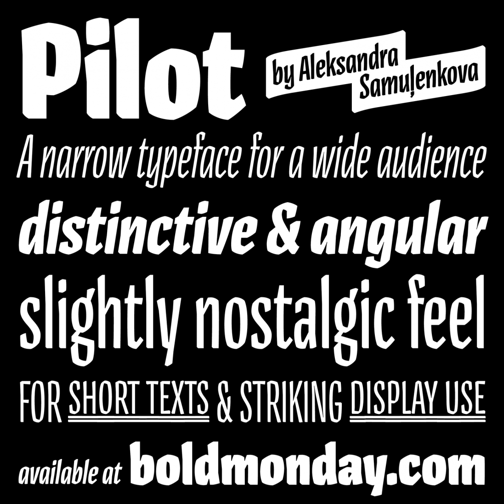
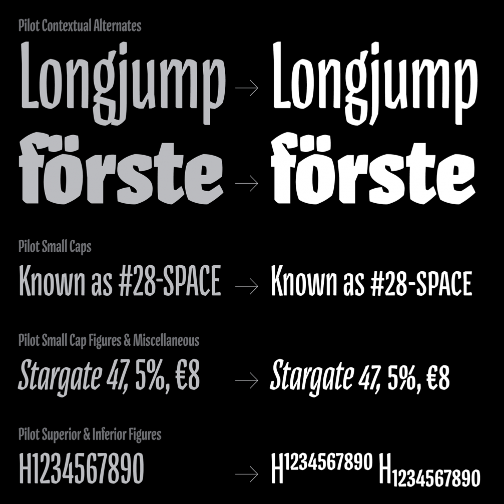
«Pilot» is an expressive typeface family with a distinctive character and slightly nostalgic flavour. It consists of 10 styles — five weights with corresponding italics, all with a «slim fit». «I have always loved condensed type — it is such a valuable tool in typography. But I had a feeling that the narrow styles are often designed just as derivatives of the regular width.
«Pilot», on the contrary, was born to be condensed! The distinctive construction of its letters is only possible because of the Pilot’s width. Applying the same construction for wider letters just wouldn’t work as well.
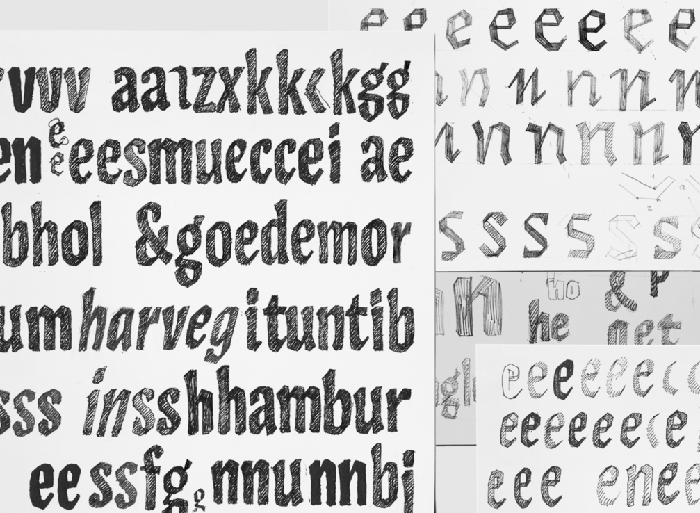
At the very early stage of this project, I was playing with an idea of drawing letters with only straight lines, trying to retain some contrast modulation. Obviously, I pretty soon abandoned this rather naive experiment but I realized that narrow shapes drawn in such a manner are much more satisfying. That’s where the Pilot’s angularity is coming from,» Aleksandra explains.
««Pilot» is definitely not a revival of an existing typeface, it doesn’t even have a link to a specific historic example. But certain kind of publications inspired me — some sci–fi pulp fiction from the 1950s and 1960s. Not so much by their typography or lettering but rather by their general appearance. That’s why I call «Pilot» a retro–futuristic typeface: it could have been a futuristic typeface invented in the past. «Pilot» looks quite authentic in such a context,» Aleksandra continues.


However, «Pilot» can be used in contemporary materials as well. While working on the typeface design, Aleksandra used it in graphic design works to be sure of its usability and functionality.
To please designers with sophisticated taste in terms of types, «Pilot» also has small caps letters, additional symbols of numbers and currency symbols in their height, as well as superior and inferior figures.
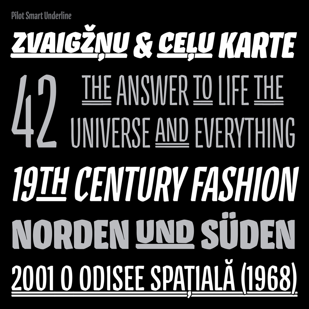
«Pilot» uses various opportunities of OpenType. Its stylistic set provides the smart underline, which is designed in appropriate style and doesn’t interfere with the elements under the base line of the letters. While contextual alternates for «j», «t» or «f» enable even tighter settings of tricky letter combinations.
Aleksandra studied at the Department of Visual Communication at the Art Academy of Latvia, where she graduated with a BA. After that, she moved to the Netherlands and still lives and works there. From 2012 to 2017 she worked as a typeface designer at the type foundry «LucasFonts» in Berlin simultaneously working on her own projects.
Aleksandra is enthusiastic about design traditions and the link between graphic and typeface design and historic events. Last year, Aleksandra gave a lecture «Diacritics as a Means of Self–Identification: Case of Latvia» in the «ATypl» conference in Warsaw. The lecture is available online.
Aleksandra is also active in the field of graphic design. In Latvia, she has collaborated with the «kim?» Contemporary Art Centre and brand «Miesai», for which she created design graphic «Millions of Cīrulis».


Viedokļi