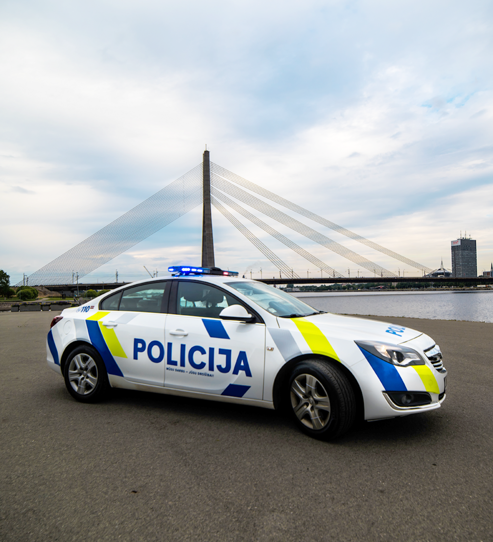
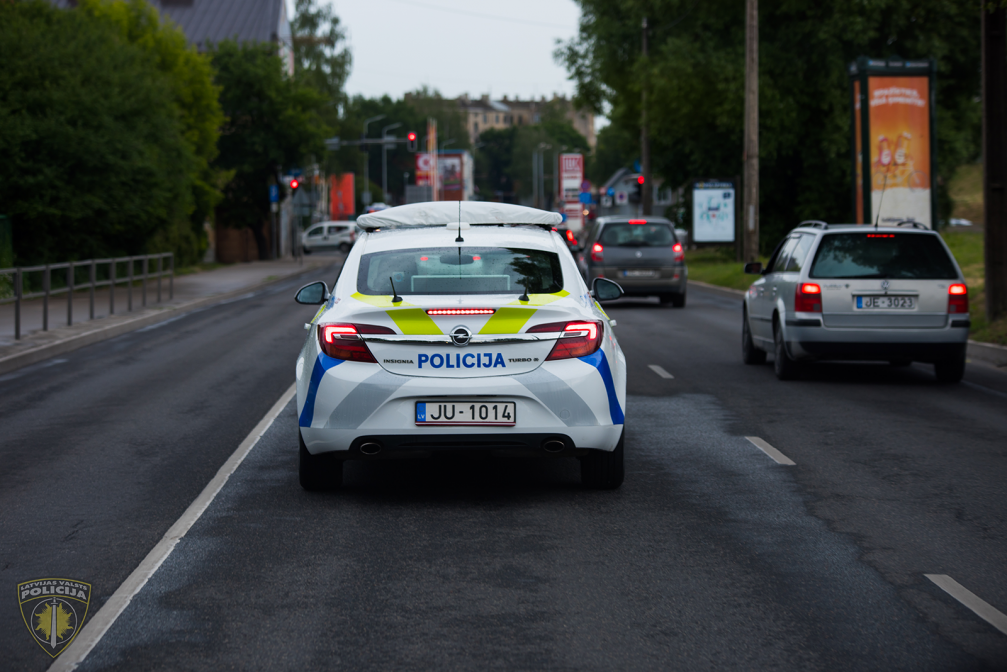
In collaboration with students and tutors of the Art Academy of Latvia, the operational transport of the State Police of Latvia now has a new visual identity. It is bright, noticeable and more functional — the police vehicles will be easy to spot both in daylight and in the night time.
Modern, colourful and safety compliant — these are the key characteristics that describe the new solution for the visual identity of the State Police car fleet. The collaboration between the State Police and the Art Academy of Latvia (AAL) begun almost a year ago, when the State Police turned to the Academy, encouraging to form a team that could create a new design for the police car’s marking. «We were honoured to receive this invitation because when Mr. Glūdiņš (designer, professor Gunārs Glūdiņš — ed.) created the current marking, he was also the Head of the AAL Design Department. We are glad that the succession remains,» says Maija Rozenfelde, the Head of AAL Functional Design department.
The current, temperate grey marking of the State Police was created by Gunārs Glūdiņš in 1991. It was the time when police wanted to distance themselves from the previous image of the Soviet Militsiya whose main colours were yellow and blue. The elegant solution with the Coat of arms of Latvia was completely relevant at that time. However, after 27 years the police seeks for design changes that would be more contemporary.
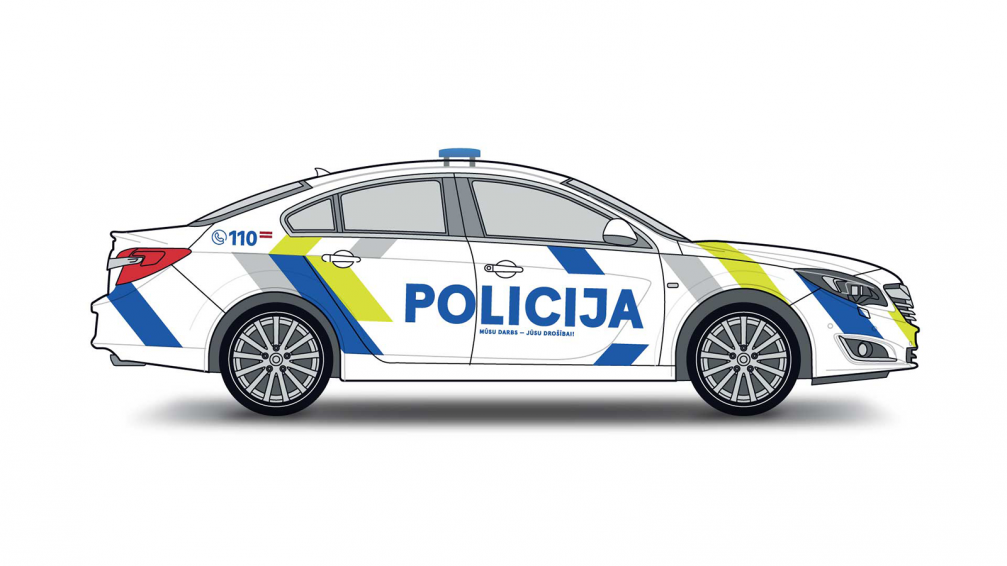

«Our main task was to create a new marking which would match with the overall rebranding of the State Police not only visually but also conceptually. The police don’t want to be associated with hiding and penalties. On the contrary, the police put effort into safety and prevention of accidents. The design solution reflects the fact that the police becomes friendlier and more available to the society. The change of the image is the most important part of the implementation of the new design,» comments Maija Rozenfelde. She explains that the design process begun with a research. The team then came to the conclusion that the Battenberg marking is the most noticeable, so they chose to use it in the design.
The new visual identity still has the grey colour as one of its elements: «We have kept the historical inclination of the grey area. In its own way, it is a multiplication of the previous forms, while giving the police a new level of visibility and strength,» says Rozenfelde.
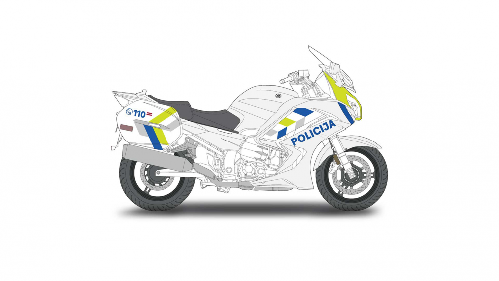
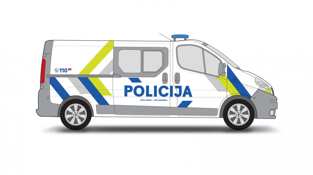
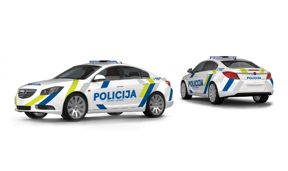
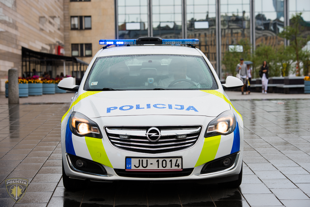
The grey colour is supplemented with yellow and blue, creating a stylized form of Latvian ethnographic motif. While the AAL students Megija Jurevica and Sallija Štāle reveal that they were also inspired by the flow of the Daugava River.
The solution features high–quality reflective elements to provide better visibility, durability, and resistance to temperature fluctuations.
The participants of the design team were Maija Rozenfelde and professor Ingūna Elere, as well as the students of the Functional Design department’s Bachelors and Masters programmes: Megija Jurevica, Sallija Štāle, Helēna Stāmere, Linda Justa, Didzis Jaunzems, Aiga Beinaroviča, Lāsma Ločmele, Alvis Berngards, Krista Miltiņa and Daila Sloka.
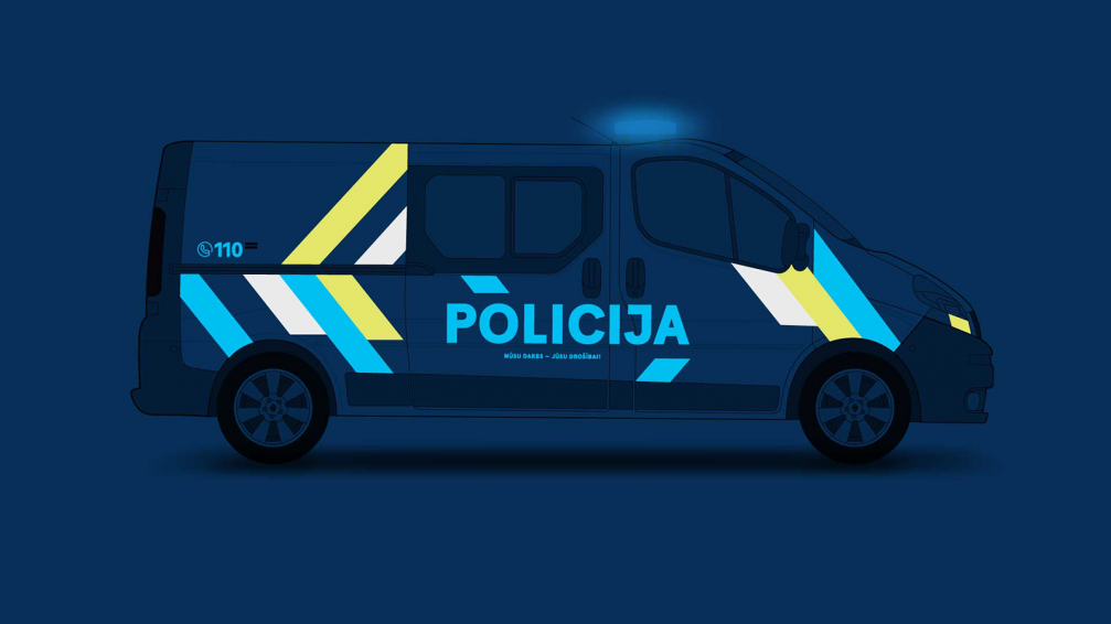
The State Police plans to introduce new marking for the operational transport gradually. First of all, the operational transport for road traffic control and patrolling functions will undergo a change of visual identity, but within three years it will be applied to the entire car fleet.


Viedokļi