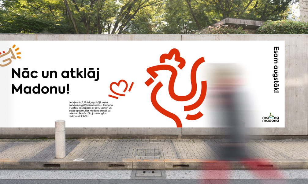
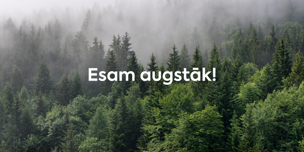
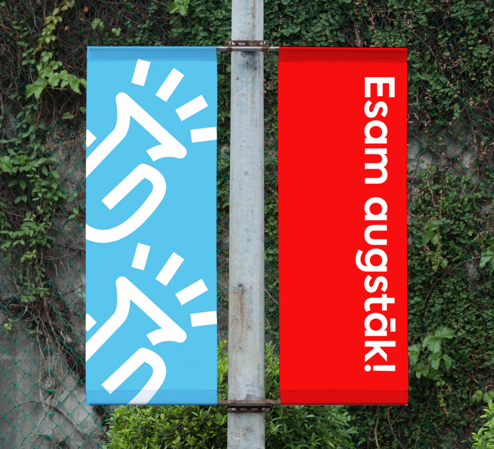
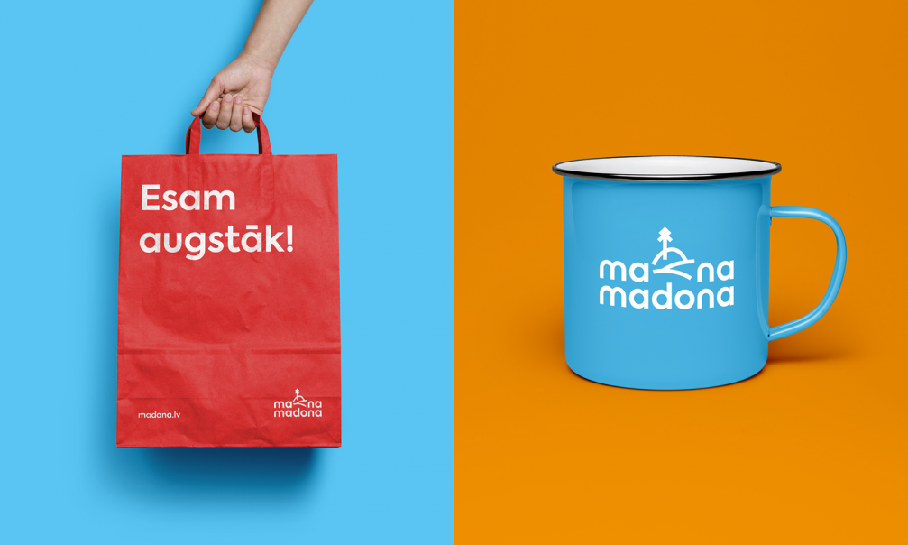
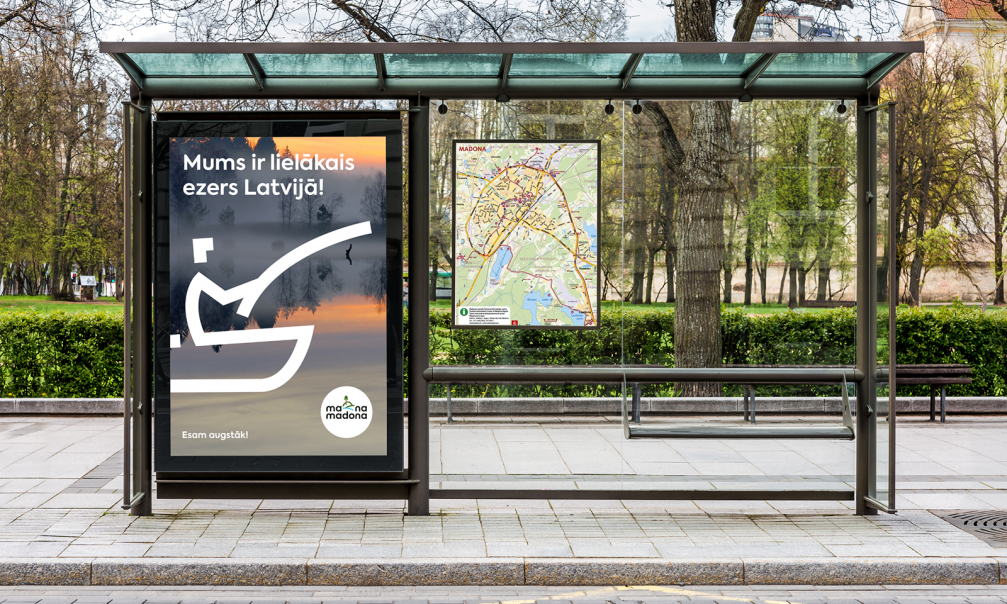
In early November, Madona county introduced a new visual identity to mark a decade since its formation. The new brand has been developed by the design agency «BrandBox» in close cooperation with the municipality. The logo uses the word game «My Madona» (Mana Madona), while the aspirational «We are higher!» (Esam augstāk!) has been chosen as the slogan of the region.
The new visual identity has been created in order to position the region more clearly and to explain the significance of the county on the regional, Latvian, and European level. Chairman of Madona Municipal Council Agris Lungevičs wants the county to keep up with the times: «Visual identity is one of the sets of actions that I believe will promote the development of the county and increase its recognition in other regions of Latvia, as well as public confidence and local patriotism.»
The commissioned design agency «BrandBox» has developed a brand strategy, brand legend, slogan, logo, visual identity, and brand book for Madona county. The residents of the county were also involved in the work process — in order to map out the most common associations and feelings about their region. «As with any county or city, the most difficult thing is to find and correctly highlight the special, distinctive features it has. The brand must not only be appealing and attractive to tourists, but also integrate citizens and their values. It should be so strong and meaningful that every resident of the region would like to associate with it. It was this aspect of the creative process that was the most difficult — finding the most appropriate means of expression because there are many equally important values in Madona county,» says Ēriks Šulcs, creative director of «BrandBox».

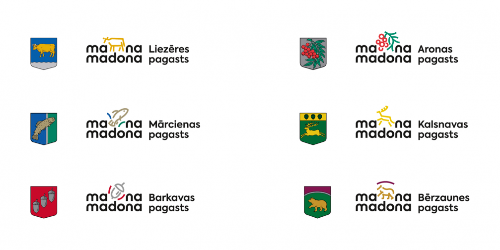
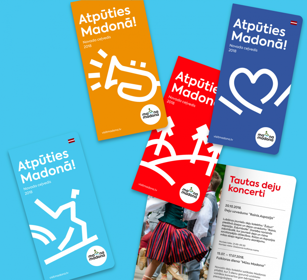
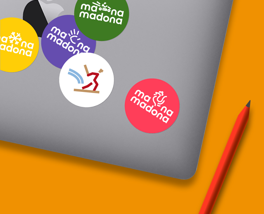
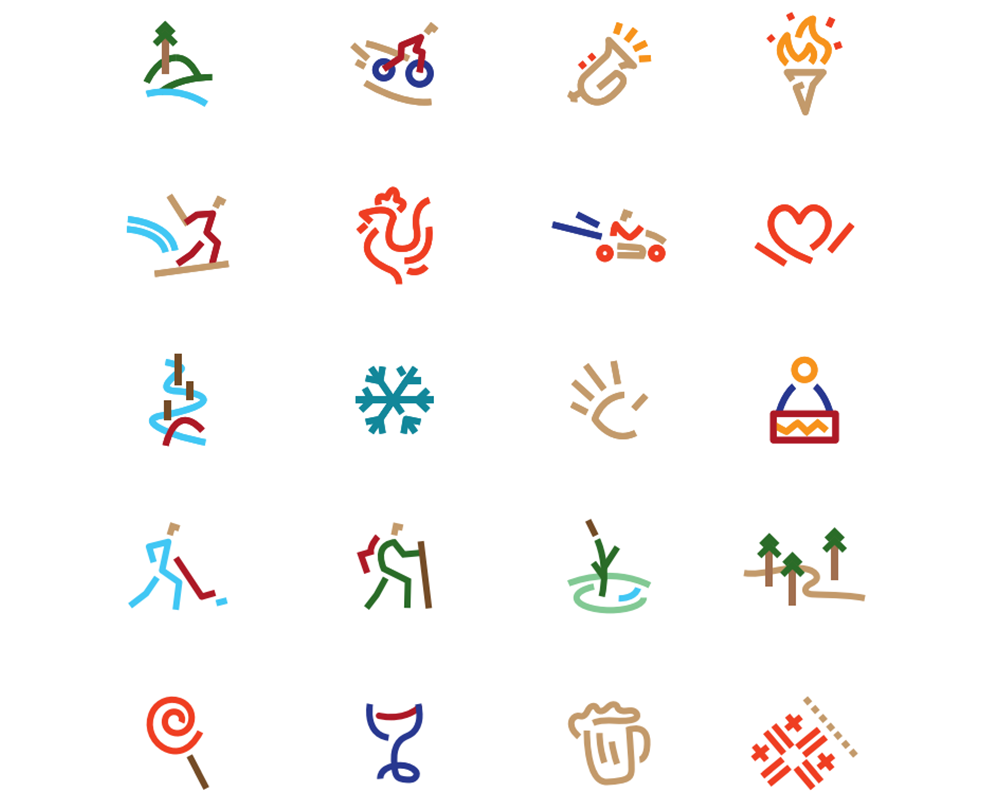
The county’s newly created logo is bold and easily recognisable, including the word game «My Madona» and changing, customisable symbols — each of the county’s parishes and municipal companies now has its own «My Madona» logo, and schools, businesses and even citizens can create their own custom logos. The playful and easy-to-read typeface «Axiforma» has been used for the logo, the slogan, and all headlines.
Meanwhile, the phrase «We are higher!» has been chosen as the slogan of the county. Ēriks Šulcs explains its meaning: «Madona county is the highest county in Latvia geographically, but most importantly — the slogan is a call to action. Let’s aim higher! Let’s do it better! We want to be higher, right? In addition, the graphic design of the brand «My Madona» allows both residents and guests to fill it with their experience, emotions and intentions — to bring it to life!»
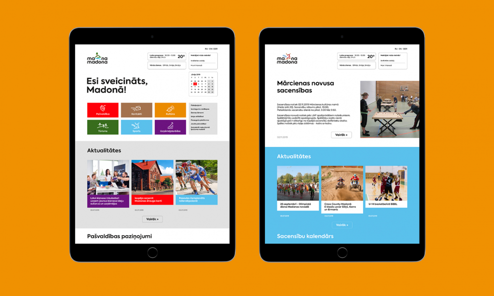
A new website has also been developed for the county, and the visual identity has already been applied on social networks and souvenirs. A spatial version of the logo — a sculptural object has been placed on Madona’s Pine Hill, where residents and guests can take photos and share these photos to promote Madona’s name near and far. The design of the visual identity cost the municipality slightly less than 12 thousand euros (including VAT). More details of the visual identity can be viewed on the «BrandBox» homepage.

Viedokļi