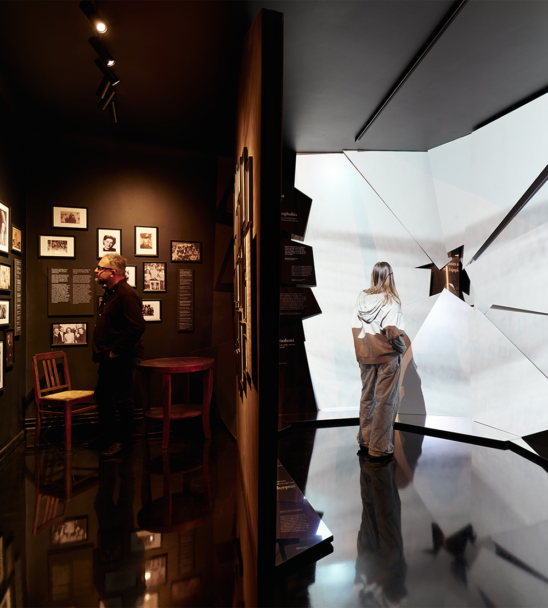
Brand design studio «Overpriced» is young, bright and ambitious. It is also the first in Latvia to draw a clear line between graphic and brand design. In the past 18 months the company has worked with 34 clients, creating their brands or bringing these back to life. All of their work is based on a well thought out brand strategy and often complemented with illustration – one of the «Overpriced» signature traits.
Brand design studio «Overpriced» was founded one and a half years ago by graphic designer Aigars Mamis who is a well–known figure in the Latvian design scene, illustrator Roberts Rūrāns and Krišjānis Mazurs and Kristaps Siliņš, both from the brand strategy agency «White Label». «We all saw the value of our idea — to create a studio that perceives design as a tool for problem solving, not just plain decoration. I’m not saying that other studios don’t think about the purpose of design, especially lately the discussion has become more audible, but these attempts often are limited by trying to find the solutions in–house and making the strategy themselves. In fact, a whole team is needed to focus on just that,» head of the studio Aigars tells about the ideas that encouraged the foundation of «Overpriced».
Brand design, not graphic design
It was Krišjānis Mazurs’ idea to call «Overpriced» a «brand design» studio. When asked how the notion «brand design» that they use is different from the more common «graphic design», Krišjānis explains that the former makes use of graphic design elements to achieve its aims, and yet it is only one of its elements. The remaining ones are brand strategy and the work of the creative director, outlining a clear vision for implementing strategy through design.
«Brand design isn’t something new, it’s just that in Latvia, where the market is small, no one uses this positioning because it is a big risk to focus on one thing. The studios take on everything they can get, but in our case together with a strategy brand design is the best we can offer,» Aigars Mamis comments. He explains that brand design is not just a logo — it is a visual language that consists of ideas, logos, colours, typography, visual elements and a composition that unites everything.

««Overpriced» design solutions are very focused. Our communication is clear and understandable, therefore a large part of visuals are clean in their execution. Our aim is to communicate one thing only, and the message must be strong,» Aigars continues. He mentions illustration as another significant trait of the «Overpriced» creative signature, mainly thanks to illustrator Roberts Rūrāns. «Compared to a more global market, Latvian clients still need to grow in their understanding of what can be achieved with illustration. People are unaware of how strong a communicator illustration may be. It can create unique situations, characters, even worlds and tell every kind of story. We often include it in our design solutions to make brands more unique and approachable,» says Aigars, who also works as a lecturer at the Art Academy of Latvia.

Overcoming obstacles and finding solutions
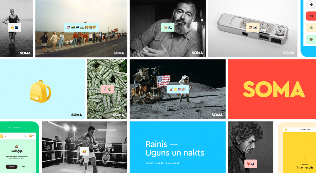
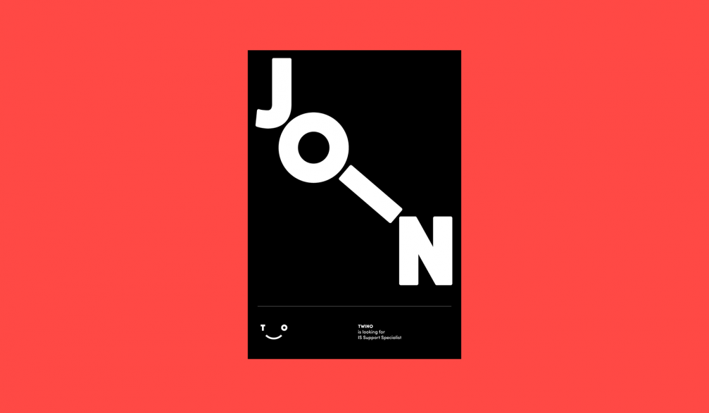
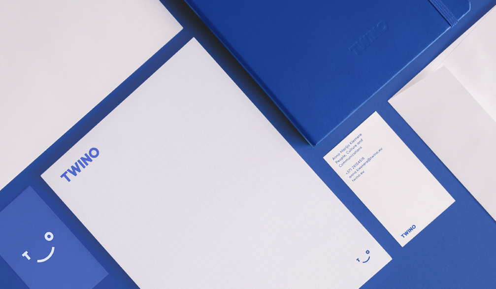
«Overpriced» clientele ranges from «Vest» bar to the investment platform «Twino» and entertainment platform «Shortcut» by «Lattelecom». In the course of eighteen months «Overpriced» has worked with thirty–four brands, twenty–five of which were either newly created or improved. Among those was the education company «Lielvārds» with its learning platform «Soma» that made it into the final shortlist of the Latvian Design Award and received a special prize awarded by the IT company «Accenture», the main partner of the competition. ««Soma» serves as a good example of how to make a technologically innovative product more humane through brand design and speak to the audience in an easy to comprehend and interesting way,» concludes Krišjānis Mazurs. Since it was necessary to make the brand understandable for the youth, the studio used lively colours, simple icons and relatable emoji. This universal language offers a way to organise the different study materials offered by the «Soma» software and may also be used in the designs of physical objects – stickers, bags, and hats.

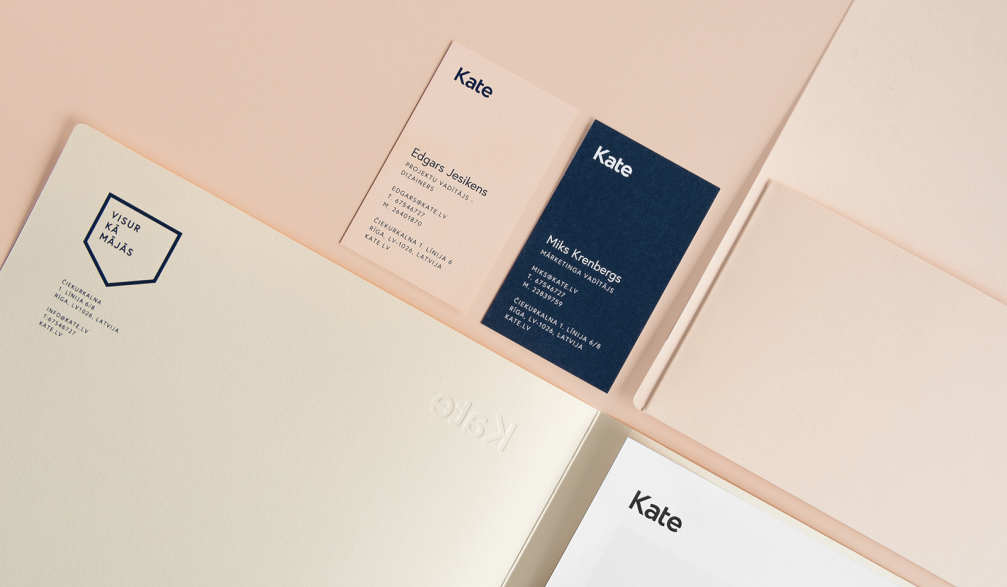
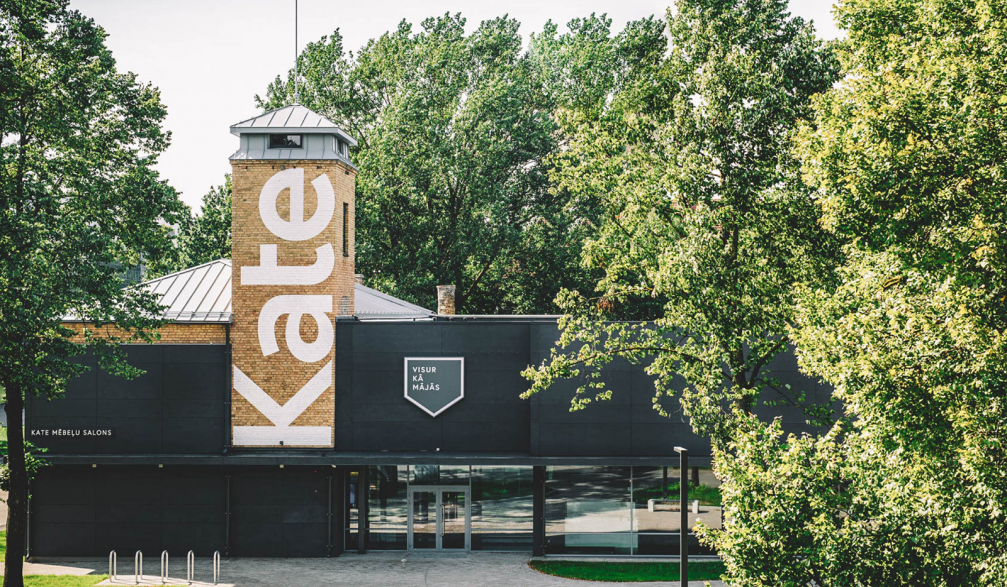
The visual identity of the furniture showroom «Kate» reflects the two areas in which the company is active — selling furniture they produce themselves and that produced by others. The ascetic symbol that may be compared to a painting and a frame at the same time, tells two stories — the empty frame stands for «Kate» as curators for those choosing furniture, and the full frame stands for the home goods they produce. Brand design can be easily used in both price tags and large–scale ads.
Aigars says that it is important for «Overpriced» to establish meaningful relationships with their clients and to achieve mutual trust. This is also the case of the hotel «Neiburgs», which is «a dear and extensive» project for the studio. The strategy of «Neiburgs» is to present it as an accommodation for introverts — without a loud lobby and bar, but with a library, restaurant and carefully designed interior where the guests can feel like in their own «little world». The idea of mindfulness sometimes directly, sometimes indirectly is reflected in all brand communication materials created by «Overpriced».
When asked if their client vision does not vary from that offered by «Overpriced», Aigars explains that clients are only presented with one version of the design, which crystallises within the studio: «We don’t present «this» or «that», we are not that indecisive. We offer one solution that simply will work best.»


Viedokļi