Over the past year and a half, several Latvian municipalities have decided to change their visual identities. In autumn 2017, a new unified visual identity of Liepaja municipality was presented, following by Valmiera and Alūksne last year. Alūksne’s visual identity by the design studio «H2E» highlights its unique location and local dialect.
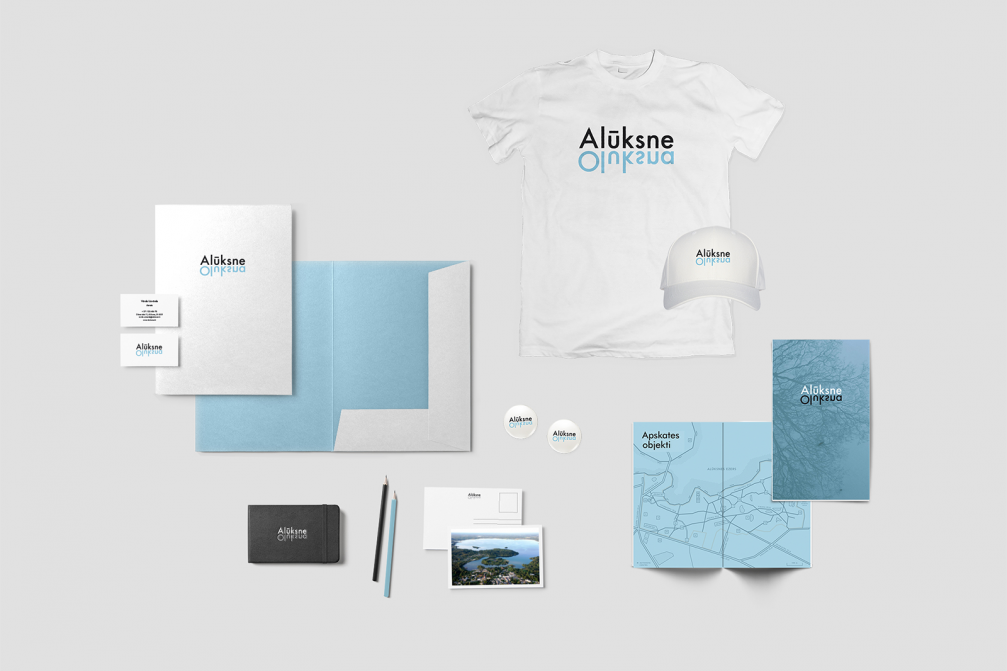
In Alūksne municipality, the decision on the need for a new visual identity wasn’t rushed. Already in 2015, the city announced a competition for logotype and slogan and everyone interested was able to participate and submit ideas, based on the Alūksne brand concept that was carried out even before that. Opinions and options were entirely different, so the municipality turned to the design studio «H2E». After careful research of Alūksne’s symbols, the studio presented three sketches in 2017. «The process that began as a consultation on the existing offers, transformed into a long-term collaboration in which we developed both the identity of the city and the concept of souvenir line. The residents of the city also were able to participate by voting for their favourite version on the municipality’s website,» recalls Ingūna Elere, the creative lead of «H2E» design studio.
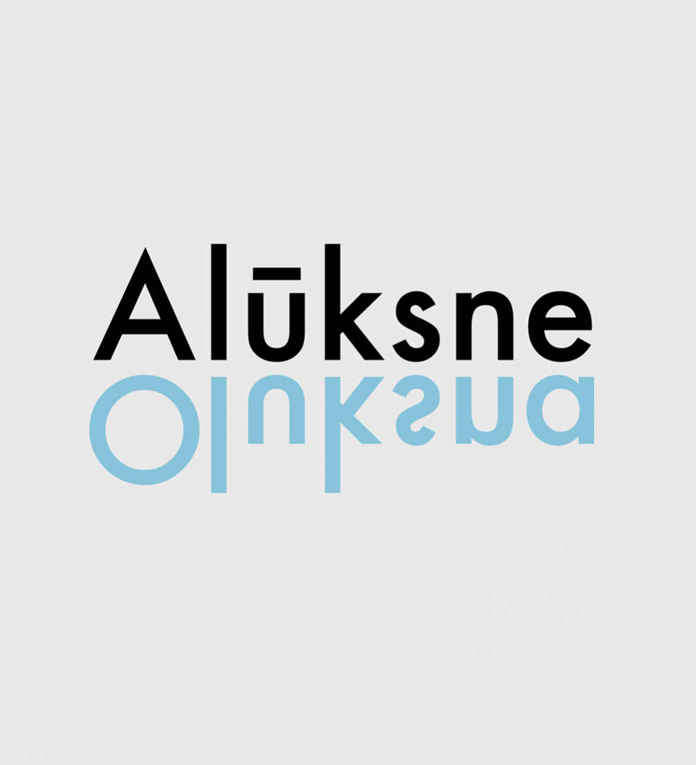
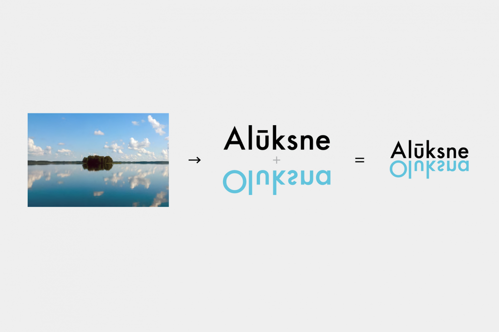
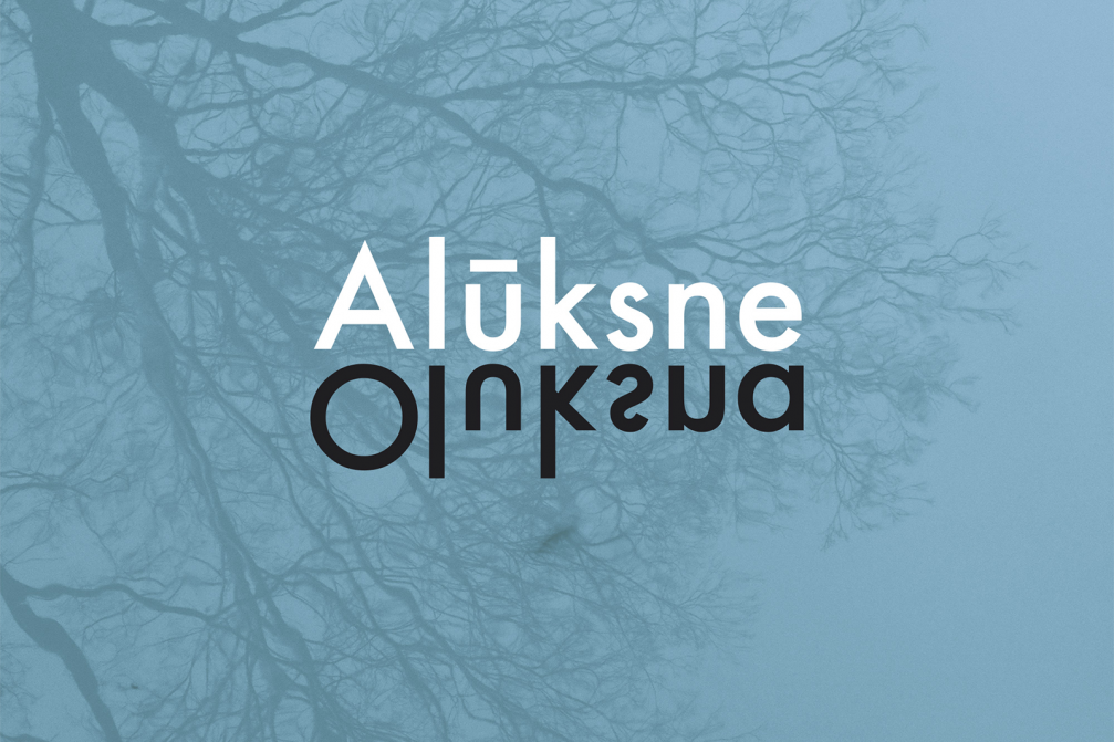
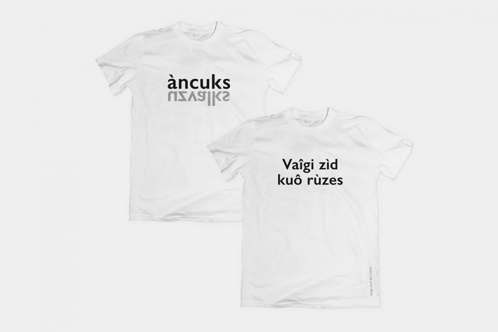
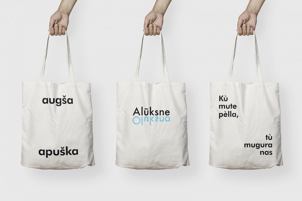
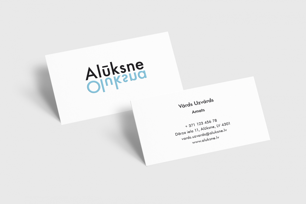
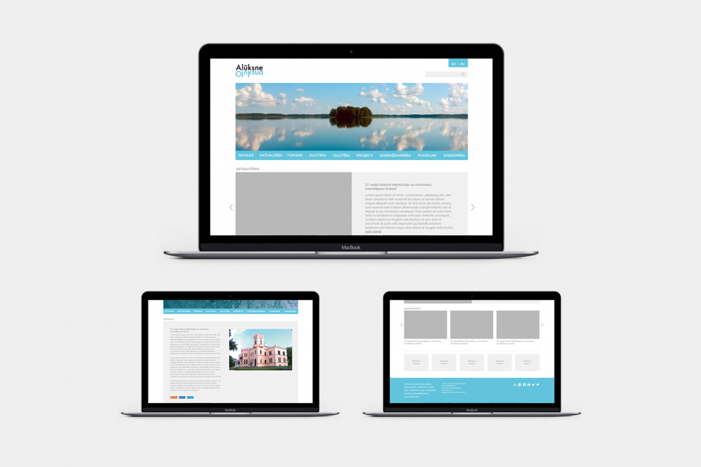
Last year, the finalist was confirmed — a graphic symbol which features both the current and historical name of the city, thus connecting the past and the present. «We came to this idea in the work process while searching for the uniqueness of Alūksne. The genius loci that we could express in visual language. Each place has its spirit, context, history. Alūksne is situated in a muddy place, and its historical name is Oluksna, derived from the Latgalian language,» Ingūna explains. The authors have emphasized the local dialect as a distinctive feature of the place. As a result, the logotype symbolically represents Alūksne as a unique place with a lake in the middle of the city. While in the lake the ancient name Oluksna reflects like in «a clear lake, like a pure tear, like water in spring and the sky». «H2E» emphasizes that the primary goal of the new visual identity is to show Alūksne as a modern city with an ancient and rich history that is still respected, gives strength and creates its story.
In 2017, the design studio «H2E» created the visual identity of Liepaja as well — find out more in this article.


Viedokļi