Talsi has joined the Latvian towns and municipalities with new graphic visual identities. The author of the visual identity is the design studio Teika, they focus on the existing values and symbols of Talsi.
The development of the municipality brand began in March last year. The Talsi Municipality decided to create a new website for the municipality, they then realized the need for a clear and unified visual identity. The strategic communication expert Liene Kupča interviewed the residents of the Talsi Municipality for three months. In the process, she defined the three main values of Talsi brand — courage, meaningfulness and humanity. «While creating the brand for Talsi it was crucial for our team to understand the context, to change the perspective and to emerge above the mundane to find, see and systematize the unifying values to tell others about — to the visitors, partners, investors and potential residents,» Liene explains.
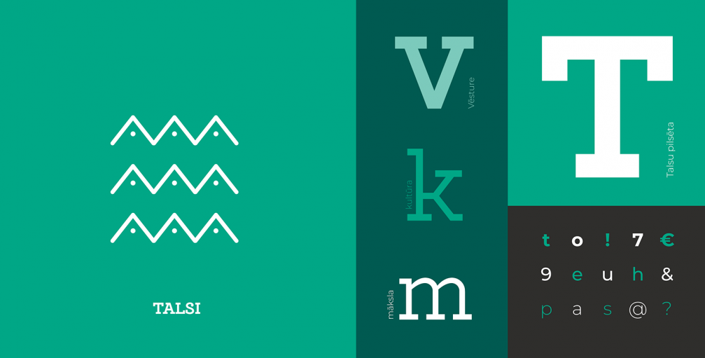
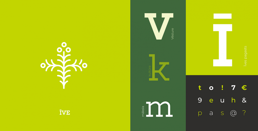
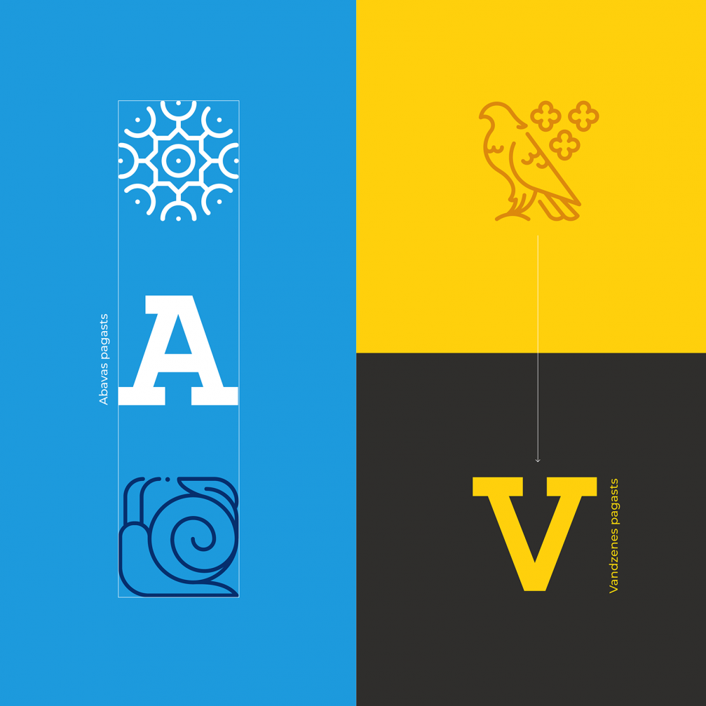
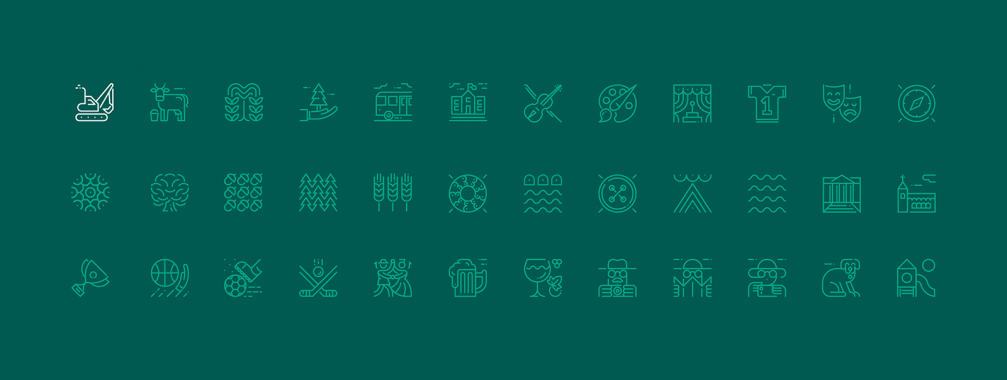
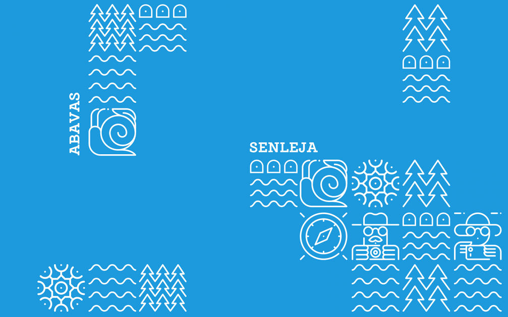
The Talsi Municipality values were brought to life visually by the design studio Teika. The graphic designer Jānis Tiltiņš admits that creating the visual identity for the entire municipality consisting of four towns and 14 parishes is challenging: «Such a large and diverse municipality risks focusing on the centre and forgetting about the smaller places — so we found a way to include the character of the smaller parishes in the fabric of the new brand. Each one has a colour code and a specific pattern, we present the municipality as a unified system and we communicate all fields of responsibility — education, culture, sports, transportation etc.»
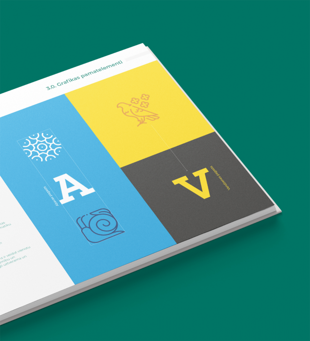
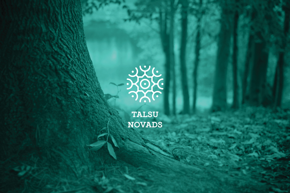
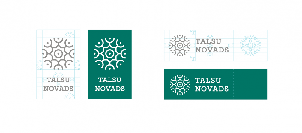
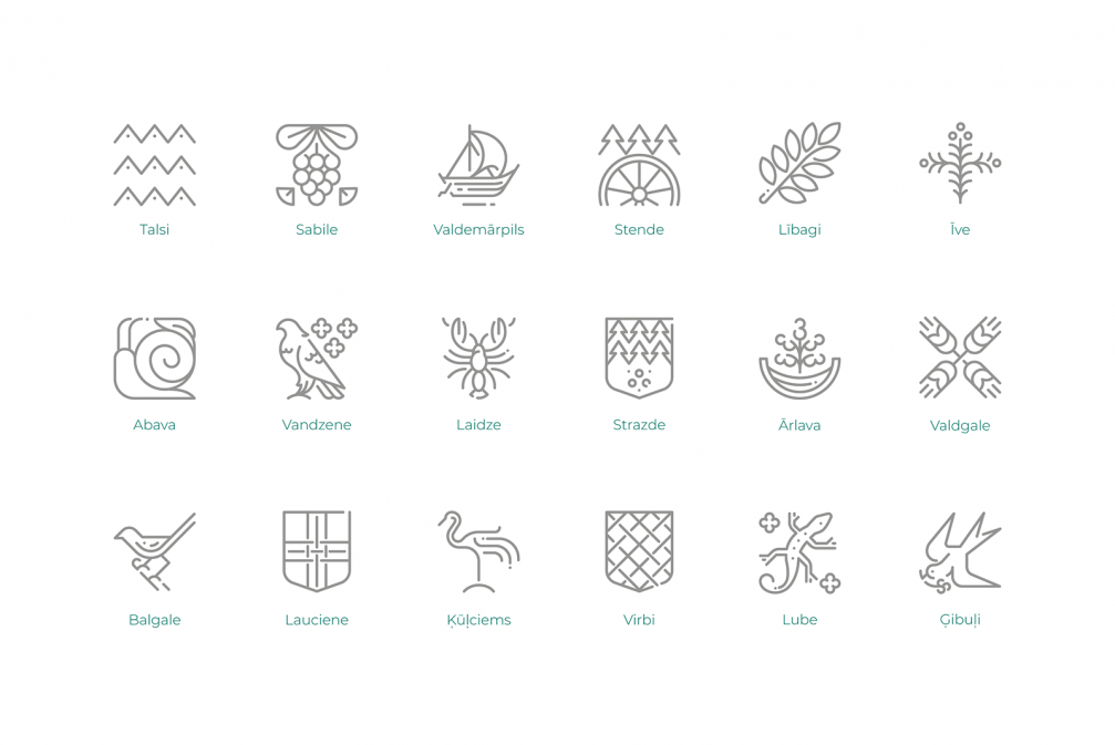
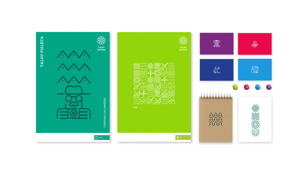
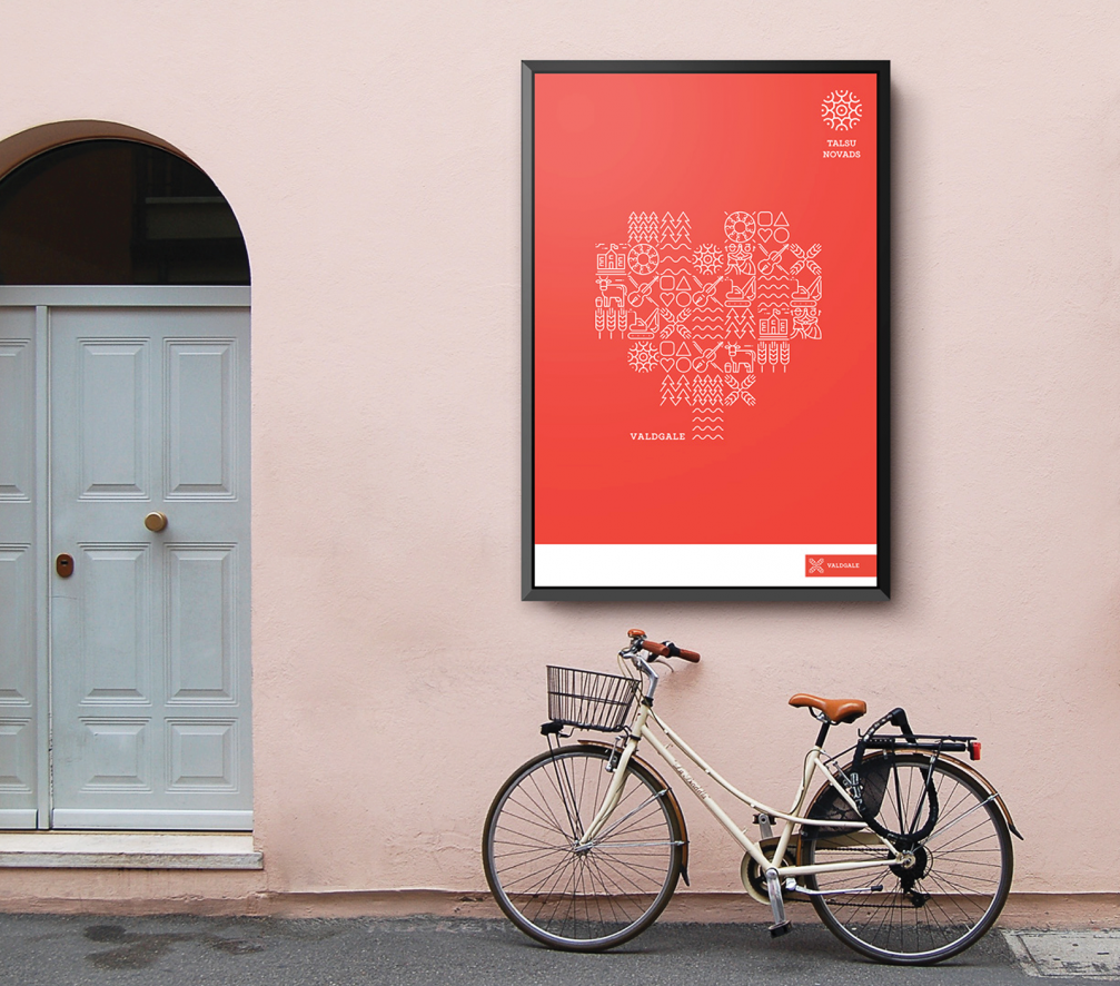
The logo is the traditional Talsi sun in a new form and colour scheme. The colour palette for every town and parish is designed considering the history, heraldic, symbols and values of the place. Along with the municipality logo, the main element of the visual identity is town and parish, thematic, informative and location pictograms. They include the values, affiliation and well–known symbols of Talsi. The pictograms make up the pattern of the municipality, that alludes to the traditional symbol of the municipality — the Talsi traditional skirt. «The pattern of pictograms unites the important Talsi Municipality characteristic elements in a graphic net that can be used in the digital and urban environment, in interior design and printed materials for various purposes. Often it serves as a background or additional pattern. The symbols offer countless possibilities,» the design studio Teika comments.
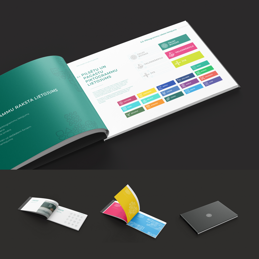
A style book is created to ease the implementation of the brand. It compiles the guidelines for the visual identity; workshops about the idea and implementation of the brand have been organized in collaboration with the municipality.


Viedokļi